![[OLD SEMESTER] 15-104 • Introduction to Computing for Creative Practice](../../../../wp-content/uploads/2023/09/stop-banner.png)
A student in CMU Design called Bryce Li created a website in 2021 that helps visualize songs by a specific artist. If you like a song by that artist, the website can show you other songs by the same artist that are similar. This information is presented in clustered data points that are visualized as circles. Each circle represents a song and the closer 2 circles are together, the more similar those songs are. When you click on a circle, it also plays a 30-second clip of the song so you can hear it for yourself. This website was coded using libraries from React and Three js. And the coding languages are HTML, CSS, and JS. To cluster different points by shared similarities, Spotify has a quantifying API that Bryce used along with a k-means clustering algorithm. I thought this was interesting because I often come across a similar situation where I like an artist’s song but I don’t know how to find similar songs. By simplifying the amount of data a user sees and taking away unnecessary information, this website, therefore, communicates clearly what the user wants to know: similar types of songs by the same artist.
Category: SectionD
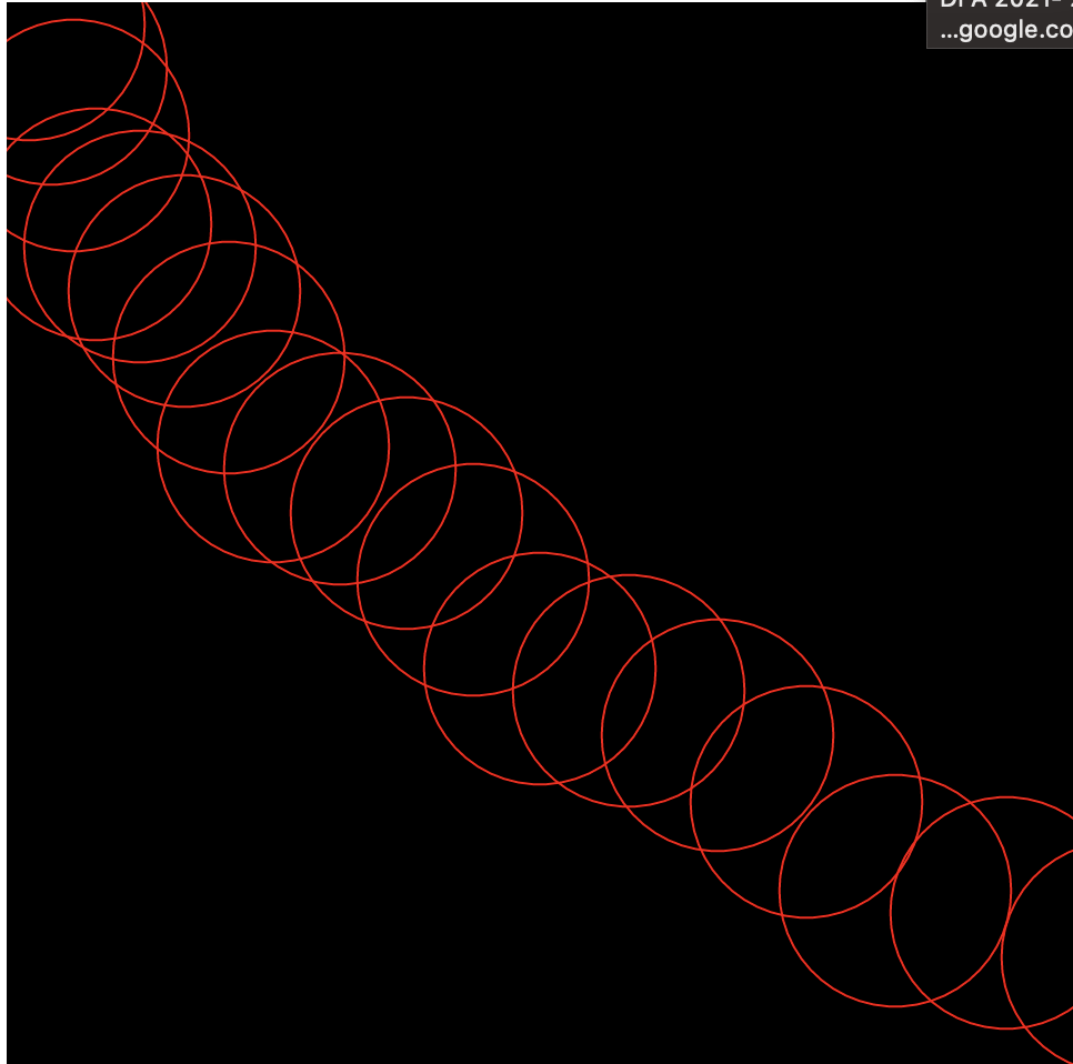
Project 07: Composition with Curves
function setup() {
    createCanvas(400, 400);
    background(220);
}

function draw() {
    background(0);
    //moves epicycloid to center
    translate(width / 2, height / 2);
    epicycloid();
}

function epicycloid() {
    // https://mathworld.wolfram.com/EpicycloidInvolute.html
    var x;
    var y;
    var a = map(mouseX, 0, width, 300, 80);
    var b = map(mouseY, 0, height, 100, 10);
    strokeWeight(2); //line weight
    stroke(10, mouseX, mouseY); // color of epicycloid
    noFill();

    //epicycloid
    beginShape();
    for (var i = 0; i <= 500; i ++) {
        var theta = map(i, 0, 500, 0, TWO_PI);
        x = (a + b) * cos(theta) - b * cos((a + b / b) * theta);
        y = (a + b) * cos(theta) - b * sin((a + b / b) * theta);
        vertex(x, y);
    }
    endShape();
}
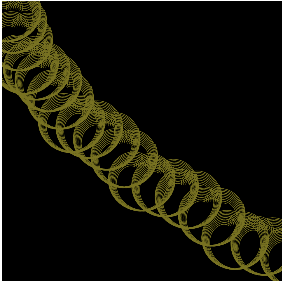
I think that the hardest part of this project was trying to find a curve on the website that was in parametric form. Figuring out how to make that formula more dynamic in this composition was also difficult. The curve that I ended up choosing was an epicycloid. In the way that I wrote the code, I like how it can be very simple with just a few circles but as the user moves the mouse, it create more interesting shapes which is really fun.
LO 7: Information Visualization
Title: WHO Immunization Progress Reports
Year: 2020
Artist: Stamen
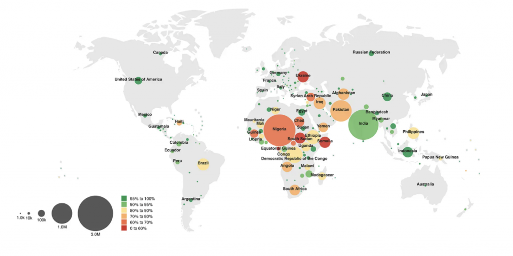
Stamen is a data visualization design agency that combines creativity and fun with utility. I also think that information can also be shown in creative ways which is why I wanted to look into a project that they created. One that I think is cool is the World Health Organization immunization Progress Report in which Stamen created data visualization of the world and their immunization progress. The compelling visualizations that they created tell a story of countries that have made significant progress in their immunizations. Data, especially data that involves other countries should be visualized because they are an easy way for people who speak different languages to understand information. Because Stamen is working with WHO, I think that their visualization was a smart and creative way to visually tell this story in a way that is accessible for everyone to see. Although these visualizations don’t solve the problem of increasing immunizations in countries, designing a way that people can see that these countries are struggling can lead to more solutions.
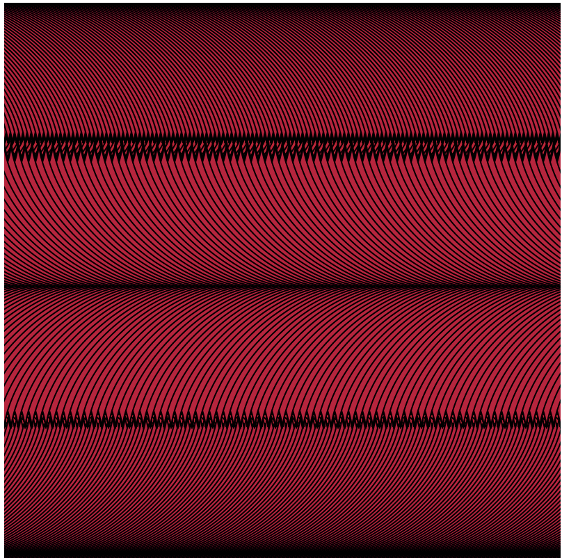
Curves Interactive Drawing – P07
// gnmarino@andrew.cmu.edu
// Gia Marino
// section D
var red; // variable for red in fill for gradient
var blue; // variable for blue in fill for gradient
function setup() {
createCanvas(400, 400);
background(200);
}
function draw() {
// maps variables red and blue so mouseX at 0 makes fill blue
// and at edge of the canvas mouseX makes color red
// creates a blue to red gradient
red = map(mouseX, 0, width, 0, 255);
blue = map(mouseX, width, 0, 0, 255);
// fills shapes and makes a red to blue gradient
fill(red, 0, blue);
// nested loop draws astroids going to the right and skips every other row
for (var y1 = 0; y1 <= width; y1 += 4*size) {
drawAstroid(0, y1);
for(var x1 = 0; x1 <= width + size; x1 += 3) {
drawAstroid(x1, y1);
}
}
// nested loop draws astroids going to the left and skips every other row
for (var y2 = 2 * size; y2 <= width; y2 += 4*size) {
drawAstroid(width, y2);
for(var x2 = width; x2 >= 0 - size; x2-=5) {
drawAstroid(x2, y2);
}
}
}
function drawAstroid(x, y) {
// push needed so translate doesn't effect rest of code
push();
translate(x, y);
beginShape();
// loop and astriod x and y implements math for astroid curve
for(var k = 0; k<360; k++){
// allows for mouseY to change size of astroid between 20 up to 80 pixels
size = map(mouseY, 0, height, 20, 80);
Astroidx = size * Math.pow(cos(radians(k)),3);
Astroidy = size * Math.pow(sin(radians(k)),3);
vertex(Astroidx,Astroidy);
}
endShape(CLOSE);
pop();
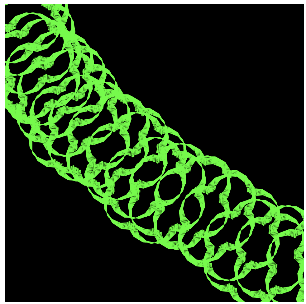
}For this week I had a really difficult time figuring out what curves would work for my ideas. I originally wanted to try a whirl with a logarithmic spiral but it was too difficult to implement the math. I then found the astroid shape and thought it was cool so I figured out how to implement it into code and then I made it move with mouse X and mouse Y tried to find a pattern or drawing that would look cool. I eventually found a pattern by doing this and decided my idea. I then decided my parameters would be changing the size of the astroid which therefore changes how many rows you see, and the color.
Looking Outwards 07
For this week’s exploration of data visualization I picked Ebb and Flow and I am particularly going to look at their project for Pitch Interactive Inc called “Covid-19 Daily Cases Across the US”.
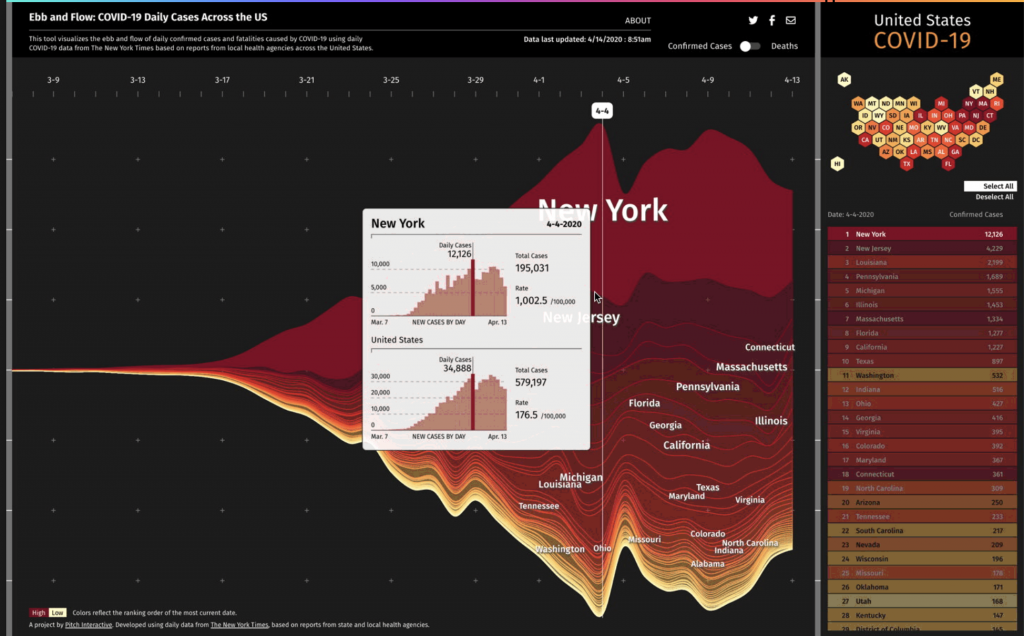
I really admire this tool because I feel like this is a great example of when data visualization is needed the most. It is an important tool for educating the public in a clear way especially when stress is high and misinformation is rampant. This project started while the concept of flattening the curve was spreading.
This graph uses the steam graph methodology and the data was extracted from the New York Times. This graph allows you to look at certain states and be able to compare them. The y-axis shows confirmed cases and deaths and the x-axis represents time starting March 7th.
Overall, I think this tool is very cool because it seems like this tool is constantly evolving even while the pandemic is currently winding down in the US. I think visualizations like this are so important and I think this team did really well at making it clear and concise while also informational.
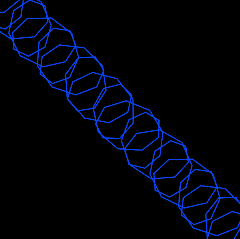
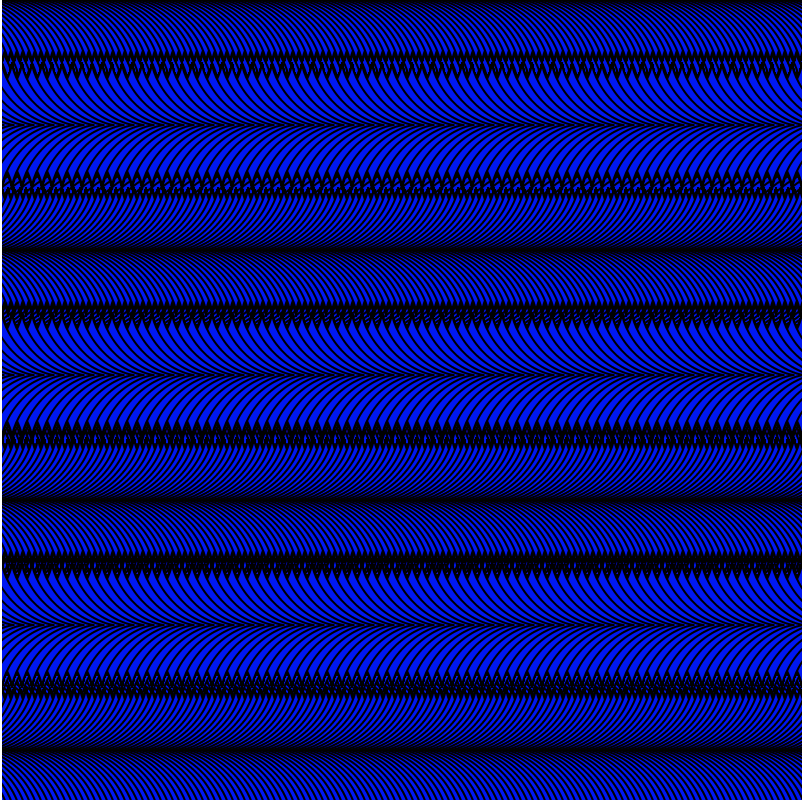
Project 07: Composition with Curves
sketch
//Julianna Bolivar
//jbolivar@andrew.cmu.edu
//Section D
//Project 07: Composition with Curves

var x;
var y;

function setup() {
    createCanvas(480, 480);
    frameRate(10);
}

function draw() {
    background(0);
    for (var curveLines = 1; curveLines < 10; curveLines++){ //draw slinky
        for (var amtLines = 1; amtLines < 5; amtLines++){
            push();
            translate(curveLines * 10, amtLines * 10);
            drawEpiTri();
        }
    }
}

function drawEpiTri() {
    var a = map(mouseX, 0, width, 15, 100);
    var b = map(mouseY, 0, height, 15, 50);
    noFill();
    stroke(mouseX, mouseY, 0); //color changes with mouse
    push();

    var a = map(mouseY, 0, width, 10, 50);
    var b = map(mouseX, 0, height, 10, 50);
    var h = constrain(mouseY, 0, b);
    var ph = mouseY/50;

    beginShape();
    for (var i = 0; i <= 500; i ++) { //shape equation
        var theta = map(i, 0, 50, 0, TWO_PI);
        x = (a+b)*cos(theta)-h*cos(ph+theta*(a+b)/b);
        y = (a+b)*sin(theta)-h*sin(ph+theta*(a+b)/b);
        vertex(x, y);
    }
    endShape();
    pop();
}
LO: Information Visualization
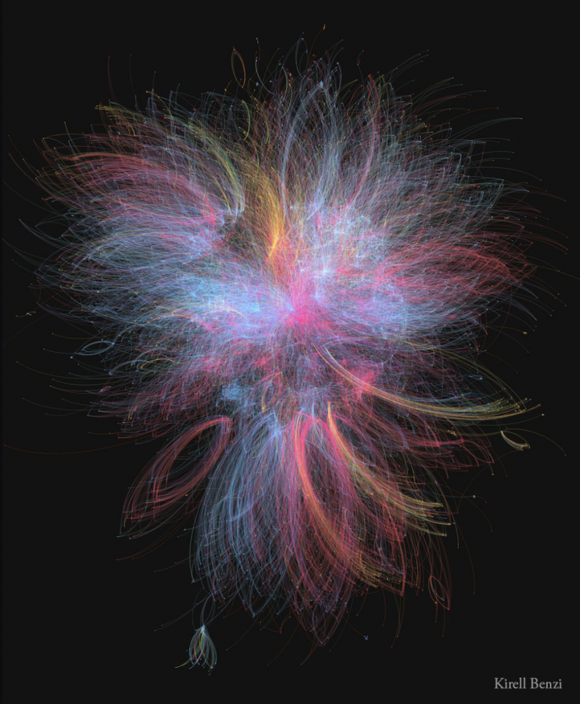
Dr. Kirell Benzi is a data artist and researcher. Kirell holds a Master of Science in Communication Systems from ECE Paris and a Ph.D. in Data Science from Ecole Polytechnique Federale de Lausanne. In 2017, he started his studio, Kirelion, around information design, creative technology, data visualization, and software engineering. He has collaborated with the likes of the EU, Stanford, Princeton, Cornell, Berkeley, UCLA, and more. He creates art that is exceptionally beautiful, pieces that one wouldn’t assume is based off of data points. Some of my favorites are; “The Dark Side and the Light” (2015), which is built upon the interactions between more than 20,000 characters from the Star Wars universe. The blue nodes represent those associated with the light side of the Force, including the Jedi, the Republic, and the Rebellion. The dark side is represented by the red nodes, which includes the Siths and the Empire. Yellow nodes represent criminals and bounty hunters, which mostly connect to the red nodes. The most influential characters are Anakin and Emperor Palpatine. I also really enjoy “Scientific Euphoria” (2014), which is about how in July 2012, CERN physicists found evidence of a new elementary particle, predicted by Peter Higgs in 1964. The graph shows the flow of retweets as people discussed the discovery. The network splits into two with European tweets concentrated in the center and U.S. tweets at the bottom.
https://www.kirellbenzi.com/art
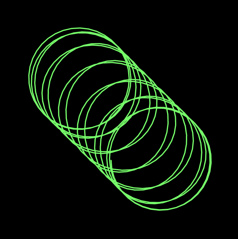
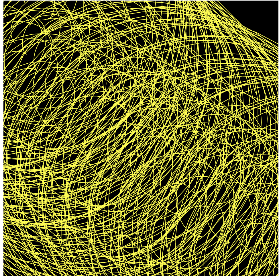
Project 7: Composition with Curves
//Elise Chapman
//ejchapma
//ejchapma@andrew.cmu.edu
//Section D

var nPoints = 100; //number of points along the curve
var noiseParam=5;
var noiseStep=0.1;
var petalNum=1; //number of petals on curve
var x; //for points along curve
var y; //for points along curve

function setup() {
    createCanvas(480,480);
    frameRate(10);
}

function draw() {
    background(0);
    //draws the epitrochoid curve
    //Cartesian Parametric Form  [x=f(t), y=g(t)]
    push();
    translate(width/2, height/2);
    var a = 90;
    var b = a/petalNum;
    var h = constrain(mouseY / 8.0, 0, b);
    var ph = mouseX / 50.0;
    fill(mouseY,0,mouseX);
    noStroke();
    beginShape();
    for (var i = 0; i<nPoints+1; i++) {
        var t = map(i, 0, nPoints, 0, TWO_PI); //theta mapped through radians
        //Cartesian Parametric Form  [x=f(t), y=g(t)]
        x = (a + b) * cos(t) - h * cos(ph + t * (a + b) / b);
        y = (a + b) * sin(t) - h * sin(ph + t * (a + b) / b);
        var nX = noise(noiseParam); //noise for x values
        var nY = noise(noiseParam); //noise for y values
        nX=map(mouseX,0,width,0,30);
        nY=map(mouseY,0,height,0,30);
        vertex(x+random(-nX,nX),y+random(-nY,nY));
    }
    endShape(CLOSE)
    pop();
}

//click to increase number of petals on the curve
function mousePressed() {
    petalNum+=1;
    if (petalNum==6) {
        petalNum=1;
    }
}
To begin, I liked the movement that was created by Tom’s example epitrochoid curve, so I went to the link he provided on Mathworld and read about the curve. I understood that I could make the petals interactive by adding a click into the program and changing the value of b in the curve equation. So at this point, my program allowed from 1 to 5 petals depending where in the click cycle the user is.

Then, I thought back to one of the previous labs, where we would draw circles with variable red and blue fill values, which I really enjoyed aesthetically. So, I made the blue value variable dependent upon the mouseX value and the red value variable upon the mouse Y value.
Finally, I really enjoyed the jittery star from the class example from our lecture on Randomness and Noise, so I decided I wanted to add noise. Because the curve is drawn with a series of points, I added noise randomness to each of the points, affecting both the x scale and the Y scale. Overall, I enjoy how the final project came out. I think it would be a cool addition to the header of a website, especially if I’m able to make the background transparent.

LO: Information Visualization
Immediately, I was intrigued by Moritz Stefaner’s work, specifically his Project Ukko: a visualization of seasonal wind prediction data. Project Ukko presents a thematic map of wind data using lines of varying opacity (prediction accuracy), thickness (wind speed), tilt and color (trend of wind speed). Stefaner outsources his computational data from clients, which is processed by another group called RESILIENCE, so unfortunately I cannot find much about the algorithm behind his work, but I can tell that Stefaner put a lot of effort into the process of his visualization. He asks questions like “What are the main views?”, “What needs to be available immediately, what on demand?”, and “How important is each part?”. I admire that he keeps the design process, that I myself have to go through in my major, central to his work. Furthermore, the final piece is both beautiful and highly functional. For someone not entrenched in the data, it is still an easy visualization to process; but it can easily become a deeply detailed source. It is minimalistic in that it includes only the necessary parts, yet it still feels so rich.
Moritz Stefaner, Project Ukko
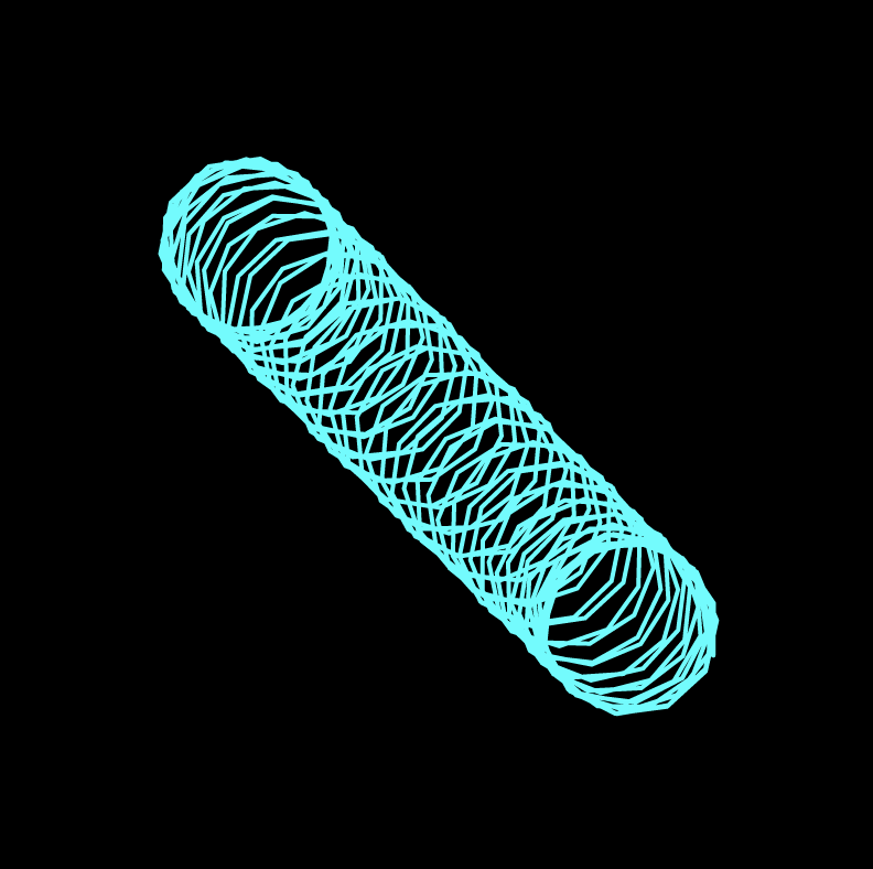
Project 7: Composition with curves
// Yash Mittal
// Section D

nPoints = 100;

function setup() {
    createCanvas(480, 480);
    frameRate (7);
}


function drawLemniscateCurve () { // coding the curve

    var x;
    var y;

    var a = 180;
    var h = mouseX; // X axis interaction
    var w = map (mouseY, 0, 480, 0, 240) // Y axis interaction

    stroke (205, 0, 11);
    strokeWeight (5);
    fill (255);

    beginShape ();

    for (var i = 0; i < nPoints; i = i + 1) {

        var t = map (i, 0, nPoints, 0, TWO_PI);

        x = (a * cos (t + w)) / (1 + pow(sin (t), 2)); // iterating x
        y = (a * sin (t + h)) * (cos (t)) / (1 + pow(sin (t), 2)); // iterating y

        vertex (x + w / 3, y + h / 3);
    }

    endShape (CLOSE);
}

function draw() {

    background (0);

    push ();
    translate (width / 2, height / 2);
    drawLemniscateCurve ();


    }
After I chose my curve, I realized that it somewhat looks like Spiderman’s eyes from into the spider-verse and I wanted to experiment more with that so I tried to iterate different eyes based on the X and Y location of the mouse. I struggled with drawing the curve at first but once I understood the concept, iterating became pretty easy.