
Month: August 2017
Project 01 – Yugyeong Lee
//Yugyeong Lee
//Section B
//yugyeonl@andrew.cmu.edu
//Project-01

function setup() {
    createCanvas(400, 425);
	background(0, 69, 124);
	noStroke();
	fill(0, 138, 187);
	quad(0, 0, width, 0, width, 150, 0, 165);
}

function draw() {
	noStroke();
	//hair
	fill(20);
	beginShape();
	vertex(118, 103);
	vertex(121, 114);
	vertex(112, 121);
	vertex(88, 167);
	vertex(88, 240);
	vertex(78, 288);
	vertex(90, 348);
	vertex(80, 408);
	vertex(108, 415);
	vertex(127, 327);
	vertex(172, 271);
	vertex(164, 240);
	vertex(218, 214);
	vertex(220, 263);
	vertex(210, 281);
	vertex(210, 338);
	vertex(242, 350);
	vertex(265, 328);
	vertex(242, 165);
	vertex(210, 121);
	vertex(165, 98);
	vertex(135, 98);
	vertex(118, 103);
	endShape();

	//neck
	fill(211, 173, 138);
	beginShape();
	vertex(127, 327);
	vertex(151, 286);
	vertex(172, 271);
	vertex(164, 240);
	vertex(218, 214);
	vertex(220, 263);
	vertex(210, 281);
	vertex(210, 338);
	vertex(180, 305);
	vertex(144, 314);
	vertex(127, 327);
	endShape();

	//face
	fill(232, 189, 151);
	push();
	translate(width/2, height/2);
	angleMode(DEGREES);
	rotate(-25);
	ellipse(-8, 15, 50, 40);
	rotate(-5);
	ellipse(-8, -42, 106, 145);
	ellipse(-62, -35, 15, 30);
	pop();

	//hair
	fill(20);
	triangle(98, 224, 122, 114, 122, 168);
	quad(160, 111, 185, 117, 217, 147, 194, 135);

	//brows
	fill(50);
	beginShape();
	vertex(130, 183);
	vertex(134, 176);
	vertex(152, 165);
	vertex(154, 167);
	vertex(136, 178);
	vertex(130, 183);
	endShape();

	beginShape();
	vertex(176, 153);
	vertex(192, 143);
	vertex(202, 143);
	vertex(194, 145);
	vertex(178, 155);
	vertex(176, 153);
	endShape();

	//mouth
	stroke(60)
	line(180, 226, 197, 218);
	line(197, 218, 211, 207);
	line(188, 217, 194, 215);
	line(194, 215, 199, 211);
	line(192, 226, 200, 223);
	line(200, 223, 205, 219);
}
I first worked in Photoshop to simplify a picture of myself into combination of simple geometries. After planning which geometries to use, I took the coordinates from Photoshop and applied them to appropriate code. I used beginShape() and endShape() to insert all the coordinates in more complex shapes while using rotated ellipse, triangle, quad, and lines for simple shapes.
Test_project 1
This is a test! 🙂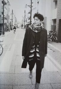
jamieh-LookingOutwards-01
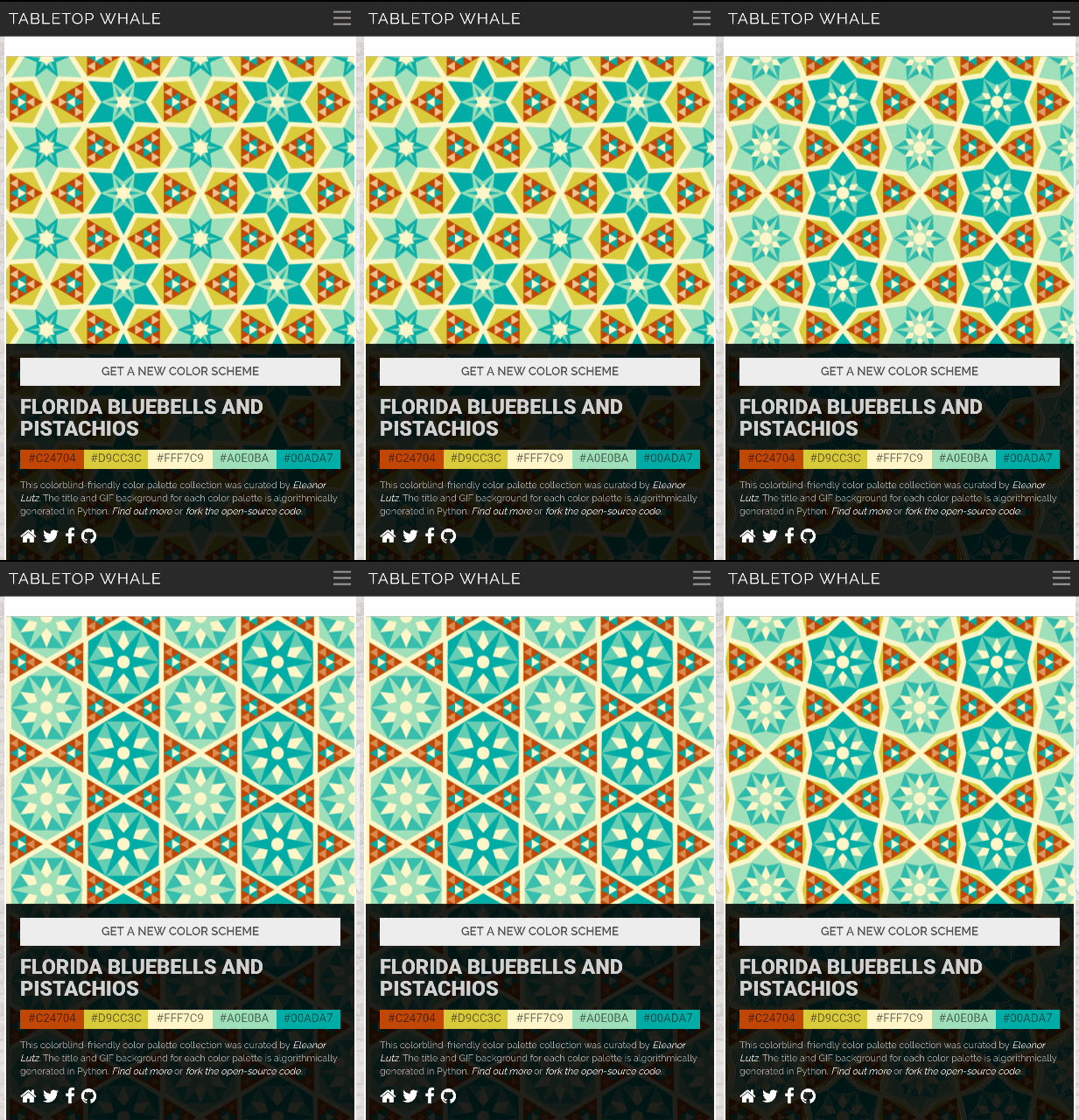
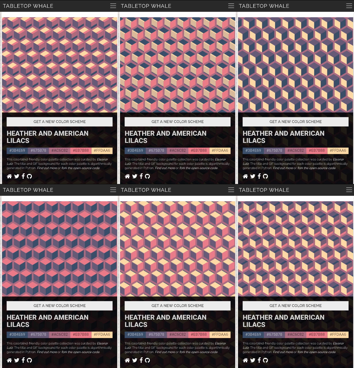
I came across the website Tabletop Whale, which is a website by a biology PHD student Eleanor Lutz who spends time creating infographics on science. Although she makes most of her infographics in Photoshop and Illustrator, some of her blog posts are gifs or animated interactive explanations for her topic of the month.
She firstly researches a theme or topic, then once she is sure she understands it well enough to teach others, she will go ahead to design and create the infographics. Her main purpose is to inform others. Eleanor is inspired by the idea that such illustrations can bring surprise and spark interest in topics which others may not even fully understand. This type of project shows that sometimes ideas are best presented through diagrams, illustrations or moving pictures to help others understand. What I appreciate about her approach is that she makes use of different types of media and presentation to present different concepts, from computational 3D modeling to gif making through multiple Photoshop image frames to using Python coding. This just shows that today and in the future, complex information can be visualized and not only read through words on textbooks.
yoonseo1-Project 1- Self Portrait
function setup() {
    createCanvas(600, 500);
    background(211,192,163);

}

function draw() {
    strokeWeight(0.8);
    line(202,93,165,124);
    line(199,118,152,138);
    line(180,148,152,176);

    //Eyes
    var c = color (57,22,15);
    fill(c);
    noStroke();
    triangle(190,190,223,185,223,195);
    triangle(223,195,223,185,253,190);
    triangle(339.52,190,364.33,185,364.33,195);
    triangle(364.33,195,364.33,185,394.52,190);
    noFill();
    var c = color (0,0,0);
    stroke(c);
    strokeWeight(4);
    //nose
    line(294.82,195,294.82,273.5);
    strokeWeight(2);
    line(308,206.33,327,278);
    strokeWeight(0.5);
    ellipse(298,283,47,4);
    strokeWeight(1.4);
    //chin
    line(180.29,334.9,273,405.5);
    line(322,403,411.2,336.9);
    //lips side
    strokeWeight(0.6);
    line(259.13,336.34,282.13,342.34);
    line(309,341,335,335);
    noStroke();
    //lips
    var c = color(169,79,79);
    fill(c);
    triangle(285.08,337.44,306.05,337.44,295.56,342.54);
    noFill();
    var c = color(0,0,0);
    stroke(c);
    //side hair
    strokeWeight(1.6);
    line(140.07,195.83,151.95,210.17);
    line(432.28,211,443.13,195);
    strokeWeight(1);
    //hair
    line(426.57,154.59,440.84,187.59);
    line(417.53,167,397.5,97);
    strokeWeight(2.2);
    line(270.63,115,241,144);
    line(294.82,162,275,154);
    strokeWeight(1.2);
    line(316.5,93,284.91,93);
    strokeWeight(1.4);
    line(232,106,188,162);
    strokeWeight(1.3);
    line(375,146,358,129);


}
For this self Portrait project, I wanted to create fragmented geometry to express the shape of the face. I intentionally tried using few complete geometries such as rectangle, circles, and etc. I instead used variation in stroke to illustrate bit of depth.
jiaxinw-Looking Outwards-01
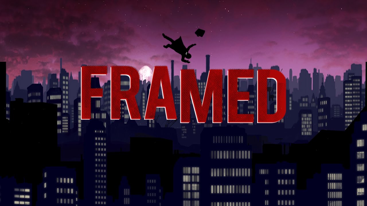 The Poster of Framed
Game name: Framed
Developer: Loveshack
Publisher: Noodlecake Studios Inc
The trailer video of Framed
Framed is a mobile game where you re-arrange panels of the animated comic book to change the outcome of the story. It is developed by the Australian studio Loveshack, which was a three-member team (now there are four members). The unique narrative-based puzzles game mechanism, the outstanding art style, and the seamless animation design impressed me a lot. Framed did a really good job on combining interaction and storytelling together, for allowing players actually to affect the story through the whole process instead of just watching as a viewer. Different from the normal design of moving the protagonist or objects in scenes, the player moves the order of the comic panel to change the story.
From the art aspect, this game has a polished silhouette comic style. The comic style matches the game mechanism very well, and it gives an intuitive indirect control for the players. Besides the visual part, the music part also does a good job to help the player get into the story. There is no dialogue or traditional sound effect in the game, that is why the background music becomes important. As the story going on, the player will find that three different characters have their own theme. Moreover, the music has different layers. When the player is arranging the panel, which means the story is on a break, the background music is a basic accompaniment. When the play button is pressed for starting the story, the theme melody joins in. The design of music helps to indicate the pace and emotion of the story, creating an immersive atmosphere.
When Loveshack created Framed, the team had three members: Joshua Boggs, Ollie Browne, and Adrian Moore. Joshua was responsible for programming and design, Ollie was the artist and designer, and Adrian took the music and design part. The studio spent about 2 years to develop the game. At the very beginning, the rough idea of Framed was born when Joshua read the book Understanding Comics by Scott McCloud and happened to see that the position of the gaps between panels in comics can affect the meaning of the story. Joshua immediately realized it could be a great idea for a game mechanism.
So far, Framed has become a great success for Loveshack as it has received over 30 awards and accolades and the studio released Framed 2 which is a sequel to Framed in July 2017.
For more details about Framed and Loveshack, please go to http://loveshackentertainment.com/
rachel park test post
 testing
Michael Miller_Project-1
Instructions: Move the mouse around the screen to wake up the face.
function setup() {
    createCanvas(300,300);

}

function draw() {
    background(32,50,126);

    ellipseMode(CENTER);
    noStroke();
    fill(255,203,70);
    //face(sun)
    ellipse(mouseX,mouseY,325,325);
    //mouse gets close to center(sunrise)
    if(dist(mouseX,mouseY,150,150)<15)
    {
	if(mouseIsPressed){
	    //eyes bug out
	    fill(255);
	    ellipse(90,125,70,70);
	    ellipse(210,125,70,70);

	    fill(0);
	    ellipse(random(85,95),random(120,130),60,60);
	    ellipse(random(205,215),random(120,130),60,60);
	}else{
	    //normal eyes
	    fill(255);
	    ellipse(90,125,40,40);
	    ellipse(210,125,40,40);

	    fill(0);
	    ellipse(90,125,30,30);
	    ellipse(210,125,30,30);
	    text("Click!",140,290);
    }
    }else{
	//eyes open as as mouse moves closer to center(wakes up)
	fill(255);
	ellipse(90,125,40,35/(dist(mouseX,mouseY,150,150)-14)+5);
	ellipse(210,125,40,35/(dist(mouseX,mouseY,150,150)-14)+5);

	fill(0);
	ellipse(90,125,30,25/(dist(mouseX,mouseY,150,150)-14)+5);
	ellipse(210,125,30,25/(dist(mouseX,mouseY,150,150)-14)+5);
	//sleep
	text("ZZZ",143,290);
    }
    //mouth moves as mouse moves closer to center(talking)
    fill(0);
    ellipse(150,200,150/(abs(150-mouseX)+1),90/(abs(150-mouseY)+1));
    //outline of face to suggest people to fill it with circle
    noFill();
    strokeWeight(15);
    stroke(0);
    ellipse(150,150,325,325);

}
I suppose my project is more of an emotional self-portrait than an accurate depiction of my appearance, focused more on metaphor than realism. As you move the mouse closer to the center of the screen, not only does the face form, but everything brightens and daytime comes, waking up the face for the learning that is to be had. By wiggling the mouse a little bit, you can make the mouth move, showing that talking is possible, but it will take controlled effort. And when the mouse is in the center of the screen, clicking causes the face to get super excited, showing how it feels to be here. Overall, the project was fun to work on, and I found it fulfilling to explore different avenues to complete it.
Michael Miller-Looking Outwards-1
Trailer for Subset Games’ FTL
FTL: Faster Than Light is a game developed from 2011 to 2012 by Justin Ma (as the artist) and Matthew Davis (as the programmer), along with Ben Prunty (the sound designer and composer) and Tom Jubert (as the writer). In the game, the player assumes the role of a spaceship’s captain who must make decisions, manage the crew, and control the ship’s systems in order to defeat the Rebel movement. The gameplay was largely inspired by tabletop games such as Red November, but through the use of real-time action native to video games, FTL can achieve greater levels of engagement while still maintaining the ability for players to make well-informed, strategic decisions through the ability to pause. Having played both FTL and Red November, I truly admire the creators of FTL’s ability to make the game feel active and responsive by simplifying the complexity of events experienced during gameplay. FTL could be played as a boardgame– every event would be resolved using dice rolls– and if it were, it would be much more complex than Red November; however, the experience is streamlined for the player, and as such, although the events of the game are mechanically almost identical to those of Red November, the feel of the game becomes far more active. I admire the game’s ability to change how a game feels for the player by presenting the same ruleset in a different manner.
![[OLD FALL 2017] 15-104 • Introduction to Computing for Creative Practice](../../../../wp-content/uploads/2020/08/stop-banner.png)
