aerubin-LookingOutwards-09-Section-C

Anna Boyle wrote about the Flow Machines Project for her Week 4 Looking Outwards post. This project was designed to have a computer program compose music in the style of a specific composer. The video Anna provided was a computer composed piece in the style of the Beatles. She writes about the mathematical algorithms utilized to create sequences that then are combined to create a piece.

Although the melodies are composed utilizing this algorithm, there are still aspects of the piece that are created with help from human intelligence. The harmonization is all done by people as chord progressions that make musical sense are difficult to accomplish because the melodic line effects the sound of the chordal progression. In addition, the words were composed by humans as the syllables of the words must match the music and make cohesive sense. So although the melodic line is computer generated, many other aspects of the piece are still composed by humans.

Link to Anna’s Blog Post

thlai-LookingOutwards-09

2016 AICP Sponsor Reel

I asked my friend Heidi what her favorite Looking Outwards project was, and this was it. I had actually watched this video before – I think it went viral about a year or so ago. I agree with what Heidi says in her Looking Outwards post: “…it looks so believable, and yet the textures and behaviors of the people dancing…would never make sense in real life.” When I first watched the video, I actually thought it was people dancing in intricate costumes because the movements and textures looked so realistic. I think the dancing and colors really capture the energy of the music, and the fast paced changes in costume keeps the viewers on their feet and keeps them interested. I think the creators did motion capture technology justice. I agree with what Heidi says her her post. The project is incredibly imaginative and entertaining to watch.

dnam-LookingOutwards-09

For this week’s Looking Outwards assignment, I looked at the writing by my close friend, Na Hyun Kim. On week 4, she looked at different types of sound arts and decided to further explore loop sounds in music. She linked the topic of sound art to something that she is interested in. She further discusses loop music by giving an example of a youtube musician who used sound loops to cover songs. This is the youtube video mentioned before, and Na Hyun’s Looking Outwards post can be found here.

jennyzha – Project 09

sketch

// Jenny Zhang
// jennyzha
// Section D
// Project 09

var jennyzha;

function preload() {
    var Image = "https://i.imgur.com/c3AjAad.jpg";
    jennyzha = loadImage(Image);
}

image(jennyzha);

function setup() {
    createCanvas(480, 480);
    background(0);
    jennyzha.loadPixels();
    frameRate(10);
}

function draw() {
    var px = random(width);
    var py = random(height);
    var ix = constrain(floor(px), 0, width-1);
    var iy = constrain(floor(py), 0, height-1);
    var ColorXY = jennyzha.get(ix, iy);

    push();
    stroke(ColorXY);
    strokeWeight(1);
    line(px, py, px, py + 30); 
    pop();

    stroke(ColorXY);
    strokeWeight(1);
    line(mouseX, mouseY, mouseX, mouseY + 30); 
}

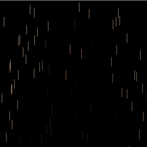
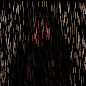
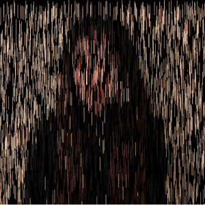
This project took me a lot of trial and error, interestingly enough, not because of the code but because of imgur and the image itself. First, after seeing that my code would not load, and feeling fairly confident in my code itself, I realized that I had used the wrong url for the image on imgur. Second, after the code started to run the way I wanted it to, I saw that it was loading just the background. This is when I realized that it was because the image was over 1000X1000 pixels and my canvas was only the max requirement, 480X480. I quickly went back to the original image, shrunk it down and the code worked perfectly.

mstropka-Looking Outwards-09

https://blog.twitter.com/official/en_us/a/2013/the-geography-of-tweets.html

For this week’s looking outward assignment I looked at Asher Blackburn’s looking outwards 7, which is a visual map of where people have tweeted from. This caught my eye for the same reasons that he wrote about in his looking outwards post in that the concept is very simple, but the resulting image is incredibly complex and interesting. The map has billions of points from months of data collection and when all of these points are plotted, the map begins to raise questions. For example, after looking at the map in detail you start to wonder about why certain areas send more tweets than others, why one person is sending a tweet in the middle of nowhere, and what is the content of these tweets.

It would be very interesting if the map were able to link to the tweets that were sent out at these locations. Looking at the map, I am very curious what users are sending out at these locations and times. I would like to be able to look more in depth and answer some of these questions with the help of the map.

LookingOutwards-09

gyueunp – Looking Outwards 05

The Looking outwards Im referencing

VOID from Chris Bjerre on Vimeo.

This project was interesting to me because it shows how art & coding intersects with commercial product. Also the visuals were unsettling in a poetic way where the coding of pattern did not feel forced and the sole focus, more a tool used in a larger narrative. The part I found most interesting was Bjerre’s project titled ‘VOID’ which Gyueun linked in her post. I agree with Gyueun’s attraction towards the “simple yet complex visual structures” in the linked projects. Bjerre’s work aims to unsettle the viewer through visuals and audio and VOID was a project that did both of these things along with an original non-dialogue narrative.  

mstropka-Project09-E

sketch

//Max Stropkay
//Section E
//mstropka@andrew.cmu.edu
//Project-09

var underlyingImage;

function preload() {
    var myImageURL = "https://i.imgur.com/j59r16x.jpg";
    underlyingImage = loadImage(myImageURL);
}

function setup() {
    print("made");
    createCanvas(480, 480);
    background(0);
    underlyingImage.loadPixels();
    frameRate(20);
}

function draw() {
var size = 20;
    for(var i = 0; i < 480; i+=10){
      for(var j = 0; j< 480; j+=10){
        fill(underlyingImage.get(i, j));
        ellipse(i+random(-10,10), j+random(-10, 10), size ,size);
      }
    }


}

For my project I took a picture of my friend and replaced every pixel with an ellipse that is filled with the color of the underlying picture. This gives the image a sort of painterly feel. Then I made the ellipses move randomly to give the image a sense of movement.

hannahk2-LookingOutwards-09

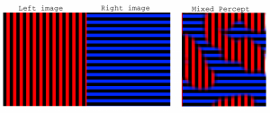
I chose Clarisa’s looking outwards from week 2, because I can relate to her fascination with virtual reality after experiencing it for the first time recently. I think the project she chose, Memo Akten’s Fight (2017), is really amazing and I agree with Clarisa in that the most interesting aspect is its variability- no two people will see and interpret the visuals in their brains the same way, though the images stay constant with each showing. I think it is important, however, to highlight how the artist achieved this effect by utilizing his knowledge of psychology and the binocular rivalry phenomenon. While looking around, the viewer’s brain chooses which aspects of the two images shown become dominant or suppressed, presenting the viewer with an animated patchwork of the two images. Even more amazing is the message that the picture we see in our minds is not a clear representation of the outside world, but of simulated world constructed based on our expectations and prior experiences.

http://www.memo.tv/fight/

(the link to the work)

cespinoz-Looking Outwards 02

(the original looking outwards post)

(the simulation of the mixing of the two images within the brain)

fight_snippet_4 from Memo Akten on Vimeo. (a clip of the two images shown in the VR)

LookingOutwards-09-LookingOutwards!


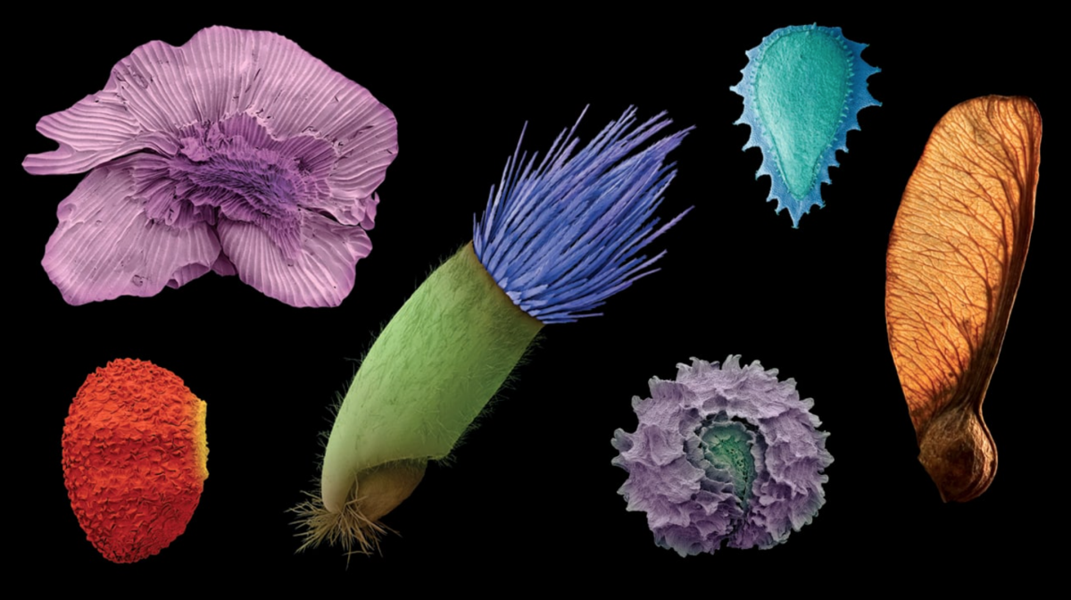
SEM scans of various plant seeds colorized

Supawat’s Looking Outwards Post

This week, I’d like to address Supwat’s Looking Outwards post from Week 5, where he writes about the magical microscopic universe uncovered through colored electron microscopy (SEM). It was really interesting to read an alternative perspective on one of the Miller Gallery’s most exciting exhibitions (in my opinion), World Within, created and curated by Rob Kesseler. What was most surprising to me when observing the artifacts and documentation of this photographic process is that SEM scans are taken only in black and white.

Here’s how it works: Through a an electric light filament, the machine shoots a flow of electron through a pair of electromagnetic lenses. The beam is varied and scans itself across the studied object. Depending on the position of the beam, an electron detector collects data from the secondary electrons that are repelled back from scan. After that, the image is run that through some filters that result in a extremely high resolution black and white image.

While these images are quite impressive on their own, without the sensibility of the artist who colors and shades these images, we wouldn’t be able to experience such evocative and beautiful colored imagery. It’s refreshing to find this kind of artistic collaboration even in the most dense and complex scientific studies.

Here is the tutorial Supawat linked that reveals the methodology behind coloring SEM scans:
Tutorial on Coloring SEM Scans

I took a gander and was truly blown away 🙂

Sheenu-Project 09-Portrait

sketch

// Portrait
// Name: Sheenu You
// Andrew ID: sheenuy
// Section E

//Variables
var sheenu;
var a =0;
var b =0;
//Loads Image
function preload() {
    var myImageURL = "https://i.imgur.com/JCe4MPY.jpg";
    sheenu = loadImage(myImageURL);
}

function setup() {
    createCanvas(480, 480);
    background(0);
    //Load Pixels of image
    sheenu.loadPixels();
    frameRate(120);
}

function draw() {
    //Variables that generate Image
    var x = random(width);
    var y = random(height);
    //Gets all those pixels and arranges into variable
    //Generates "Sheenu" pixel
    var image = sheenu.get(x, y);
    fill(image);
    textSize(7);
    text("Sheenu",x, y);
    //Generates random "You" pixel
    text("You",a,b)
    //"You" pixel genereator
  a += 20;
  if (a > width) {
    a = 0;
    b += 20;
  }


}

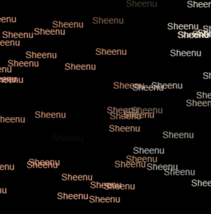
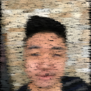
I wanted to do something with text, so I decided to use my name as a custom pixel. I guess you can say this portrait has my name (and face) all over it. I like how the text starts to appear like brush strokes or pastel as more text generates and creates the full image. I found it as an interesting effect I wasn’t aware of nor expecting. I also wanted to do something with my last name, so I made them generate in an orderly fashion but with randomly generated colors. The “You” is definitely a huge contrast compared to the “Sheenu”, which generates randomly and has a specifically generated fill. In the end, all I can say is that a picture is truly worth a thousand words (or names).