sijings-lookingoutwards-08


Janet Echelman (born 1966) is an American sculptor and fiber artist. She graduated from Harvard University in 1987. Her sculptures have been displayed as public art, often as site-specific installations. She starts working with a Hamble material. She first studied Chinese calligraphy at Hong Kong University where she encountered a building/architecture made by bamboo which has a strength she admired during an earthquake. In 1997, Echelman won a Fulbright Senior Lectureship and traveled to India with the intention of giving painting exhibitions. For Janet’s work, I really appreciate how she can flexibly manipulate materials and media. I remember in this talk, she first discussed how her material cannot arrive on time and results in her changed choice of using the material. Instead of waiting, she used a local material, the fishing net. She then discovered how the adaptability of it –the ever-changing form of the interaction of the wind.
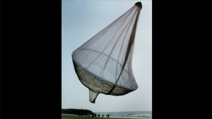
The First Work She felt Satisfied to Work with | 1997 | Mahabalipuram

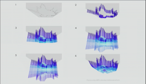
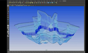
For most of her work, she will design on applications first to construct precise shape with gentle movement. She figured out to use the variable of a machine to create a pattern of hand-made patterns. To let more industrial workers work on her piece, she created her own language of how to make these patterns for the workers. She analyzes the photos of the sky and graphs the saturation with software that is developed by her studio. This software helped her to create images that describe the imagined shape during the day and night time, with wind and without.
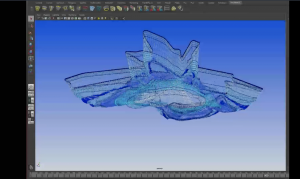
The Form of Her Work Without Wind Interpetated from This Application |2014| The Bill and Melinda Gates Foundation Campus
The Form of Her Work With Wind Interpetated from This Application |2014 |The Bill and Melinda Gates Foundation Campus
Layers of Saturation Echelman Uses to Analysis | 2014 | The Bill and Melinda Gates Foundation Campus

Throughout the whole presentation, she presented with pretty self-explanatory pictures and animations. Her instructions are calm, slow and really natural. The anecdote jokes she shared about really helps to add layers on her overall presentation. She also demonstrates a really clear timeline with the different stage in her life and artwork, from her basically new to the medium and material to the place where she mastered it and combine with sound, climate change, and etc.


Janet Echeiman’s talk on Inst-Int Festival

Bettina-LookingOutwards-08

Derek Watkins‘s work piqued my interest because his ethos relates to my design methodology, and his approaches relates to an independent study I’m doing this semester.

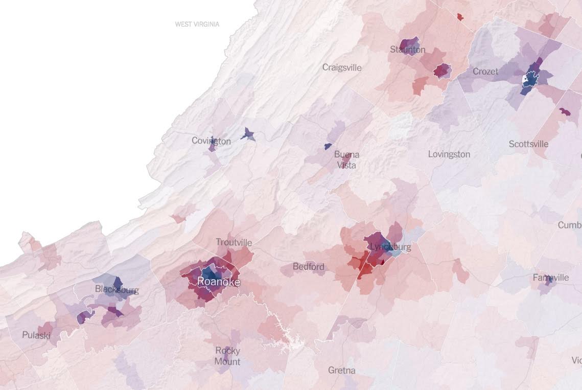
Watkins works at New York Times where he tells interprets how to tell stories in ways more than just written word and still image. He includes animations and interactive elements to add layers of information to the otherwise standard scrolling-interaction the reader needs to go through. I appreciate his statement in the Eyeo 2017 video, that it’s not about “video journalism” or “photojournalism”, it’s about understanding the nature of the content and what form best communicates the essence of the content to readers. That sentiment of identifying concept and purpose before creating form relates to my design practice; it’s an approach I notice people from other disciplines have trouble grasping– people (myself included) struggle with ambiguity and strive for a tangible grasp of what the thing they’re making is.

Nevertheless, when we let go of preconceived notions of what a form should be, we evolve news sites from pages of text to interactive data visualizations. I hope to apply similar approaches, both conceptually and formally, to an independent study I’m working on where I want to communicate the different lenses I’ve interpreted The Little Prince through in a web format.

Above: images from Watkin’s work in New York Times articles.

afukuda-LookingOutwards-08


Eyeo 2015 – Theo Watson & Nick Hardeman

Theodore Watson and Nick Hardeman are the key figures of the creative studio Design IO LLC (based in Cambridge, Massachusetts), specializing in the design and development of innovative, interactive installations. Watson – the Creative Director w/ a BFA Design & Technology from Parsons School of Design – is an artist, designer and experimenter whose work strives to invite people to play. Hardeman – Minister of Interactive Art – is a new media artist, designer and experimenter who enjoys combining traditional means of art medium with emerging technologies.

The studio blends design and technology, creating innovative, interactive installations and galleries for the people to enjoy. I admire their progressive mindset; applying current technological capabilities into traditional means of art. Growing up, interactive installations were not common (if they even existed); yet in today’s museum galleries – especially the children section – there are so many variety of interactive installations. I think this fosters the children’s growth more and that is why I admire how Design IO has contributed so many of these installations. Out of all their work, the Living Library my favorite project. Growing up I always enjoyed the interactive books like Eric Carl; it engages children more. And I think that the Living Library pushes this concept effectively through the use of technology.

Their presentation skill is pretty orthodox; they begin with introduction of the speakers, and they transitioned to the precedent which inspired the project they are talking about. Their presentation organization was very basic yet appreciated for its logical flow and simplicity.


Video showcasing Living Library project by Design IO (favorite work by them)

Link | http://design-io.com/ – Design IO website
http://design-io.com/projects/LivingLibrary/ – Living Library project page

Project-07-Curves

sketch.js

//Hanna Jang 
//Section B 
//hannajan@andrew.cmu.edu 
//Project-07

var numberPoints=200; 

function setup() {
	createCanvas(420, 420); 
	frameRate(15); 
}

function draw() {
	 
//map the color background changes using r, g, b  and mouse
	var r=map(mouseX, 0, width, 0, 255); 
	var g=map(mouseY, 0, height, 0, 90); 
	var b=map(mouseX, 0, width, 0, 250); 
	background(r, g, b, 30); 
	
	//stroke
	stroke(240, 174, 231); 
	strokeWeight(0.3); 
	
	translate(width/2, height/2); 
	drawEpitrochoid(); 
}

function drawEpitrochoid() {
	var x; 
	var y; 
	var h=100; 
	var theta; 
	
//variables to help modify change using mouse 
	var a=map(mouseX, 0, width, 0, 20); 
	var b=map(mouseY, 0, height, 0, 40); 
	
//draw outer epitrochoid 
	beginShape(); 
	for(var i=0; i<numberPoints; i++) {
		theta=map(i, 0, width/2, 0, 360); 
		x = (a + b) * cos(theta) - h * cos(((a + b)/b) * theta);
       y = (a + b) * sin(theta) - h * sin(((a + b)/b) * theta);
 
 vertex(x, y); 
	}
endShape(); 
}

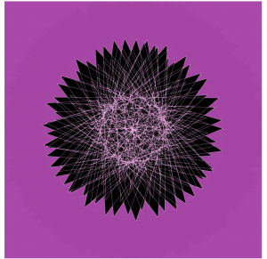
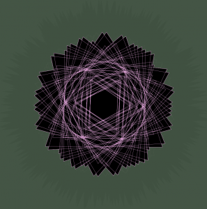
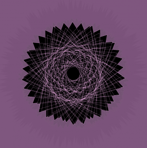
I started this project by looking through the different mathematical curves on the Mathworld curves site. I stumbled upon a specific curve named Epitrochoid that I really liked. It reminded me of a shape of a flower, which is why my project is themed around pink, to give it a pink flower look.

I wanted the background to also change as according to the mouse movement, which is why I also made maps for the different R, G, B variables. It was a bit hard to understand how I wanted the mouse to interact with the different variables of the functions, but once I made maps to form relationships with the mouse and variables a and b, I was set.

(Shown above are examples of different Epitrochoid patterns and sizes according to the movement of mouse)

dnoh-sectionD-lookingoutwards-07

Project: Ross Spiral Curriculum

By: Moebio Labs

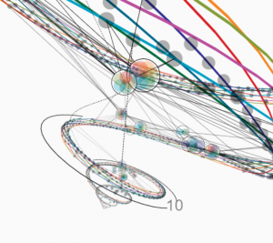
When I first saw this diagram/informational system I did not understand whatsoever what it stood for. However, the moment I saw it, the form and colors just caught my eye. This beautiful diagram demonstrates basically a curriculum that weaves different subjects and assignments into a spiral that is organized from K to 12th grade. I suppose that the creator of this diagram put classes into a certain category, then organized them into specific age levels, then put them into a spiral.

Seeing that this was put into a 3D diagram made it far more impressive as it became an interactive map, rather than simply a diagram.

dnoh-sectionD-project7-curves

sketch

var nPoints = 100;

function setup() {
    createCanvas(480, 480);
    background(255);
}

function draw() {
  angleMode(DEGREES);
  var r = map(mouseX, 0, width, 0, 360); //rotate using x axis
  var m = map(mouseY, 0, height, 0, 360); //rotate using y axis

  background(255);
  push();
  translate(width/2, height/2); //move Epicycloid to center
  rotate(r);
  rotate(-m);
  drawEpicycloid(); //draws the function below
  pop();

}

function drawEpicycloid() {
  var a = 50; //set sizes of curves
  var b = 50;
  var aa = map(a,0,50,50,mouseX-350);
  var bb = map(b,0,50,50,mouseY-350);

  fill(220,180,165); //add butt color

  beginShape();
  for (var i = 0; i < nPoints; i++) {
    angleMode(RADIANS);
    var t = map(i,0,nPoints,0,TWO_PI); //map the points to a circular area

    x = (aa+bb)*cos(t)-bb*cos((t*(aa+bb))/bb);
    y = (aa+bb)*sin(t)-bb*sin((t*(aa+bb))/bb);
    vertex(x,y);
  endShape(CLOSE);
  }
}

I started with a basic code that let me create the simplest Epicycloid, which is basically in the form of a butt. I, therefore, took that notion and turned the shape’s color to skin tone. However, I added parameters that allowed me to change the rotation and overall shape of the Epicycloid using mouseX and mouseY. All in all, due to the randomness of the mouseX and mouseY alterations, I loved how I could stop anywhere along the square and it would procure a different shape.

Project 7, odh

odhP7

//Owen D Haft
//Section D
//odh@andrew.cmu.edu
//Project 7

var nPoints = 100;

function setup() {
    createCanvas(480, 480);
    frameRate(10);
}

function draw() {
    background(255);
    push();
        translate(0, mouseY); //Changes the height based on MouseY
        fill(111, 111, 222);
        drawCurve(); //Draws the curve
    pop();
}
    
function drawCurve() {

    beginShape();
    for (var i = 0; i < nPoints; i++) {
        var t = map(i, 0, nPoints, 0, TWO_PI); //maps the points of the equations
        strokeWeight(1);

        //The equations that generate the curve
        x = (mouseX/19)*((sin^3)*(t)); //Curve changes with mouseX
        y = 13*cos(t) - 5*cos(2*t) - 2*cos(3*t) - cos(4*t);
        
        vertex(x, y);
    }
    endShape(CLOSE);    
}

I attempted to use a Heart Curve in this project, but I came across an issue with using Sin^3. Therefore, I just went with the result I got leading to my current project. I chose to have the curve stretch with the mouseX and change heights with mouseY.

Looking Outwards 07

This video features two seemingly irrelevant “posters”. One with images of our world, the other with “random” dots. The artist, studio Nand.io, wanted to venture to see what “tomorrow” would look like. In this project titled, Analog Mensch Digital, the poster on the right, with the random dots is the tomorrow. After reading about the project it explains that the random dots are in fact digitally encrypted patterns of the images on the left on the analog poster. The artist wanted to give a new way of looking at the world, the right poster. Basically, the analog poster is only there to give concept and understanding to the digital poster. It would interesting to think about if we in fact needed the digital poster as the reference for the analog.

NatalieKS-LookingOutwards-08

Eyeo 2015 – Jesse Louis-Rosenburg and Jessica Rosenkrantz from Eyeo Festival // INSTINT on Vimeo.

The duo Jessica Rosenkrantz and Jesse Louis-Rosenberg founded Nervous System in 2007, when the two were still in school. Jessica studied biology and architecture at MIT and Harvard Graduate School of Design, and Jesse studied math and computer science at MIT. The duo are based in Somerville, MA. They describe their philosophy as “digital gardening”; rather than cultivate plants, they cultivate algorithms, and they breed systems with their own innate behaviors which they can manipulate and sculpt. They also focus on three areas of research: science & nature, digital fabrication, and co-creation. During their presentation, they employed a large number of visuals and spoke very clearly, so that everyone would be able to understand their work.

There is a lot of emphasis on studying how patterns and forms emerge in nature, and how new technology in digital fabrication can generate these patterns. They mostly study organic forms and patterns, which I really admire. They try to create these organic forms through innovative digital fabrication, giving rise to new textiles for potential products. It’s really fascinating how they use nature and biology to computationally create unique forms.

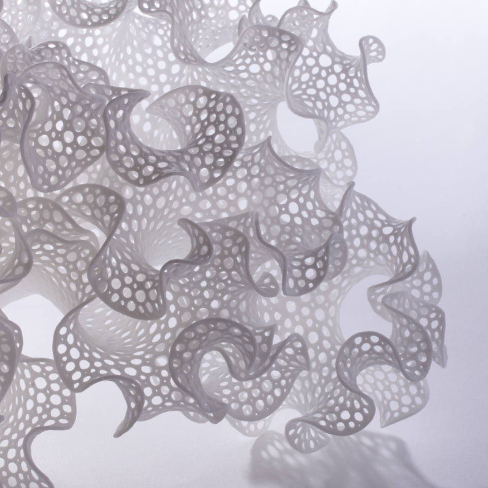
One project of theirs I especially love is Floraform, which studies and generates differential growth seen in plants. Patterns in nature are always something I have been interested in, and seeing them generated through computation is especially cool.

florescence ornata 2

myoungsh-project-07-curves

sketch

var nPoints = 100;
function setup() {
    createCanvas(400, 400);
    frameRate(60);
}
function draw() {
    background(0);
    translate(width / 2, height / 2);
    var a = 150; //for function
    var b = 25;
    var h = 25;
    fill(256, 256, 0);
    push();
    beginShape();
    for (var i = 0; i < nPoints; i++) { //draw the curves
        var t = map(i, 0, nPoints, 0, TWO_PI);
        var x = (a - b) * cos(t) + h * cos(t * (a - b) / b); //use these functions
        var y = (a - b) * sin(t) - h * sin(t * (a - b) / b);
        vertex(x + random(-1, 1), y + random(-1, 1)); //wiggle
        if (mouseX > width / 2 & mouseY > height / 2) { //2nd quadrant
          fill(256, 0, 256)
          b = 50;
          h = 50;
        }
        if (mouseX < width / 2 & mouseY < height / 2) { //3rd quadrant
          fill(256)
          b = 10;
          h = 10;
        }
        if (mouseX > width / 2 & mouseY < height / 2) { //4th quadrant
          fill(0, 256, 256)
          b = 15;
          h = 15;
        }
    }
    endShape(CLOSE);
    pop();
}