jwchou-Project07-Curves

sketch 66

// Jackie Chou
// Section E
// jwchou@andrew.cmu.edu
// Project-07-Curves

function setup() {
    createCanvas(480, 480);
    frameRate(60);
    angleMode(DEGREES); //change angle mode
}

//goal: draw a flower with a center that pops up as the flower takes form
//then flower abstracts and center dissapears

function draw() {
    background(200, 210, 253);
    var R = map(mouseX, 0, width, 200, 255); //change stroke color of flower as mouseX changes
    var G = map(mouseX, 0, width, 140, 250);
    var B = map(mouseX, 0, width, 60, 130);

    drawRanunculoiud(); //draw curve function

    //flower center
    translate(-width/2, - height/2); //move flower center to center
    fill(170, 80, 130); 
    
    if (mouseX < 200 & mouseX > 50) {   //draw flower center when flower starts to be visible
    var ellipseSize = map(mouseX, 0, 200, 80, 0)
    noStroke();
    ellipse(width/2, height/2, ellipseSize, ellipseSize);
}

function drawRanunculoiud(){
    beginShape();
    noFill();
    stroke(R, G, B); 
    translate(width/2, height/2); //move curve to center


    for (var i = 0; i < width/5; i++){ //mouseX controls number of curves
        constrain(mouseX/3, 100, 300); //constrain mouseX

        var x;
        var y;

        var a = map(mouseX, 0, width, 30, 10);
        var t = map(i, 0, mouseX, 10, 360);

        //Ranunculoid http://mathworld.wolfram.com/Ranunculoid.html
 		x = a * (6 * cos(t) - cos(6 * t));
        y = a * (6 * sin(t) - sin(6 * t));
        vertex(x, y);

    endShape();
    }
}
}

For this project, I had a bit of a hard time implementing the equation. However, looking and actually studying the diagrams on the site helped me understand what each variable affected the curve.

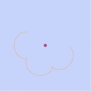
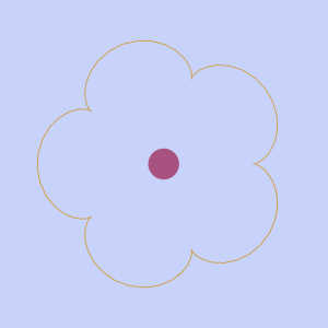
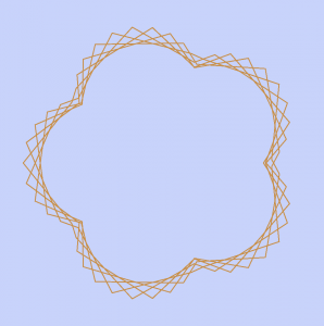
I eventually created a Ranunculoid, which looks like a flower with 5 pedals. When the mouse moves to the right, the flower grows but then eventually abstracts. When the form looks like a flower, a center disk forms. However, when the form abstracts, the center disk dissappears.

The first three frames showcase the growth of the flower.

The next three frames showcase the abstraction.
eeryan-Project07-Curves

sketch

function setup() {
  createCanvas(400, 400);
  frameRate(10);
}


function draw() {
  background(245, 252, 99);
  // draw the frame
  fill(0);
  noStroke();
  stroke(1);

  // draw the curve
  push();
  translate(width / 2, height / 2);
  drawNeoid();
  pop();
}

function drawNeoid(){
  var x;
  var y;
  var ac = mouseX/50;
  var a = constrain(ac, 0.4, 80);//constrains variable to keep curve from scrunching too small
  var b = mouseY/100;
  noFill();
  stroke(0,0,255);
  strokeWeight(2);
  beginShape();
  for(var i = 0; i < width; i+=5){
    var t = map(i, 0, -10, 10, TWO_PI);//maps theta so curve expands and contracts smoothly
    x = cos(t) * (a * t + b);//parametric equation for neoid
    y = sin(t) * (a * t + b);//parametric equation for neoid
    vertex(x,y);
  }
  endShape(OPEN);
}

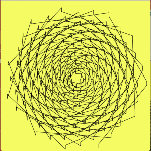
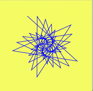
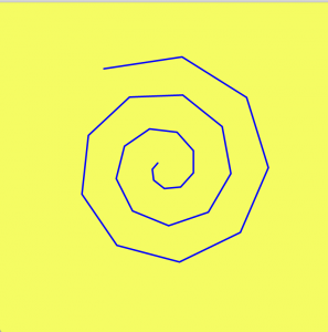
I started by playing with the epichondroid curve example code. By using the vertex command twice with differently ordered variables, I was able to render the curves in interesting ways. I then moved to playing around with a neoid curve, and by adjusting the for loop I was able to achieve the curve I ended up with.

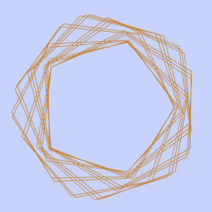
These are examples of what the curve would have looked like if my for loop had added 5, 10, and 15 to i.

jamieh-Looking-Outwards-07

Interaction between human and plants through lighting
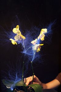
Sensor attached to orchid

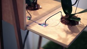
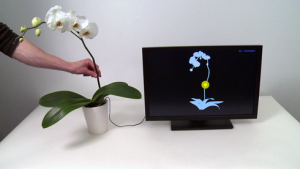
The Botanicus Interacticus project by Disney Research (in collaboration with Philipp Schoessler, Jonas Loh/Studio NAND, Munehiko Sato) is an interactive technology that creates an expressive visual interaction between humans and plants. It was exhibited at the 2012 SIGGRAPH exhibition. The way the Botanicus Interacticus works is by placing a wire in the plant soil, which when touched or within close proximity with any location of the plant is detected, the collected data will trigger shapes and colours around the plant. Those shapes and colours depend on several factors, including touch/gesture, amount of contact and proximity. This project is based upon a sensing technology Touché, which was previously invented at Disney Research Pittsburgh. The added expression to the plants do not cause any harm and is non-invasive. The main purpose of the project was to eliminate the divide between real and artificial, which also develops new organic forms. My favourite aspect of this project is the response through lighting that dances around the plant based on interaction, which makes what is relatively static into something dynamic.

Computer showing the collected data of where touch is sensed

Below is a video of the interaction between person and plant.

enwandu-Looking Outwards-07

Cyclotone III | Fulldome Audiovisual Projection | 2015

Paul Prudence

This is an excerpt, Prudence associates with his Cyclotone project.

“By gyro-static action, The Machine is transparent to successive intervals of time. It does not endure or ‘continue to be’, but rather conserves its contents outside of time, sheltered from all phenomena. The Machine’s immobility in Time is directly proportional to the rate of rotation of its gyro stats in space.”

–From How to Construct a Time Machine, Alfred Jarry.

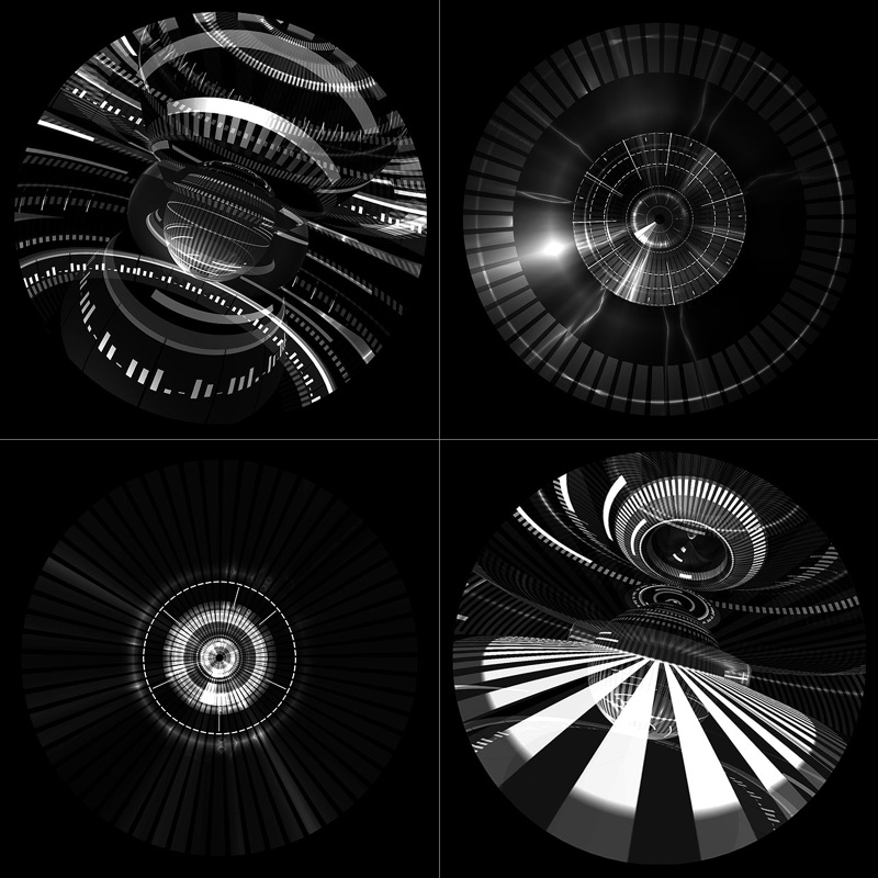
Paul Prudence is a live-cinema artist, well versed in the area of time-based geometric narratives, and audiovisuals. Many of his projects, including ‘Cyclotone’ explore very abstract avenues to combine sound, space, and form in an interesting fashion. He is inspired heavily by constructivist minded artists, particle accelerators, and four-dimensional place. His project embodies his artistic sensibility, and a clear connection can be seen between what inspires him, and his artwork.

I really admire the project, because of the intersection between sound and space in the project. It is quite compelling, despite being a 2D representation on a screen. Much of my admiration comes from be being in awe what he could create, it is extremely satisfying to watch. Even the still images successfully suggest motion. Prudence produces a mesmerizing, floor-to-ceiling sensation by cross-wiring electroacoustic sound design and conceptual video material.

LookingOutward-07

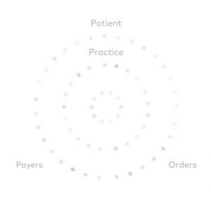
For this weeks project, I chose a project with athenahealth. Fathom, a design firm focused on creating visuals that show data, partnered alongside athenahealth to create a visual showing how patients move through their healthcare network. The application divides patients’ interaction into four parts: practice, patient, orders, and payers.

Four parts of patient interaction with healthcare network.

Practice includes initial patient exchanges with caregivers, patient includes the patient’s individual interaction with the online health portal, orders include orders and lab transactions, and payers include payer transactions like processing of insurance claims.

When in action, the application has a series of dots that appear and float around the screen between the various groups, changing colors according to the category and where it is.

I find this application very visually pleasing and creative compared to many other data displaying applications. It’s easy to revert to a graphical display of data, but this application uses a much more original visual. Standing alone, the application can easily catch peoples eyes and be a work of art. However, in reality it displays data in a way that shows relationships and connections between various areas of the healthcare network.

https://fathom.info/athenahealth/

mjnewman Project-07, Section A

circles

function setup() {
    createCanvas(480, 480);
}

function draw() {
    //mapping for colors lines and background
    var r = map(mouseX, 0, width, 0, 200);
    var g = map(mouseY, 0, height, 0, 255);
    var b = map(mouseX, 0, width, 0, 155);
    background(209, g, 100);
    stroke(r, 150, b);
    strokeWeight(3);

    //moving to middle of the canvas
    translate(width / 2, height / 2);
    noFill();
    drawHypotrochoid();
}

function drawHypotrochoid(){
    //variables to be used in the equation
    var x;
    var y;
    var h = width/2;
    var a = map(mouseX, 0, width, 0, PI);
    var b = map(mouseY, 0, height, 0, 1);

    //HYPOTROCHOID EQUATION
    // x = (a-b)*cos(angle) + h*cos(((a-b)/b) angle)
    // y = (a-b)*sin(angle) - h*sin(((a-b)/b) angle)

    beginShape();
        for(var i = 0; i < width; i+= 5){
            var angle = map(i, 0, width, 0, 360);
            x = (a - b) * cos(angle) + h * cos(((a-b)/b)*angle);
            y = (a - b) * sin(angle) - h * sin(((a-b)/b)*angle);
            vertex(x,y);
        }
    endShape();
}

In order to fully understand the curves process, I tried to keep this project as simple as possible. This meant choosing a basic equation to start off with, which is how I ended up choosing the hypotrochoid curve. It took a little while to get used to how the rather long equation to generate the lines would semantically be converted into p5js; I had to add more multiplication stars than I had originally anticipated and had a lot of trouble trying to figure out that because when it wasn’t correct, nothing would render. I was able to play around with the numbers as well as colors by keeping this part of the project relatively simple. However, I am still mesmerized by the dancing lines from such a short amount of code.

Screenshots:

jooheek – Project07 – Curves

sketch

//JooHee Kim
//Section E
//jooheek@andrew.cmu.edu
//Project-07


//This project is based on the epicycloid formula
//http://mathworld.wolfram.com/Epicycloid.html
function setup() {
    createCanvas(480, 480);
    angleMode(DEGREES);
}

function draw() {
	background(0,30);
	
	//moves lines to the middle of canvas
	translate(width/2, height/2);
	
	//draws 5 curve shapes in different sizes
	for (var curveSize = 0; curveSize < 10; curveSize += 2) {
		//draws lines on every angle of the curve in degrees mode
		for (var i=0; i<360; i++) {

			//variable that remaps mouseX from 0 to 12
			//represents "a" in original formula
			var M = map(mouseX, 0, width, 0, 12);

			//represents "b" in original formula
			var b = 5;

			//variables of line coordinates drawn according to the epicycloid curve formula
			//substitutes with M so that the size and number of petals change according to mouseX
			var lineX1 = curveSize*((M+b)*cos(i-100) - b*cos(((M+b)/b)*i-100));
			var lineY1 = curveSize*((M+b)*sin(i-100) - b*sin(((M+b)/b)*i-100));
			var lineX2 = curveSize*((M+b)*cos(i) - b*cos(((M+b)/b)*i));
			var lineY2 = curveSize*((M+b)*sin(i) - b*sin(((M+b)/b)*i));

			//draw line with variables
			stroke(i, 210, 210, curveSize);
			line(lineX1, lineY1, lineX2, lineY2);
		}
	}

}

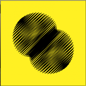
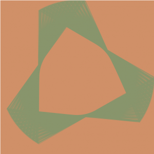
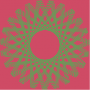
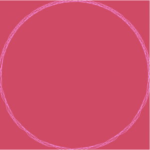
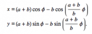
After looking at the types of curves that were given to us, I decided to choose the epicycloid. It uses a parametric equation:


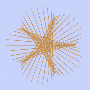
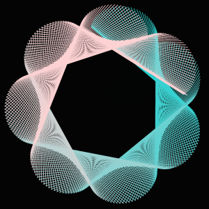
I first tried to figure out how the graph works in coding, and after trying out many options I liked using lines with graph formula. Although I thought this project was simpler than other projects, I found it fun using curve formulas to represent curves in different ways. I first started out with one curve shape but found that putting it in a for loop that varies in sizes makes it more interesting. I also had fun playing with the opacity in both the background and lines.

Before I put it in a for loop and put opacity in it

*There are more curves when looked on the browser than when looked in this WordPress blog.

hdw – Looking Outwards – 07

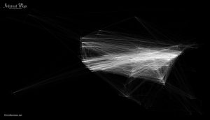
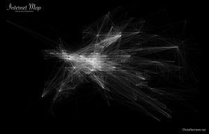
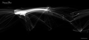
Chris Harrison did a really cool project on internet maps, where he compared internet connectivity of the world, and focused in on North America and Europe especially, as they had the most connections between each other.

Logistically, he mapped out the locations of connectivity by nearest whole number in a coordinate system. The brighter the point, the more points of connectivity there is. Harrison himself says that this approach probably is not indicative of users, as one point of connectivity can have multiple users. However, he chose the data and representation style based on an aesthetic approach, as there are already many other practically modeled ones existing. You can read more about it here.


Internet connectivity of Europe


Internet connectivity of North America


Internet connectivity of the World

I love how delicate the lines are and how orderly the grids look, zoomed in. Because Harrison rounded connectivity locations to nearest longitude and latitude, it looks like it follows a coordinate grid system. The contrast between order and chaos gives the appearance of string art.

yushano_Project 7 – Curves

sketch


function setup() {
    createCanvas(400, 400);
    frameRate(10);
}


function draw() {
    background(226,236,236);
    
    strokeWeight(2);
    noFill();
    
    // draw the curve
    push();
    translate(width / 2, height / 2);

    // the curve inside
    for (var i = 0; i < 8; i++) {
        var r = 207-(207-152)/6*i;
        var g = 171-(171-92)/6*i;
        var b = 177-(177-103)/6*i;
        stroke(r,g,b);
        drawTetracuspidCurve();
        rotate(PI/14);
    }

    // the circle curve outside
    for (var i = 0; i < 6; i++){
        var r = 215-(215-147)/6*i;
        var g = 195-(195-126)/6*i;
        var b = 186-(186-118)/6*i;
        stroke(r,g,b);
        drawRanunculoidCurve();
        rotate(PI/3);
    } 
    pop();


}

function drawRanunculoidCurve() {
    var nPoints = 100;
    var x;
    var y; 
    var a = 100;
    var b = a / 5;   
    var ph = mouseX / 40;
    // control the shape in two opposite sides
    if (mouseY <height/2){
        var h = constrain(mouseY / 8, 0, b);
    } else {
        var h = constrain((height - mouseY) / 8, 0, b);
    }
    
    beginShape();
    for (var i = 0; i < nPoints; i++) {
        // map the points onto angles
        var t = map(i, 0, nPoints, 0, TWO_PI);
        x = (a + b) * cos(t) - h * cos(ph + t * (a + b) / b);
        y = (a + b) * sin(t) - h * sin(ph + t * (a + b) / b);
        vertex(x, y);
    }
    endShape(CLOSE);    
}

function drawTetracuspidCurve(){
    var nPoints = 200;
    var x;
    var y;
    var a = 120;
    var ph = mouseX / 40;

    beginShape();
    for (var i = 0; i < nPoints; i++) {
        var t = map(i, 0, nPoints, 0, TWO_PI);
        x = a / 4 * (3*cos(t) -  cos(ph + 3 * t));
        y = a / 4 * (3*sin(t) +  sin(ph + 3 * t));
        vertex(x, y);
    }
    endShape(CLOSE);    
}


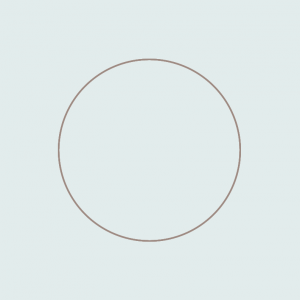
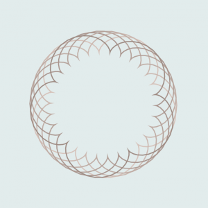
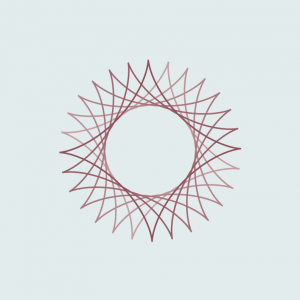
Above are the process of my work. So, I combined two different kinds of curves in my project: Ranuncuidloid and Tetracuspid curves. The first shape is inspired from the form of flowers, and the other is inspired from the shape of a star. These two curves are all rotatable according to the x-coordinates of the mouse. Also, the flower shapes is generated from the y-coordinates of the mouse. The flower shape is more visible if the y-coordinates of your mouse is more towards the center, is like the flower is blooming. This project helps me understand more about the use of translate() and rotate(), which are my weakness. Also, I learned about many control elements in the curve equation, which is also meaningful.

svitoora – 07 Looking Outward

Ideo’s Font Map

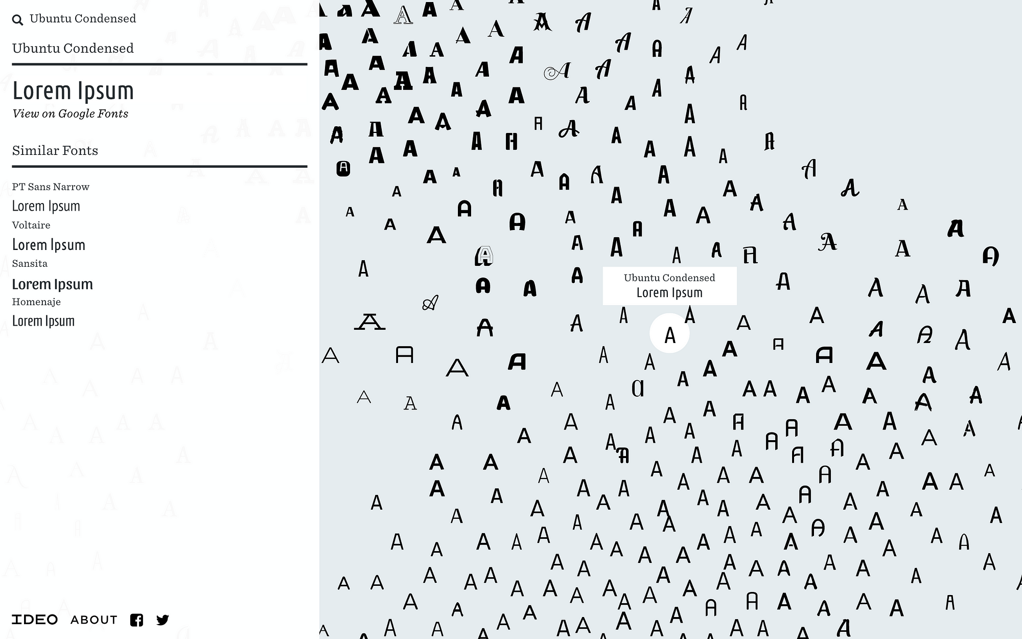
Font Map by Ideo

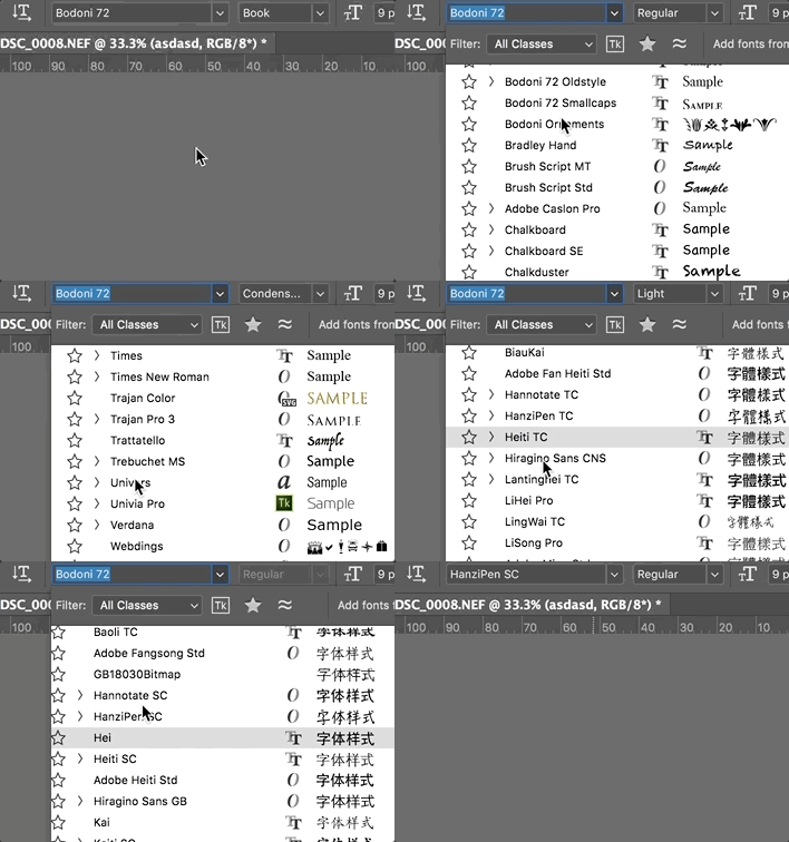
As a designer, choosing font can sometimes be daily a chore. Each font has certain characteristics, historical associations, and aesthetic associated with it. Currently, searching for fonts in most software is an extremely tedious task scrolling through a long list of alphabetically sorted font names that sometimes bears no association with what it actually looks.

What designers have to deal with.

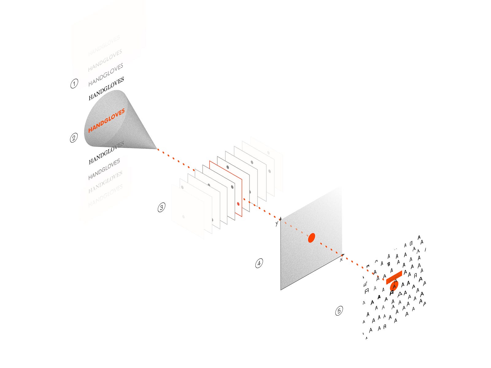
Ideo’s Font Map solved a problem that communication designer have been faced for centuries since the invention of lithography and the printing press: choosing the font. The algorithm of this font map is highly complex. By using artificial intelligence, the machine is trained to notice fonts’ visual characteristic by being fed 750 web fonts. Afterwards, the each font’s visual characteristic is mapped onto a 2D plane whereby similar fonts cluster close to one another and different fonts are further apart. This particular project by Kevin Ho uses a lot of vectors and AI external modules that are beyond my technical expertise to accomplish the task. Although the algorithm that is being used in this project is beyond my level of understanding, I hope to one day understand it.

Diagram showing the flow of information in a nueral network.