heeseoc-Project-07-Curves

sketch

//Steph Chun
//15-104 section #A
//heeseoc@andrew.cmu.edu
//Project-07

var a = 30;
var b = 10;
var t = 500;
var h = 80;

function setup() {
    createCanvas(400, 400);
    frameRate(10);
}

function draw() {
	background(0);
	stroke(255);

	push();
	translate(width/2, height/2);
	beginShape();

	//lines//
	for (var i = 0; i < 50; i++) {
		var Xcoord = ((a-b)*cos(i))+(h*cos(((a-b)/b)*i));
		var Ycoord = ((a-b)*sin(i))+(h*sin(((a-b)/b)*i));
		var Xcoord2 = ((a-b)*cos(i-t))+(h*cos(((a-b)/b)*(i-t)));
		var Ycoord2 = ((a-b)*sin(i-t))+(h*sin(((a-b)/b)*(i-t)));
		b = mouseX + 650;
		line(Xcoord + random(-3, 3), Ycoord+ random(-3, 3), Xcoord2+ random(-3, 3), Ycoord2+ random(-3, 3));
    	
    	//bubbles//
		push();
		rotate(i);
    	ellipse (i + random(-3, 3), Ycoord, 2, 2);
    	ellipse (i + random(-3, 3), Ycoord2, 4, 4);
    	ellipse (Xcoord, i + random(-3, 3), 2, 2);
    	ellipse (Xcoord2, i + random(-3, 3), 4, 4);
    	pop();
    }
    endShape(CLOSE);
    pop();
    
    //bigger circle//
    push();
    translate(width/2, height/2);
    beginShape();
    for (var i = 0; i < 20; i++) {
    	fill(255, 50);
        var theta = map(i, 0, 20, 0, TWO_PI);
        var x = mouseX * 0.25 + 60;
        var px = x * cos(theta);
        var py = x * sin(theta);
        vertex(px + random(-3, 3), py + random(-3, 3));
    }
    endShape(CLOSE);
    pop();

    //smaller circle//
    push();
    translate(width/2, height/2);
    beginShape();
    for (var i = 0; i < 20; i++) {
    	fill(0);
        var theta = map(i, 0, 20, 0, TWO_PI);
        var x = mouseX * 0.25 + 20;
        var px = x * cos(theta);
        var py = x * sin(theta);
        vertex(px + random(-3, 3), py + random(-3, 3));
    }
    endShape(CLOSE);
    pop();

}

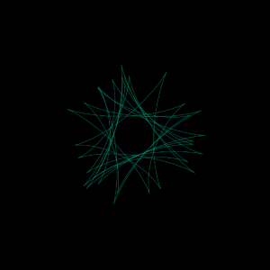
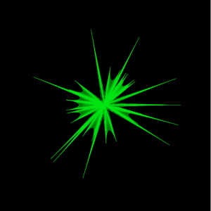
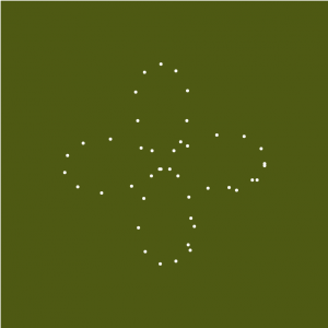
For this project, I started off with browsing mathworld website and finding the curve that we would want to use. I chose hypotrochoid. Then, I tried to generate that curve through coding, and what I found out was at some point, the lines that I made through the equation I chose made an eye-shaped form at some point, so I restricted the mouse movement to have it start from the shape and added wiggly circles in the middle of those lines. I added the wiggly bubbles in the back because it felt like it needed some more elements to it to have some sort of a visual balance. I kept all the colors white, because I did not want it to be way to literal in communicating my “zooming into an eye” idea. Below is the screenshot of the shape I got inspired from.

jamieh-project-07-Curves

sketch

/*
Jamie Ho
jamieh@andrew.cmu.edu
10:30
Project 07
*/

var vals = 100;			//# of points to deltoidCrv
var angles = 360;		//total angle
var maxCrvs = 10;		//# of crvs desired

function setup() {
    createCanvas(450, 450);
}

function draw() {
	background(0);
	translate(width/2, height/2);
	
	for(var i = 0; i < maxCrvs; i++){
		//equal rotation of canvas for each drawDeltoidCrv based on # of crvs
		rotate(angles/i);	
		//stroke colour based on mouse position
		var colourX = map(mouseX, 0, width, 0, 255);
		var colourY = map(mouseY, 0, height, 0, 255);
		stroke(0, colourX, colourY);

		drawDeltoidCrv();
	}
}

function drawDeltoidCrv(){
	noFill();
	angleMode(RADIANS);
	beginShape();
	for(var i = 0; i < vals; i++){
		//mapping i to the circle
		var theta = map(i, 0, vals, 0, TWO_PI);		
		//multiplied factor for crvs
		var t = 60;									
		
		//making mouse positions a percentage to scale crvs
		var mX = map(mouseX, 0, width, 0, 1);		
		var mY = map(mouseY, 0, height, 0, 1);
		
		//defining x and y coordiantes of deltoid crv 
		//size of deltoid crvs are in relationship w/ mouse positions
		var x = (2*t*cos(theta)+t*cos(2*theta))*mX;	
		var y = (2*t*sin(theta)-t*sin(2*theta))*mY;	

		strokeWeight(0.5);
		vertex(x, y);
		line(0, 0, x, y);
	}
	endShape();
}

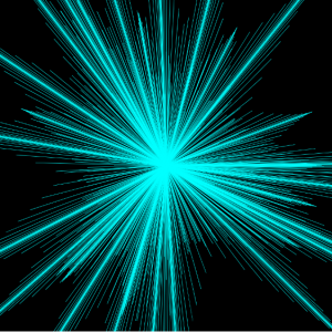
The curves are based on deltoid curves, which looks similar to a triangle. I experimented with using just the deltoid curve itself as well as representing the multiple curves with lines. Representing with lines look more interesting than just the deltoid curves themselves. I also experimented with where the lines are drawn from, such as from (0, 0) or from (width/2, heigth/2). Drawing lines from (width/2, height/2) makes the lines intersect in more complex ways, but I preferred how the 3 vertex ends of the curves are more dynamic with (0, 0) as starting point.

Just vertexes on deltoid curves
Lines drawn from (0, 0) only

Lines drawn from (width/2, height/2)

Final iteration with lines drawn from (0, 0) and vertexes of deltoid curves
Final iteration with size affected by mouse position

The hardest part of the process was incorporating the mouse position into the curves without messing up the shape, then I realized I could use mouse position by mapping it to make it a scale factor.

LookingOutwards07 – jooheek

The Rhythm of Food: Moritz Stefaner

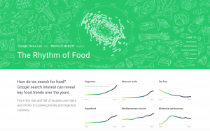
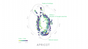
This collaboration with Google News Lab called “The Rhythm of Food” by Moritz Stefaner tries to visualize seasonal patterns in food searches based on twelve years of Google search data related to food. It compares seasons, the year, and the relative search interest of the particular type of food. This is done by representing the seasons on the outer most circle, the colors as the year, and the distance from the center of the circle as the relative search interests.

I find it interesting how this data visualization compares multiple variables that you would never think of comparing. Who knew that there would be a correlation between food searches and the type of year? The way the data is visualized also helps people see that correlation in a way that makes sense. I appreciate how they created their own system or in a sense, computation, to demonstrate data visualization.

They also made an animation making it easier to see the visualization.

Rhythm of Food – flying charts from Moritz Stefaner on Vimeo.

cduong-Project-07-Curves

sketch

//Name: Colleen Duong
//Email: cduong@andrew.cmu.edu
//Section: D
//Project-07

function setup() {
    createCanvas(480, 480);
}


function draw() {
    background(244, 174, 163);

    // draw the curve
    push();
    translate(width/2, height/2); //makes it rotate from the center
    drawEpitrochoid();
    pop();
}

//--------------------------------------------------
function drawEpitrochoid() {
    //Epicycloid: http://mathworld.wolfram.com/Epicycloid.html
    var n = 1000; //amount of control points

    var x;
    var y;

    var a = constrain(mouseX, 0, 300) //radius of inner circle
    var b = 20; //radius of outer circle
    var h = constrain(mouseY, 0, 300); //distance from the vertice (x, y)

    stroke(255);
    noFill();
    beginShape();
    for (var i = 0; i < n; i++) {
        var t = map(i, 0, n, 0, 100);

        x = (a + b) * cos(t) - h * cos(((a + b) / b) * t); //equation for epicycloid
        y = (a + b) * sin(t) - h * sin(((a + b) / b) * t); //equation for epicycloid

        vertex(x, y);
    }

    endShape(CLOSE);


}

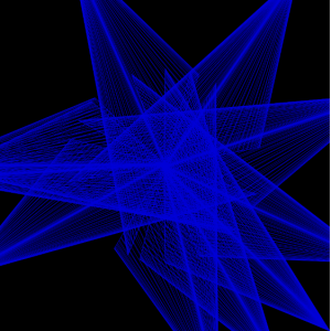
I spent a really long time looking through mathworld trying to figure out what kind of curve I want to use and found several spiral-like shapes that I wanted to originally use, but they used an x, y, and z coordinate so I wasn’t sure how that would turn out with p5js so I decided to use my second choice, which was epitrochoid. It took me a while to figure out what to put in for each variable value in the math equations because it was so confusing but I finally created something that I enjoyed looking at (especially the part that just looks like a circle growing smaller when you go from left to right)

Source: http://mathworld.wolfram.com/Epitrochoid.html

agusman-LookingOutwards-07

1.01 ‘Circles Within Circles’
Simon F A Russell

Video Documentation

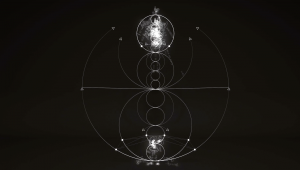
This video, created by freelance animation director Simon Russell, is one in a series of explorations on sonically generated geometry. He uses a program called Houdini, a plug-in commonly used with Cinema 4D, to generate 3D particle simulations that emit audio pulses from particle data (such as collisions, position on the canvas, etc.) In this sequence, a particle burst generates the first tone which sets the precedent for the following tones. The outer and inner ring also emit a constant tone. A Plexus-like effect, as Russell describes it, generates other tones based on the heights of the circular drawings.

As a musician, it’s really fascinating to see how other musicians interpret sound because it is almost always never the same. Sound is a highly intimate sensation and is internalized within us from a very young age. Our interpretations and projections of sound, music and raw noise alike, are a reflection of a deeper aggregate of personal influences, preferences, inspirations. When we hand off the task of interpretation to a computer, we see a collaboration between the preferences of a human and the logic of a highly sensitive machine- it is a joint effort between the person who has influenced the program with their associations with sound and the computer who can grab pieces of data that humans simply do not have access to or are too complex to grasp. These things include frequencies below or above our range of hearing, precise decibel and frequency levels that can be compared and contrasted relatively to others, and of course the potentiality of representing these datums in an orderly and beautiful way. In Russell’s video, we can see manifested the representations of the 8 note scale and how the laws of physics applies to the perception of sound. Really data-vis!!!

cduong-Looking Outward-07

“Emoto” is an installation that represents the global response around the London 2012 Olympic Games based on millions of twitter messages. Using this data they created a physical sculpture. The sculpture represents message volumes, per hour, and horizontal bands that move up and down according to the amount of tweets they get each time. What I admire about this project is the creativity of it and the physical forms that it creates. It just looks really aesthetically pleasing and so complex at the same time. What captured my attention the most was that I thought they were buildings at first, which they could be seen as from far away since they are just abstract lines based on data collection. People can also look at it and get a vague idea of what kinds of responses were obtained for specific events during the Olympics like a certain person winning a gold medal or breaking a world record.

I’m not sure how the code for this project works but I think that the program is always updating and always being connected to a specific type of tweet that the program looks for to update the physical data sculpture.

This project was specifically made based on people’s reactions to a specific event, which gives a sense of what types of projects this company makes and also gives a gauge of what kinds of interests they like since they picked such a specific event like the 2012 London Olympics.

Project: Emoto – Installation
Creator: Studio Nand
Year: 2012
Link: http://www.nand.io/projects/clients/emoto-installation/


A video of what the project looks like when activated

adev_Project07_Curves

adev_project_07

var iInc;
var colR;
var colG;
var p;
var q; 
var curveSize;
function setup() {
   createCanvas(480, 480);
  
}

function draw() {
    p = map (mouseY, 0, height, 1, 10);
    q = map (mouseX, 0, width, 1, 15);
	colR = map(mouseX, 0, width, 130, 20);
	colG = map(mouseY, 0, height, 60, 110);
	curveSize = map (mouseX, 0, width, 100, 200);

	var k = p/q;
	 background(colR,colG, 10);


iInc = map (mouseY, 0, height, 0.05, 1.5);	

translate (width/2, height/2);

for (var i = 0; i < TWO_PI * q ; i+= iInc*1.2) {
var r = curveSize * cos (k*i);
var x = r * cos(i);
var y = r * sin(i);
fill(255,);
strokeWeight(iInc*5);
point (x+ random (-1, 1), y+random(-1, 1));

} 
    
}

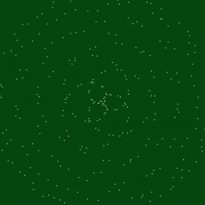
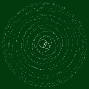
For this project, I really wanted to play around with the jitter. I’m haven’t done any sort of math in a while so it was challenging for me to find my way around the curves. I decided to have more fun with it aesthetically and use dots to represent the curves because I think they’re more delicate and ephemeral.

The patterns and colours make it feel less mathematical and almost cozy like fall or early winter.


mstropka-Looking Outwards-07

This is one project from a data visualization firm called Variable. Nike hired the designers at Variable to create a data visualization for the data collected from one of their products, Nike Fuel. The video explains the process of moving from the raw data that the team received from these devices to these plant like organic forms. I think that this approach to data visualization is very interesting because the visualizations themselves don’t necessarily make the data readable in any useful way like a graph or a chart would. Instead, they create a sort of artistic expression of the data. My favorite part of this project is that each visualization was created with data from one person, and the colors and shape of the virtual strands are personalized to the athletes. This makes these visualizations sort of like self portraits of the athletes who’s data was collected.

mstropka-Project-07-E

sketch

//Max Stropkay
//Section E
//mstropka@andrew.cmu.edu
//Project_07

var nPoints = 1000;
function setup() {
  createCanvas(480, 480);


}
function drawEpicycloid(){
  // x = (R+r)cos theta - r cos((R+r)/r)theta)
  // y = (R + r)sin theta - rsin(((R+r)/r)theta)

  var R = 100 //radius of large circle
  var r = 10 //radius of small circle
  var a = mouseX //take values of mouse x
  var b = mouseY //take values of mouse y

  //draw curve in center of screen
  push();
  translate(240, 240)
  noFill();
  strokeWeight(.01);

  //draw curve
  beginShape();
  for(var i = 0; i < nPoints; i++){

    var t = map(i, 0, nPoints, 0, TWO_PI);

    var x = (a + r)*cos(t) - (r)*cos(((a + b)/r)*(t))
    var y = (b + r)*sin(t) - (r)*sin(((a + b)/r)*(t))

    //points of curve will be drawn at somewhere within 50 pixels of (x,y)
    vertex(x + random(-50, 50),y + random(50, - 50));
  }
  endShape(CLOSE);
  pop();
}

function draw(){
  drawEpicycloid();
}
//redraw background if the mouse is pressed
function mousePressed(){
  background(255);
}

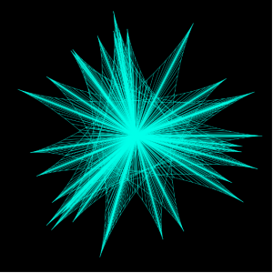
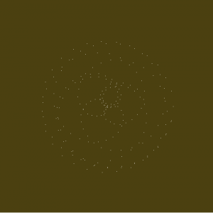
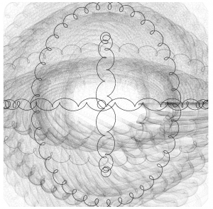
For this assignment, I used the equation for an epicycloid with the mouse’s location driving certain variables to change the shape as the mouse moves. I can’t say I understand the equation for this type of curve that well so I just started substituting the mouseX and mouse Y value for random variables in the equation until I got something that looked cool. I also added a random value to the x and y coordinates of the points that the program draws.

Here is a screenshot from before I added the random values to the x and y coordinates.


hdw – Project 7 – Curves

sketch

//Helen Wu
//Section A
//hdw@andrew.cmu.edu
//Project 7

function setup() {
    createCanvas(480,480);
    background(255, 71, 123)
}


function draw() {
  push();

  //this is to call the centers of which the sextic functions will be called from
  translate(width/2, height/2);
  beginShape();
  for(var i = 0; i < 25; i++){
    //25 sets the direction of which the curves draw
      var t = map(i,0,100,0,360);
      //t = angle
      var a = map(mouseY, 0, 480, -5, 5);
      //a = control the curvature of the loops
      var x = 4*a*(Math.pow(cos((1/3)*t),3))*cos(t);
      var y = 4*a*(Math.pow(cos((1/3)*t),3))*sin(t);
      //centerX and centerY = center of smaller curves
      var centerX = 10*x
      var centerY = 10*y
  }
  endShape(CLOSE);
  pop();


//drawing below sextics on points along above sextic
  cayleysSextic(centerX, centerY);
  }

function cayleysSextic(centerX,centerY) {
  push();
  //placement of sextics along center
  translate(width/2+centerX,height/2+centerY);
  beginShape();
  for(var i = 0; i < 50; i++){
      //t = angle
      var t = map(i,0,100,0,360);
      //a = control the curvature of the loops
      var a = map(mouseX, 0, 400, -10,10);
      var x = 4*a*(Math.pow(cos((1/3)*t),3))*cos(t);
      var y = 4*a*(Math.pow(cos((1/3)*t),3))*sin(t);
      //center of smaller loop's smaller curves
      noStroke()
      fill(255,255,255,30);
      ellipse(x*3,y*3,1,1);
      //drawing ellipses along the curve
  }
  endShape(CLOSE);
  pop();
}

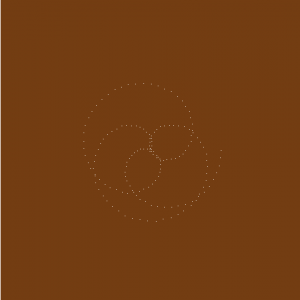
This project was based on Cayley’s Sextic, which coincidentally looks like a butt. 👀👀

I mapped Cayley’s Sextic along another Cayley’s Sextic, just to see how it would look. I kind of like how cute the final product turned out to be. The centers of one are along the next, both mapped to the mouse position on the canvas.