sntong-Project-07-Composition-with-Curves

sketch

//scarlet tong
//sntong@andrew.cmu.edu
// Section A
// Project 07 - Composition with Curves


//intitalize a value before using it for the x and y equations
var a = 0;

function setup() {
    createCanvas(300, 300);
    angleMode(DEGREES);
}

function draw(){
  //changing the alpha channel allows the movements of the dots to "lag" behind
  //creating interesting "tails" for each dot
  background(250,170,23,100);
  push();
  translate(150, height/2); // so that we can see the curve on the cancaus
  beginShape();
  for(var i = 0; i < 200; i++){
    var theta = map(i,0,100,0,360);
    // a controls how much the curve "bends" and loops
    var a = map(mouseX, 0,480,-7,7);
    //Conchoid of de Sluze equation from Wolfram MathWorld
    var x = (1/cos(theta)+(a*cos(theta)))*cos(theta);
    var y = (1/cos(theta)+(a*cos(theta)))*sin(theta);
    // color of the dots changes according to mouse position
    var col = map(mouseY, 0,300,0,255);
    var jitter = map(mouseY, 0,300,0,7);
    noStroke();
    fill(col);
    //"polar array" the Conchoid from the center
    rotate(90);
    //the first dotted line
    ellipse(x*20+random(0,1),y*20+random(0,1),2,2);
    //the second dots are rotated on a different angle of offset
    rotate(45);
    //the second dotted line
    fill(255-col);
    ellipse(-x*10+random(0,1),-y*10+random(0,1),2,2);
    // another layer of dots with larger diameters are then introduced to highlight
    //specific paths the curve took.
    if(i%4==0){
      ellipse(x*20+random(0,1),y*20+random(0,1),3,3)
    }
  }
  endShape(CLOSE);
  pop();

}

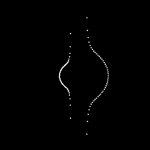
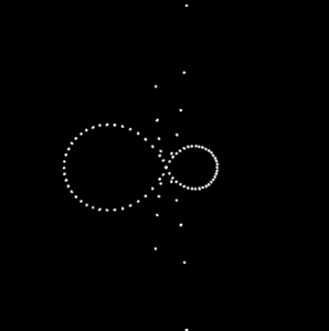
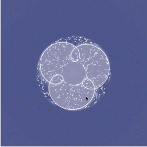
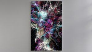
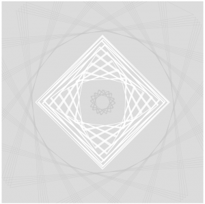
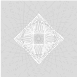
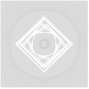
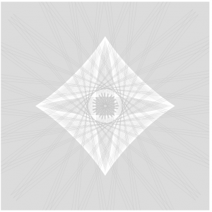
For this project I choose the to use the Conchoid of de Sluze equation found on Wolfram MathWorld as my base curve. I did more experimenting while I was coding and layer more alterations to the curve configuration each step. In this assignment I wanted to explore the use of density so that it implies a set of lines; however once the image is static it becomes harder to tell which dots make up a specific curve. I started off with a set of mirrored curves where one is scaled to a factor to another. Then I added motion of the curves by tracking mouseX and mouseY. From there color change is referred to mouse position and rotation is introduced to the curves.

mjnewman LookingOutwards-07, Section A


Through the Digg API, Chris Harrison was able to visually represent the most popular news stories of the day. Especially in today’s news cycle, there is so much content to absorb and process daily. With all that social media does to the news cycle, I wonder what those rings would look like in 2017 as opposed to 2007-2008. That was still a very busy and important era of the 21st century, but everything has grown and escalated since then. I admire how Harrison attempts to condense our everyday activity and attention into one artifact.

What I find interesting is how warm toned each circle is, which means there is a lot of “World & Business,” “Technology,” “Lifestyle,” and “Offbeat” Stories. However, the API is constantly being updated to better adapt to news stories, so the colors will change with that.

thlai-Project-07-Curves

My math is a bit rusty so my head spun when perusing the Mathworld website. I first played around with the equations given in the project example, which resulted in this:

I studied each part of the code until I was able to create another curve. I created a Cartioid Curve that increases size and rotates based on mouseX, and the background also changes based on the mouseX and mouseY positions.

sketch

// Tiffany Lai
// 15-104, Section A
// thlai@andrew.cmu.edu
// Project 07 - Curves

var nPoints = 500; // amount of points in curve

function setup() {
    createCanvas(480, 480);
}

function draw() {
    // background changes colors based on mouse position
    var r = map(mouseX, 0, width, 50, 200);
    var g = map(mouseY, 0, width, 150, 200);
    var b = map(mouseX, 0, height, 200, 255);
    background(r - 100, g - 100, b - 100, 130);

    drawCurve(); // draw the cardioid curve
}

function drawCurve(){
    //mathworld.wolfram.com/Cardioid.html

    var x; // defining x and y positions of vertices in curve
    var y;

    var a = map(mouseX, 0, width, 0, 100); // map mouseX from 0 to 5

    fill(100, 200, 255, 20); // blue
    stroke(255); // white
    translate(width/2, height/2);

    beginShape();
    for (var i = 0; i < nPoints; i++) {
        var t = map(i, 0, nPoints, 0, TWO_PI);
        x = a * (1 + cos(t)) * cos(t); // parametric equation of cardioid
        y = a * (1 + cos(t)) * sin(t); // parametric equation of cardioid

        rotate(radians(mouseX/500)); // rotate based on mouseX
        ellipse(x, y, 1, 1); // draw spiral of dots
        vertex(x, y); // draw the first curve (blue)
    }
    endShape();

    beginShape();
    for (var i = 0; i < nPoints; i++) {
        var t = map(i, 0, nPoints, 0, TWO_PI);
        x2 = a * (1 + cos(t)) * cos(t); // parametric equation of cardioid
        y2 = a * (1 + cos(t)) * sin(t); // parametric equation of cardioid

        rotate(radians(mouseX/500)); // rotate based on mouseX
        fill(255, 150, 150, 20); // pink
        vertex(x2, y2); // draw the second curve (pink)
    }
    endShape();
}

thlai-LookingOutwards-07

Wind of Boston: Data Paintings is an installation by Refik Anadol Studios that uses data from patterns of wind around Boston and turns them into a series of data paintings. Even though this visualization is not necessarily immediately readable by the viewer to gain valuable information, the final product(s) are beautiful installations on digital canvases. Refik Anadol Studios developed custom software to analyze and visualize wind speed and direction patterns throughout one year, and used that data to create the series. The visuals provide a very fluid, calming feel and make me reminisce about the oceanside, which may have been the artists’ intention. I truly appreciate the dynamics of each piece and the process documentation. The final results are incredibly beautiful.

jennyzha – looking outwards 07

This project stemmed from a request made by the Dalai Lama himself, in 2014, to design an Atlas of Human Emotion. The purpose of the atlas was to design a map that would ultimately guide emotional travelers, and help people find a state of calm.

A couple of key atlas concepts include the fact that emotions are at the core of what makes us human and are distinct from one another. Furthermore, these emotions have several states, varying in intensity which, within each emotion, each emotional state has actions associated with it caused by a trigger. Finally, each emotion is associated with a particular Mood and a clearer understanding of one’s Emotions can contribute to the feeling of a Calm State.

What I really love about this is how much consideration went into the flawless integration and transition of the data into the visualization. It’s attention to detail, keeping the key Atlas concepts in mind throughout the creation process, making sure different features would represent those different concepts.

Atlas of Emotions

jennyzha – project 07

sketch

// Jenny Zhang
// Section D
// jennyzha@andrew.cmu.edu
// Project 07 

//http://mathworld.wolfram.com/Epitrochoid.html

function setup() {
  createCanvas(480, 480);
}

function draw() {
  background(255, 200, 200);
  translate(width/2, height/2);  // moving the drawing to center 

  drawEpitrochoid();
}

function drawEpitrochoid() {

    var n = 1500;          
    noFill();
    stroke(255);

    var x;
    var y;
    var h = constrain(mouseX, 0, 480); //distance between radius of smaller circle to the curve drawn (contrained and varied between left and right borders)
    var a = 300;    //radius of bigger circle
    var b = a/constrain(mouseY, 0, 480);  //radius of smaller circle (constrained to the left and right borders)


    beginShape();
        for (var i=0; i < n; i++) {

            var t = map(i, 0, n, 0, TWO_PI);

            var x = (a + b) * cos(t) - h * cos (((a+ b)/b)*t); //epitrochoid equation
            var y = (a + b) * sin(t) - h * sin (((a+ b)/b)*t); //epitrochoid equation
           
            vertex(x, y);
        }  
    endShape();
}

I really enjoyed playing around with all of the possible varying numbers in this project and am very pleased with the outcome. Moving your mouse very slowly throughout the canvas you’re able to see so many different beautiful designs made by the epitrochoid curves.

rfarn-project-07-curves

I started this project by simply creating basic curves. I started with the astroid curve.

However, I wasn’t inspired by this simple curve so I decided to explore some other curves. I came across the epitrochoid curve.

I decided to add a simple interaction, increasing the general radius as well as the loop sizes as the mouse moves from side to side. Then I added the astroid curve back on top as a little embellishment.

sketch

function setup() {
    createCanvas(480, 480);
}

function draw() {
    background(36, 7, 26);
    translate(width/2, height/2); //moves curves from (0,0) center to center of canvas
    epitrochoid(); //draws epitrochoid curve
    astroid(); //draws radial astroid curve

}

function epitrochoid() {
    var b = 5; 
    var h = (b * 4) + mouseX/4; //change as mouse moves from side to side
    var a = 30 + mouseX/3;

    fill(107, 77, 87);
    strokeWeight(2);
    stroke(221, 200, 196);
    beginShape();
    for(var t = 0; t < 2 * PI; t += PI/500){ //1000 points along circle
        var x = (a + b) * cos(t) - h * cos(((a + b)/b) * t); //x coordinate
        var y = (a + b) * sin(t) - h * sin(((a + b)/b) * t); //y coordinate
        vertex(x, y);
    }
    endShape(CLOSE);
}

function astroid() {
    var a = 25 + mouseX/2; //changes as mouse moves from side to side

    noFill();
    strokeWeight(10);
    stroke(107, 77, 87);
    beginShape();
    for(var t = 0; t < 2 * PI; t += PI/500){ //1000 points along circle
        var x = a * pow(cos(t), 3); //x coordinate
        var y = a * pow(sin(t), 3); //y coordinate
        vertex(x, y);
    }
    endShape(CLOSE);
}

yoonyouk-project07-curves

sketch

//Yoon Young Kim
//Section E
//yoonyouk@andrew.cmu.edu
//Project07

var a = 50; //size of the rose curve
var nPoints = 100; //number of points on the curve

function setup(){
    createCanvas(480, 480);
    frameRate(10);
    noLoop();
}

function drawRoseCurve() {
    background(207, 212, 255); // blue background color

    stroke(145, 85, 112); //dark purple outline color
    strokeWeight(5);
    fill(204, 120, 157); //dusky pink fill color

    var t; //theta of the equation
    
    push();
    beginShape();

    translate(width/2, height/2);
    for(i = 0; i<mouseX; i++){ //number of points drawn based on the movement of mouseX
        var t = map(i, 0, mouseX + 40, 0, TWO_PI); //polar equation for the Rose Curve

      
        var r;
        var n = 4; // number of petals - when n is even, the function turns to 2n, therefore will create 8 petals

        r = a*cos(n*t); // drawing the Rose curve
        
        x = r *cos(t); //converting from polar to Cartesian
        y = r *sin(t); //converting from polar to Cartesian
        vertex(x, y);

    }
    endShape();
    pop();

}

function mouseMoved() {
    a = a + 1; //increasing the size of the flower when the mouse moves
    if(a>200){
        a=50;
    }
    drawRoseCurve();
}

I thought it was originally difficult to plug in the curve equations since we had to consider radians and Cartesian vs. polar equations. I wanted to do a rose curve because I was interested in how the lines would loop around in a flower like shape. In order to integrate the mouse movement with my curve I used the map function in order to determine the number of points of my curve. Therefore, as you move the mouse back and forth the loops will draw or undraw depending on the movement. Unfortunately, I was still unable to figure out how to make the entire curve close properly.

ashleyc1-Section C-Project-07-Curves

sketch

//Ashley Chan
//Section C
//ashleyc1@andrew.cmu.edu
//Project-07-Curves

var width = 480;

function setup() {
    createCanvas(480, 480);

}

function draw() {

    background(220);

    drawAstroid();
    drawRanunculoid();

}

//first "shape"
function drawAstroid() {

    var x; 
    var y;
    var b = 40; 

    stroke(255);
    strokeWeight(.5);
    noFill(0);
    beginShape();

    push();
    translate(width/2, height/2);
        for(var i = 0; i < 500; i ++) {

            //llows for lots of different ways shape is being drawn
            var theta = map(i, 0, width, constrain(mouseX, 0, 480) + 600, TWO_PI);

            //astroid parametric formulas
            x = (3 * b * cos(theta)) + (b * cos(3* theta));
            y = (3 * b * sin(theta)) - (b * sin(3* theta));

            vertex(x, y);

            }
            endShape(CLOSE);
            pop();
}

//second "shape"
function drawRanunculoid() {

    var x;
    var y;
    var a = 5; //scales shape

    stroke(200);
    strokeWeight(.5);
    beginShape();
    translate(width/2, height/2);
        for(var i = 0; i < 75; i ++) {

            var theta = map(i, 0, width, 2 * constrain(mouseX, 0, 480) + 600, TWO_PI);

            //ranunculoid parametric formulas
            x = a * (6 * cos(theta)) + (cos(6* theta));
            y = a * (6 * sin(theta)) - (sin(6* theta));

            vertex(x, y);

        }

        endShape(CLOSE);

    //same shape but bigger and falls outside of astroid
    beginShape();
        for(var i = 0; i < 75; i ++) {

            var theta = map(i, 0, width, 2 * constrain(mouseX, 0, 480) + 600, TWO_PI);

            x = 50 * (6 * cos(theta)) + (cos(6* theta));
            y = 50 * (6 * sin(theta)) - (sin(6* theta));

            vertex(x, y);

            }

            endShape(CLOSE);
        
}

I had a lot of fun with this project. My process was just a lot of exploring the different functions via mathworld and playing around with which functions look nice with one another. It was a nice refresher to look at math formulas and think about how they corresponded with the visual compositions it was creating. I also spent a lot of time learning about map() and how to draw complex “shapes” using vertex(). I think there’s a lot of potential of using math as a way to create compelling and dynamic visuals.

Some Stills:

mmirho – Looking Outwards 7

Shape in Scapes – Transporting architecture into audio-video performance

“Shape in Scapes – Transporting architecture into audio-video performance”

Created by Studio Antimateria and POLITECNICO di PIACENZA’s students.

The algorithms used in this program, especially seen in this first picture, were generated through a simple program I could design, with many points reflecting off walls and flowing together as a liquid. The rest of the animations were mostly designed specifically for the surface and created an incredible light show on the model and topography.

Here’s an example of a more designed formation from the project.

This work shows a large scale model of a sprawled town. The lights are what makes it significant, as they represent data points and patterns in the structure of the three models, and how they form spaces and direction.

This surface of light, although I’m unaware of the technology used to create it, had simple computationally generative design behind it, and lots of directly artistic, human-created design.

I really enjoy this project because it expresses a common architectural structure in a brilliantly flashy, even more artistic way. The initial idea of the project definitely reflects the artist’s sensibilities, as it was designed to do so, directly by the artist, of course. Little computation was used, so little randomness and unpredictability occurred. However, as a result, the entire project felt a lot less natural.