rsp1-Project-07-Curves

sketch

/*Rachel Park
rsp1@andrew.cmu.edu
Section B @ 10:30AM
Project 07: Composition with Curves*/


function setup() {
  createCanvas(480, 480);
}

function draw() {
  background(240);
  translate (width/2,height/2);
  noStroke();
  stroke(100);
  noFill();
  drawHypotrocloid();
}

function drawHypotrocloid() {;

    //initializing the x and y variables
    var x;
    var y;

    //setting the variables for the hypotrocloid equation
    var a = 200;
    var h = map(mouseX, 0,width, 0, 480);
    var b = a/map(mouseY, 0, height, 0, 480);

    //drawing the hypotrocloid
    beginShape();
        for (var i = 0; i < 550; i++) {

            var angle = map(i, 0, 550, 0, TWO_PI);

            var x = (a - b) * cos(angle) + h * cos (((a - b)/b)*angle);
            var y = (a - b) * sin(angle) - h * sin (((a - b)/b)*angle);

            vertex(x, y);

        }
    endShape();
}

For this project I decided to use the hypotrocloid.

Like the screencaps of my code below, I found that I could generate very interesting shapes and patterns just from the one type of curve, and had fun moving around the mouse to try out different configurations.


These screencaps of my code above represent the patterns generated as the mouse if moved from the left to the right side of the canvas.

These following screencaps represent the patterns generated as the mouse is moved from the top to the bottom of the canvas.


mjanco – Project07 – Curves

sketch

//Michelle Janco
//Section B
//mjanco@andrew.cmu.edu
//Project-07

var gPoints = 100;
var EPITROCHOID = 0;
var curveMode = EPITROCHOID;

function setup() {
    createCanvas(400, 400);
    frameRate(20);
}

function draw() {
    background(255, 155, 100);

    // draw curve
    push();
    translate(width / 2, height / 2);
    switch (curveMode) {
    case EPITROCHOID:
        drawEpitrochoidCurve();
        break;
    }
    pop();
}

function drawEpitrochoidCurve() {
    // http://mathworld.wolfram.com/Epicycloid.html

    var x;
    var y;

    var a = 80.0;
    var b = a / 10.0;
    var h = constrain(mouseY / 20.0, 0, a);
    var ph = mouseX / 50.0;

    fill(200, 240, 200);
    beginShape();
    for (var i = 0; i < gPoints; i++) {
        var t = map(i, 10, gPoints, a, TWO_PI);

        x = (a + b) * cos(t) - h * cos(ph + t * (a + b) / b);
        y = (a + b) * sin(t) - h * sin(ph + t * (a + b) / b);
        vertex(x-10, y+10);
    }
    endShape(CLOSE);

    fill(150, 250, 0,100);
    beginShape();
    for (var i = 0; i < gPoints; i++) {
        var t = map(i, 10, gPoints, a, TWO_PI);

        x = (a + b) * cos(t) - h * cos(ph + t * (a + b) / b);
        y = (a + b) * sin(t) - h * sin(ph + t * (a + b) / b);
        vertex(x+10, y-10);
    }
    endShape(CLOSE);

}

For this project, I played around a lot with the values of my variables, as well as values in the mapping function of my for loops. Once I found a visual I liked, I knew I wanted to duplicate the pattern, offset it a bit, and change the alpha value to create some new colors where the curves overlap.

aboyle-Project 07-Curves

aboyle curves

//Anna Boyle
//Section D
//aboyle@andrew.cmu.edu
//Project 07 Curves

function setup() {
    createCanvas(480,480);
}

function draw() {
    background(38,48,97)
    //draws all the stars/moons
    //Placement and size deliberately chosen by me
    push();
    translate(width/2, height/2-30);
    drawHypotrochoid()
    pop();
    push();
    translate(50,100);
    scale(0.2,0.2);
    drawHypotrochoid();
    pop();
    push();
    translate(400,50);
    scale(0.15,0.15);
    drawHypotrochoid();
    pop();
    push();
    translate(220,40);
    scale(0.1,0.1);
    drawHypotrochoid();
    pop();
    push();
    translate(100,350);
    scale(0.25,0.25);
    drawHypotrochoid();
    pop();
    push();
    translate(30,240);
    scale(0.1,0.1);
    drawHypotrochoid();
    pop();
    push();
    translate(420,400);
    scale(0.2,0.2);
    drawHypotrochoid();
    pop();
    push();
    translate(360,340);
    scale(0.1,0.1);
    drawHypotrochoid();
    pop();
    push();
    translate(410,180);
    scale(0.17,0.17);
    drawHypotrochoid();
    pop();
    push();
    translate(50,430);
    scale(0.1,0.1);
    drawHypotrochoid();
    pop();
    fill(255)
    //text to show how many sides there are
    textSize(20)
    text("SIDES:",15,30)
    text(sides,85,30)
    textSize(30)
    //"Goodnight, moons" when circles
    //"Goodnight, stars" when star-shaped
    if (mouseY<100){
        celestial="moons"
  } if (mouseY>380){
        celestial="stars"
  } if (mouseY>=100 & mouseY<=380){
        celestial="."
        fill(38,48,97)
  }
    text ("Goodnight, ", 130, 410)
    text(celestial,285,410)

}

//how many sides there are
var sides=4

function drawHypotrochoid(){
    var x;
    var y;
    //makes the shapes bigger or smaller
    var a=constrain(mouseX/4, 40, 130);
    var b=a/sides
    var h=constrain(mouseY/16, 0, b)
    var ph=mouseX/50
    var nPoints=100
    noStroke()
    fill(243,250,142)
    //the equation for the curve
    beginShape();
        for (var i=0; i<nPoints; i++){
        var t=map(i, 0, nPoints,0,TWO_PI);
        x = (a-b) * cos(t) + h * cos(ph + t*(a-b)/b);
        y = (a-b) * sin(t) - h * sin(ph + t*(a-b)/b);
           vertex(x,y)
    }
    endShape(CLOSE);
}

//If mouse is pressed, another side is added
//stays between 4 and 8 sides
function mousePressed(){
    sides=sides+1
      if (sides>8){
          sides=4
  }
}

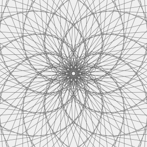
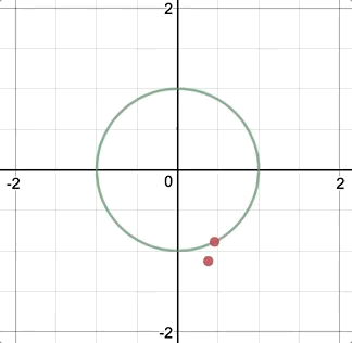
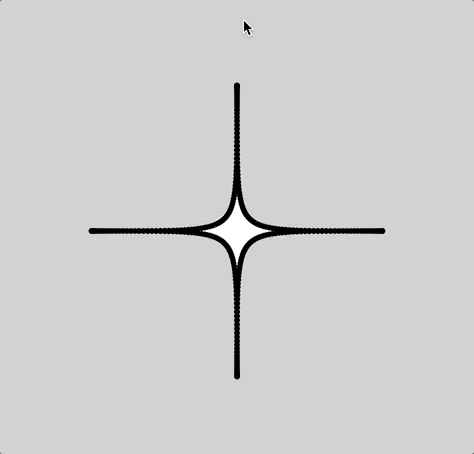
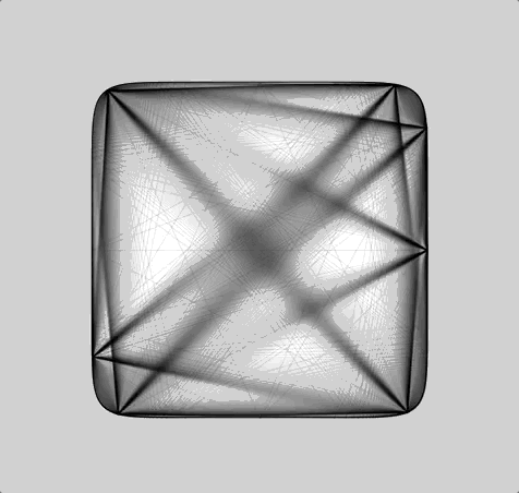
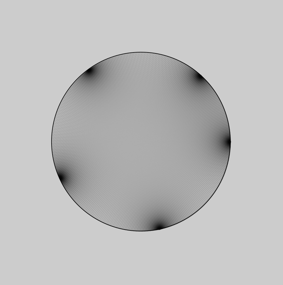
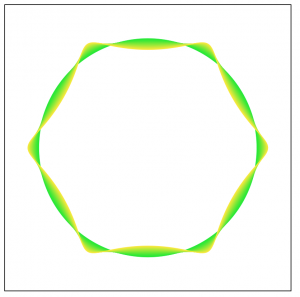
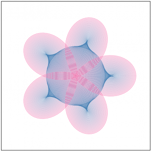
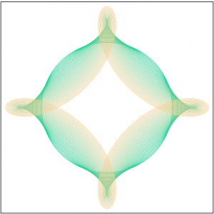
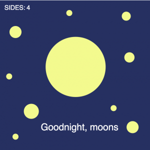
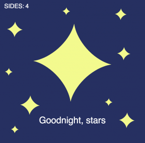
For the type of curve, I selected hypotrochoid. (http://mathworld.wolfram.com/Hypotrochoid.html). Since it was fairly similar to epitrochoid curves, I referenced the example while I was writing my code. I had some trouble making it look like what I wanted it to; for a while, it was only a circle that got thinner or wider as you moved the mouse. Eventually I figured out that the number you divide variable a by is the number of sides. When I increased that number, it looked a lot more like the example image given on mathworld.wolfram.com. I made it so the curve starts with four sides, but you can add up to eight by clicking the mouse.  You can make the curve bigger or smaller by moving the mouse from left to right or vice versa.

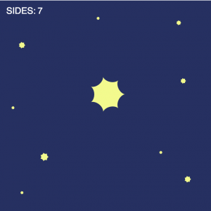
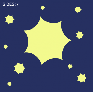
Somewhere along the line I realized that the two extremes were a circle and a star shape, so I made it a sky full of celestial objects and I added the text “Goodnight, moons” and “Goodnight, stars” when the mouse was at the top and the bottom.

I wish I had done more to experiment visually, but overall I enjoyed this project!

svitoora – 07 – Squircle

sketch

// 
// Supawat Vitoorapakorn
// Svitoora@andrew.cmu.edu
// Section E
// 
// Squircle
// Equation from:
// https://en.wikipedia.org/wiki/Superellipse

w = 480;
h = 480;

//Signum function
function sgn(x) {
	if (x > 0) {
		return 1
	}
	if (x == 0) {
		return 0
	}
	if (x < 1) {
		return -1
	}
}

//------------------------

var SQUIRCLE = []; // Array for nodes
var theta;
var a = w * .33 // Squircle width
var b = h * .33 // Squircle height
var n = 3.5 // roundness

// Create nodes for squircle
function create_squircle(x, y) {
	this.x = x;
	this.y = y;
}

// Calculate Squircle's X position from theta
function squircle_x() {
	angleMode(DEGREES);
	return abs(cos(theta)) ** (2 / n) * a * sgn(cos(theta))
}

// Calculate Squircle's Y position rom theta
function squircle_y() {
	angleMode(DEGREES);
	return abs(sin(theta)) ** (2 / n) * b * sgn(sin(theta))
}

// Create Squircle based on an interval of theta
// and push its node into an array
function make_squircle() {
	angleMode(DEGREES);
	//Plot every interval degree of squircle
	interval = 1;
	for (theta = 0; theta < 360; theta += interval) {
		x = squircle_x(theta);
		y = squircle_y(theta);
		SQUIRCLE.push(new create_squircle(x, y))
	}
}

var gon = 60;
var min_gon = 45;
var max_gon = 160;
var SWITCH = 1;
// Create a bounce loop animation from drawing lines
function gon_loop() {
	print(SQUIRCLE.length)
	if (gon == max_gon) {
		SWITCH = -1;
		print("inversing");
	};
	if (gon == min_gon) {
		SWITCH = 1;
	}
	gon += SWITCH;
}

// Draws Squircle from array
function draw_squircle() {
	//Draw Shape

	if (inverse == 1) {
		fill(255);
	} else {
		fill(0);
	}
	beginShape();

	strokeWeight(1);
	for (i in SQUIRCLE) {
		x = SQUIRCLE[i].x
		y = SQUIRCLE[i].y
		curveVertex(x, y);
	}
	//Force Close Shape
	curveVertex(SQUIRCLE[5].x, SQUIRCLE[5].y);
	endShape(CLOSE);
	connect_lines();
}

// Connect a point in squircle to every point
function connect_lines() {
	//Add lines
	if (inverse == 1) {
		stroke(0, 0, 0, 255 * .1);
	} else {
		stroke(255, 255, 255, 255 * .1)
	}
	for (i in SQUIRCLE) {
		x_0 = SQUIRCLE[i].x
		y_0 = SQUIRCLE[i].y
		for (i in SQUIRCLE) {
			if (i % (gon) == 0) {
				// %gon used to skip certains nodes
				// to not overload the computer
				x_1 = SQUIRCLE[i].x
				y_1 = SQUIRCLE[i].y
				line(x_0, y_0, x_1, y_1);
			}
		}
	}
}

//------------------------

function setup() {
	createCanvas(w, h);
	background(255 * .75);
	make_squircle();
	print(SQUIRCLE.length / 2, SQUIRCLE.length / 6)
}

//------------------------

// Use mouseX to control the roundeness of squircle
function control_roundness() {
	mousePos = (abs(mouseX - (w / 2)) / (w / 2));
	mousePos = constrain(mousePos, 0, 1);
	roundness = map(mousePos, 0, 1, .2, 10);
	n = roundness;
	SQUIRCLE.length = 0;
	make_squircle();
}

//Use mouseY to control size of squircle
function control_size() {
	mousePos = (abs(mouseY - (h / 2)) / (h / 2));
	mousePos = constrain(mousePos, 0, 1);
	size = map(mousePos, 0, 1.2, .175, .35);
	a = w * size;
	b = h * size;
	SQUIRCLE.length = 0;
	make_squircle();
}

function mouseClicked() {
	inverse = inverse * -1;
}

//------------------------

var inverse = 1; // incerts color
function draw() {
	if (inverse == 1) {
		background(255 * .8);
	} else {
		background(255 * .1)
	}
	control_roundness();
	control_size();
	gon_loop(); //bounce animation for connecting line

	//Draw Closed Shape
	push()
	translate((w / 2), (h / 2)) // center drawing
	draw_squircle();
	pop()
}

Squircle

For my equation, I picked the superellipse equation which is capable of creating a squircle. I stumbled upon this equation on MathWorld:

\left|{\frac {x}{a}}\right|^{n}\!+\left|{\frac {y}{b}}\right|^{n}\!=1,

Since this equation is not particularly helpful, I went on Wikipedia and found the parametric equation for the superellipse:

{\displaystyle {\begin{aligned}x\left(t\right)&={|\cos t|}^{\frac {2}{m}}\cdot a\operatorname {sgn}(\cos t)\\y\left(t\right)&={|\sin t|}^{\frac {2}{n}}\cdot b\operatorname {sgn}(\sin t)\end{aligned}}}

At first, I was a bit confused about what the signum sgn() function is, but after some googling, I understood it and was able to replicate the function easily in javascript. Initially, I thought about  doing a spirograph whereby a pen would rotate around the moving point and generate a drawing with variable orbital roundness:

Initial Idea sketched on Desmos.

Variable Density

After re-building my equation in javascript, I found that the curve was denser in some area than others. This I believe is caused by the way that I parametrically constructed this curve via iterating from 0 to 360˚ and pushing the nodes into an array:

Notice how the nodes are denser near the corners.

Had this been constructed through Calculus, these variable densities wouldn’t occur. But since these variable densities existed, I decided to take advantage of it use it as nodes to do a string art. These are the results:

akluk – Section A – Looking outwards-07


A still of what the animation looks like.
For this week the project that I have chosen to explore is a project called “The creatures of Prometheus” by Simon Russell which was created this year.


Demonstration of the animation

What I found interesting about this project is the fact that it utilizes both visual and audio data to convert into a beautiful animation. What is interesting is that the artist usually hand animates his own animations, but for this project, he simply created a self generative algorithm and plugged in the data, and the animations were as vivid and fluid as it is. While I do not know what exactly the algorithm that was used to generate this animation. It seems to utilize not only the current audio/visual data presented but also calculates and incorporates the rate at which the audio and visual data is changing to create a more natural and organic waves. What I most like about his style which is also present in this project is the use of more vibrant and neon colors, which the lines looking like electrical pulses and waves. It gives a very futuristic and sci-fi nature to his artwork. Below is the link to the project.
The Creatures of Prometheus

aboyle-Looking Outwards-07

“The Creatures of Prometheus” is a generative visualization of the ballet composed in 1801 by Beethoven. It was created as part of a series of self-initiated studies by Simon Russell that explore the connection between audios and visuals. Russell was assisted by Alex Eckford, Greg Felton, and Alan Martyn. It can be found at http://www.creativeapplications.net/sound/the-creatures-of-prometheus-generative-visualisation-of-beethovens-ballet-with-houdini/. The visualization is entertaining to watch and it makes the audience think about their conceptions of music and color. I also think that the little stick figure composer at the bottom is adorable.

According to the website, the “animation is driven mainly through a MIDI file. The Houdini setup reads the notation and emits particles using the pitch to derive their height and amplitude to derive their speed. As the volume of each note increases it also effects the colour emitted.” The setup also takes into account the previous note when determining the height of the current note. The little conductor is keyframed, but his movements are exaggerated depending on the volume.

The creator could have been inspired by the idea of synesthesia, which is a phenomenon where two senses are intertwined so that people can see music or hear colors. The creator also could have been inspired by Disney’s Fantasia 2000, which beautifully gives visuals to many classical musical compositions. Regardless of possible inspirations, it’s very clear that the creator has a love for visuals, music, computation, and the combinations thereof.

hyt-Looking-Outward-07: Data Visualization

When I was searching for the project, I was intrigued by Project Ukko, a seasonal wind and weather visualizing web application developed by Truth and Beauty Operations. It is a elegant-looking interfaces that utilizes dashed lines and colors to reflect a thematic map with wind prediction  data around the world. Particularly, the categories of quantitative data are visualized through attributes such as opacity, line’s thickness, angle, and color hues. And on the side panels, you would also have access to the more detailed analytic data for further reference. The final results were produced through d3.js, coffeescript, pixi.js. I think this link is also helpful in terms of understanding the designer’s process of having the creative solution: http://truth-and-beauty.net/projects/ukko.

akluk-Project-07-curves

sketch

//Alvin Luk
//Section A
//akluk@andrew.cmu.edu
//Project-07


var nPoints = 200;
var edges = 2;


function setup() {
    createCanvas(400, 400);
    frameRate(10);
}


function draw() {
    background(255);
    // draw the frame
    fill(0); 
    noStroke();
    stroke(0);
    noFill(); 
    rect(0, 0, width-1, height-1); 
    
    // draw the curve
    push();
    translate(width / 2, height / 2);
    drawCurve(edges);
    pop();
}

//--------------------------------------------------
function drawCurve() {
    // Hypotrochoid
    // http://mathworld.wolfram.com/Hypotrochoid.html
    // draws multiple hypotrochoid with differeing h's
    for (var j = 0; j < 30; j++){
    var x;
    var y;
    
    var a = map(mouseX,0,width,0,200);
    var b = a/edges;
    var h = map(mouseY,0,height,0,4*j);
    //changes color gradient depending on which hypotrochoid currently at
    //and also the position of mouseX and mouseY
    var red = map(j,0,30,0,255);
    var green = map(mouseX,0,width,0,255);
    var blue = map(mouseY,0,height,0,255);
    stroke(color(red,green,blue));

    //draws single hypotrochoid
 	noFill();
    beginShape();
    for (var i = 0; i < nPoints; i++) {
        var t = map(i, 0, nPoints, 0, TWO_PI);
        
        x = (a - b) * cos(t) + h* cos(t * (a - b) / b);
        y = (a - b) * sin(t) - h * sin(t * (a - b) / b);
        vertex(x, y);
    }
    endShape(CLOSE);
	}	


}

//adds number of edges/ corners each time the mouse is pressed
function mousePressed() {
    edges +=1
    if (edges > 7){
    	edges = 2;
    }
}
//--------------------------------------------------

For this project. I first followed the guidelines provided in the assignments and chose a graph from the mathworks curves section. I chose the Hypotrochoid, since there was a lot of variables in the parametric equations of the curves that I could play with that enabled me to create varying versions and variations of the curve. I also thought that just one hypotrochoid seems kind of static. So I decided to use a for loop to generate numerous hypotrochoid super imposed on each other with a changed parameters. I also made it so the color changes based on the position of x and y. Clicking also changes the ratio of a and b creating new different classes of hypotrochoid. Below are some screenshots of what my program creates.

mjanco – section B -LookingOutwards07


http://www.wordcount.org/

http://number27.org/wordcount

I chose to look at Jonathan Harris’s piece Wordcount, from 2003. It is a visualization of humans’ frequency of use of certain words. I really thought the concept was quite simple, but what made me begin to admire it more was when I read this section of Harris’s description: “The intention is for the user to feel embedded in the language, sifting through words like an archaeologist through sand, awaiting the unexpected find.” I realized that this was not just a list of data, but a clean visualization that users could explore and make connections within. I found my own curiosity growing as I wanted to discover the ranking of specific words. I love that the clean interface and simple concept leaves room for discovery. Since the project is very linear, I can assume that conditional statements were used to have the font size decrease as the ranking increased, from left to right. They also would need to be used to make the font fill change for every other word, alternating from black to gray. Wordcount was probably done similarly to the bar graph assignment. On his biography, it says that Harris is “exploring the ways in which humans use technology to shape their experience of life.” I feel that his fascination with human use of technology, but also of overall systems, is what inspired this piece, as language is a system that we have created (just like technology). This was a simple but effective piece for him to visually see patterns and relationships within human word use.


juyeonk-Looking Outwards-07

Video: showing the paths of airplanes over North America in different colors.


Title: Flight Patterns

Artist: Aaron Koblin

Year of Creation:

Link to the Project: http://www.aaronkoblin.com/project/flight-patterns/

Link to the Bio of the Artist: http://www.aaronkoblin.com/project/about/


This project was intended to visualize the air traffic above North America over the course of a day. Originally, this work was made as a part of the experiments for the larger project called “Celestial Mechanics” by Aaron Koblin and their colleagues named Scott Hessels and Gabriel Dunne at UCLA. They attained the flight information from the Federal Aviation Administration, analyzed the data and plotted them using the Processing programming environment. Colors and special effects were added later using Adobe After Effects and Maya.

(Before the special effects were added)


Flight Patterns

(After the effects were added)