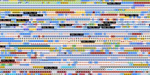
This is a project created on accident by CMU student Shan Huang in 2014. It’s a Google chrome plugin that looks through a user’s history and collects all the favicons of all the websites visited. It then organizes all the favicons and arranges them into a large mural based on oldest link to newest. Each image is still functional, so when clicked it will redirect you to the original website. What I really like about this project is how it transforms everyday online browsing into an art form. It also shows us the overwhelming amount of times people use the internet and go on a website in a day or just an hour in just one image. It’s truly a beautiful but also very reflective and realistic piece.
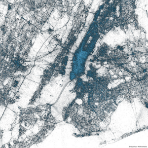
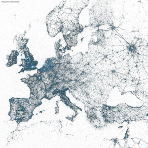
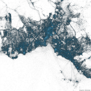
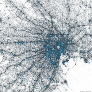
in 2013, Twitter’s team for Visual Insights created a project that gave every twitter user a virtual brush that they could mark the location of every tweet they made. Twitter was able to track billions of tweets, since 2009, and place them on a map to track tweet geographic patterns.
Above is Europe, Istanbul, and Tokyo. Every place is incredibly unique and varied. This gave Twitter a lot of helpful data surrounding who and where uses their service.
My favorite part of this experience is that it is so simple. But at the same time it is so complex. There are billions of points that have to be mapped and this is no small feat.
Something else I noticed is not on the land but in the sea. there are dots all over the ocean. This means that they were even able to trace off-coast tweets from maritime traffic.
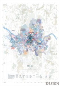
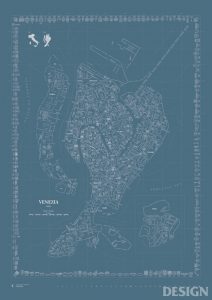
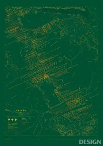
Map of seoul represented through patternsMap of Venezia represented through texts and pictograms of tourist attractions and architecturesMap of Amazon River, Brazil represented in terms of the degree of deforestation
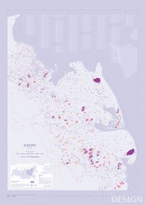
Map of Ozeros (lakes in Russian)
Map is one of the most notable use of information visualization in a way that it is a combination of information based on carefully formulated intention and utility. For creating a map, designers need to take multiple things into consideration: the quality of aesthetics, readability, and most importantly, delivery of information. For this week’s looking outwards, I looked into graphic maps created by Amoeba Group based in Seoul, Korea. Amoeba Group focuses on data visualization, specializing in transferring the data onto a two-dimensional map.
From an interview of CEO of Amoeba Group I found on the web, he states that they first refer to google Earth and Open Street Maps to figure out the the tiniest alleys and streets names when studying the geographical data. Then, they move on to learn about the traditional map-making process, understanding the logistics and the characteristics of maps. Once that’s finished, they move on to understanding the specific geographical and cultural significance of the region of the map.
I found this map project particularly interesting because; first, I was very drawn to the graphic quality of the project; second, map is an area of data visualization that I seemed to have overlooked.
“Musical Buoy in Search Towards a New Shore” (2009), All images courtesy of Nathalie MiebachThe musical score for “Hurricane Noel.”All images courtesy of Nathalie Miebach
Nathalie Miebach is an artist who turns Weather Data into physical artwork just like this “Musical Buoy in Search Towards a New Shore” sculpture and the “Hurricane Noel” musical scores.
Ordinary people would never interpret weather data such as Nathalie Miebach and I find this quite fascinating because this is bringing Art, Music, Science, and Math together as one entity. This artifact could exist in an art gallery, in a science lab, and in a concert hall because these artifacts that she creates fit into these areas of study. Her work is very detailed and accurate that scientists can interpret the data just with the sculpture. The relationship between all the realms of the academic field of art and visuals is so interesting to me and I hope I can tie different academics together with my practice. When she is creating these artworks, she analyzes the weather data and assigns certain patterns of weather with color and objects in the case of her sculptures.
This is the On Broadway Project presented by Moritz Stefaner. He created this visualization project from activities of ordinary people in order to show the busy life of those who live and visit Broadway, Manhattan in New York. To do so, he monitored data such as number of twitter posts and taxi rides per day, and well as colors in the instagram posts. After gathering that data, he compressed his findings into the data layers that you see below:
What I love about Moritz’s project was that he essentially took the normal lives of people living on Broadway and compiled it into a visual product using his own algorithms or ones given to him by organizations that he had worked for. I was taken aback at how relevant the data was to ordinary people who may not necessarily be into statistics, but can enjoy this visual and even learn something from it.
Here is the link to the On Broadway Project:
http://truth-and-beauty.net/projects/on-broadway
Amsterdam SMS by Aaron Koblin for MIT Senseable City Lab, 2012
This work is a visualization for SMS messages in Amsterdam. It is interactive using the realtime data provided by KPN Mobile. They algorithm he Koblin used is Processing and OpenGL.
OpenGL is a cross-platform programming interface that majorly used for rendering 2D and 3D vectors. One of its wide use is scientific visualization, which is shown perfectly here in this project. I personally like this project a lot because it visualizes a scientific research in a more aesthetic form. The research itself it is also meaningful. The idea of collecting the message data on New Year’s Eve shows the wide use of technology in this modern society. People rely more on communication through digital devices now. The representation of the building is interesting and aesthetic that I like it a lot.
This project is very inspiring in the way that it visualizes the useful message in a clear and artistic way. I think this method will be useful for me to do architecture research. The information visualization can help represent a lot like the site condition, the people’s access to the buildling or around and so on. It plays a very important part in architecture that I think it is very good for me to learn this skill.
Back in 2016, design firm CLEVER°FRANKE and fashion brand Byborre collaborated with Red Bull on their “RedBull Playrooms” event in order to track and visualize various datapoints in a club setting. Wearing bracelets designed by Byborre that monitored clubgoers’ movement, temperature, and excitement, visualizations of that data were generated using Processing and the Adobe Creative Suite in order to create both live animations that were projected on screens throughout the night, as well as a personalized printed “Flight of the Night,” which showed how a particular clubgoer spent their night – which rooms they frequented, which songs got them the most excited, and so on.
What I found interesting about this project was that clubgoers were receiving feedback as to how the night was going in real time, which is both interesting for the partygoer, and helpful in understanding what about an event is the most engaging and effective, allowing for better planning and overall better experiences. While it’s fun to see this in a recreational club setting, I’m curious to see what would come from applying the same technology and visualization practices to other settings, and if that data could be used to improve those spaces and experiences.
More work by CLEVER°FRANKE can be found on Behance or on their website.
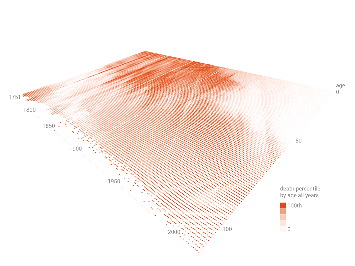
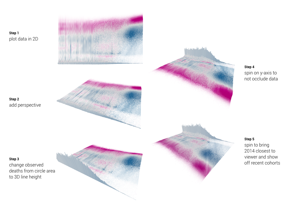
The is a project done by Skye Moret in 2017 to visualize 264 years of Swedish mortality. This is a unconventional yet visually pleasing and intuitionistic diagram. I particularity appreciate two aspects of it: it uses not only the conventional x, y axis, but also incorporate z-axis to make the chart 3D. Also, the visualization is not only a still image, but a motion that rotates the perspective, and shows the timeline step by step. With computers we can explore many ways to demonstrate and convey data. Moret’s choice of color, gradient, and the shadow effect, all demonstrate her artistic sensibility.
The software Moret used is Processing—a free and “flexible software sketchbook and language for learning how to code within the context of visual arts.” It has amazing mapping data to visual attributes that allow users to change aspects such as opacity, color, and perspective.
This week I will be looking at Rachel Binx and exploring the way she graphically represent data. She is also the author of Meshu, ManyMaps, Cliffs&Coasts, and Gifpop. Binx is currently working with the Content Science and Algorithms team in Los Angeles in Netflix.
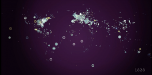
History of the World in 100 Seconds is a video by Gareth Lloyd and Tom Martin that uses data from 14,238 Wikipedia Articles. They pulled out every geotagged article and every reference to an event and cross referenced them to find every events with a corresponding location. In the video, a dot appears corresponding to all 14,238 events chronologically and according to location. At the end, the dots start appearing more and more rapidly like fireworks, and a recognizable map of the world as we know it materializes. The dots also start to resemble how cities look from above as they become more and more clustered. I admire this project both because of how they represented the information graphically, but also for the sheer volume of data they were able to analyze and represent.
![[OLD FALL 2017] 15-104 • Introduction to Computing for Creative Practice](../../../../wp-content/uploads/2020/08/stop-banner.png)