karinac-Project-07

karinac-project-07

//Karina Chiu
//Section C
//karinac@andrew.cmu.edu
//Project-07

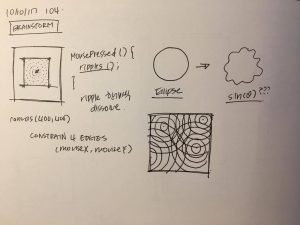
//number of points drawn on hypocycloid
var nPoints = 500;

function setup() {
    createCanvas(400, 400);
}


function draw() {
    background(234,187,196);

    //rotation by mouseX
    var angle = mouseX/200;
    
    // draw the curve
    push();
    translate(width / 2, height / 2);
    rotate(angle);
    drawHypocycloidCurve();
    pop();
}

function drawHypocycloidCurve() {  
    var x;
    var y;
    var a = constrain(mouseX/5,0,width);
    
    fill(255);
    strokeWeight(3);
    stroke(150,46,63);

    beginShape();
    for (var i = 0; i < nPoints; i++) {
        var t = map(i, 0, nPoints, 0, TWO_PI);
        x = (1*a) * cos(t) + a * cos(7*t);
        y = (1*a) * sin(t) - a * sin(7*t);
        vertex(x,y);
    }
    endShape(CLOSE);
}

I started first by attempting to generate a simple astroid curve:  Image result for astroid curve

In doing so, while looking up formulas and trying to figure out what each variable in the equation affects, I found out that an astroid is part of a bigger group called hypocycloids, which is “a special plane curve generated by the trace of a fixed point on a small circle that rolls within a larger circle.”

https://en.wikipedia.org/wiki/Hypocycloid

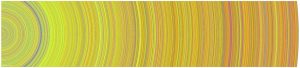
After creating a simple astroid that expands and contracts with the movement of the mouse, I decided I wanted to experiment with the other variables to see what other shapes I could make. Following the logic of the curves, I ended up with the flower-like shape that you see above. To complete the project, I added a rotation to the expanding flower.

dayoungl Project -07

sketch

//Sharon Lee
//Section E
//dayoungl@andrew.cmu.edu
//Assignment 07-C
var h = 280;
var v = 5;
var dirX = 1;
var wall1 = 60;
var wall2 = 340;
var xarray = [];
var yarray = [];
var rings = 10;
var counts = [];
var circles = [];

var xs = []
var ys = []
var is = []

function setup() {
  createCanvas(400,400);
  // angleMODE(DEGREES);
  frameRate(8);
}

function draw() {
  ripples();
  for(i = 0; i< counts.length;i++){
    counts[i]++;
  }
  if(counts[0]>rings){
    counts.splice(0,1);
    xarray.splice(0,1);
    yarray.splice(0,1);
  }
 
}

function ripples() {
  background(100);
  //rectangle
  push();
  rectMode(CENTER);
  stroke(122,203,241);
  strokeWeight(4);
  noFill();
  rect(width/2, height/2,h,h);
  //set the number of the ripples
  for (i = 0; i < xarray.length; i ++){
    
    //draw ripples
    stroke(122,203,241);
    noFill();
    // var m = map(mouseX, 0, width, 25, 75);
    //constrain the ripples inside the square
    var xc = constrain(xarray[i], wall1, wall2);
    var yc = constrain(yarray[i], wall1, wall2);
    xs.push(xc);
    ys.push(yc);
    is.push(counts[i]);
    //ellipse(xc,yc,50 * counts[i], 50 * counts[i]);
  }

  for (i = 0; i < xs.length; i++) {
    ellipse(xs[i],ys[i],50 * is[i], 50 * is[i]);
  }

  pop();
  fill(100);
  noStroke();
  rect(0,0,wall1,height);
  //create bounding box
  //right bouding box
  rect(wall2,0,wall1,height);
  //left bounding box
  rect(height,0,width,wall1);
   //top bounding box
  rect(0,0,width,wall1);
  //bottom bounding box
  rect(0,wall2,width,wall1);
}

function mousePressed() { 
  counts.push(0);
  xarray.push(mouseX);
  yarray.push(mouseY);
}

// function mouseDragged() {
//   ripples (mouseX, mouseY);
// }

I wanted to represent ripples. As mouse is clicked, the ripples appear on the screen and overlap on top of each other.

selinal-Looking-Outwards-07

Personal Knowledge Database by Moebio Labs (Santiago Ortiz)

http://intuitionanalytics.com/other/knowledgeDatabase/

Moebio Labs is a collaborative team of engineers, analysts, programmers, etc. which has swept through and encountered millions of pages on the internet. While they make most of their data visualizations about a specific topic or theme, their project Personal Knowledge Database acts as an archive for the research they have done throughout the ten years since they started making data visualizations. I admire how they use of old, “unseen” material and incorporate it as a main thematic element in another one of their projects. I think there is a significance in the metaphorical translation of the project’s concept to a visual, and the interactive and technical aspects are extremely impressive. One observation I have of the algorithm used is the separation of certain links/projects into nodes within other nodes, perhaps to indicate time period and area of research.

Image result for personal knowledge database santiagoImage result for personal knowledge database santiago

sunmink-LookingOutwards-07


Dear Data by, Georgia Lupi and Stefani Posavec http://www.dear-data.com/all/

Stefanie Posavec is a designer who works with data projects that are related to language, literature, or science. She uses data as a source visualize hand-crafted works. One of her most admirable work is “Dear Data”, which is a collection of postcards that includes data that shows something about two people’s personalities. This project began when Lupi and Posavec were curious if they could know each other by few colored pens marked on the postcards. By spending hours on each postcard they could make a detailed postcard that enables them to share their personalities. Lupi mainly encoded data in a way that presents different noises she heard in 32 weeks, and Posavec’s card was filled with brightly colored rectangles.

I was excited to see some of the postcards they made because I have not seen many data visualizations that use color encoding to represent certain emotions or condition. The algorithm generated in their work is human thoughts to programme and display data through visualization. After seeing many works based on mathematically generated algorithms, it was refreshing to understand the data through a different perspective.

afukuda-Project07-Curves

afukuda-project-07

/* 
 * Name | Ai Fukuda 
 * Course Section | C 
 * Email | afukuda@andrew.cmu.edu
 * Project | 07
 */ 

function setup() {
  createCanvas(400, 400);
}

function draw() {
  background(193, 228, 221);
  translate(width/2, height/2);  // translating grid to center 

  drawSpirograph();
}

function drawSpirograph() {
    // Spirograph: 
    // http://mathworld.wolfram.com/Spirograph.html

    var nPoints = 1000;          
    noFill();
    stroke(140, 164, 212);

    var x;
    var y;
    var a = 200;    // fixed radius in which smaller circle (b) rolls around 
    var b = a/constrain(mouseY+10, 50, 350);  // smaller circle radius - making it interactive with mouseY 
    var h = constrain(mouseX+10, 50, 350);  // distance from center of interior circle in which spirograph is traced - mouseX

    beginShape();
        for (var i=0; i < nPoints; i++) {

            var t = map(i, 0, nPoints, 0, TWO_PI);

            x = (a + b) * cos(t) + h * cos((a-b) / b * t);
            y = (a + b) * sin(t) + h * sin((a-b) / b * t);
            vertex(x, y);
        }  
    endShape();

    
} 

My project is based on the Spirograph mathematical curve (link: http://mathworld.wolfram.com/Spirograph.html). Keeping one variable (a) constant, initially I was going to keep things simple by only using small integers (> 10) to create the geometry, but by incorporating mouseX and mouseY for the (b) and (h) variables (see link to see what these variables represent), the geometry became more intricate, more dynamic, and more kaleidoscope-like, which I was compelled by.

danakim-LookingOutwards-07

eCLOUD (2007); Dan Goods

The eCLOUD is a permanent installation between gates 22 and 23 at the San Jose International Airport. It is a dynamic sculpture that mimics the volume and behavior of a cloud. The sculpture is made of polycarbonate tiles that change its transparency levels according to real time weather from around the world. A dynamic display shows which city the eCLOUD is displaying and it’s current weather data in real time.The eCLOUD was designed by Dan Goods, Nik Hafermaas and Aaron Koblin.

I admire the project’s sensitivity to it’s environment. The designers did a nice job of finding the right balance between simplicity and complexity to make sure that the installation relates back to its surrounding environment and is not obnoxious. I admire that the installation itself is informative and has a function within the space.

eCLOUD; Dan Goods
eCLOUD; Dan Goods

eCLOUD

katieche – looking outwards – 07

I chose the work of Nicolas Felton because I had found out about him back when I was in high school, and I thought everything he did at the time was just through adobe programs, not through computation or coding! His work is really fascinating as he essentially records every moment of his life for an entire year (every year), and then complies them into informational graphics for an annual report on each January 1st. He uses processing to create graphs and charts, and then exports them into Adobe InDesign to create his reports. He’s even created an app which sends users reminders to record data, and essentially collects, and categorizes the user’s everyday data.

feltron
article

katieche-project-07

katieche-07

/*
katie chen
katieche@andrew.cmu.edu
project 07
section E
*/

function setup() {
    createCanvas(480, 480);
}

function draw() {
    background(255, 210, 190);
    var mx = constrain(mouseX, 60, 450);

push();
beginShape();
    // points 
    var n1 = 400;
    // big circle radius
    var a1 = 100;
    // small circle radius
    var b1 = map(mx, 0, width, 0, 10);
    // distance from center of the interior circle to P (what draws the line)
    var h1 = map(mx, 0, width, 0, 300);

    noFill();
    stroke(255, 222, 221);
    strokeWeight (0.2);
    translate(width/2, height/2); //center the object
    for(var i = 0; i < n1; i++) {
        var t = map(i, 0, n1, 0, TWO_PI); 
        var x1 = (a1-b1)*cos(t) + h1*cos(t*(a1-b1)/b1)
        var y1 = (a1-b1)*sin(t) + h1*sin(t*(a1-b1)/b1)
        vertex(x1, y1);
endShape();
    }
pop();

push();
beginShape();
    // points
    var n = 400;
    // big circle radius
    var a = map(mouseY, 0, height, 0, 200);
    // small circle radius
    var b = 10;
    // distance from center of the interior circle to P (what draws the line)
    var h = map(mouseX, 0, width, 0, 200);
    noFill();
    stroke(255, 231, 226);
    strokeWeight (0.2);
    translate(width/2, height/2); //center the object
    for(var i = 0; i < n; i++) {
        var t = map(i, 0, n, 0, TWO_PI); 
        var x = (a-b)*cos(t) + h*cos(t*(a-b)/b)
        var y = (a-b)*sin(t) + h*sin(t*(a-b)/b)
        vertex(x, y);
endShape();
    }

pop();


}

I wanted to create 2 shapes, one that has less points and shows more of the shape being drawn, and one that’s super complicated. The pinker shape is more complicated so I constrained it before it jumbles into a solid donut shape.

The white line shape is what I like more since if you place your mouse near the center-left hand side of the canvas and move your mouse from the top to the bottom of the canvas, you can kind of see the spirograph being drawn. Moving your mouse from left to right makes the swirls bigger.

dchikows – Section C -Looking-Outwards – 07

Chris Harrison is an Assistant Professor of Human-Computer Interaction at Carnegie Mellon University. Harrison also directs the Future Interfaces Group which is a lab that creates novel computer interfaces and technologies that further a delightful human computer interaction. Harrison’s project called Digg Rings uses data from top news story outlets to create ring like images. The rings of each disk are composed of the ten top news stories that day relating to categories of the news. The disks are tree like in nature. As time goes on they get larger and larger and the rings grow based on the amount of views each story has. I enjoy this data visualization for news stories because of its similarity to how a tree grows in rings. Although, I think it would be interesting to see the project in different colors.

See more of Chris Harrison’s work

Key for data visualization
Up close of data visualization rings
Example of whole rings designated by days of the week

serinal – looking outwards 07 (section C)

Periscopic did a data visualization for “The Emotional Highs and Lows of Donald Trump” during the last Presidential election. I think that this was a really cool way to visually understand one aspect of the election. The Periscopic team used the Microsoft’s Cognitive API Service in order to sort through all the various stages of emotions as well as measure the frequency and intensity of each. There are 7 big categories of emotions and the team at Periscopic discovered that even thought the API could correctly and efficiently categorize and recognize these emotions, they sometimes lumped together things like “mocking” and “dominance” into the bigger categories.

On Periscopic’s site they state: “Our goal with this exploration was to test the API to determine if it could be a viable tool to lend additional data to projects that contain video. While we didn’t complete an exhaustive analysis, we do feel the API reveals valuable patterns that might otherwise be very time-consuming to obtain.” I think that for a company that does data visualization, it is really cool that they take time to do personal projects to explore new forms of data identification and analysis in order to use it in their later practices with different companies and corporations.

One of the many emotions identified
identifying emotions throughout different speeches

Read more about Periscopic’s Donald Trump project here