alchan-Project 07-curves

curves

// attributes of shape
var points;
var angle;

function setup() {
  createCanvas(480, 480);
  angleMode(DEGREES);
  frameRate(30);
}

function draw() {
  background(200);
  // set attributes to change with mouse position
  points = map(mouseX, 0, width, 0, 300);
  angle = map((mouseX + mouseY / 2), 0, width, 0, 360);
  // draw "main" curve
  stroke(209, 122, 110);
  drawCurve(width/2, height/2);

  // draw "background" curves, setting each to a random color
  // and a randomized position
  stroke(random(200, 255), random(200, 255), random(200, 255));
  drawCurve(width/2 + random(-10, 10), height/2 + random(-10, 10));
  stroke(random(200, 255), random(200, 255), random(200, 255));
  drawCurve(width/2 + random(-20, 20), height/2 + random(-20, 20));
  stroke(random(200, 255), random(200, 255), random(200, 255));
  drawCurve(width/2 + random(-30, 30), height/2 + random(-30, 30));
  stroke(random(200, 255), random(200, 255), random(200, 255));
  drawCurve(width/2 + random(-40, 40), height/2 + random(-40, 40));
}

function drawCurve(posX, posY) {
  var x;
  var y;
  //var a = 400;
  var b = map(mouseY, 0, 480, 20, 80);

  strokeWeight(1);
  noFill();

  push();
  translate(posX, posY);
  rotate(angle);
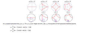
  // astroid curve (http://mathworld.wolfram.com/Astroid.html)t
  beginShape();
  for (var i = 0; i < points; i++) {
    x = 3 * b * cos(i) + b * cos(3* i);
    y = 3 * b * sin(i) - b * sin(3 * i);
    vertex(x + random(0,2), y + random(0,2));
  }
  endShape(CLOSE);
  pop();
}

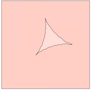
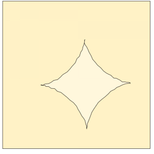
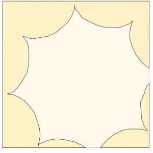
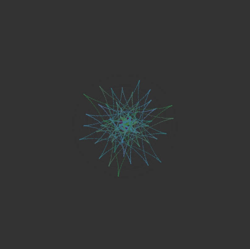
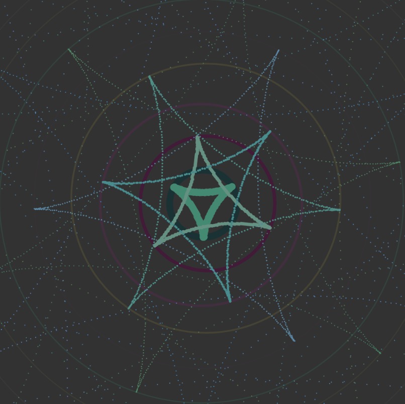
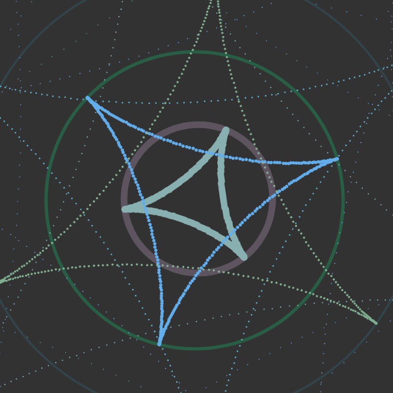
Since I was a little overwhelmed with the idea of creating a project based on mathematical curves, I decided to approach the project by “sketching” in the browser and figuring out how the code/ curve would render as I modified different variables. I chose an astroid for my curve. I also hadn’t originally set the angle mode of the drawing to degrees, and ended up with a spirograph-like drawing at first which was visually interesting, but not quite what I was going for.

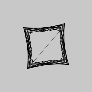
Once I had figured out how to make the curve actually a curve, I added in variables to make the size, number of points drawn, and rotation of the curve interactive. I also added elements of randomization to try to achieve a flickering/ glitching effect to add more interest.

mecha-project07-curves

sketch

//maddy cha
//section e
//mecha@andrew.cmu.edu

var nPoints = 100;

function setup() {
    createCanvas(480,480);
}

function draw() {
    //background g value is increased with mouseX
    background(255,constrain(map(mouseX,0,width,0,255),210,240),200);   
    frame();
    //location of curve depends on mouse (but is constrained 60 pixels around center in x and y directions)
    translate(constrain(mouseX,width/2-30,width/2+30),constrain(mouseY,height/2-30,height/2+30));
    hypocycloid();
}

//draws outside black rectangle
function frame(){
    noFill();
    stroke(0);
    rect(0,0,width-1,height-1);
}

function hypocycloid(){
    var x;
    var y;
    var r;
    var a = map(mouseX,0,width,0,150);
    //increases amount of points on hypocycloid
    //makes it so that points are increasing by whole numbers
    var b = nf(map(mouseX,0,width,0,6),2,0);

    push();
    //rotates based on mouseX location
    rotate(mouseX);
    //opacity of shape is dependant on mouseX
    fill(256,256,256,map(mouseX,0,width,0,100));
    beginShape();
    for (var i = 0; i < nPoints; i++) {
        var t = map(i, 0, nPoints, 0, TWO_PI);
        
        x = (a/b)*((b-1)*cos(t)-cos((b-1)*t))
        y = (a/b)*((b-1)*sin(t)+sin((b-1)*t));
        //draws points at x and y values (with some randomness)
        //nPoints dictates how many points are drawn between lines
        vertex(x+random(-2,2), y+random(-2,2));
    }
    endShape(CLOSE);
    pop();
}

For this project, I started with creating a deltoid by implementing the formula into my code. Once I was able to understand how to do this, I wanted to expand my scope by looking at the overarching hypocycloid. I decided that I wanted my mouseX and mouseY interactions to increase the amount of cusps that would appear on my shape. In order to do this, I had to alter my original deltoid formula to take in a greater amount of variables.

Once I figured that out, I implemented more ways in which the user could interact with my code using their mouse. I relied on the constrain() and map() functions in order to make sure the shape stayed in the canvas. While mouseY was used to change the location of my shape, mouseX dictated the amount of cusps, the color of the background color, the size, fill opacity, and the rotation of the hypocycloid. Additionally I experimented with adding randomness so that my project would be more visually entertaining.

Lookingoutwards -07

This is a project from Stamen. Name of the project is Facebook Flowers. The projects starts with George Takei sharing a picture on Facebook. After the initial share, shares that followed generates thread that continues as more shares occur. In the process, popular people are revealed as branching-off points of their own, and the process begins again. It is named flower because the visualization of data resembles the organism.

This project is particularly admiring on a fact that it converted the data that could be represented boring to interesting representation. It was always an interesting idea to record or see how fast and wide can social media spread information abroad. This project proves that social media is one of the fastest way to spread any thing to variety of people.

More dramatic case of sharing

jknip-SectionA-LookingOutwards-07

“Digg Rings” by Chris Harrison (2007-2008)

Between 2007 and 2008, Harrison grabbed the top 10 most dugg stories every day and rendered tree-ring-like visualizations based on the data. I really admire how each tree-ring created such different visual illusions and how certain colors/data categories are more prominent across each day of the week — Harrison describes that these variations occur as rings are cumulative. Randomness is unlikely to be found within this project, as the artist visualizes these rings based on real data. There may be some flaws in the algorithm as he notices that some days have fewer than 10 top stories, which is unusual. Harrison’s artistic sensibilities can be found in his choice of color palette, along with scale and presentation of the final rings. Each coded ring creates such different visual perspective depending on the scale it is shown.

http://www.chrisharrison.net/index.php/Visualizations/DiggRings

jiaxinw-Project-07-Curves

sketch

var mouse_x;

function setup() {
    createCanvas(480, 480);
}

function draw() {
    background(50);
    var x;
    var y;

    // limit the mouseX only works in canvas
    if(mouseX<width & mouseX >0){
        mouse_x = mouseX;
    } else if (mouseX<=0){
        mouse_x = 0;
    } else{
        mouse_x = width;
    }

    // http://mathworld.wolfram.com/Deltoid.html 
    // mapping the b from 0 to 480 into from 0 to 30,
    // and since b is the radius of the small circle, make it relate to
    //mouse X can change the scale of the curves. 
    var b = map(mouse_x, 0, width, 0, 30);

    for (var i = 1; i <= 20; i++) {
        push();
        //put the whole thing in the center of the canvas and make it shake
        translate(width/2+random(-5,5), height/2+random(-5,5));
        //change mouseX also affect the rotation of the shapes 
        var rotateAng = map(mouse_x, 0, width, 0, TWO_PI)
        //make the rotation more obvious
        rotate(rotateAng + i*3);
        //make the stroke weight become less according to the number of shape
        strokeWeight(8/i);
        noFill();
        //make the stroke color of circles randomlmy change
        stroke(random(20,100),random(10,130),random(50,100)
            ,400/i);
        ellipse(0,0,6*i*b,6*i*b);
        //call the function to draw curves
        DrawCurves(i * b);
        pop();
    }
}

function DrawCurves(R) {
    //map the color change into a range as the mouseX is changing
    var red = map(mouse_x, 0, width, 10, 20);
    var green = map(mouse_x, 0, width, 10, 15);
    var blue = map(mouse_x, 0, width, 10, 20);

    fill(red*random(4, 7), green*random(11,12),blue*random(6,15));
    //draw curves according to the parametric equations
    for (var i = 0; i < 360; i++) {
        var t = radians(i);
        x = 2 * R * cos(t) + R * cos(2 * t);
        y = 2 * R * sin(t) - R * sin(2 * t);
        beginShape(POINTS);
        vertex(x, y);
        endShape();
    }
}

First, I went through the curves and picked out Deltoid (http://mathworld.wolfram.com/Deltoid.html) one to play around.

After I successfully drew our the curve in a static way, I thought about how to make it look more interesting. I tried to draw multiple curves in different scales but found that if they are in the same direction, it looked boring. So I tried to make them rotate and point to different directions. Next step, I used mouseX to control the rotation. And I thought if the scale of the curves can also be changed, it would be interesting! After this was done, I figured out I could also play around with the stroke weight to make curves look different and also colours!

I am glad that I finally got an interesting interactive result 🙂


jiaxinw-LookingOutwards 07

Shipmap.org
by Kiln

Shipmap.org shows commercial shipping movements based on hundreds of millions of data points from throughout 2012. It was created by created by Kiln based on data from the UCL Energy Institute (UCL EI). UCL EI took data showing location and speed of ships and cross-checked it with another database to get the vessel characteristics. With this information, they were able to compute the CO2 emissions for each observed hour, following the approach laid out in the Third IMO Greenhouse Gas Study 2014. The designer took the resulting dataset and visualized it with WebGL on top of a specially created base map. The most impressive thing about this website is that it shows a high level of interaction with datas — such as you can select different time, ship categories and zoom in or out — and at the same time the map maintains the elegant visual appearance by using simple colors and movements.

For more information, please go to https://www.shipmap.org/

Looking Outwards 07 – Yugyeong Lee

Aaron Koblin is a digital media artist known for his innovative use of data visualization. Out of his many projects, eCLOUD is a “dynamic sculpture inspired by behavior of an idealized cloud.” Located in the San Jose International Airport,  hang from above, turning from transparent to opaque states to mimic the real time weather conditions of cities around the world. Based on the data collected from the National Oceanic and Atmospheric Administration, custom software, with use of algorithm, transfer electricity into the dynamic display to simulate cloud-like behavior. This project is admirable in transforming data into an architectural form that is integrated into the space to create an unique atmosphere. Through collecting the weather data and thereby turning something digital to embody natural characteristic, the artist articulate his sensibilities in visualizing data in a different perspective.

portfolio: http://www.aaronkoblin.com/project/ecloud/

mecha-lookingoutwards-07

Touching Air

For this week, I decided to look into the work of Stefanie Posavec, specifically her explorations with wearable data visualizations. Collaborating with information researcher Miriam Quick, Posavec created this piece titled Touching Air in 2014. The two collected data regarding large particulate (PM10) levels. Each necklace they created in this series was meant to visualize a week’s worth of data, with the size and shape of each piece representative of the amount of particulates in the air. The large, spiky piece in the image above represents the fact that there are a dangerous amount of particulates in the air–making the piece harmful to touch.

Posavec wrote that her decision to visualize this data using a necklace had to do with how these specific particulate levels are harmful to one’s heart and lungs. When I imagine data visualizations, my mind immediately thinks of graphs and other two-dimensional ways of visualizing data. Because of how this went against the norm of what I consider to be data visualizations, I felt that it was an interesting piece to dissect. I was inspired with how the communication of the data was representational of the issues that the subject brings about.

yoonyouk-lookingoutwards-07

This week’s looking outwards I focused on the work of Periscope, a company that focuses on data collection and visualization. Their goal is to send a message to their audiences and engage the public. Their visualization of data is very unique and provides a creative outlook data trends. For example, in data collection titled, “Most Negative Inaugural Speech in Decades.” I thought this data collection was unique in many ways – one being that they made quantitative data of facial expressions. Microsoft API was used to detect facial expressions while the presidents were speaking. A unique algorithm must have been crafted in order to detect facial expression and then determine whether it is positive or negative. They then combined all of the emotions into an arc like formation, creating a feather-like graph.

Above is the graph for President Trump’s inaugural speech. The graph shows a lot of negative emotions arising.

Rather than taking a typical approach of data visualization, such as a bar graph of a pie chart, the designers utilized a unique shape that still represented the appropriate data. When clicking on the individual strokes of the feather, users were able to detect the specific feelings felt during the speech.


daphnel-Looking Outwards-07

Atlas of Emotions

In 2014, the concept of creating an Atlas of Emotion through data visualization was created. Dalai Lama and Dr. Paul Ekman were inspired by their conversations with each other to create this Atlas. The concept for this was to create a map that would guide emotional travels and try to help them find their state of calm. The 5 main emotions considered are Anger, Sadness, Fear, Disgust and Enjoyment. I find this project very interesting and reflective of the creators themselves because although the map looks fairly simple, there was a lot of data put into this piece of work and it is a lot more meaningful than a regular map. I admire how much detail they put into the meaning of this map. Each of the five continents of emotion contain states which can lead to actions, triggers, moods and so forth. This project aims to bridge together the gap between the academic and personal.