Project-07-Chickoff-Checkered Shape

sketch

//Cora Hickoff
//Section D
//chickoff@andrew.cmu.edu
//Project-07

var nPoints = 100;
var CYCLOID = 0; 

var titles = ["<><><><><><><><><><><><><><><><><><><><>"];
var curveMode = CYCLOID;


function setup() {
    createCanvas(400, 400);
    frameRate(10);
}

function draw() {
    background(224, 200, 197, 90);

      for (var y = 0; y < height; y += 5) {
        for (var x = 0; x < width+25; x += 50) {
            fill(255, 240, 250, 20);
            ellipse(x, y, 10, 5);
        }
    }
    
    // draw the frame
    fill(200, 0, 0); 
    noStroke();
    text(titles[curveMode], mouseX / 3, mouseY / 3);
    stroke(0);

    fill(200, 0, 0); 
    noStroke();
    text(titles[curveMode], mouseX / 3, mouseX / 2);
    stroke(0);

    noFill(); 
    strokeWeight(0);
    rect(0, 0, width-1, height-1); 

    // draw the curve
    push();
    translate(width / 2, height / 2);
    switch (curveMode) {
    case CYCLOID:
        drawCycloidCurve();
        break;
    }
    pop();
}

//--------------------------------------------------
function drawCycloidCurve() {
    // Cycloid:
    // http://mathworld.wolfram.com/Cycloid.html

    var a = 9.0;
    var b = a / 3.0;
    var h = constrain(mouseY / 20.0, 80, b);
    var ph = mouseX / 50.0;
    
    fill(205, 20, 20, 90);
    strokeWeight(1);
    beginShape();
    for (var i = 0; i < nPoints; i++) {
        var t = map(i, 0, nPoints, 0, TWO_PI);
        
        x = b - 4 + (t - sin(t)) - h * sin(ph + t * (a * b) / b);
        y = b + (1 - cos(t)) - h * cos(h + t * (a + b) / b);

        //places curve in middle of canvas
        vertex(x - 12, y - 20);
    }
    endShape(CLOSE);

    var a = 9.0;
    var b = a / 6.0;
    var h = constrain(mouseY / 20.0, 80, b);
    var ph = mouseX / 50.0;
    
    fill(205, 160, 160, 200);
    noStroke();
    beginShape();
    for (var i = 0; i < nPoints; i++) {
        var t = map(i, 0, nPoints, 0, TWO_PI);
        
        x = b - 4 + (t - sin(t)) - h * sin(ph + t * 2 * (a * b) / b);
        y = b + (1 - cos(t)) - h * cos(h + t * (a + b) / b);

        //places curve in middle of canvas
        vertex(x - 12, y - 20);
    }
    endShape(CLOSE);
    
}

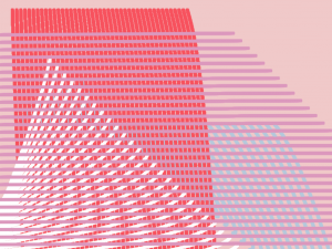
In this project, I wanted to make the final product very soothing to look at, as well as aesthetically pleasing. My process with this was to play around with color and shape until I got this result which uses the same shape twice but changes some attributes such as color, opacity, strokeWeight (or lack thereof).

LookingOutwards-07-Chickoff

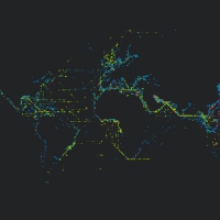
Platts is a data visualization project created by U.K. designer Brendan Dawes in 2017 which visualizes “the journey of over 3000 ships created from five months of historical shipping data.”It was created for the Igloo 360 degree wrap-around projection system. The map of the world in this piece is created with little dots that grow over the course of the video. I find it fascinating to see how connected the world is in terms of the way we exchange products and exports, but also realize how disconnected I feel I am to that same world.

This project reminds me a lot of the travel and migration patterns of animals. I love this visualization of ship routes because it reduces human life to a simpler, objective level. The ship moves from Country A to Country B while experiencing some weather difficulties along the way. No opinion is needed with simple facts like these. And so I find it comforting to see the life in this way because it shows how insignificant and small humans are, even if we sometimes act like we’re the universe’s royalty.

Project-06-Chickoff-Hazy Clock

sketch

//Cora Hickoff
//Section D
//chickoff@andrew.cmu.edu
//Project-06

function setup() {
    createCanvas(400, 400);
}

function draw() {

    background(240, 8, 8, 1);
    noStroke();

    for (var y = 0; y < height+5; y += 15) {
        for (var x = 0; x < width+5; x += 15) {
            fill(25, 220, 20, 1,);
            ellipse(x, y, 20, 20);
        }
    }

     for (var y = 0; y < height+5; y += 15) {
        for (var x = 0; x < width+5; x += 15) {
            fill(25, 50, 200, 1);
            triangle(x, y, 5, 5, 2, 10);
        }
    }
    
    var H = hour();
    var M = minute();
    var S = second();

    var mappedH = map(H, 0,23, 0,width);
    var mappedM = map(M, 0,59, 0,width);
    var mappedS = map(S, 0,59, 0,width);
    var triangleHeight = height / 3;
    var triangleWidth = width / 2;

    //hour
    fill(205, 18, 90, 3);
    triangle(200, .5*triangleHeight, .5*triangleWidth, mappedH, 0, triangleHeight);

    //minute
    fill(20, 20, 180, 3);
    triangle(0, 4*triangleWidth, .5*triangleWidth, mappedM, 2, triangleHeight*2);

    //second
    fill(15, 100, 180, 3);
    triangle(0, .5*triangleWidth, 1.5*triangleWidth, mappedS, 0, triangleHeight);

}

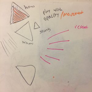
I started this project by thinking about how I could make this clock visually interesting. I found that lowering the opacity caused it to feel more blended and smooth, versus hard and rigid like the clocks we see in classrooms. In addition, I created a for() loop to cause thin triangles to cascade at the start of the program, and felt it was representative of the passage of time.

LookingOutwards-06-Chickoff

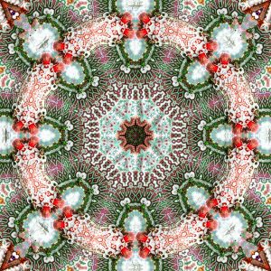
This is a video created by Jonathan McCabe, a generative artist and designer from Canberra, Australia. He creates these pieces by giving random values to pixels, usually between -1 and 1, and defines sets of rules that dictate how the pixels will respond to those around them and therefore morph to create these life-like, biological patterns.

OB_tile_0501 from McCabe’s Flickr

McCabe’s art touches on British mathematician Alan Turing who proposed that “naturally occurring patterns — things like the spots and stripes on animal fur — could arise from a random state of cells.” In addition, the states of these cells would also affect the neighboring cells, and create a domino effect, just as the pixels in McCabe’s work are part of a much bigger network and affect one another. Art like this fits into the realm of aleatoricism, which is “the incorporation of chance into the process of creation, especially the creation of art or media.”

I am really fascinated by the idea of letting art define itself and leaving things up to chance rather than controlling something to the point that it suffers and creativity is suffocated. In my own experience, I’ve sometimes felt the need to make my art “perfect.” However, I soon realized that the mistakes I made in the process of art-making were very interesting, and it became more enjoyable to embrace the imperfections than force the work to be something it’s not.

Project-05-Chickoff

sketch

//Cora Hickoff
//Section D
//chickoff@andrew.cmu.edu
//Project-05

function setup() {
    createCanvas(600, 400);
    noStroke();
}
 
function draw() {
    background(136, 179, 130);
    drawGrid();
    noLoop(); 
}
function drawGrid() {
  for (var y = 0; y < height + 50; y += 100) {
        for (var x = 0; x < width + 100; x += 100) {
            fill(y*5/8, x*.9/2, x*1/3, 220);
            //body
            ellipse(x, y, 100, 200);
        }
    }
     for (var y = 0; y < height + 50; y += 100) {
        for (var x = 0; x < width + 10; x += 100) {
            fill(y, 100, 100);
            //mouth
            ellipse(x, y+50, 20, 10);
        }
    }
      for (var y = 0; y < height + 50; y += 100) {
        for (var x = 0; x < width + 2; x += 100) {
            fill(80, 70, 75);
            //left eye
            ellipse(x-15, y+13, 10, 10, 100);
            //left mole
            fill(0);
            ellipse(x-23, y+18, 1.5, 1.5, 100);
            //right eye
            fill(75);
            ellipse(x+20, y+30, 10, 10, 100);
            //right mole
            fill(0);
            ellipse(x+25, y+40, 1.5, 1.5, 90);
        }
    }

    noLoop();
}

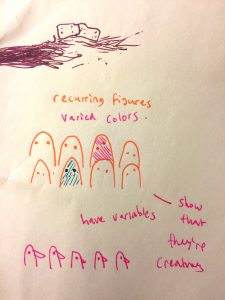
When I started this project, I knew I wanted to make some kind of creature and have it duplicated in a way that made it look like they were in a crowd. I started by doing a quick sketch of these faces and then went from there, trying to make it a fun project. 🙂

LookingOutwards-05-Chickoff

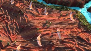
Warde “Home Is A Quest” DIRECTOR’S CUT is an animated commercial made by Leo Burnett for Warde, which is “the biggest reseller of fabrics in the middle east and Africa” and is known world-wide for these designs.

Warde “Home Is A Quest” Still

While I really love the animation itself, I felt that the music and narration weakened the video and made it feel gimmicky and cheesy. Even if it was the producer’s intention to have the video be light and upbeat, it felt overdone. The soundtrack that is chosen for a video is incredibly important and can easily change the mood. This choice can make or break a project.

“That’s when we know we arrived: home,” is what I think the most powerful line of this commercial because of the image it’s paired with: baby birds in their nest being fed by their mother. Unfortunately, this scene ended as quickly as it appeared. I wish it lasted longer because the concept of home and comfort seems to be the main theme of this commercial, but it ended so quickly and was not able to have as much of an impact.

Still, I really love how the landscapes of the animation look like soft fabrics. The rolling hills and even the rocks are comforting despite being in the wilderness.

Project-04-chickoff

sketch

//Cora Hickoff
//Section D 
//chickoff@andrew.cmu.edu
//Project-04

function setup() {

    createCanvas(400, 300);
    background(240, 200, 200);

}

function draw() {

    //light blue strings
    stroke(180, 200, 220);
    strokeWeight(4);
    for (var x1 = 0; x1<=300; x1+=10) {
    curve(100, 100, 100+x1, 100+x1, 30+x1, 150, 200, 200);
}

    //red strings
    stroke(250, 80, 90);
    for (var y1 = 5; y1<=215; y1+=5) {
    curve (150, 15, 50+y1, 500+y1, 10+y1, 12, 50, 70);
}

    //bottom white strings
    stroke(255);
    for (var x2 = 30; x2<= 300; x2+=9) {
    curve (20, 20, 30+x2, 40+x2, 10-x2, 300, 40, 50);
}
    //pink lines
    stroke(220, 150, 189);
    for (var x2 = 30; x2<= 300; x2+=9) {
    line (0, 12+x2, 250+x2, 10+x2);
}

}

When I first started this project, I found that the thin lines and curves felt too harsh, so I added a line of code that made the stroke weight heavier and therefore make the drawing softer.

In addition, I realized that by deleting the code, “noFill();” the black in the drawing appeared and created a faded, 3D effect, which was interesting to have in a flat drawing.

Pictured below is what the drawing looks like when “noFill();” is added to the code.

LookingOutwards-04-Chickoff

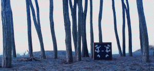
This is Ambient Synthesis, a sculpture which emits sounds of varying frequencies according to its light stimuli. It was created by Amanda Ghassaei in 2012 who graduated from Pomona College with a BA in Physics and Minor in Chemistry.

All of the sculpture’s data is interpreted by a MaxMSP application which uses the Max visual programming language to connect an object to virtual patch cords to create sound. What I find most interesting about this project is that it gives the environment and light around the sculpture a voice. This is contrary of videos of landscapes that are coupled with music that may not reflect the actual state of the animals and nature being filmed.

I’m very curious about what other factors of an environment, besides light, could be used to create sound. It would be interesting to see a sculpture respond to natural disasters, temperature, or the amount of movement around it…what if a specific sound were emitted if a creature were within a certain range of the sculpture? The sculpture would then be notifying you of something that maybe you can’t detect with your eyes, unlike light. It would then serve as a guardian, informing you of how large the animal is that’s approaching, and perhaps let you know whether it is a threat.

Project-03

sketch

//Cora Hickoff
//Section D 
//chickoff@andrew.cmu.edu
//Project-03

function setup() {
    createCanvas(640, 480);
    rectMode(CENTER);
    frameRate(10);
}

function draw() {

    //mouseX controls the degrees
    var deg = mouseX;
    var rad = radians(deg);

    background(144,180,180);
    //make background change color
    //when mouse midway point of canvas width
    if (mouseX > (width / 2)) {
        background (232,180,180);
    }

    //small gold circle
    fill(255, 214, 169);
    noStroke();
    //restrict mouseX to 0-135
    var m = max(min(mouseX, 40), 135);
    var size = m * 120.0 / 400.0;
    ellipse(10 + m * 190.0 / 400.0, 200.0, size, size);

    //white circle
    fill(255);
    noStroke();
    //restrict mouseX to 0-400
    var m = max(min(mouseX, 400), 35);
    var size = m * 120.0 / 300.0;
    ellipse(10 + m * 190.0 / 400.0, 200.0, size, size);

    //big gold circle
    fill(255, 214, 169);
    noStroke();
    //restrict mouseX to 0-335
    //mouseX, 920 causes mouseX 
    //to control bid golden circle
    //once white circle overlaps
    var m = max(min(mouseX, 920), 335);
    var size = m * 120.0 / 400.0;
    ellipse(10 + m * 190.0 / 400.0, 200.0, size, size);

    //peach square
    fill(240,140,130);
    //as mouseX moves across
    //canvas, its degrees determine
    //the square's rotation
    rotate(rad);
    rect(300 + m * 190.0 / 400.0, 200.0, size, size);

}

In this project, I wanted to make a shape rotate based on the mouse’s x coordinates. By adding the other ellipses, I realized that the end result made them all look like planets in a solar system and the rectangle looked as though it were orbiting them.

Looking Outwards-03-Section D

99 Failures Pavilion

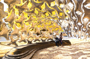
This is the 99 Failures Pavilion, a temporary pavilion which was named in support of the idea that failure is beneficial to knowledge and success. It was created by Architecture graduate students and design professionals at the Digital Fabrication Lab at the University of Tokyo in November of 2013.

Many structural models were tested in order to find the right geometry that would allow this flat, stainless steel to become sturdy in its 3D form.  The stainless steel sheets were then welded together and formed to mimic pillows. I find it fascinating that even steel can appear as soft as it does in this project. It looks weightless and balloon-like.

Another element that I believe has helped this pavilion’s success is the golden tree behind it. Since it’s autumn, the structure seems more like a shelter for the cold days to come, and makes the steel more comforting. This ability to transform a material is what I appreciate most about this work. Architecture should not only be about functionality, but also about creating spaces with feeling.