creyes1-LookingOutwards-07

Back in 2016, design firm CLEVER°FRANKE and fashion brand Byborre collaborated with Red Bull on their “RedBull Playrooms” event in order to track and visualize various datapoints in a club setting. Wearing bracelets designed by Byborre that monitored clubgoers’ movement, temperature, and excitement, visualizations of that data were generated using Processing and the Adobe Creative Suite in order to create both live animations that were projected on screens throughout the night, as well as a personalized printed “Flight of the Night,” which showed how a particular clubgoer spent their night – which rooms they frequented, which songs got them the most excited, and so on.

What I found interesting about this project was that clubgoers were receiving feedback as to how the night was going in real time, which is both interesting for the partygoer, and helpful in understanding what about an event is the most engaging and effective, allowing for better planning and overall better experiences. While it’s fun to see this in a recreational club setting, I’m curious to see what would come from applying the same technology and visualization practices to other settings, and if that data could be used to improve those spaces and experiences.

More work by CLEVER°FRANKE can be found on Behance or on their website.

yunzhous-LookingOutward-07

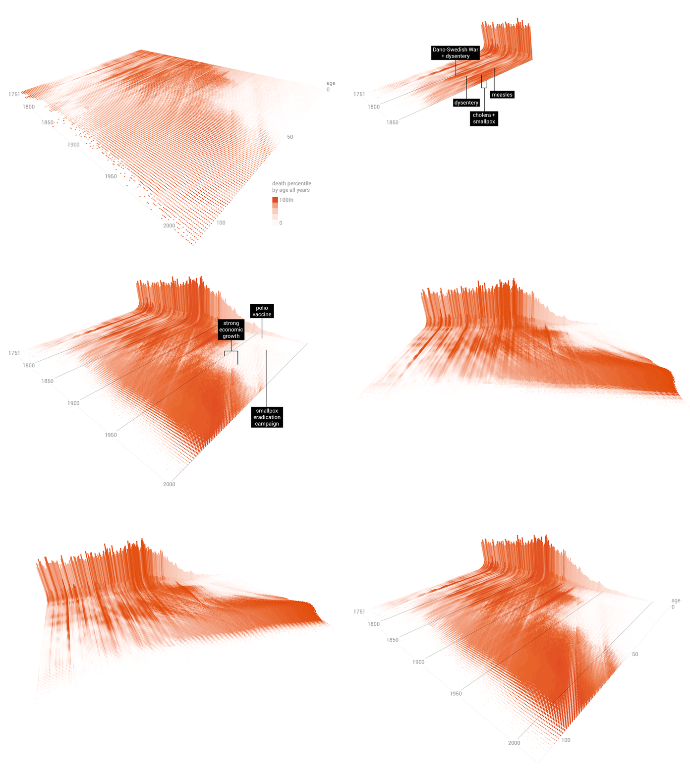
Swedish Morality

Swedish Morality


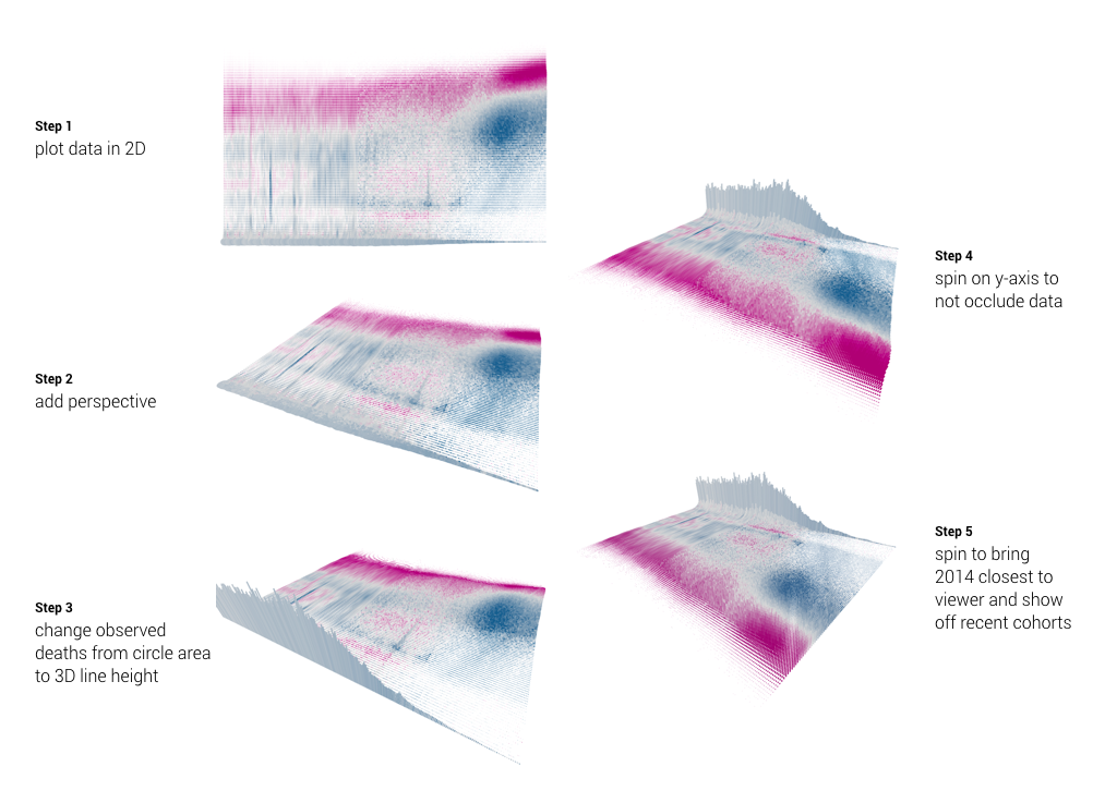
The is a project done by Skye Moret in 2017 to visualize 264 years of Swedish mortality. This is a unconventional yet visually pleasing and intuitionistic diagram. I particularity appreciate two aspects of it: it uses not only the conventional x, y axis, but also incorporate z-axis to make the chart 3D. Also, the visualization is not only a still image, but a motion that rotates the perspective, and shows the timeline step by step. With computers we can explore many ways to demonstrate and convey data. Moret’s choice of color, gradient, and the shadow effect, all demonstrate her artistic sensibility.

The software Moret used is  Processing—a free and “flexible software sketchbook and language for learning how to code within the context of visual arts.” It has amazing mapping data to visual attributes that allow users to change aspects such as opacity, color, and perspective.

You can read more here

ghou-lookingoutwards-07

This week I will be looking at Rachel Binx and exploring the way she graphically represent data. She is also the author of MeshuManyMapsCliffs&Coasts, and Gifpop. Binx is currently working with the Content Science and Algorithms team in Los Angeles in Netflix.

Many of the projects she has led and produced before creatively interprets and represent data. Such as NASAJPL Vortex, Mapzen Metro Extracts, New York Times Internal Dashboard, Harvard Library Haystacks, Healthy Los Angeles, and many others.

For example, the Harvard Library Haystacks displays items in the Harvard Library by categories.

This is a graphical representation of the categories in the library displaying them in shapes and colours so it is easier to interpret.

The NASAJPL Vortex is a project that Rachel Binx lead including project and visual design and then later management.

This project, for example, is built in React and d3.js.

rgroves – Looking Outwards-07

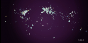
History of the World in 100 Seconds is a video by Gareth Lloyd and Tom Martin that uses data from 14,238 Wikipedia Articles. They pulled out every geotagged article and every reference to an event and cross referenced them to find every events with a corresponding location. In the video, a dot appears corresponding to all 14,238 events chronologically and according to location. At the end, the dots start appearing more and more rapidly like fireworks, and a recognizable map of the world as we know it materializes. The dots also start to resemble how cities look from above as they become more and more clustered. I admire this project both because of how they represented the information graphically, but also for the sheer volume of data they were able to analyze and represent.


https://vimeo.com/19088241

kyungak-lookingoutwards-07

(Simon Russell, Audio Geometry: Circles Within Circles, 2016)

Simon Russell is an artist that explores the relationship between sound and shape. He utilizes the program “Houdini” to create and earn audio files produced by collusions of f-curves. Most sounds are created through 3D geometric shapes, and their heights differentiate the pitch of the sounds. After sounds are created in Houdini, they are then exported to Cinema 4D. Additional geometric shapes are rendered afterwards to create visuals that go with the sounds. This project is fascinating because the sound files and the geometric shapes are original. The sound comes from randomly colliding set of geometric shapes, and the sound in return produces a new representing set of geometric shapes. The give and take relationship of these factors seemed very new and interesting to me. The visuals were also very aesthetically pleasing, which is also a plus in terms of artistic sensibilities.

Jihee Kim (Section D)– LookingOutwards-07

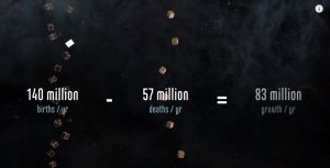
The Shadow Peace is a short film that presents the effects of nuclear war. Neil Halloran, one of the most brilliant data visualizers in the world created this video using custom software to quantify the consequences of nuclear war, as the possibility of it happening has been constantly increasing especially with tension building up between the US and North Korea. He compares trends like casualties in wars and bombing in the past with his software and depict them through visual elements.

scene from the short film that demonstrates data and its visualization

It is fascinating how Halloran communicates data through his short films so effectively. A lot of it has to do with the visually enticing elements of the video that are made possible by simple geometries that represent data, comparison (in this case Hiroshima bomb attack, etc.) and narration. More specifically, elements such as bar charts are thoughtfully used and placed (on timelines, globes, etc.) so that the viewers could put information and data into context. His approaches to data visualization show his focus on bestowing relevance to data sets that could have no meaning to some people.

Halloran certainly touches people’s senses through his data visualization so that global matters/issues like war do not feel so distant and irrelevant to people. He allows us to hear and see data -data that connects the people to the world through visualization.

For more information on The Shadow Peace, visit:
The Shadow Peace
An interview with the creator on the project can be found here:
The Shadow Peace Interview

eeryan-LookingOutwards-07

I find data visualization to be an interesting intersection between programming and graphic design/art as the better it is executed, the more likely people are to try to absorb the information given.

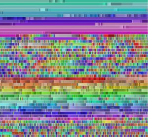
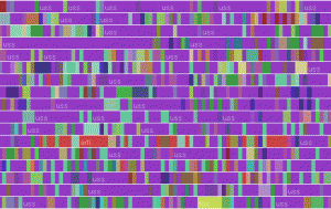
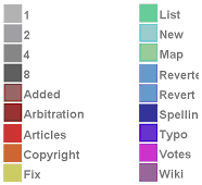
I chose to look at Fernanda Viegas’ chromogram, a data visualization piece that tracks what Wikipedia users (editors, not readers) search for. The algorithm tracks the first three letters of Wikipedia searches, and assigns a color to the string, resulting in a series of lines of blocked color that allows viewers to pick out repeated trends in editor activity.

The above photo is an example of this, tracking the searches of a single editor who focused on naval centric articles. The purple is the string “USS”.

Link to the project

sntong-LookingOutwards-07

Nicholas Rougeux is a self-taught digital artists who wanted to visualize and provide a new way music can be read, thus creating the project Off the Staff. With the help of some scripting by Peter Jonas from MuseScore that helped Nicholas to efficiently and accurately create the animation using the program NodeBox. His creative way of interpreting and reading music has introduced a new way for people to appreciate music and demonstrate its complexity, although in a very abstract way, to those who do not have a music background.

keuchuka looking outwards 07

This “Chromogram” made in 2007 by Fernanda Viégas and Martin Wattenberg investigates how participants in Wikipedia allocate their time. The visualization technique can display very long textual sequences through a color coding scheme. The first 3 letters of a string determine the color in the Chromogram. The fist letter determines the hue, the second the saturation, and the third the brightness. Numbers become shades of gray. This system seems arbitrary but reveals some subtle patterns in Wikipedia editing. Wikipedians tend to engage in systematic activities by preserving a sustained related sequence of edits. Some editors concentrate on particular topic areas – which reveals a relatively constant color throughout the Chromogram. In other cases, users have completing a task that spans a variety of Wikipedia articles, such as categorizing and alphabetizing. This shows up as various colors or rainbows on the Chromogram. Chromogram reveals an organized systematic activities that help us understand the self-allocation of effort in Wikipedia.

jwchou-LookingOutwards-07

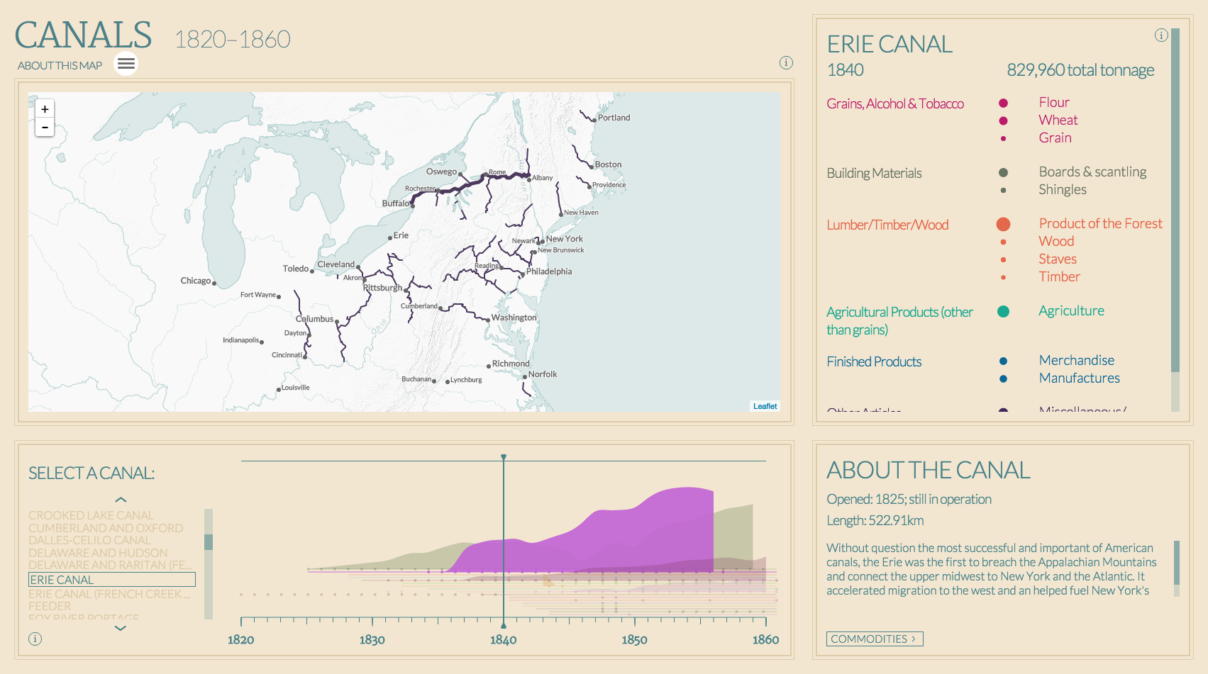
Project: American Panorama by Stamen Inc.

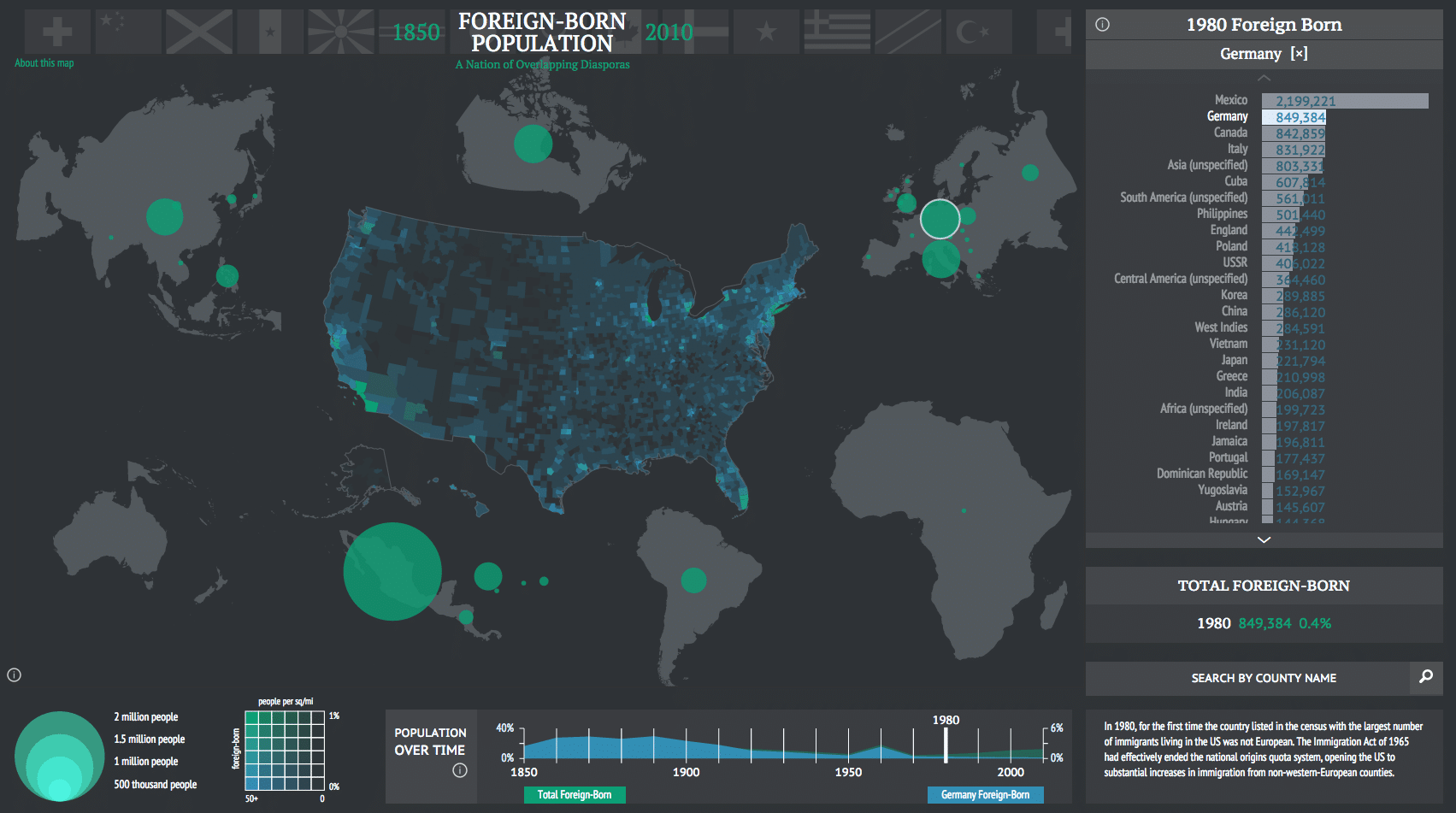
A map by Stamen showing foreign-born populations in the USA using data. Each country is shown proportionally by size.

Stamen is a company that specializes in very unique and data-centered visualizations. Many of their projects are based on geography/mapping.

For one of their projects in collaboration with Mellon Foundation, Stamen created a suite of software tools that generate maps! They used their software to make maps that portrayed a diverse set of data about America, such as physical objects (canals and trails) and statistics such as foreign-born populations in America. The creators’ artistic sensibilities are portrayed in the different aesthetic choices of the maps, such as color, layout, type choice, etc… (graphic design).

I really admire how they made the software accessible on GitHub for anyone to use/explore, which shows that they realize how data visualization can be a powerful tool for education.

American Canals

These maps were a collaborative effort with the Digital Scholarship Lab. They analyzed and compiled many data sets, and Stamen used their software to visualize it.