jknip-Project-07-curves

sketch

/*Jessica Nip
Section A
jknip@andrew.cmu.edu
Project-07
*/

 //-------------------------
function setup() {
    createCanvas(480,480);
}
 
 //-------------------------
function draw() {
    background(80);

//draw hypotrochoid curve
//define parametric variables, map and constrain mouseX and Y 
    var h = map(mouseY, 0, height/4, height/2, height/4);
    var a = constrain(mouseX, 0, width/4);
    var b = 5;

//set visual variables
    stroke(255,165,175);
    fill(255,165,175);

//set up for loop to consider all 360 degrees
    for (var t = 0; t < 360; t++) {
        //convert parametric equation of curve
        var x = width/2 +((a-b)*cos(radians(t)))+h*cos(((a-b)/b)*(radians(t)));
        var y = height/2 + ((a-b)*sin(radians(t)))-h*sin(((a-b)/b)*(radians(t)));
        //create tiny ellipses that repeat parametrically and create interactive collage
        ellipse(x, y, 1, 1);
    }  
}


Inspired by the hypotrochoid, I enjoyed looking at its ‘drawing’ mechanism that considers a smaller circle rolling around the inside of a bigger circle and the form of curves it draws. I wanted to recreate it through fireworks-inspired specks, that form both typical geometric forms (e.g. circle) and its exploded perspectives — I also wanted this relationship to be mapped with the movement of mouseX and mouseY, which I have mapped and constrained to smaller sections of the canvas. The aesthetics of the project was also inspired by this minimalist ‘flicker’ of the supposedly ‘specks’  of the form, so I used two colors that drew a distinct contrast.

yushano_Looking Outwards 07


Amsterdam SMS by Aaron Koblin for MIT Senseable City Lab, 2012

This work is a visualization for SMS messages in Amsterdam. It is interactive using the realtime data provided by KPN Mobile. They algorithm he Koblin used is Processing and OpenGL.
OpenGL is a cross-platform programming interface that majorly used for rendering 2D and 3D vectors. One of its wide use is scientific visualization, which is shown perfectly here in this project. I personally like this project a lot because it visualizes a scientific research in a more aesthetic form. The research itself it is also meaningful. The idea of collecting the message data on New Year’s Eve shows the wide use of technology in this modern society. People rely more on communication through digital devices now. The representation of the building is interesting and aesthetic that I like it a lot.
This project is very inspiring in the way that it visualizes the useful message in a clear and artistic way. I think this method will be useful for me to do architecture research. The information visualization can help represent a lot like the site condition, the people’s access to the buildling or around and so on. It plays a very important part in architecture that I think it is very good for me to learn this skill.

Aaron Koblin

sntong-LookingOutwards-07

Nicholas Rougeux is a self-taught digital artists who wanted to visualize and provide a new way music can be read, thus creating the project Off the Staff. With the help of some scripting by Peter Jonas from MuseScore that helped Nicholas to efficiently and accurately create the animation using the program NodeBox. His creative way of interpreting and reading music has introduced a new way for people to appreciate music and demonstrate its complexity, although in a very abstract way, to those who do not have a music background.

keuchuka looking outwards 07

This “Chromogram” made in 2007 by Fernanda Viégas and Martin Wattenberg investigates how participants in Wikipedia allocate their time. The visualization technique can display very long textual sequences through a color coding scheme. The first 3 letters of a string determine the color in the Chromogram. The fist letter determines the hue, the second the saturation, and the third the brightness. Numbers become shades of gray. This system seems arbitrary but reveals some subtle patterns in Wikipedia editing. Wikipedians tend to engage in systematic activities by preserving a sustained related sequence of edits. Some editors concentrate on particular topic areas – which reveals a relatively constant color throughout the Chromogram. In other cases, users have completing a task that spans a variety of Wikipedia articles, such as categorizing and alphabetizing. This shows up as various colors or rainbows on the Chromogram. Chromogram reveals an organized systematic activities that help us understand the self-allocation of effort in Wikipedia.

jknip-SectionA-LookingOutwards-07

“Digg Rings” by Chris Harrison (2007-2008)

Between 2007 and 2008, Harrison grabbed the top 10 most dugg stories every day and rendered tree-ring-like visualizations based on the data. I really admire how each tree-ring created such different visual illusions and how certain colors/data categories are more prominent across each day of the week — Harrison describes that these variations occur as rings are cumulative. Randomness is unlikely to be found within this project, as the artist visualizes these rings based on real data. There may be some flaws in the algorithm as he notices that some days have fewer than 10 top stories, which is unusual. Harrison’s artistic sensibilities can be found in his choice of color palette, along with scale and presentation of the final rings. Each coded ring creates such different visual perspective depending on the scale it is shown.

http://www.chrisharrison.net/index.php/Visualizations/DiggRings

mmiller5-Looking Outwards-07


Google News results by year appear in the physical bar graph, Centograph

Centograph is a dynamic physical bar graph made by Tinker in 2009.  Users type a keyword into a desktop computer connected to Centograph which then searches the Google News Archives for the number of times that word was used in articles since 1909.  Centograph then displays word usage by raising physical bars representing 10 year spans, giving a physical representation of the data.  Centograph is a permanent installation at St. Paul’s School for Boys, which is part of why I think it’s so cool — it’s made specifically for an educational setting.  By turning data from something esoteric into something tangible and cool, it helps to incite a level of interest in the areas of computation and data visualization, especially in students.

mjeong1-Looking Outwards-07-sectionA

“Smart Citizen Sentiment Dashboard Sao Paulo” by  Moritz Behrens. The installation is displayed on the media façade of the Galeria de Arte Digital.

Citizen Feedback to Visual Language

The project called Smart Citizen Sentiment Dashboard (SCSD) is an interactive media installation that translate set of data from the citizens into visual language. The screen is divided into three low resolution LED façades which are connected to the main computer through VGA connection. Data sets are collected through a number of workshops in which the artists invited citizens from Sao Paulo with different social and economic background.

The visualization of the data set is generated through RFID technology, facilitating on the ubiquitous Bilhete Unico travel card. The purpose of this project was to utilize this smart technology not only for travel purpose and allow citizens to express their opinion in the technology mediated urban realm.

Moritz Behrens succeeded not only in effectively translating the collected data into visual language but also in chose what kind of data they wanted to translate. Their decision to hear opinions from citizens deserves admiration since they newly opened a window for Sao Paulo’s citizens to have chance to express their feelings to public.


Link to Moritz Behrens

HaeWanPark-LookingOutwards-6

Random Number Multiples by Marius Watz and Jer Thorp

Computer generated or software based art is usually played in a digital interface not executed in traditional craft or handwork. However, this ‘Random Number Multiple’ series are computer generated but screen-printed work. There are few series in ‘Random Number Multiple’. What I personally like is the ‘Arc’ series. Marius Watz described this series as “pseudo-random compositions of radial shapes, subtly distorted by a 3D surface that lends the image a strong focal point and sense of movement.” Actually, pseudo-randomness is not a real randomness. This randomness generated by a definite computer program to satisfy a statistical test. Even if it seems random but the composition of this series is actually generated by mathematical processes. I really admire this project because it combines traditional hand-craft method and software- or computer-based method together. I think it expands more possible ways of executing art expression.

The ‘Arc’ Series
The ‘Arc’ Series
The ‘Arc’ Series – Process of Screen Printing

Random Number Multiple Series


hschung-LookingOutwards-06

When I read that the topic was “randomness,” I instantly thought of Pisarro’s paintings that use pointillism. Although he placed every dot of paint in each pointillism painting, they weren’t calculated to their own rigid, specific positions. The placement of those dots are also random to an extent, because when people “randomly” generate things, it is not wholly random. So then I wondered about computer-generated “fine art” and I came across a project called “Grow Your Own Picture” by Chris Cummins, that generates the Mona Lisa painting using polygons of different shapes and colors, which can be manipulated by the website user. Chris gives credit for the idea of genetic algorithms to Roger Johansson, who was able to regenerate the painting using polygons of different colors, transparencies, and shapes. I was really intrigued that he was able to take so many sharp shapes and blend them to mimic the original painting so convincingly. I have also never heard of the term genetic programming or genetic algorithms before. It was so interesting to hear about programming that generates a “gene pool” of shapes and then does its best to sift out the “most fit” shapes to the Mona Lisa image. Cummin’s and Johansson’s approaches to this replication of fine art vary in level of randomness, in that with Cummin’s project, someone can interact with it and manipulate the content, so it has more opportunities to be different or random. They are also random in a similar sense, in the code that generates the art.

Chris Cummin’s interactive Grow Your Own Picture https://chriscummins.cc/s/genetics/#

Roger Johansson’s Mona Lisa replication via code

Genetic Programming: Evolution of Mona Lisa

hschung-Project-06

sketch

//Heidi Chung
//Section A
//hschung@andrew.cmu.edu
//Project-06

var prevSec;
var millisRolloverTime;

function setup() {
    createCanvas(400, 400);
    millisRolloverTime = 0;
    angleMode(DEGREES);
}

function draw() {
    background(43, 58, 71);
    var H = hour(); // moon sinks down the sky
    var M = minute(); // tail moves to the right
    var S = second(); //cat's drool drips down
 
    if (prevSec != S) {
        millisRolloverTime = millis();
    }
    prevSec = S;
    var mils = floor(millis() - millisRolloverTime);
    var hourMoon   = map(H, 0, 24, 0, height);
    var minuteTail = map(M, 0, 59, 0, height);
    var secondsWithFraction = S + (mils / 1000.0);
    var secondsDroolChunky = map(S, 0, 59, 253, height);

// MOON
    noStroke(); //moon and its little craters
    
    fill(234, 232, 150); //moon's glowing rings of light
    ellipse(300, hourMoon, 120, 120);
    fill(212, 214, 150, 95);
    ellipse(300, hourMoon, 220, 220);
    fill(234, 239, 175, 90);
    ellipse(300, hourMoon, 350, 350);
    fill(175, 175, 113, 70);
    ellipse(300, hourMoon, 550, 550);

    fill(255);
    ellipse(300, hourMoon, 80, 80);//moon
    fill(230, 230, 230);
    ellipse(317, hourMoon, 30, 30);//crater
    fill(230, 230, 230, 90);
    ellipse(290, hourMoon, 20, 20); //crater
    fill(80, 40);
    ellipse(300, hourMoon - 25, 10, 10);//crater
    fill(230, 230, 230, 90);
    ellipse(320, hourMoon - 20, 15, 15);//crater
    fill(230, 230, 230);
    ellipse(305, hourMoon + 30, 15, 10);//crater

// HILL
    push();
    fill(70, 100, 90);
    stroke(40, 94, 60);
    ellipse(width/2 -50, height, 800, 200);
    pop();
    fill(127, 160, 112, 99);
    ellipse(width/2 -50, height -5, 700, 180);

// BODY
    push();
    noFill(); //tail arc
    stroke(153, 125, 125);
    strokeWeight(30);
    arc(width/2 -30, height/2 + 75, minuteTail +50, 250,  -10, 120); //350, 250 = ellipse dimensions for tail
    pop();

    fill(153, 125, 125); //cat body
    ellipse(width/3 - 20, height/2 + 150, 170, 200);

    fill(181, 158, 151); //cat belly highlight
    ellipse(width/3 - 10, height/2 +150, 130, 150);

//FISH
    push();
    fill(110, 140, 151); //fish body
    stroke(127, 156, 167);
    strokeWeight(3);
    ellipse(width/3 -100, height/2 +180, 400, 120);
    pop();

    push();
    stroke(40, 58, 72);
    strokeWeight(4);
    line(143, 360, 173, 368); //fish eye
    line(151, 377, 168, 356); //fish eye
    strokeWeight(2);
    line(197, 387, 222, 391); //fish mouth
    strokeWeight(1);
    line(213, 377, 212, 372); //fish left nostril
    line(220, 377, 220, 373); //fish right nostril
    pop();
    push();
    fill(87, 115, 135); //fish's fin
    ellipse(width/3 - 50, height/2 +180, 90, 45);

    stroke(110, 140, 151, 99);
    strokeWeight(5);
    line(31, 371, 129, 370); //fin stripes thick and transparent
    line(32, 382, 129, 380);
    line(32, 393, 129, 390);
    pop();
    fill(110, 140, 151); //fish's fin eclipse
    ellipse(width/3 - 10, height/2 +180, 45, 55);

// EARS
	var earX = width/2 - 100;
    var earY = height/2 - 80;

    fill(200, 170, 170); // both ears
    //triangle(earX +10, earY+20, earX -35, earY+30, earX - 20, earY-20); //left ear
    //triangle(186, 171, 146, 138, 208, 128); //right ear
    //plotted right ear parts in Illustrator and used the info to get the points


    beginShape(); //left ear squishy
    curveVertex(earX +10, earY+20);
    curveVertex(earX -35, earY+30);
    curveVertex(earX - 20, earY-20);
    curveVertex(earX +10, earY+20);
    curveVertex(earX -35, earY+30);
    endShape();

    beginShape(); //right ear squishy
    curveVertex(186, 171);
    curveVertex(146, 138);
    curveVertex(208, 128);
    curveVertex(186, 171);
    curveVertex(146, 138);
    endShape();

    fill(255, 200, 200); // ear insides
    triangle(178, 167, 152, 145, 195, 138); //left inside ear
    triangle(100, 141, 72, 153, 82, 116); //right inside ear

// FACE
    noStroke();
    fill(220, 220, 200); //cat face
    ellipse(120, height/2, 155, 140);

    fill(200, 170, 170); //left eye spot
    ellipse(width/2 - 110, height/2, 70, 60);

    fill(100); //eyes         
    ellipse(width/2 - 100, height/2 + 10, 20, 15); //left eye
    ellipse(width/2 - 40, height/2, 20, 15); //right eye

    strokeWeight(2);
    fill(255, 150, 150); //nose
    ellipse(width/2 -65, height/2 + 10, 10, 8);
    
    var mBottomY = height/2 + 40; //base y position of bottom corners of mouth
    var mouthX = width/2 -50;
    fill(255, 180, 180); //mouth
    //triangle(mouthX, mBottomY -5, mouthX -30, mBottomY, mouthX -15, mBottomY - 20);

    push();
    stroke(255, 169, 163);
    strokeWeight(2);
    beginShape(); //mouth squishy
    curveVertex(mouthX, mBottomY -5);
    curveVertex(mouthX -30, mBottomY);
    curveVertex(mouthX -15, mBottomY -20);
    curveVertex(mouthX, mBottomY -5);
    curveVertex(mouthX -30, mBottomY);
    endShape();
    pop();

// DROOL
    fill(155, 187, 201);//bit of drool on cat's mouth
    ellipse(width/2 - 50, 235, 10, 10) 
    fill(195, 229, 244);//highlight for drool on mouth for more noticeablility
    ellipse(width/2 - 48, 232, 5, 5) 
    fill(155, 187, 201);//the cat's dripping drool from its mouth
    ellipse(width/2 - 50, secondsDroolChunky, 10, 40);
    fill(195, 229, 244); //dripping drool highlight
    ellipse(width/2 - 48, secondsDroolChunky-4, 5, 25);
}

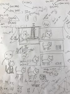
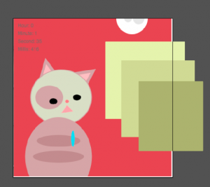
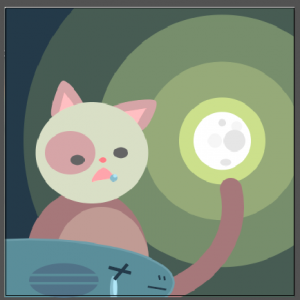
Like my last project, I started off by doodling whatever came to mind. I doodled a cat, and then I added it drooling, and then I got the idea to have it drooling while looking at fish. At first I thought I’d have the cat’s drool drop by the second, the tail move by the minute, and a pile of fish grow with each passing hour. I did end up matching the drool to seconds and the tail to minutes, but I made a glowing moon sink down the sky for the passing hours.

I had fun trying to make this abstract clock cute and whimsical, but it took me a long time to understand what I needed to code and how to execute it. I popped a few screenshots of my project into Illustrator to help plot some points for triangles- like the ears and mouth. This was also my first time using curveVertex, and I also played with transparency. I feel like my code could have made use of for loops, but I wasn’t sure where to insert them. In the end, I was finally able to make it cute enough for my tastes.

(Also, when the cat’s drool gets close enough to the fish’s eye, it looks as though the fish is crying. This was intentional.)