dnam-Looking Outwards-07

Ross Spiral Curriculm

Looking at computational information visualisation, I looked at Santiago Ortiz’s work, especially the Ross Spiral Curriculum. The graphics showcase the development of the human consciousness. The different colors represent the different aspects in how our brains developed. For example, orange discuss an important evolution in the human mind’s ability to understand the visual arts, whereas navy blue discuss human’s scientific development. The part of the art that really grabbed my attention was not only the beautiful aesthetics that interact with the user’s mouse, but also the clean UI graphics that allowed me to fully understand how to use the tool in a few seconds. You can check out Santiago Ortiz’s spiral here.

atraylor – Looking Outwards 07 – Section B

A still from the real-time animation.

When looking for works to write about at the beginning of the semester, I stumbled upon this project, A Selfless Society by the RAT.systems team at Queen Mary University of London, which visualizes data from a naked mole-rat colony.  The real time data is taken from the movement of the colony and rendered in an audio-visual animation. The project doesn’t experiment on the naked mole-rats and is purely for observation. The mole-rats have implanted passive integrated transponders that are sensed around the burrow to gather data on their movement and speed which is then used in the animation. The data gathered is being used to understand mole-rat social structure and is being put to other scientific uses. I find this project interesting because it integrates ecology, technology and art. The final result makes you wonder what each key animation means in relation to the actual happenings in the burrow.

Looking outwards-07

Data visualization is an important part of understanding complex systems because it allows for an intuitive understanding of complex systems. Data is not the answer to problems, but pulling a well informed understanding from data can help experts decide the state and needs of the system. The Tweet Bursts project from Senseable City @mit used public tweets to understand events. Data is valuable because it’s inherently crowdsourced. As natural language processing develops, computational understanding of events can be understood and communicated in realtime. Realtime access to events around the world can help leaders (hopefully) make good decisions.

http://senseable.mit.edu/tweetbursts/

Matthew Erlebacher

Video on the work of No Ceilings

Video on the work of Connected China

To be completely honest, it was somewhat hard for me to find interest in this looking outward report. This probably isn’t what you wanted me to write about, but I simply don’t find it very interesting. However, one program that was able to engage me was Fathom by Ben Fry. In particular, I enjoyed looking at the No Ceilings video which showcased statistics on how women’s rights have progressed over the years. They had statistics on things such as teenage pregnancy, child brides, and female entrepreneurship. I also found the Connected China video to be somewhat interesting. The website offered a look into the inner workings of the Chinese government, and a large amount of information on their leaders. As for the algorithms they used, likely had to create a lot of computer graphics. In addition, it seems like they had to program a large amount of mouse interactions. These helped the website feel more alive, as well as make for an incredibly intuitive experience.

http://www.noceilings.org/

http://china.fathom.info/

Matthew Erlebacher Project-07

Curve Pattern

// Matthew Erlebacher
// Section B
// merlebac@andrew.cmu.edu
// Project-07

function setup() {
    createCanvas(480, 480);
}

function draw() {
    background(125);

    var angR = map(mouseX, 0, 6.28318, 0, width);
    // Controls the rotation of the points
    var stem = map(mouseY, 0, 10, 0, height);
    // Determines the amount of stems
    
    push();
    translate(width/2, height/2);
    beginShape();
    for (var ang = 0; ang <= 6.28318; ang += 0.001) {
        var radius = 200 * cos(stem * ang);
        // Sets the radius
        var flowerX = radius * cos(ang);
        var flowerY = radius * sin(ang);
        // I found the equation from Dan Shiffman and decided to crank it up to 11
        // https://www.youtube.com/watch?v=f5QBExMNB1I

        strokeWeight(5);
        rotate(angR);
        point(flowerX, flowerY);
        // This creates points which create a flower pattern I used points instead of vertex because vertex looked unappealing
    }
    endShape(CLOSE);
    pop();
}

I am really glad with how this project turned out. At first I was pretty overwhelmed by the code and equations. However, after I watched Dan Shiffman’s video “Coding Challenge #55: Mathematical Rose Patterns” I had a much better understanding of the assignment. I decided that my two aspects of variability would be the amount of stems in the flower, and the rotation. I started out using vertex, but decided to change it to point since it had a much smoother look. I also wanted to make it so that it could rotate as much as possible, and have a massive amount of stems. I opted out of using color because I thought that it gave the image a more simplistic look.

Project-07

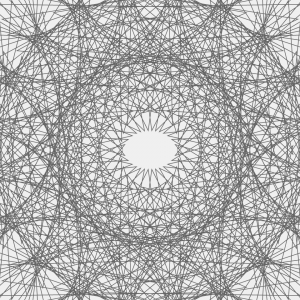
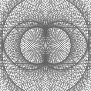
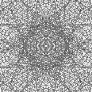
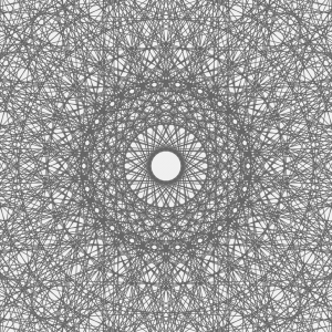
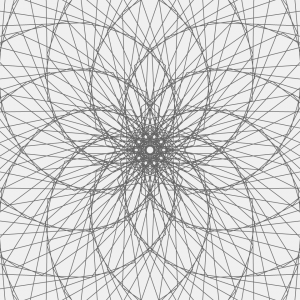
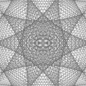
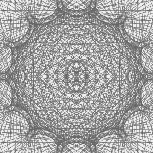
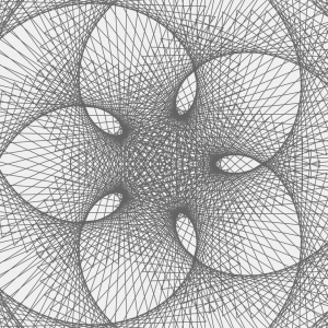
This project is an exploration of connecting two shapes through variables. My main focus was to create points along the outside of the curves, like the examples, and pass those positions to another shape as start/end points. My favorite part of this assignment was taking two existing functions, and implementing them together in one program. Some errors I encountered were duplicate variables, miscommunication of variable between functions, and misaligned positioning of drawn shapes.

sketch

//Ty Van de Zande
//ctv@andrew.cmu.edu
//Project-07
//Section B


//Most of this code was repurposed from the examples provided
//by Professor Dannenberg. Additions were made to explore 
//curves, helper functions, and passing variables.

var friz = [];
var frizy = [];
var frizX = [];
var frizyY = [];

function setup() {
    createCanvas(480, 480);
    frameRate(10);
}

function draw() {
    background(255, 200, 200); //I additionally love this pink
    fill(255, 255, 255, 64);
    var nPoints = mouseX/10;
    var radius = 50;
    var separation = 125;
    drawShape(nPoints, radius, separation);
    drawEpitrochoidCurve(nPoints);
    yoyo(nPoints, separation);

}

function drawShape(nPoints, radius, separation){  // draw the circle normally
    push();
    translate(1*separation, height / 2);
    beginShape();
    for (var i = 0; i < nPoints; i++) {
        var theta = map(i, 0, nPoints, 0, TWO_PI);
        var px = radius * cos(theta);
        var py = radius * sin(theta);
        vertex(px,py); 
        ellipse(px, py, 3,3);
        friz[i] = px;
        frizy[i] = py;
    }
    endShape(CLOSE);
    pop();  
}

//--------------------------------------------------
function drawEpitrochoidCurve(nPoints) {
    // Epicycloid:
    // http://mathworld.wolfram.com/Epicycloid.html
    
    var x;
    var y;
    
    var a = 80.0;
    var b = a / 2.0;
    var h = constrain(mouseY / 8.0, 0, b);
    var ph = mouseX / 50.0;
    
    fill(255, 200, 200);
    beginShape();
    for (var i = 0; i < nPoints; i++) {
        var t = map(i, 0, nPoints, 0, TWO_PI);
        
        x = (a + b) * cos(t) - h * cos(ph + t * (a + b) / b);
        y = (a + b) * sin(t) - h * sin(ph + t * (a + b) / b);
        vertex(x+height/2, y+width/2);
        frizX[i] = x;
        frizyY[i] = y;
        
        
    }
    endShape(CLOSE);
    
}

function yoyo(nPoints, separation) {
    var w = width/2;
    for(var i = 0; i < nPoints; i++) {
        line(friz[i]+separation, frizy[i]+w, frizX[i]+w, frizyY[i]+w);
    }
    
}

rsp1-LookingOutwards-07

Calligraffiti

https://creators.vice.com/en_us/article/nz57wz/activists-are-projecting-digital-calligraffiti-onto-walls-in-berlin

Calligraffiti is an art form combining traditional calligraphy with graffiti. In yet another unlikely symbiosis, calligraffitos are now fusing it with new media to render “digital calligraffiti,” which is projected onto the sides of structures. Worked on by refugees, the medium is a part of a community project organized by Public Art Lab. The main idea with this project is to transform the “urban screens” such as subways and building exteriors into communication platforms for immigrants. A lot of these pieces convey messages such as  “love not war,” “art is love,” and “no violence.”

From this project, I appreciate how new media art is now also being used as a new platform to raise awareness of social injustice or unnecessary violence. Instead of being just a static installation that lives in a museum, Calligraffiti can be seen in the simplest of neighborhoods and the everyday lives of the citizens who live nearby these pieces.

calligraffiti in action
the board where people can create their artwork
This man’s calligraffiti is being projected onto the wall right in front of him as he creates the calligraphy

rsp1-Project-07-Curves

sketch

/*Rachel Park
rsp1@andrew.cmu.edu
Section B @ 10:30AM
Project 07: Composition with Curves*/


function setup() {
  createCanvas(480, 480);
}

function draw() {
  background(240);
  translate (width/2,height/2);
  noStroke();
  stroke(100);
  noFill();
  drawHypotrocloid();
}

function drawHypotrocloid() {;

    //initializing the x and y variables
    var x;
    var y;

    //setting the variables for the hypotrocloid equation
    var a = 200;
    var h = map(mouseX, 0,width, 0, 480);
    var b = a/map(mouseY, 0, height, 0, 480);

    //drawing the hypotrocloid
    beginShape();
        for (var i = 0; i < 550; i++) {

            var angle = map(i, 0, 550, 0, TWO_PI);

            var x = (a - b) * cos(angle) + h * cos (((a - b)/b)*angle);
            var y = (a - b) * sin(angle) - h * sin (((a - b)/b)*angle);

            vertex(x, y);

        }
    endShape();
}

For this project I decided to use the hypotrocloid.

Like the screencaps of my code below, I found that I could generate very interesting shapes and patterns just from the one type of curve, and had fun moving around the mouse to try out different configurations.


These screencaps of my code above represent the patterns generated as the mouse if moved from the left to the right side of the canvas.

These following screencaps represent the patterns generated as the mouse is moved from the top to the bottom of the canvas.


mjanco – section B -LookingOutwards07


http://www.wordcount.org/

http://number27.org/wordcount

I chose to look at Jonathan Harris’s piece Wordcount, from 2003. It is a visualization of humans’ frequency of use of certain words. I really thought the concept was quite simple, but what made me begin to admire it more was when I read this section of Harris’s description: “The intention is for the user to feel embedded in the language, sifting through words like an archaeologist through sand, awaiting the unexpected find.” I realized that this was not just a list of data, but a clean visualization that users could explore and make connections within. I found my own curiosity growing as I wanted to discover the ranking of specific words. I love that the clean interface and simple concept leaves room for discovery. Since the project is very linear, I can assume that conditional statements were used to have the font size decrease as the ranking increased, from left to right. They also would need to be used to make the font fill change for every other word, alternating from black to gray. Wordcount was probably done similarly to the bar graph assignment. On his biography, it says that Harris is “exploring the ways in which humans use technology to shape their experience of life.” I feel that his fascination with human use of technology, but also of overall systems, is what inspired this piece, as language is a system that we have created (just like technology). This was a simple but effective piece for him to visually see patterns and relationships within human word use.


kyungak-project-07-curves

sketch

//Kyunga Ko
//15104B
//kyungak@andrew.cmu.edu
//Project 07

var cenX;
var cenY;
var numO = 100;
var dis = 100;

function setup() {
    createCanvas(480, 480);
    cenX = (width / 2);
    cenY = (height / 2);
}

function draw() {
    background(0);

    for (var i = 0; i < numO; i++) {

        //constraining mouseX range + mouseX changes size of posX & posY
        var m = map(mouseX,0,480,0,100); 
        var control = (m+10);

        //framerate changes according to mouseY
        var frame = (frameCount*i)/mouseY;

        //position X + circular movement
        var posX = cenX + control * cos(radians(30 * i + frame)); 

        //position Y + circular movement
        var posY = cenY + control * sin(radians(30 * i + frame));

        //for loop of ellipses
        strokeWeight(1);
        noFill();
        stroke(255,255,255,100);
        ellipse(posX,posX,posY,posY); 

    }

}

For this project, I wanted to make a series of translucent ellipses that continuously rotated. I wanted this continuous rotation to illusion the individual objects to be seen as a whole. Although the result didn’t yield a perfectly symmetric object to the traditional X and Y line, it is still partly symmetric to the y=x line. When the mouseX moves across the canvas, the object gets bigger. When mouseY moves, the frame rate changes. The result turned out to be much more fascinating than I thought. It was a last minute decision to give a variation to frameCount, and I am very glad I did it. The aesthetics were very satisfying. Although figuring out the sin and cosine rules were a bit challenging, I feel like I learned a lot by completing this project.