abradbur – Project-07 – Curves

icantbelieveit’snotHS

function setup() {
    createCanvas(480, 480);
}

function draw() {
    background(56, 136, 249);
    stroke(66, 229, 253);
    strokeWeight(5);
    noFill();

    //shaky box
    rect(width/2 - random(118,120), height/2 - random(118,120),
    random(238,240), random(235,240));

    //draw the hypcocylcoids
    push();
    translate(width/2, height/2);
    drawHypocyclo();
    drawCyclo2();
    pop();

}

function drawHypocyclo(){ //hypocycloid
    var x;
    var y;
    //big radius
    var a = map(mouseX, 0, 480, 50 *.01 * mouseX, 25 * .01 * mouseX);
    //lil radius
    var b = map(mouseY, 0, 480, 1 * .01 * mouseY, 10 * .01 * mouseY);
    var r; //angle

    beginShape();
    stroke(255);
    strokeWeight(1);
    for (var r = 0; r < TWO_PI * 10; r += 0.01){
        x = (a - b) * cos(r) - b * cos(((a-b)/(b))* r);
        y = (a - b) * sin(r) + b * sin(((a-b)/(b))* r);
        vertex(x,y);
    }
    endShape();

}

function drawCyclo2(){
    var a = map(mouseX, 0, 480, 50 *.01 * mouseX, 80 * .01 * mouseX); 
    var b = map(mouseY, 0, 480, 10 * .01 * mouseY, 90 * .01 * mouseY); 
    
    beginShape();
    stroke(66, 229, 253);
    strokeWeight(3);
    for (var r = 0; r < TWO_PI * 50; r += 0.01){
        x = (a - b) * cos(r) - b * cos(((a-b)/(b))* r);
        y = (a - b) * sin(r) + b * sin(((a-b)/(b))* r);
        vertex(x,y);
    }
    endShape();
}


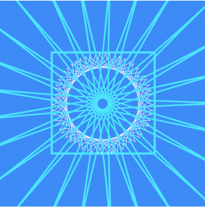
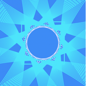
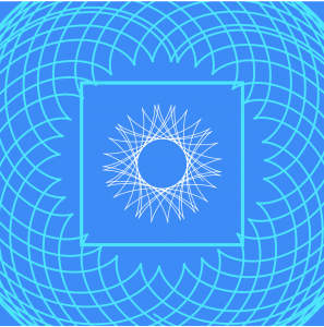
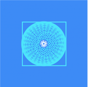
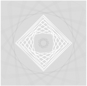
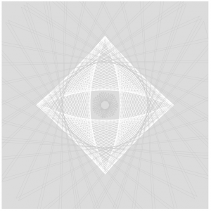
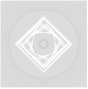
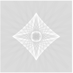
I had a surprising amount of fun with this project once I was able to figure out the math and which variables to apply to which mouse function. It was also a good opportunity for me to finally figure out how the map(); function works, which I really shouldn’t have saved for until now.

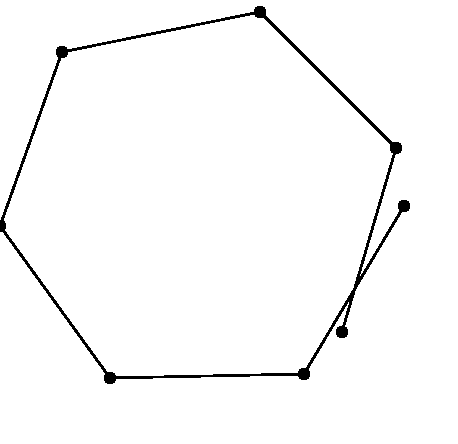
While I was playing around on the Mathworld website (wow) I found myself in love with the Hypocycloid and all the different patterns you could get out of it, so I drew two of them. I added the shaky box as a sort of center piece, and I like how it acts as a containment unit for the inner curve.

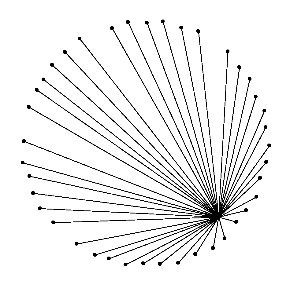
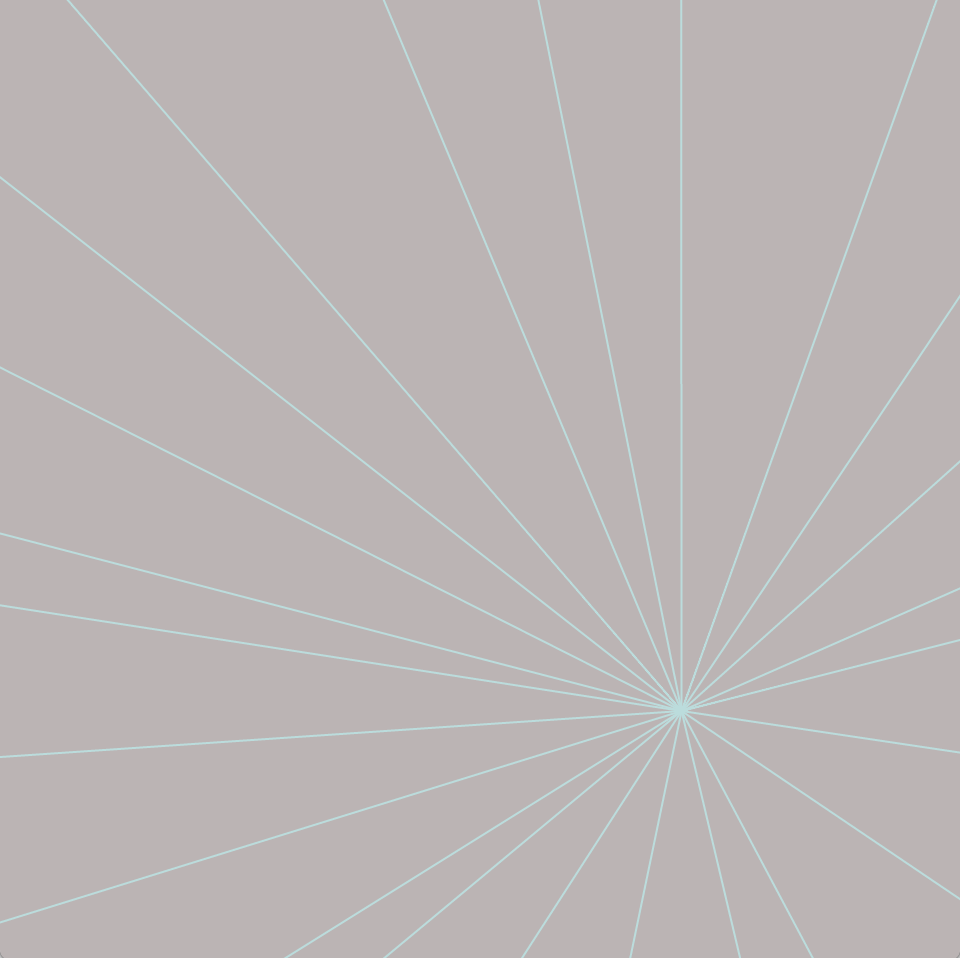
Here are a couple of states that I really enjoyed from my project.

Outward Explosion
Contained Star
Framed
Planet Box

Bettina-Project07-Curves-SectionC

sketch

// Bettina Chou
// yuchienc@andrew.cmu.edu
// Section C
// Project 07 Curves

bgCol = {"r": 200, "g": 180, "b": 180}; //background color
col = {"r": 200, "g": 220, "b": 220}; //color of dots and lines


function setup() {
    createCanvas(480,480);
}

function draw() {
    var nPoints = map(mouseX, 50, width, 1, 40, true); //varies the number of points 1 to 40
    var t = map(mouseY,0,height, 10, 400); //varies size of astroid
    var w = map(mouseY, 0, height, -100, 120); //moves center of lines left and right
    bgCol.r = map(mouseY,0,height,50,200);
    col.r = map(mouseY,0,height,50,200);
    background(bgCol.r, bgCol.g, bgCol.b);
    push();
    translate(240,235); //translate to center of canvas
    drawAstroidDots(nPoints, t, w);
    drawAstroidLines(nPoints, t, w);
    pop();
  
}

function drawAstroidDots(nPoints, t) {
    beginShape();
        for (var i = 0; i < nPoints; i++) {
            var x = t * cos(i)^3;
            var y = t * sin(i)^3;
            noStroke();
            fill(col.r, col.g, col.b);
            ellipse(x,y,5,5);
        }
    endShape();
}

function drawAstroidLines(nPoints, t, w) {
    beginShape();
        for (var i = 0; i < nPoints; i++) {
            var x = t * cos(i)^3;
            var y = t * sin(i)^3;
            if (nPoints > 1) {
                stroke(col.r, col.g, col.b);
                line(w,120,x,y); //draws lines from one center point to each dot
            }
        }
    endShape();
}

I approached this project without a visual concept as I was unfamiliar with the curves and unsure of mathematical capabilities. Instead, I found a curve that I liked, the astroid, and decided to get to know what each variable in the function does.

I soon learned of variables that affected size and number of points, and decided the astroid fit the concept of a “star burst” both in nomenclature and form.

I added interactivity with position, size, amount, and color. I was able to incorporate objects into adjust the color by adjusting the “red” variable in the RGB codes.

abradbur – Looking Outwards – 07

A Visualization of the wind currents in the U.S.

This is the Wind Map, created by Fernanda Viégas and Martin Wattenberg in 2012. It takes the current windspeed and direction of the wind currents in the U.S. in real time and presents them as whirling, organic lines. The denser the lines, the greater the windspeed. The data is pulled from the National Digital Forecast Database, and updates every hour. The simplicity of the design and the way it evokes the feeling of wind is incredible, as are the images this piece produces. Here is a screen capture of the map during Hurricane Isaac:

Hurricane Isaac

Here is the blog post.

And here is the live map.

ablackbu-Project-07-Composition with Curves

sketch

var points = 100;

var R = 200;
var G = 100;
var B = 100;

var depth = 3


function setup() {
    createCanvas(400, 400);
    background(0);
}


function draw() {

    //draw curves
    translate(width / 2, height / 2);
    rotate(mouseX/50);
    drawParabolaCurve();
    
    //decide color
    if(mouseX < width/2){
        R = 100;
        G = 100;
        B = 200;
    }else{
        R = 200;
        G = 100;
        B = 100;
    }
}   


function drawParabolaCurve() {
    // Parabola:
    // http://mathworld.wolfram.com/Parabola.html
    strokeWeight(0.1);
    stroke(R,G,B);
    noFill()
    
    //vertex points
    var x;
    var y;
    
    var a = 20;


    beginShape();
    for (var i = 0; i < points; i++) {
        var t = map(i, 0, points, 0, TWO_PI);
        
        //parabolic formula
        x = a * pow(t,depth) / a;
        y = 2 * a * t;
        vertex(x, y);
    }
    endShape(CLOSE);
    
}

For this project I really wanted to do/create something aesthetic. After looking through the algorithms and formulas, I found lots of them that were extremely complicated and hard to understand. I decided to go with something simple (a parabola) and influence it with both movement and color to make it look complex.

I created a formula that draws a more complex grid overtime you move your mouse. It creates a really interesting pattern and it makes the viewer want to make it more built up.

rfarn-project-07-curves

I started this project by simply creating basic curves. I started with the astroid curve.

However, I wasn’t inspired by this simple curve so I decided to explore some other curves. I came across the epitrochoid curve.

I decided to add a simple interaction, increasing the general radius as well as the loop sizes as the mouse moves from side to side. Then I added the astroid curve back on top as a little embellishment.

sketch

function setup() {
    createCanvas(480, 480);
}

function draw() {
    background(36, 7, 26);
    translate(width/2, height/2); //moves curves from (0,0) center to center of canvas
    epitrochoid(); //draws epitrochoid curve
    astroid(); //draws radial astroid curve

}

function epitrochoid() {
    var b = 5; 
    var h = (b * 4) + mouseX/4; //change as mouse moves from side to side
    var a = 30 + mouseX/3;

    fill(107, 77, 87);
    strokeWeight(2);
    stroke(221, 200, 196);
    beginShape();
    for(var t = 0; t < 2 * PI; t += PI/500){ //1000 points along circle
        var x = (a + b) * cos(t) - h * cos(((a + b)/b) * t); //x coordinate
        var y = (a + b) * sin(t) - h * sin(((a + b)/b) * t); //y coordinate
        vertex(x, y);
    }
    endShape(CLOSE);
}

function astroid() {
    var a = 25 + mouseX/2; //changes as mouse moves from side to side

    noFill();
    strokeWeight(10);
    stroke(107, 77, 87);
    beginShape();
    for(var t = 0; t < 2 * PI; t += PI/500){ //1000 points along circle
        var x = a * pow(cos(t), 3); //x coordinate
        var y = a * pow(sin(t), 3); //y coordinate
        vertex(x, y);
    }
    endShape(CLOSE);
}

ashleyc1-Section C-Project-07-Curves

sketch

//Ashley Chan
//Section C
//ashleyc1@andrew.cmu.edu
//Project-07-Curves

var width = 480;

function setup() {
    createCanvas(480, 480);

}

function draw() {

    background(220);

    drawAstroid();
    drawRanunculoid();

}

//first "shape"
function drawAstroid() {

    var x; 
    var y;
    var b = 40; 

    stroke(255);
    strokeWeight(.5);
    noFill(0);
    beginShape();

    push();
    translate(width/2, height/2);
        for(var i = 0; i < 500; i ++) {

            //llows for lots of different ways shape is being drawn
            var theta = map(i, 0, width, constrain(mouseX, 0, 480) + 600, TWO_PI);

            //astroid parametric formulas
            x = (3 * b * cos(theta)) + (b * cos(3* theta));
            y = (3 * b * sin(theta)) - (b * sin(3* theta));

            vertex(x, y);

            }
            endShape(CLOSE);
            pop();
}

//second "shape"
function drawRanunculoid() {

    var x;
    var y;
    var a = 5; //scales shape

    stroke(200);
    strokeWeight(.5);
    beginShape();
    translate(width/2, height/2);
        for(var i = 0; i < 75; i ++) {

            var theta = map(i, 0, width, 2 * constrain(mouseX, 0, 480) + 600, TWO_PI);

            //ranunculoid parametric formulas
            x = a * (6 * cos(theta)) + (cos(6* theta));
            y = a * (6 * sin(theta)) - (sin(6* theta));

            vertex(x, y);

        }

        endShape(CLOSE);

    //same shape but bigger and falls outside of astroid
    beginShape();
        for(var i = 0; i < 75; i ++) {

            var theta = map(i, 0, width, 2 * constrain(mouseX, 0, 480) + 600, TWO_PI);

            x = 50 * (6 * cos(theta)) + (cos(6* theta));
            y = 50 * (6 * sin(theta)) - (sin(6* theta));

            vertex(x, y);

            }

            endShape(CLOSE);
        
}

I had a lot of fun with this project. My process was just a lot of exploring the different functions via mathworld and playing around with which functions look nice with one another. It was a nice refresher to look at math formulas and think about how they corresponded with the visual compositions it was creating. I also spent a lot of time learning about map() and how to draw complex “shapes” using vertex(). I think there’s a lot of potential of using math as a way to create compelling and dynamic visuals.

Some Stills:

karinac-Project-07

karinac-project-07

//Karina Chiu
//Section C
//karinac@andrew.cmu.edu
//Project-07

//number of points drawn on hypocycloid
var nPoints = 500;

function setup() {
    createCanvas(400, 400);
}


function draw() {
    background(234,187,196);

    //rotation by mouseX
    var angle = mouseX/200;
    
    // draw the curve
    push();
    translate(width / 2, height / 2);
    rotate(angle);
    drawHypocycloidCurve();
    pop();
}

function drawHypocycloidCurve() {  
    var x;
    var y;
    var a = constrain(mouseX/5,0,width);
    
    fill(255);
    strokeWeight(3);
    stroke(150,46,63);

    beginShape();
    for (var i = 0; i < nPoints; i++) {
        var t = map(i, 0, nPoints, 0, TWO_PI);
        x = (1*a) * cos(t) + a * cos(7*t);
        y = (1*a) * sin(t) - a * sin(7*t);
        vertex(x,y);
    }
    endShape(CLOSE);
}

I started first by attempting to generate a simple astroid curve:  Image result for astroid curve

In doing so, while looking up formulas and trying to figure out what each variable in the equation affects, I found out that an astroid is part of a bigger group called hypocycloids, which is “a special plane curve generated by the trace of a fixed point on a small circle that rolls within a larger circle.”

https://en.wikipedia.org/wiki/Hypocycloid

After creating a simple astroid that expands and contracts with the movement of the mouse, I decided I wanted to experiment with the other variables to see what other shapes I could make. Following the logic of the curves, I ended up with the flower-like shape that you see above. To complete the project, I added a rotation to the expanding flower.

selinal-Looking-Outwards-07

Personal Knowledge Database by Moebio Labs (Santiago Ortiz)

http://intuitionanalytics.com/other/knowledgeDatabase/

Moebio Labs is a collaborative team of engineers, analysts, programmers, etc. which has swept through and encountered millions of pages on the internet. While they make most of their data visualizations about a specific topic or theme, their project Personal Knowledge Database acts as an archive for the research they have done throughout the ten years since they started making data visualizations. I admire how they use of old, “unseen” material and incorporate it as a main thematic element in another one of their projects. I think there is a significance in the metaphorical translation of the project’s concept to a visual, and the interactive and technical aspects are extremely impressive. One observation I have of the algorithm used is the separation of certain links/projects into nodes within other nodes, perhaps to indicate time period and area of research.

Image result for personal knowledge database santiagoImage result for personal knowledge database santiago

afukuda-Project07-Curves

afukuda-project-07

/* 
 * Name | Ai Fukuda 
 * Course Section | C 
 * Email | afukuda@andrew.cmu.edu
 * Project | 07
 */ 

function setup() {
  createCanvas(400, 400);
}

function draw() {
  background(193, 228, 221);
  translate(width/2, height/2);  // translating grid to center 

  drawSpirograph();
}

function drawSpirograph() {
    // Spirograph: 
    // http://mathworld.wolfram.com/Spirograph.html

    var nPoints = 1000;          
    noFill();
    stroke(140, 164, 212);

    var x;
    var y;
    var a = 200;    // fixed radius in which smaller circle (b) rolls around 
    var b = a/constrain(mouseY+10, 50, 350);  // smaller circle radius - making it interactive with mouseY 
    var h = constrain(mouseX+10, 50, 350);  // distance from center of interior circle in which spirograph is traced - mouseX

    beginShape();
        for (var i=0; i < nPoints; i++) {

            var t = map(i, 0, nPoints, 0, TWO_PI);

            x = (a + b) * cos(t) + h * cos((a-b) / b * t);
            y = (a + b) * sin(t) + h * sin((a-b) / b * t);
            vertex(x, y);
        }  
    endShape();

    
} 

My project is based on the Spirograph mathematical curve (link: http://mathworld.wolfram.com/Spirograph.html). Keeping one variable (a) constant, initially I was going to keep things simple by only using small integers (> 10) to create the geometry, but by incorporating mouseX and mouseY for the (b) and (h) variables (see link to see what these variables represent), the geometry became more intricate, more dynamic, and more kaleidoscope-like, which I was compelled by.

serinal – looking outwards 07 (section C)

Periscopic did a data visualization for “The Emotional Highs and Lows of Donald Trump” during the last Presidential election. I think that this was a really cool way to visually understand one aspect of the election. The Periscopic team used the Microsoft’s Cognitive API Service in order to sort through all the various stages of emotions as well as measure the frequency and intensity of each. There are 7 big categories of emotions and the team at Periscopic discovered that even thought the API could correctly and efficiently categorize and recognize these emotions, they sometimes lumped together things like “mocking” and “dominance” into the bigger categories.

On Periscopic’s site they state: “Our goal with this exploration was to test the API to determine if it could be a viable tool to lend additional data to projects that contain video. While we didn’t complete an exhaustive analysis, we do feel the API reveals valuable patterns that might otherwise be very time-consuming to obtain.” I think that for a company that does data visualization, it is really cool that they take time to do personal projects to explore new forms of data identification and analysis in order to use it in their later practices with different companies and corporations.

One of the many emotions identified
identifying emotions throughout different speeches

Read more about Periscopic’s Donald Trump project here