sunmink-LookingOutwards-07


Dear Data by, Georgia Lupi and Stefani Posavec http://www.dear-data.com/all/

Stefanie Posavec is a designer who works with data projects that are related to language, literature, or science. She uses data as a source visualize hand-crafted works. One of her most admirable work is “Dear Data”, which is a collection of postcards that includes data that shows something about two people’s personalities. This project began when Lupi and Posavec were curious if they could know each other by few colored pens marked on the postcards. By spending hours on each postcard they could make a detailed postcard that enables them to share their personalities. Lupi mainly encoded data in a way that presents different noises she heard in 32 weeks, and Posavec’s card was filled with brightly colored rectangles.

I was excited to see some of the postcards they made because I have not seen many data visualizations that use color encoding to represent certain emotions or condition. The algorithm generated in their work is human thoughts to programme and display data through visualization. After seeing many works based on mathematically generated algorithms, it was refreshing to understand the data through a different perspective.

katieche – looking outwards – 07

I chose the work of Nicolas Felton because I had found out about him back when I was in high school, and I thought everything he did at the time was just through adobe programs, not through computation or coding! His work is really fascinating as he essentially records every moment of his life for an entire year (every year), and then complies them into informational graphics for an annual report on each January 1st. He uses processing to create graphs and charts, and then exports them into Adobe InDesign to create his reports. He’s even created an app which sends users reminders to record data, and essentially collects, and categorizes the user’s everyday data.

feltron
article

katieche-project-07

katieche-07

/*
katie chen
katieche@andrew.cmu.edu
project 07
section E
*/

function setup() {
    createCanvas(480, 480);
}

function draw() {
    background(255, 210, 190);
    var mx = constrain(mouseX, 60, 450);

push();
beginShape();
    // points 
    var n1 = 400;
    // big circle radius
    var a1 = 100;
    // small circle radius
    var b1 = map(mx, 0, width, 0, 10);
    // distance from center of the interior circle to P (what draws the line)
    var h1 = map(mx, 0, width, 0, 300);

    noFill();
    stroke(255, 222, 221);
    strokeWeight (0.2);
    translate(width/2, height/2); //center the object
    for(var i = 0; i < n1; i++) {
        var t = map(i, 0, n1, 0, TWO_PI); 
        var x1 = (a1-b1)*cos(t) + h1*cos(t*(a1-b1)/b1)
        var y1 = (a1-b1)*sin(t) + h1*sin(t*(a1-b1)/b1)
        vertex(x1, y1);
endShape();
    }
pop();

push();
beginShape();
    // points
    var n = 400;
    // big circle radius
    var a = map(mouseY, 0, height, 0, 200);
    // small circle radius
    var b = 10;
    // distance from center of the interior circle to P (what draws the line)
    var h = map(mouseX, 0, width, 0, 200);
    noFill();
    stroke(255, 231, 226);
    strokeWeight (0.2);
    translate(width/2, height/2); //center the object
    for(var i = 0; i < n; i++) {
        var t = map(i, 0, n, 0, TWO_PI); 
        var x = (a-b)*cos(t) + h*cos(t*(a-b)/b)
        var y = (a-b)*sin(t) + h*sin(t*(a-b)/b)
        vertex(x, y);
endShape();
    }

pop();


}

I wanted to create 2 shapes, one that has less points and shows more of the shape being drawn, and one that’s super complicated. The pinker shape is more complicated so I constrained it before it jumbles into a solid donut shape.

The white line shape is what I like more since if you place your mouse near the center-left hand side of the canvas and move your mouse from the top to the bottom of the canvas, you can kind of see the spirograph being drawn. Moving your mouse from left to right makes the swirls bigger.

dchikows – Section C -Looking-Outwards – 07

Chris Harrison is an Assistant Professor of Human-Computer Interaction at Carnegie Mellon University. Harrison also directs the Future Interfaces Group which is a lab that creates novel computer interfaces and technologies that further a delightful human computer interaction. Harrison’s project called Digg Rings uses data from top news story outlets to create ring like images. The rings of each disk are composed of the ten top news stories that day relating to categories of the news. The disks are tree like in nature. As time goes on they get larger and larger and the rings grow based on the amount of views each story has. I enjoy this data visualization for news stories because of its similarity to how a tree grows in rings. Although, I think it would be interesting to see the project in different colors.

See more of Chris Harrison’s work

Key for data visualization
Up close of data visualization rings
Example of whole rings designated by days of the week

aranders-project-07

aranders-project-07

//Anna Anderson
//Section D
//aranders@andrew.cmu.edu
//project-07

var nPoints = 100;

function setup() {
  createCanvas(400, 400);
  frameRate(10);
}

function draw() {
  background(250, 250, 200);
  textSize(25);
  text("GOOD", width / 2 - 38, 40);
  text("LUCK", width / 2 - 33, 380);
  push();
  noStroke();
  translate(width / 2, height / 2);
  drawquadrifolium();
  pop();
}

function drawquadrifolium() {
  var x;
  var y;
  var r;
  var a = constrain(mouseX, 5, 230);

  fill(0, 153, 51);
  beginShape();
  for (var i = 0; i < nPoints; i++) {
    var t = map(i, 0, nPoints, 0, TWO_PI);
    r = a * sin(2 * t);
    x = r * cos(t);
    y = r * sin(t);
    vertex(x, y);
  }
  endShape(CLOSE);
}

I made this shape called a quadrifolium. I found it on the website which was given to us to look at curves. I knew what I wanted to do right when I saw it. It took me a while to get the hang of the different variables within the equation, but I ended up liking the project. The image is inspired by a four leaf clover for good luck. I could use some of that for the rest of this semester. Actually, for the rest of my life.

mecha-project07-curves

sketch

//maddy cha
//section e
//mecha@andrew.cmu.edu

var nPoints = 100;

function setup() {
    createCanvas(480,480);
}

function draw() {
    //background g value is increased with mouseX
    background(255,constrain(map(mouseX,0,width,0,255),210,240),200);   
    frame();
    //location of curve depends on mouse (but is constrained 60 pixels around center in x and y directions)
    translate(constrain(mouseX,width/2-30,width/2+30),constrain(mouseY,height/2-30,height/2+30));
    hypocycloid();
}

//draws outside black rectangle
function frame(){
    noFill();
    stroke(0);
    rect(0,0,width-1,height-1);
}

function hypocycloid(){
    var x;
    var y;
    var r;
    var a = map(mouseX,0,width,0,150);
    //increases amount of points on hypocycloid
    //makes it so that points are increasing by whole numbers
    var b = nf(map(mouseX,0,width,0,6),2,0);

    push();
    //rotates based on mouseX location
    rotate(mouseX);
    //opacity of shape is dependant on mouseX
    fill(256,256,256,map(mouseX,0,width,0,100));
    beginShape();
    for (var i = 0; i < nPoints; i++) {
        var t = map(i, 0, nPoints, 0, TWO_PI);
        
        x = (a/b)*((b-1)*cos(t)-cos((b-1)*t))
        y = (a/b)*((b-1)*sin(t)+sin((b-1)*t));
        //draws points at x and y values (with some randomness)
        //nPoints dictates how many points are drawn between lines
        vertex(x+random(-2,2), y+random(-2,2));
    }
    endShape(CLOSE);
    pop();
}

For this project, I started with creating a deltoid by implementing the formula into my code. Once I was able to understand how to do this, I wanted to expand my scope by looking at the overarching hypocycloid. I decided that I wanted my mouseX and mouseY interactions to increase the amount of cusps that would appear on my shape. In order to do this, I had to alter my original deltoid formula to take in a greater amount of variables.

Once I figured that out, I implemented more ways in which the user could interact with my code using their mouse. I relied on the constrain() and map() functions in order to make sure the shape stayed in the canvas. While mouseY was used to change the location of my shape, mouseX dictated the amount of cusps, the color of the background color, the size, fill opacity, and the rotation of the hypocycloid. Additionally I experimented with adding randomness so that my project would be more visually entertaining.

daphnel-Looking Outwards-07

Atlas of Emotions

In 2014, the concept of creating an Atlas of Emotion through data visualization was created. Dalai Lama and Dr. Paul Ekman were inspired by their conversations with each other to create this Atlas. The concept for this was to create a map that would guide emotional travels and try to help them find their state of calm. The 5 main emotions considered are Anger, Sadness, Fear, Disgust and Enjoyment. I find this project very interesting and reflective of the creators themselves because although the map looks fairly simple, there was a lot of data put into this piece of work and it is a lot more meaningful than a regular map. I admire how much detail they put into the meaning of this map. Each of the five continents of emotion contain states which can lead to actions, triggers, moods and so forth. This project aims to bridge together the gap between the academic and personal.

Bettina-LookingOutwards-07

Screenshot of a person interacting with the project, “We Feel Fine”. Find the project page here, and the site itself here.

This interactive site, We Feel Fine, was made in 2005 and searches the internet every 10 minutes for expressions of human emotion on blogs and then displays the results these dynamic representations. Not only is the result beautiful, but this piece also helps connect people around the world by seeing others who share similar feelings as we are right now. I’d imagine to implement this, one would need to parse content from sites (perhaps use API’s?) but perhaps the logic would be similar to the concept of strings, and searching through each word in a string and matching them to words in emotion dictionaries. There could also be work with the d3.js library which is made for data visualization.

I also admire how this digital piece was also turned into a print piece. As a designer, I am always searching for how we bridge the gap between print and digital mediums, and this system seems to have either piece suit the medium quite well: the digital piece serves to collect and display data in real time, where as the print piece memorializes moments and interesting findings.

hannahk2-Project-06

sketch

//Hannah Kim
//Section A
//hannahk2@andrew.cmu.edu
//Assignment-06-A

function setup() {
    createCanvas(550, 550);
    background(0);
}

function draw() {
	var H = hour();
    var M = minute();
    var S = second();

noStroke();
fill(200, 200, 250, 10);
//top hourglass
triangle(156, 98, 259, 257, 364, 98);
//bottom hourglass
triangle(156, 420, 259, 257, 364, 420);

//top sand
fill(255, 255, 250, 20)
triangle(216, 174, 258, 244, 304, 173);
//bottom sand
quad(198, 366, 170, 410, 350, 410, 319, 366);

//top sand circle
fill(0);
ellipse(260, 175, 86, 10);
//bottom sand circle
ellipse(259, 368, 120, 12);

//maps dot y coordinate and color based on second and day
var doty = map(S, 0, 59, 260, 368);
var dotcolor = map(H, 0, 23, 0, 255)

fill(0, 0, 255);
ellipse(259, doty, 2, 2);

}

I really enjoyed thinking of ways to show time in an abstract manner. I chose ultimately to create a representation of an abstract method of showing time, a stylized hour glass.

rgroves – Abstract Clock – section B

sketch


var quote = ["All", "time", "is", "all", "time.", "It", "does", "not", "change.",
"It", "does", "not", "lend", "itself", "to", "warnings", "or", "explanations.", "It", "simply", "is.", "Take", "it", "moment", 
"by", "moment,", "and", "you", "will", "find", "that", "we", "are", "all,", "as", "I've", "said", "before",
"bugs", "in", "amber."];

var letters = 360;


function setup() {
    createCanvas(400, 400);
}

function draw() {
    background(220, 170, 125);

	var H = hour();
    var M = minute();
    var S = second();

    
    //floor
    fill(162, 137, 118);
    quad(0, 250, width, 300, width, height, 0, height);
    strokeWeight(40);
    stroke(250, 180, 135);
    beginShape();
    curveVertex(0, 250);
    curveVertex(0, 250);
    curveVertex(width/3, 200);
    curveVertex(2 * width/3, 230);
    curveVertex(width, 300);
    curveVertex(width, 300);
    endShape();
    noStroke();
    

    //window
    fill(240, 190, 135);
    rect(width/3 - 14, 45, 50, 50);
    var time = H + M/60 + S/3600; 

    if (time <= 12) { //window gets light from midnight to noon
        var skyR = map(time, 0, 12, 35, 200);
        var skyG = map(time, 0, 12, 40, 220);
        var skyB = map(time, 0, 12, 70, 235);
        fill(skyR, skyG, skyB);
    }
    if (time >= 12) { //window gets darker from noon to midnight
    	var skyR = map(time, 12, 24, 200, 35);
    	var skyG = map(time, 12, 24, 220, 40);
    	var skyB = map(time, 12, 24, 235, 70);
    	fill(skyR, skyG, skyB);
    }
    rect(width/3 - 15, 45, 30, 30);

    //darkness filter - entire room gets darker from 19:00 to midnight and lighter from midnight to 7:00
    if (time <= 7) {
    	var a = map(time, 0, 7, 200, 0);
        fill(35, 40, 70, a);
    } else 
    if (time >= 19) {
    	var a = map(time, 19, 24, 0, 200);
        fill(35, 40, 70, a);
    } else {
    	var a = 0;
        fill(35, 40, 70, a);
    }
    rect(0, 0, width, height);

    //medallion
    stroke(50, 20, 50);
    strokeWeight(3);
    line(width/3 + 21, height/3 + 1, width/3 + 21, height/3 + 100);
    noStroke();
    fill(175, 110, 20);
    ellipse(width/3 + 20, height/3, 25, 25);
    fill(200, 155, 37);
    ellipse(width/3 + 21, height/3 + 1, 20.5, 20.5);
    fill(150, 50, 100);
    ellipse(width/3 + 21, height/3 + 1, 5, 5);
    for (i = 0; i < 10; i++) {
    	push();
    	translate(width/3 + 21, height/3 + 1);
    	var angle = map(i, 0, 10, 0, 2 * PI);
    	rotate(angle);
    	fill(255, 254, 208);
    	ellipse(0, 7, 2, 2);
    	pop();
    }

    //light from the medallion
    if (time <= 7) { //beam moves across the floor as the sun/moon move across the sky
    	var lightbeam = map(time, 0, 7, 200, 400);
    } else
    if (time >= 19) {
    	var lightbeam = map(time, 19, 24, 0, 200); 
    } else {
    	var lightbeam = map(time, 7, 19, 0, 400);
    }
    if (lightbeam < 200) { //beam becomes more concentrated at noon, midnight
    	var lightbeamwidth = map(lightbeam, 0, 200, 80, 20);
    } else {
    	var lightbeamwidth = map(lightbeam, 200, 400, 20, 80);
    }
    fill(230, 180, 80, 100);
    ellipse(lightbeam, letters, lightbeamwidth, 20);
    var whitelight = color(230, 240, 200, 40);
    var redlight = color(150, 50, 10, 60);
    var redlightheight = map(M, 0, 60, height/3 + 1, letters);
    var lines = 5000
    for(i = 0; i < lines; i++) { //amount of red in the light bean represents minutes in the hour
    	strokeWeight(.1);
    	var leftx = map(i, 0, lines, width/3 + 21, lightbeam - lightbeamwidth/2);
    	var rightx = map(i, 0, lines, width/3 + 21, lightbeam + lightbeamwidth/2);
    	var y = map(i, 0, lines, height/3 + 1, letters);
    	var amt = map(y, redlightheight, letters, 0, 1);
    	var fade = lerpColor(redlight, whitelight, amt);
    	if (y < redlightheight) {
    		stroke(redlight);
    	} else {
    		stroke(fade);
    	}
    	line(leftx, y, rightx, y);
    }

    //light from window
    fill(whitelight);
 	quad(width/3 - 15, 45, width/3 + 35, 45, lightbeam + (5 * lightbeamwidth), height, lightbeam - (5 * lightbeamwidth), height);

 	//words go across the page - quote loops every minute
 	var textspeed = map(S, 0, 60, 0, quote.length); //quote is fewer than 60 words, so have to convert
 	var textspeedinteger = textspeed - (textspeed%1);
 	var textspacing = map(textspeedinteger, 0, quote.length, 0, width - 25);
 	if (dist(textspacing, letters, lightbeam, letters - 5) < 5 * lightbeamwidth) {
 		fill(whitelight);
 	} else {
 		fill(155, 125, 110);
 	}
 	text(quote[textspeedinteger], textspacing, letters - 5, width, 50);

 	
}

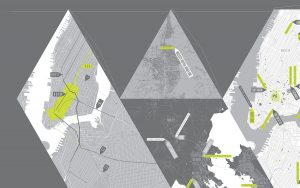
For this project I was inspired by the medallion in Indiana Jones that illuminates a point on a map at a certain time of day. The beam of light moves across the screen every 12 hours from 7am to 7pm and 7pm to 7am (as the sun and moon move across the sky) and fills with red every hour. The beam of light is also thinner in the middle of the picture (when the sunlight is most direct) and wider towards the edges. The quote at the bottom cycles every minute and the light through the window represents the time of day. The entire room also gets darker at night. It’s a random Kurt Vonnegut quote about time that I picked, I may think harder about what quote I really want and change it.