Alec Albright – Project 07 – Curves

sketch

// Alec Albright
// aalbrigh@andrew.cmu.edu
// Section B
// Project 07

var nPoints = 100; // number of points used to draw curves

function setup(){
    createCanvas(480, 480);
    angleMode(RADIANS);
}

function draw(){
    background("lightpink");

    // center the shapes
    push();
    translate(width / 2, height / 2);

    // draw all the shapes
    drawHippopede();
    drawEpicycloid();
    drawHypotrochoid();

    pop();
}

// draws Hippopede
function drawHippopede() {
    var x; // x coordinate of vertex
    var y; // y coordinate of vertex
    var r; // polar coordinate
    var a = mouseX / 2 // main parameter of the curve
    var b = map(a, 0, 480, 100, 240); // circle radius
    var rotation = map(mouseY, 0, 480, 0, TWO_PI); // amount of rotation

    // thickness of line proportional to the circle radius
    strokeWeight(b / 5);
    stroke("white");
    noFill();

    // rotate shape
    push();
    rotate(rotation);

    // start drawing the shape, one point at a time
    beginShape();
    for(var i = 0; i < nPoints; i++){
        var t = map(i, 0, nPoints, 0, TWO_PI);
        
        // find r (polar equation)
        r = sqrt(4 * b * (a - b * sinSq(t)));

        // convert to x and y coordinates
        x = r * cos(t);
        y = r * sin(t);

        // draw a point at x, y
        vertex(x, y);
    }
    endShape();
    pop();
}

// draws hypotrochoid
function drawHypotrochoid() {
    var x; // x coordinate of vertex
    var y; // y coordinate of vertex
    var a = map(mouseX, 0, 480, 50, 150); // radius of the interior circle
    var b = 3; // radius of the petals
    var h = mouseX / 10; // distance from center of interior circle
    var red = map((mouseX + mouseY) / 2, 0, 480, 0, 255); // how much red
    var blue = map(mouseY, 0, 480, 0, 255); // how much blue
    var alpha = map(mouseX, 0, 480, 50, 255); // how opaque
    var rotation = map(mouseY, 100, 300, 0, TWO_PI); // amount of rotation

    strokeWeight(2)
    stroke("white");

    // control color and opacity with mouse location
    fill(red, 0, blue, alpha);

    // control rotation with mouseY
    push();
    rotate(rotation);

    // create the shape itself
    beginShape();
    for(var i = 0; i < nPoints; i++) {
        var t = map(i, 0, nPoints, 0, TWO_PI);

        // use parametric euqations for hypotrochoid to find x and y
        x = (a - b) * cos(t) + h * cos((a - b) / b * t);
        y = (a - b) * sin(t) - h * sin((a - b) / b * t);

        // draw a point at x, y
        vertex(x, y)
    }
    endShape(CLOSE);
    pop();
}

// draws an epicycloid
function drawEpicycloid() {
    var x; // x coordinate of vertex
    var y; // y coordinate of vertex
    var a = map(mouseX, 0, 480, 50, 200); // radius of interior circle
    var b = map(mouseY, 0, 480, 10, 50); // radius of petals
    var blue = map((mouseX + mouseY) / 2, 0, 480, 0, 255); // how much blue
    var red = map(mouseY, 0, 480, 0, 255); // how much red
    var rotation = map(mouseY, 100, 300, 0, TWO_PI); // how muhc rotation

    // control color with mouse location
    strokeWeight(10)
    stroke(red, 0, blue);

    // control rotation with mouse location
    push();
    rotate(rotation);

    // start drawing shape
    beginShape();
    for(var i = 0; i < nPoints; i++) {
        var t = map(i, 0, nPoints, 0, TWO_PI);

        // find coordinates using epicycloid parametric equations
        x = (a + b) * cos(t) - b * cos((a + b) / b * t);
        y = (a + b) * sin(t) - b * sin((a + b) / b * t);

        // draw a point at x, y
        vertex(x, y);
    }
    endShape();
    pop();
}

// defines sin^2 using trigonometric identities
function sinSq(x) {
    return((1 - cos(2 * x)) / 2);
}

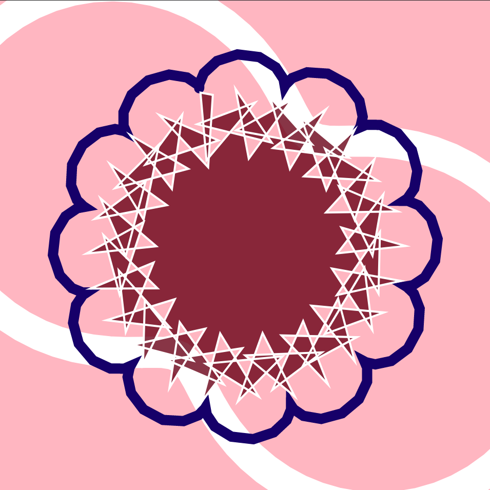
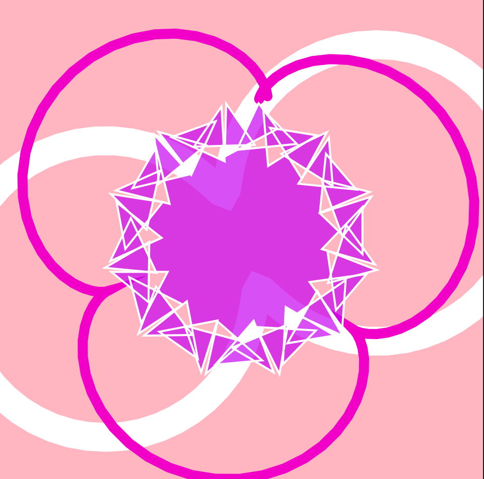
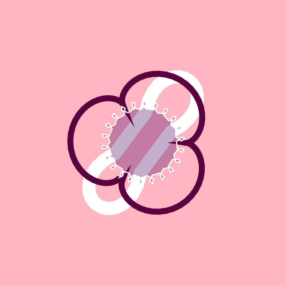
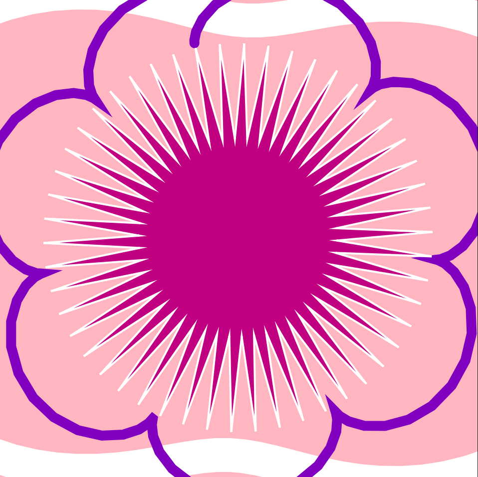
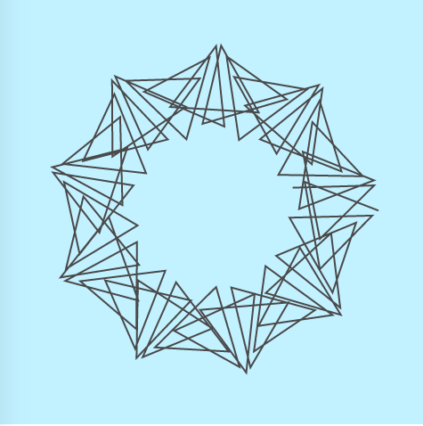
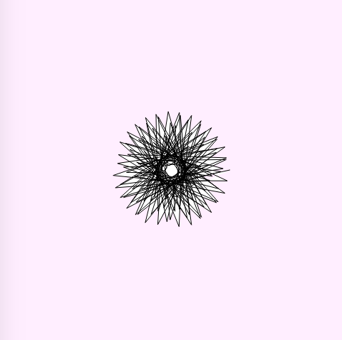
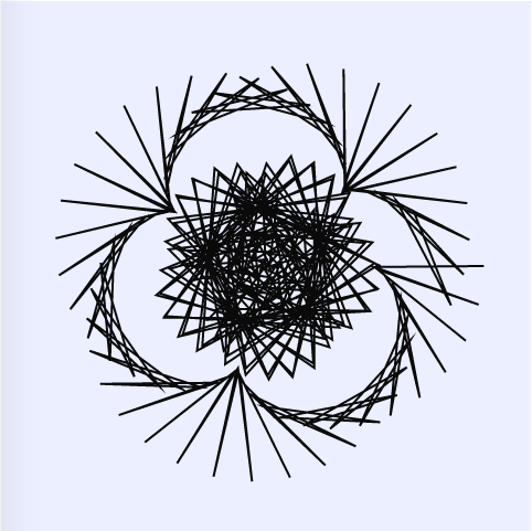
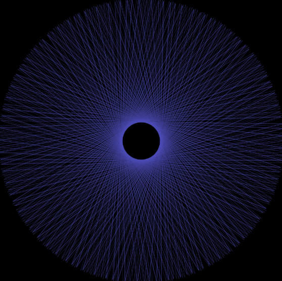
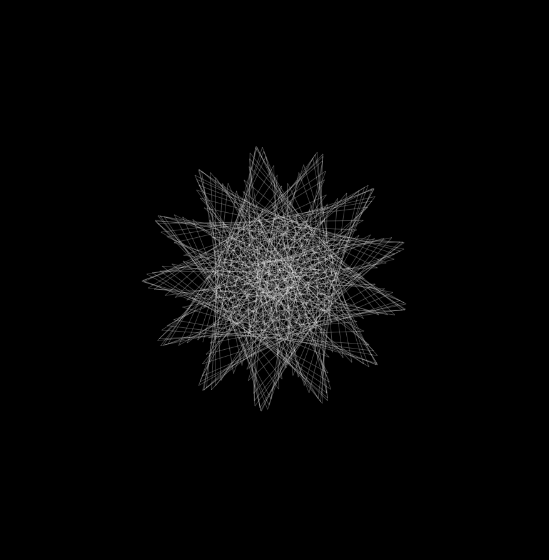
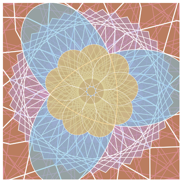
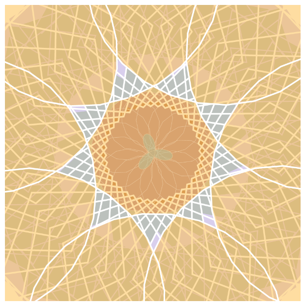
In order to put together this project, I started with a simple curve, the hippopede, and began to implement increasingly more complex ones. Once I was able to draw the three curves (hippopede, hypotrochoid, and epicycloid), I started mapping various features of the curves to things like color, transparency, stroke weight, and rotation until I was satisfied with the results. Particularly, the color mapping was interesting to me because I utilized the average of the mouseX and mouseY coordinates in order to determine some aspects of color like the amount of red in the hypotrochoid and the amount of blue in the epicycloid. This allowed me to have more freedom to speculate interesting relationships that could be created using the coordinate system.

mouseX = 400, mouseY = 50
mouseX = 240, mouseY = 400
mouseX = 50, mouseY = 200
mouseX = 480, mouseY = 240

Sewonp – PO – 07

sketch

//Sewon Park
//sewonp@andrew.cmu.edu
//Section B
//Project-07

function setup() {
    createCanvas(480, 480);
    		
}

function draw() {
	background(0,0,0);
	push();
	translate(width/2, height/2); //placing curve at center
	drawBicorn();
	pop();
}

function drawBicorn(){

	var x;
	var y;
	var w = map(mouseX,0,width,0,200); // changes length of the curve through mouse control
	var h = map(mouseY,0,height,0,200) // changes height of the curve through mouse control
	
	stroke(255,0,0);
	beginShape();
	for(var i = 0; i <200; i ++){
	var t = map (i, 0, 200, 0 ,200);
	x = (w*sin(t)); //x coordinate equation for Bicorn
	y = (h*sin(t)*cos(t)); //y coordinate equation for Bicorn
	vertex(x,y); // placing curve at center
	}
	endShape(CLOSE);

}

For this project, I was very conflicted about choosing the curve as I was not knowledge about the realm of mathematical graphs. Having only known parabolas and hyperbolas, I was surprised to see the myriad of curves on the reference website. Many of the curves seemed somewhat randomly drawn without specific symmetry or shape. As I appreciate symmetry, I decided to select the Bicorn curve. The curve represented a variety of objects such as a ribbon, the infinity sign, and a mask. I tried to develop an abstract visualization of Deadpool’s mask.

I also thought of Spiderman whilst making the project, prompting me to create a web like structure to assimilate spiderwebs when creating the mask.

The web-like structure of the curve outskirts.

Emma NM-LO-08

Dear Data

Giorgia Lupi is an information designer at Accurat (data-driven research, innovation, and design), based in New York and Milan. She works to create visual narratives that use data to connect it to what it is: knowledge, behaviors, people. Stefanie Posavec is a data designer from the UK. She tends to use hand-crafted methods to create non-traditional representations of data from language, literature, or scientific areas.

I really enjoyed how they collaborated together and learned new things about each other through data and drawings. I am also really interested in design, so for the dear data project cards to hold data, but in an interesting visual way was cool to me. I liked their thought process of how they created the data visualization.

They talk a lot about their thought process and how they were feeling/felt throughout it. They also mentioned their insights and a reflection of the project. To convey the project, they almost told it as if it were story, after all, postcards are short stories. I think it’s important to include insights and reflection/things you learned when sharing a project. It shows that the project was more than just “moving through the motions” and helps you understand what you’ve learned.

Sydney Salamy: Looking Outwards-07

Herald Harbinger is a piece created by Jer Thorp in 2018. The piece is a number of columns made up of bars of screens. These screens visualize both the human activity that occurs outside the plaza (ie: movements of people and of vehicles) and the real-time activity of the Bow Glacier located in the Canadian Rockies, and the glacier activity is made audible outside the plaza as well. These visualized data feeds are supposed to contrast with and show the relationship between each other (human activity vs. natural activity).


  • I admire how much effort is put into the project to get it to work. Not only did they have to go all the way to an iceberg to get the sounds, but instead of just getting a recording and leaving, they decided to set up their equipment so that the sound is collected in real time. I also like the idea of humans vs. nature. The way Thorp used moving lights to portray this relationship was interesting, and resulted in a pretty piece. I like their decision to play the sounds of the glacier outside the building. Since it’s an urban area, there isn’t much of a chance for interaction with nature, especially nature of this type, making the choice much more impactful and interesting.


  • I don’t know much about the algorithms that generated the work, but I assume it’s relatively complicated. The algorithms would need to be able to convert the information they are receiving from the two very separate areas into lights to be portrayed on the screens. I’m not sure if specific sounds got specific positions and/or colors on the screens, or whether it was all random, but this would have to have been written in the algorithms as well. This conversion would also have to be done in real time. 


  • Thorp’s work revolves around data, and he is one of the world’s most well-known data artists. Herald Harbinger uses data collected from the equipment near the glacier and the urban area outside the plaza the piece is in to create the piece itself. The data is what is shown interacting on the screens.
Video demonstrating the art piece Herald Harbinger. It shows the piece in action, lights changing in correspondence to the changes in the sound that are being played during the video. It also shows outside the building where the sounds of the glacier is being played and where the sounds of human life are being taken from.
Equipment used to gather the sound data from the Bow Glacier in the Canadian Rockies. Pictured is a number of crates with wires and other equipment inside, along with a stand holding up pannels.

Crystal Xue-LookingOutwards-07

Wind Map

“The wind map is a living portrait of the wind currents over the U.S. “

Martin Wattenberg co-leads the People + AI Research initiative at Google. And he produced a lot of data visualization work.

The real-time wind map showed the tracery of wind flowing over the US delicately. The direction, intensity of the wind can be captured just at a glimpse of the map that can even be zoomed in.

Images from Hurricane Isaac (September 2012)

It is such a successful project to me is that it achieved the purpose of visualizing complex data artistically for people not in the academic field. Mentioned by Martin, “bird watchers have tracked migration patterns, bicyclists have planned their trips and conspiracy theorists use it to track mysterious chemicals in the air. ” Mostly using the simplest and strongest visual language, data visualization workers can produce complex but legible work.

Chelsea Fan-Project 07-Curves

Curves

/* Chelsea Fan
Section 1B
chelseaf@andrew.cmu.edu
Project-07
*/

function setup() {
    createCanvas(480, 480);
}

function draw() {
    background(mouseX/2, width/2, 255);
    drawHypocycloid1(); //draw hypocloid 1
    drawHypocycloid2(); //draw hypocycloid 2
}

function drawHypocycloid1() {
	//constrain mouse values to only affect when on canvas
	var x = constrain(mouseX, 0, width);
	var y = constrain(mouseY, 0, width); 
    noFill(); //no fill color
    strokeWeight(2); //line thickness
    stroke(width-mouseX); //stoke color changes based on mouseX

    //Hypocycloid 1
	push();
	translate(width/2, height/2); //begin at center of canvas
	var a = map(mouseX, 0, width, 0, 100);
	var b = map(mouseY, 0, height, 0, 100);
	beginShape();
	    for (var i = 0; i<=100; i++) {
    	    var t = map(i, 0, 100, 0, TWO_PI); //angle variable
    	    //hypocycloid1 equations
    	    x = (a+b)*cos(t) + b*cos((a+b)*t); 
    	    y = (a+b)*sin(t) - b*sin((a+b)*t);
    	    vertex(x, y);
    }
    endShape();
	pop()
}

function drawHypocycloid2() {
	//Hypocycloid 2
	push();
	translate(width/2, height/2); //begin at center of canvas
	var a = map(width-mouseX, 0, width, 0, 100);
	var b = map(width-mouseY, 0, height, 0, 100);
	beginShape();
	    for (var i = 0; i<=150; i++) {
    	    var t = map(i, 0, 100, 0, 360); //angle variable
    	    //hypocycloid2 equations
    	    x = (a+b)*cos(t) + b*cos((a+b)*t); 
    	    y = (a+b)*sin(t) - b*sin((a+b)*t);
    	    vertex(x, y);
    }
    endShape();
	pop()
}

Hypocycloid 1
Hypocycloid 2
Both Hypocycloids

It took me quite a while to figure out how to use an equation of a hypocycloid in javascript. In addition, I spent a lot of time looking through the MathWorld website looking at different curves and equations. I really enjoyed looking at the curves. I like the colors that I chose. The background is blue when the mouse is on the left and changes to pink as the mouse moves right. In addition, I like that the color of the hypocycloid drawings change from black to white and contrasts the background color. I am pretty happy with my product. However, I prefer being able to imagine (in my mind) what my code will create/draw. And, I can imagine what one individual hypocycloid looks like on the screen, but I could never imagine all the changes of my drawing based on where the mouse is.

Sewon Park – LO – 07

-Multiplicity by Moritz Stefaner

One information visualization project that I found most inspiring was Multiplicity by Moritz Stefaner. His machine learning algorithm conducts a full view of thousands of photos taken of Paris and organizes them through similarity in content and color. Such organization creates a massive mosaic composed of Paris’s favorite tourist spots, unvisited places, and the people of Paris.

I find this project inspiring as it used such advanced technology to really portray the culture of Paris. Through analyzing the myriad of photos taken by locals and tourists, it captures the beauty of the city. The project uses neural networks trained for image classification with t-sne mapping to find the optimal layout of similar images.

-layout configured through t-sne mapping

The artist proclaimed the focus of the project was on the visualization piece and the data-collection mechanics was merely a tool to facilitate the realization.

Alec Albright – Looking Outwards – 07

Image result for cool ggplot2 examples
Example scatterplot from the ggplot2 R package by Hadley Wickham, Winston Chang, Lionel Henry, and Thomas Lin Pedersen.
Image result for cool ggplot2 examples
Example time series plots from the ggplot2 R package by Hadley Wickham, Winston Chang, Lionel Henry, and Thomas Lin Pedersen.

The ggplot2 package for the R programming language, as created by Hadley Wickham, Winston Chang, Lionel Henry, and Thomas Lin Pedersen in 2016, is a data visualization tool that innovated the process of creating graphs in R. It outlines a “grammar of graphics” that is extremely versatile and easy to implement, which are its most admirable traits. The algorithm allows users to map different variables from a dataset to a variety of different aesthetics (shape, x or y axis, color, etc.) with very easy customization. In this versatility, the authors were able to manifest their dedication to allowing for flexible visualizations beyond traditional methods. Overall, this package incredibly useful in computational data visualization and has revolutionized how data analysts look at their data.

Ankitha Vasudev – Project 07 – Composition with Curves

sketch

//Ankitha Vasudev
//ankithav@andrew.cmu.edu
//Section B
//Project 07

//global variable
var nPoints = 600;

function setup() {
    createCanvas(450, 450); 
    frameRate(100);
}

function draw() { 
	background(0);

    //variables to change stroke color depending on mouse position
	var r = map(mouseX, 0, width, 50, 255);
	var g = map(mouseX, 0, width, 50, 255);
	var b = map(mouseY, 0, height, 50, 255);

    noFill();

    //calling Hypotrochoid function
	push();
    stroke(r, g, b);
    strokeWeight(0.15);
    translate(width/2, height/2);
	drawHypotrochoid();
	pop();

    //calling Astroid function
	push();
	stroke(g, b, r);
	strokeWeight(0.15);
	translate(width/2, height/2);
	drawAstroid();
	pop();

}

function drawHypotrochoid() {
    var x;
    var y;
    var h = width/2;
    //Mouse controls radius of hyportochoid
	var a = map(mouseX, 0, width, 0, width/100);
	var b = map(mouseY, 0, height, 0, height/200);
   
    beginShape();
      for (var i = 0; i < nPoints; i++) {
    	var angle = map(i, 0, 180, 0, 360);
    	//using formula for Hypotrochoid
    	//mathworld.wolfram.com/Hypotrochoid.html
    	x = (a - b) * cos(angle) + h * cos((a - b) * angle);
        y = (a - b) * sin(angle) - h * sin((a - b) * angle);
        vertex(x, y);
      }
    endShape();
 }

function drawAstroid() {
	var x;
	var y;
	//Mouse controls radius of Astroid
	var a = map(mouseX/2, 0, width, 0, width/5);
	var b = map(mouseY/2, 0, height, 0, height/10);

    beginShape();
      for (var i = 0; i < nPoints/2; i++) {
        var angle = map(i, 0, 100, 0, 360);
        //using formula for Astroid/Hypocycloid
        //mathworld.wolfram.com/Hypocycloid.html
        x = (a - b) * cos(angle) - b * cos(angle * (a - b));
        y = (a - b) * sin(angle) - b * sin(angle * (a - b));
        vertex(x, y);
      }
    endShape();
}

This project was the most difficult one so far because it took me a while to understand how to draw the curves the way I wanted them to be. I had to look at some online videos to get a better understanding. Additionally, reading the explanations behind the curve equations on Mathworld helped a lot. I played around with the variables and curve layers before finalizing on a Hypotrochoid and Astroid curve. However, the equation for an astroid was too complex so my curve uses a general Hypocycloid equation.

Both curves layered
Both curves layered

Julia Nishizaki – Project 07 – Curves

sketch

//Julia Nishizaki
//Section B
//jnishiza@andrew.cmu.edu
//Project 07 - Curves

var nPoints = 200;
var rotation = 0; //rotation for all Hypotrochoid Evolutes starts at 0

function setup() {
    createCanvas(480, 480);
}

function draw() {
    background('white');
    stroke('white');
    
    //Hypotrochoid Evolutes:
    drawHypotrochoidEvolute(5, 300, 0.75, 2.5, color(139, 198, 63, 125)); //green
    drawHypotrochoidEvolute(10, 150, map(mouseX, 0, width, 0, 2), 1.5, color(173, 18, 26, 125)); //red
    drawHypotrochoidEvolute(5, 200, map(mouseY, 0, height, 0.25, 1), 2.5, color(177, 158, 219, 125)); //purple
    drawHypotrochoidEvolute(50, 150, map(mouseY, height, 0, 0, 2), 1.5, color(113, 198, 232, 125)); //blue
    drawHypotrochoidEvolute(25, 226, map(mouseX, width, 0, 0.25, 1.5), 2, color(253, 185, 63, 125)); //yellow
}

function drawHypotrochoidEvolute(pedalNum, angularity, size, strokeW, fillColor) { //pedalNum and angularity affect how many "pedals" you see, and their appearance
    // Hypotrochoid Evolute:
    // http://mathworld.wolfram.com/HypotrochoidEvolute.html
    push();
    translate(width / 2, height / 2);
    scale(size); //scales down Hypotrochoids (including stroke), specified under draw
    
    //causes all Hypotrochoid Evolutes to rotate at same rate, clockwise when mouse is below the middle of the canvas, counter-clockwise when above
    rotation += map(mouseY, 0, height, -TWO_PI / 800, TWO_PI / 800);
    rotate(rotation);
    
    //creates the Hypotrochoid Evolutes
    beginShape();
    fill(fillColor);
    strokeWeight(strokeW);
    for (var i = 0; i < nPoints; i++) {
        var t = map(i, 0, nPoints, 0, TWO_PI);
        var h = map(mouseX, 0, width, -200, 200);
        //The equation for Hypotrochoid Evolutes
        x = (angularity - pedalNum) * cos(t) + h * cos((angularity - pedalNum) * (t / pedalNum));
        y = (angularity - pedalNum) * sin(t) - h * sin((angularity - pedalNum) * (t / pedalNum));
        vertex(x, y);
    }
    endShape();
    pop();
}

When approaching this project, I was a little overwhelmed, as I didn’t really know where to start, but after looking through the different roulette curves on the Mathworld curves website, I chose to focus on just the hypotrochoid evolute forms, as there were a large range of forms and examples for that particular curve that I could explore. After playing around with them a little, I started experimenting with colors and transparencies, and tried to go in the direction of a kaleidoscope, as I wanted my project to be constantly changing, and to reveal/conceal the different layers of colors depending on the location of your mouse.

Neutral State: When mouse is in center of canvas
Mouse near upper-right corner
Mouse near lower-left corner