Chelsea-Fan-Looking Outward-07

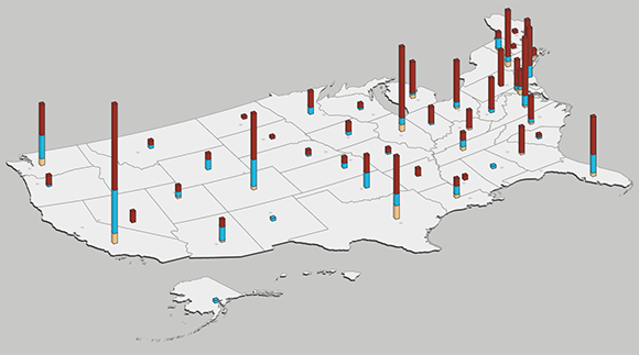
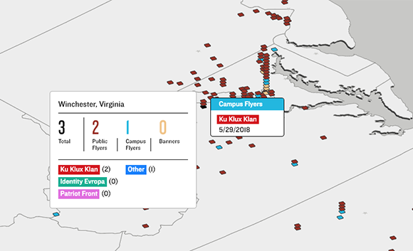
Wes Grubbs created an interactive data visualization software to collect data about Hate Flyering across the USA for the Southern Poverty Law Center.

Users are able to zoom to view, select each state to see the statistics, and also see the change in Hate Flyering over time. The interactive visualization allows you to select the time range from 2018-2019, see the different groups of flyers and the types of flyering.

I really admire that Grubbs created an interactive visualization for something very prevalent in today’s society. I don’t know what algorithms generated this work, but I am astounded by the creativity of Grubbs to create an actual map drawing of the USA with 3D bar graphs. The bar heights increase with the number of Hate Flyerings. In addition, the bay is specifically located (on the map) on the location (in the US) where the data was gathered. This seems like such a simple idea, yet the creativity manifests in this form of presentation.

Grubbs Interactive Data Visualization (n.d.): USA Map Hate Flyering Bar Graph
Grubbs Interactive Data Visualization (n.d.): Winchester Hate Flyering Statistics in 2018

Siwei Xie – Project 07 – Curves

sketch

//Siwei Xie
//Section B
//sxie1@andrew.cmu.edu
//project-07

var nPoints = 500;
var t;
var angle = 0;
var adj = 2;

function setup() {
    createCanvas(480, 480);
}

function draw() {
	background(220);
    noStroke();

	//draw Quadrifolium with variant colors
    push();
    fill(mouseX, mouseY, 80);
    translate(mouseX, mouseY);
    rotate(radians(angle));
    drawQuadrifolium();
    angle = (angle + adj) % 360;
    pop();

    //draw Epitrochoid with variant colors
    push();
    fill(80, mouseX, mouseY);
    translate(200, 200);
    drawEpitrochoid();
    pop();
}

//draw rotating & moving windmill
function drawQuadrifolium() {
    var a = 70;
    
    beginShape();
    for (var i = 0; i < nPoints; i++) {
        var t = map(i, 0, nPoints, 0, TWO_PI);

        //http://mathworld.wolfram.com/Quadrifolium.html
        r = a * sin(2 * t);
        x = r * cos(t);
        y = r * sin(t);
        vertex(x, y);
    }
    endShape(CLOSE);
}

//draw variant curve in the middle
function drawEpitrochoid(){
    var a1 =  40;
    var b1 = 200;
    var h = constrain(mouseY/ 10.0, 0, b1);
    var t;
    var r = map(mouseX, 0, 600, 0, 1); 
    
    beginShape();
    fill(200, mouseX, mouseY);
    for (var i = 0; i < nPoints; i++) {

        stroke("black");
        vertex(x, y);
        var t = map(i, 0, nPoints, 0, TWO_PI * 2); // mess with curves within shapes

        //Parametric equations for Epitrochoid Curve
        x = r* ((a1 + b1) * cos(t) - h * cos((t * (a1 + b1) / b1) + mouseX));
        y = r* ((a1 + b1) * sin(t) - h * sin((t * (a1 + b1) / b1) + mouseX));
        
    }
    endShape(CLOSE);
    
}

I had fun creating this image. I used Quadrifolium and Epitrochoid in my drawing, and adjusting them according to the position of mouse.

Quadrifolium is a type of rose curve with n=2. It has the polar equation. Epitrochoid is a roulette traced by a point attached to a circle of radius r rolling around the outside of a fixed circle of radius R, where the point is at a distance d from the center of the exterior circle. 

By modifying the limits of parameters and changing value of parameters in the formula, I was able to play with the curves.

Screenshot after I finished drawing the Quadrifolium.

Emma NM-Project-07(Curves)


curves

/* 
Emma Nicklas-Morris
Section B
enicklas
Project-07
Curves
*/

var numP = 200;


function setup() {
    createCanvas(400, 400);

}

function draw() {
    background("#F9CDAD");
    
    // curve name
    noStroke();
    textAlign(CENTER);
    textSize(24);
    fill("black");
    text("Hypocycliod", width / 2, 35);

    // draws hypocycloids
    drawHypocycloid(10, 0, "#FC9D9A"); // light pink one 
    drawHypocycloid(7, 30, "#FE4365"); // bright pink one
    drawHypocycloid(4, 60, "#AE1F3A"); // dark pink one
    drawHypocycloid(1, 90, "#610819"); // maroon one
}

function drawHypocycloid(scale, rotation, color) {
    // Hypocycliod:
    // http://mathworld.wolfram.com/Hypocycloid.html

    // effects number of points and the shape of the hypocycloid and size
    var a = constrain(mouseX, 118, 300) / 20;
    // as the mouse moves down, number of points decrease
    var b = constrain(mouseY, 20, 200) / 100;
    var n = a / b;
    var o = mouseY - (mouseX / 75); // outline size on shape

    strokeWeight(o);
    stroke(color);
    noFill();

    push();
    translate(width / 2, height / 2); // center of canvas
    rotate(rotation);
    beginShape();
    for (var i = 0; i < numP; i++) {
        var p = map(i, 0, numP, 0, TWO_PI);

        // equation for hypocycloid
        var x = ((a / n) * ((n - 1) * cos(p) - cos((n - 1) * p)));
        var y = ((a / n) * ((n - 1) * sin(p) + sin((n - 1) * p)));
        vertex(scale * x, scale * y);

    }
    endShape(CLOSE);
    pop();
}


This project seemed daunting at first because I have not done any math in awhile, but once I realized that I could just type the equation for creating a curve it became more exciting. It took me a while to choose a curve. I was interested in one that had multiple points or leafs. I also wanted to use mouseX and mouseY to control how many points/leaf were show at a time. Then, I thought about using mouse position to also control the outline size. Finally, I decided to use scale to make several hypocycloids to make the drawing more interesting. I find the upper right hand corner most interesting and the lower right hand corner the least interesting. Ideally, I wish the maroon hypocycloid didn’t look like such a big blog when the mouse is in the bottom right hand corner because the lines beneath it seem interesting, but the top one block it. I think this was a fun assignment to play with.

Claire Lee – Looking Outwards – 07

I chose to write about Stamen Design’s Cell Phone Coverage in the Bay Area. I do admire the firm’s work as a whole, but I thought that the designs they chose to generate from this particular dataset was really interesting to look at. I really liked how they took as mundane of a topic as cell phone coverage and made it into something visually appealing and beautiful. It was also really fascinating to see the variety in the different kinds of designs that they made out of the same type of data. I think that this set of designs is a really good representation of Stamen Design’s artistic sensibilities in that the firm considers itself to be sitting at the intersection between design and data science, and the collection embodies that combination.

Cell Phone Coverage in San Francisco, Carrier 1

Specifically, the Cell Phone Coverage in San Francisco is meant to visualize cellular network strength across four major carriers in the Bay Area through data-driven algorithms and interactive sketches. Although I’m not really sure about this, I think that this kind of data-derived design algorithm would involve importing data into the code editor and then inputting the values into some type of array structure to generate the patterns. It also looks like there are preset color and shapes that go with the information, so I would assume those use some type of array as well.

Minjae Jeong-LO-06

http://www.chrisharrison.net/index.php/Visualizations/ColorFlower

I was in Chris Harrison’s class, designing human centered software, last semester and he does many interesting and innovative projects that I find very valuable. One of my favorite information visualization project he did is the “color flower”, because even with such large amount of data, the visualization of the data is really easy to understand, and also the patterns and position of colors really create a theme that fits well with color. Chris is a very brilliant engineer and designer, that I think there are many things we can learn from him in both technical and design thinking process.

Xu Xu – Looking Outwards – 07

Building visual tools to manage Germany’s rail network and its hundreds of thousands of daily passengers.

The project Peak Spotting was created by Studio NAND in collaboration with Moritz Stefaner, intended to provide visualization to passenger loads and identify potential bottlenecks early on. This web application collects millions of data-points over 100 days into the future, then these data-points are integrated into custom developed visual tools such as animated maps, stacked histograms, path-time-diagrams and lists with mini visualizations.

The application is split into 4 sections horizontally: Calendar, Day view, Train collection, and Train details. This application was designed with the team at Deutsche Bahn and the later users. According to Stefaner, prototyping with Tableau proved very useful to learn quickly if specific features would prove useful and in which form.

This project had my interest because of it’s various forms of data visualization. Through a combination of graphs and animations, the user is able to grasp data quickly and make judgement early on. The visualizations communicate information while also being aesthetically pleasing to the eye.

Sewon Park – LO – 08

The artist that I have selected from the EYEO presentations is Meejin Yoon. As I have several friends that are enrolled in the architecture program, I have developed significant interest in the field of architecture. Yoon’s Korean descent led me to select and view the project, which was both aesthetically mesmerizing and technologically inspiring

Meejin Yoon is currently the dean of architecture at Cornell University and heads the Howeler + Yoon studio, completing architecture projects ranging from from memorials to olympic infrastructures. Yoon studies architecture and likes to incorporate modern technology in her work.

http://www.howeleryoon.com/work/49/circus-conservatory (Link to her studio website)

During her lecture, she gives an effective presentation of her work through discussing why the use of technology was important in her work. She uses reusable energy for the environment and interactive technology to engage the viewers. I admire that she not only uses technology for aesthetics but also for practical purposes.

Meejin Yoon’s lecture at EYEO 2015

Xiaoyu Kang-Looking Outwards-07


Every IP, 1999

This project is called 1:1. It is a project that was created in 1999 as a collection of database. The database was created to eventually contain the addresses of every website in the world. The data was collected through sending out a crawler, which will determine if there is a website at a specific numeric address, which is called IP and range between 0.0.0.0 and 255.255.255.255. The crawler also determines whether the website is open to public or not. When this project first started in 1999, around two percent of the website, which is around 186100 sites were included in the database. However, the internet world in changing at a speed faster than anticipated in 2001 so the first version of this project is out of date.

1:1 (2) is then created as a continuous project based on the first version. This project consists of the database of the website addresses generated between 2001 and 2002. This second project also includes interfaces that compare the data between the first and the second database.

Every IP, 2001

Julia Nishizaki – Looking Outwards – 07

This week, I chose to look at Stefanie Posavec’s art.park.data, a 32.5m long data visualization drawing in Queen Elizabeth Olympic Park, created from data collected by students participating in Space Studios’ “School’s (Not Quite) Out for Summer.” The students, who were from the nearby neighborhoods, and transitioning from elementary to middle school, explored the park with Raspberry Pis fitted with special sensor Hardware Attached on Top (HATs), in order to collect data like the latitude and longitude of their locations, the humidity and temperature, the sounds they heard, the types of plants around them, and even the emotions they felt in that place.

Stefanie Posavec’s art.park.data, at the East London Canvas in Queen Elizabeth Olympic Park
A section of Posavec’s art.park.data, a visualization of data collected by students in the park

I particularly admire this project, as the students were able to explore the park, make observations, write down notes, and afterwords, use arts and crafts materials to create their own personal visualizations of the data, making this experience more meaningful for the students, and centered solely around them and their perspectives. Although data visualization can sometimes seem impersonal or distant, through Posavec’s use of bright colors, graphic forms, and simple composition, she was able to create a friendly, interesting, and playful snapshot of the park through the eyes of the children who visit it.

Fallon Creech-Project-06-Abstract-Clock


sketch

//Fallon Creech
//Section B
//fcreech@andrew.cmu.edu
//Project-06

var xarc = 200
var yarc = 200
var center = 200

function setup() {
  createCanvas(400, 400);
}

function draw() {
  background(77);
	noStroke();

//beginning of red hours circle
	fill(77);
  ellipse(center, center, 300, 300);
  fill(241, 106, 111);
  arc(xarc, yarc, 300, 300, 1.5*PI, ((hour()%24)/12*PI-HALF_PI+0.0001));

//end of red hours circle
  fill(77);
  ellipse(center, center, 225, 225);

//beginning of green minutes circle
  ellipse(center, center, 200, 200);
  fill(176, 215, 119);
  arc(xarc, yarc, 200, 200, 1.5*PI, (minute()/30*PI-HALF_PI+0.0001));

//end of green minutes circle
  fill(77);
  ellipse(center, center, 125, 125);

//beginning of blue seconds circle
  ellipse(center, center, 100, 100);
  fill(139, 219, 217);
  arc(xarc, yarc, 100, 100, 1.5*PI, (second()/30*PI-HALF_PI+0.0001));

//end of blue seconds circle
  fill(77);
  ellipse(center, center, 25, 25);

//literal time
	fill(255);
  textAlign(RIGHT);
  text(hour()%24, 185, 30);
  text(":", 190, 30);
  textAlign(CENTER);
  text(minute(), 200, 30);
  text(":", 210, 30);
  textAlign(LEFT);
  text(second(), 215, 30);
}

I approached this project by making a simplified version of a typical analog clock. This design is meant to be highly and easily legible, so I used an RGB color palette to easily distinguish between time segment and a layout that references typical clocks. I envision this design being an alternative to typical clocks, in which numbers aren’t needed to interpret the time.