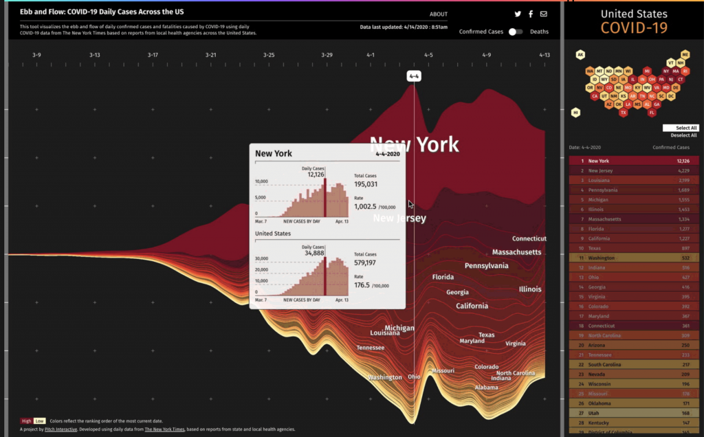
For this week’s exploration of data visualization I picked Ebb and Flow and I am particularly going to look at their project for Pitch Interactive Inc called “Covid-19 Daily Cases Across the US”.
This is a line graph that has every state available and you can mouse over and get even more information on total cases and compare it to the overall US
I really admire this tool because I feel like this is a great example of when data visualization is needed the most. It is an important tool for educating the public in a clear way especially when stress is high and misinformation is rampant. This project started while the concept of flattening the curve was spreading.
This graph uses the steam graph methodology and the data was extracted from the New York Times. This graph allows you to look at certain states and be able to compare them. The y-axis shows confirmed cases and deaths and the x-axis represents time starting March 7th.
Overall, I think this tool is very cool because it seems like this tool is constantly evolving even while the pandemic is currently winding down in the US. I think visualizations like this are so important and I think this team did really well at making it clear and concise while also informational.
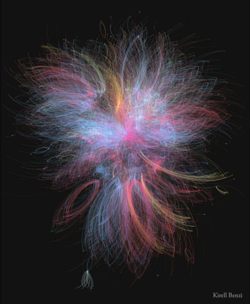
Dr. Kirell Benzi is a data artist and researcher. Kirell holds a Master of Science in Communication Systems from ECE Paris and a Ph.D. in Data Science from Ecole Polytechnique Federale de Lausanne. In 2017, he started his studio, Kirelion, around information design, creative technology, data visualization, and software engineering. He has collaborated with the likes of the EU, Stanford, Princeton, Cornell, Berkeley, UCLA, and more. He creates art that is exceptionally beautiful, pieces that one wouldn’t assume is based off of data points. Some of my favorites are; “The Dark Side and the Light” (2015), which is built upon the interactions between more than 20,000 characters from the Star Wars universe. The blue nodes represent those associated with the light side of the Force, including the Jedi, the Republic, and the Rebellion. The dark side is represented by the red nodes, which includes the Siths and the Empire. Yellow nodes represent criminals and bounty hunters, which mostly connect to the red nodes. The most influential characters are Anakin and Emperor Palpatine. I also really enjoy “Scientific Euphoria” (2014), which is about how in July 2012, CERN physicists found evidence of a new elementary particle, predicted by Peter Higgs in 1964. The graph shows the flow of retweets as people discussed the discovery. The network splits into two with European tweets concentrated in the center and U.S. tweets at the bottom.
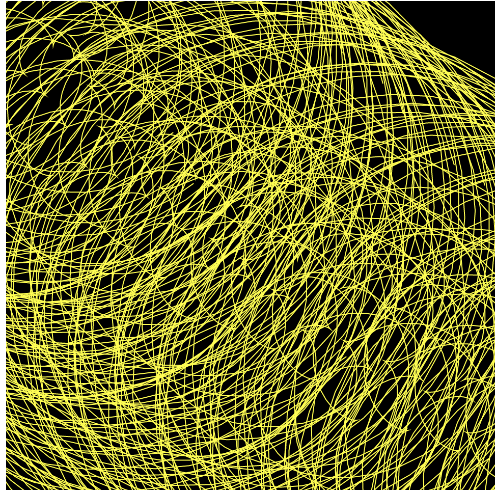
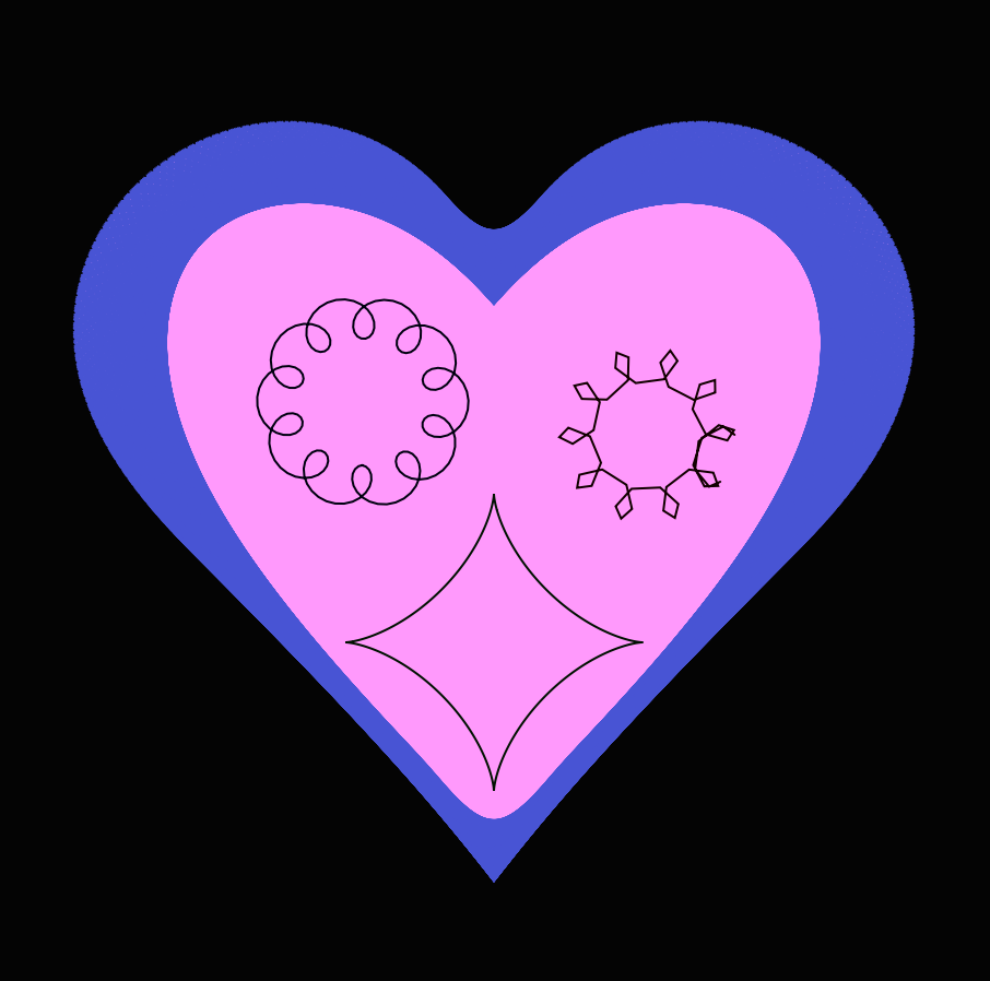
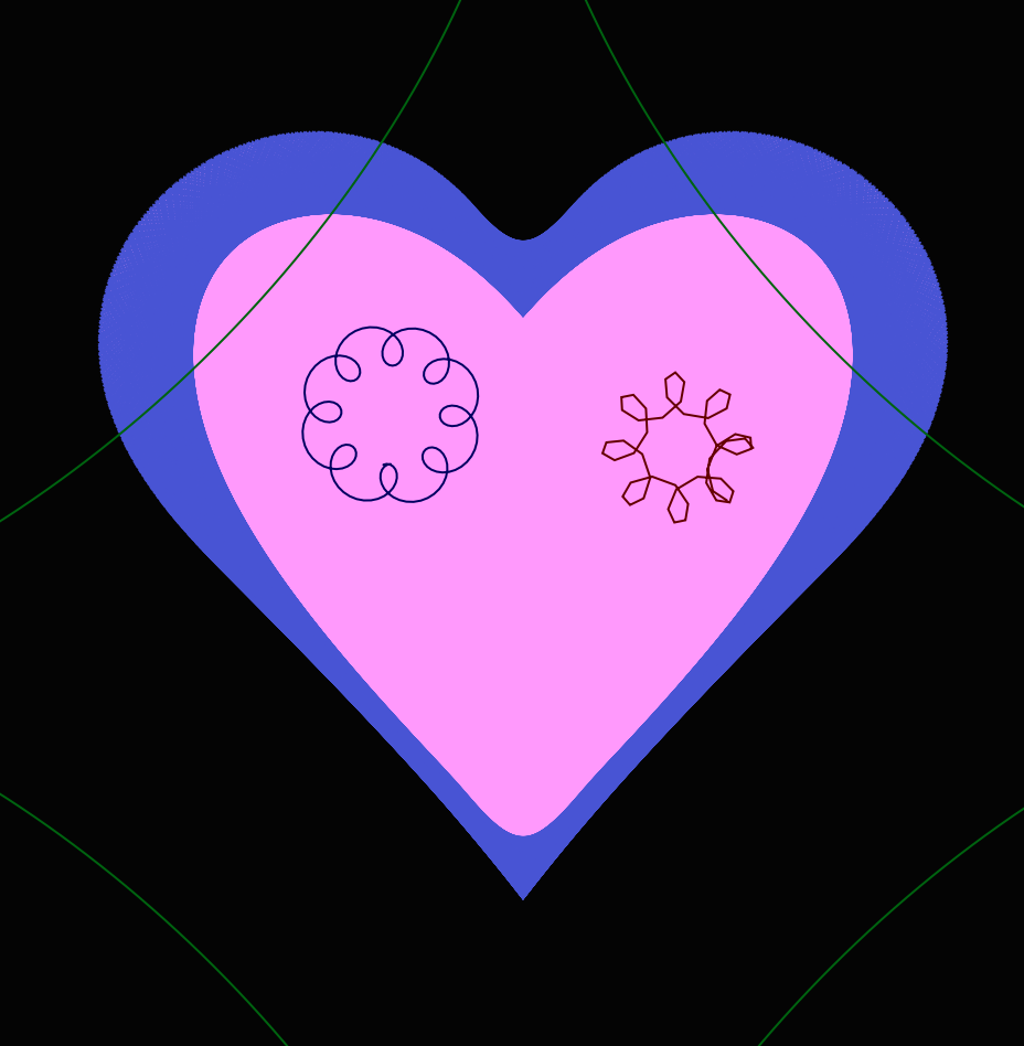
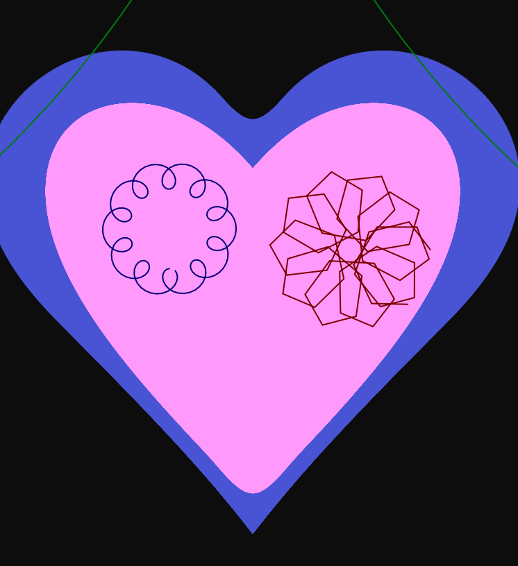
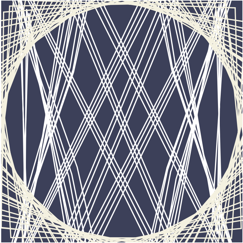
This project was done with the parametric equation of the Devil’s curve. It was an interesting project. I needed time do research on what curves I thought were interesting and cool. I wanted to make something that was visually appealing with simple interactions. I would not say that this project was hard.
//Yanina Shavialenka
//Section B

var n;
var heartShape = [];
var theta = 0;
var nPoints = 55;

function setup() {
    createCanvas(480, 480);
}

function draw() {
    background(map(mouseX, 0, width, 0, mouseY));
    heartCurve();
    epitrochoidCurve();
    hypotrochoidCurve();
    astroidCurve();
}

function heartCurve() {
    //https://mathworld.wolfram.com/HeartCurve.html
    push();
    fill(255, 153, 255);
    stroke(73, 84, 216);
    translate(width/2, height/2-35);//changes (0,0) point to center the heart in the middle
    beginShape(); //Begins to draw heart curve
    for (var v of heartShape) {
        vertex(v.x, v.y);
    }
    endShape(); //Ends drawing heart curve
    //The following equations were taken from teh MathWorld
    var radius = height / 40; //sets how big the heart is on the canvas
    var xPos = 16 * pow(sin(theta), 3) * radius;
    var yPos = (13 * cos(theta) - 5 * cos(2 * theta) - 2 * cos(3 * theta) - cos(4 * theta)) * -radius;
    heartShape.push(createVector(xPos, yPos));
    theta += 0.8; //changes the angle by 0.8 each time which increases the outer blue stroke
    pop();
}

function epitrochoidCurve() {
    //https://mathworld.wolfram.com/Epitrochoid.html
    var b = 3.5;
    var h = (b + 5) + mouseX/100;
    var a = mouseX/b;
    push();
    noFill();
    stroke(0, 0, mouseX);
    translate(180, height/2-50);
    /*
    Changes (0,0) point to center the epitrochoid on the
    left side of a heart.
    */
    beginShape(); //Begins to draw epitrochoid curve
    //The following equations were taken from teh MathWorld
    for(var t = 0; t <= TWO_PI; t += PI/110){
        var xPos = (a+b) * sin(t) - h * sin(((a+b)/b) * t);
        var yPos = (a+b) * cos(t) - h * cos(((a+b)/b) * t);
        vertex(xPos,yPos);
    }
    endShape(); //Ends drawing epitrochoid curve
    pop();
}

function hypotrochoidCurve() {
    //https://mathworld.wolfram.com/Hypotrochoid.html
    var b = 3.5;
    var h = mouseY/2; //As height increases, the get little sharp crown circles
    //As height decreases, we get oval star curves instead of crown circles
    var a = mouseX/b;
    push();
    noFill();
    stroke(mouseX, 0, 0);
    translate(width/2+70, height/2-35);
    /*
    Changes (0,0) point to center the hypotrochoid on the
    right side of a heart.
    */
    beginShape(); //Begins to draw hypotrochoid curve
    //The following equations were taken from teh MathWorld
    for (var i = 0; i <= nPoints; i ++) {
        var t = map(i, 0, 50, 0, TWO_PI);
        var xPos = (a-b) * cos(t) + (h * cos(((a-b)/b) * t));
        var yPos = (a-b) * sin(t) - (h * sin(((a-b)/b) * t));
        vertex(xPos,yPos);
    }
    endShape(); //Ends drawing hypotrochoid curve
    pop();
}

function astroidCurve() {
    //https://mathworld.wolfram.com/Astroid.html
    var a = map(mouseX, 0, width, 0, height);
    push();
    noFill();
    stroke(0, mouseX, 0);
    translate(width/2, 300);
    /*
    Changes (0,0) point to center the astroid at the
    bottom of a heart.
    */
    beginShape(); //Begins to draw astroid curve
    //The following equations were taken from teh MathWorld
    for (var i = 0; i < height; i++) {
        var t = map(i, 0, width, 0, TWO_PI);
        var xPos = 3 * a * cos(t) + a * cos(3 * t);
        var yPos = 3 * a * sin(t) - a * sin(3 * t);
        vertex(xPos,yPos);
    }
    endShape(); //Ends drawing astroid curve
    pop();
}
|
In this project I drew the curve of a heart and inside of a heart there’s 3 addition curves. Epitrochoid and hypotrochoid in my opinion were kind of like opposite of each other since epitrochoid draws ellipses inside and hypotrochoid draws ellipses outside. For me it was kind of challenging to do this because I had to research a lot of new functions such as Math.pow and many things for me didn’t work so I had to change the curves multiple times for them to work. It was interesting to analyze how angles of 0.1 or 1 would affect the curves, sometimes the smaller the angle the bigger the shape became which is polar opposite of what would I have expected.
//Elise Chapman
//ejchapma
//ejchapma@andrew.cmu.edu
//Section D

var nPoints = 100; //number of points along the curve
var noiseParam=5;
var noiseStep=0.1;
var petalNum=1; //number of petals on curve
var x; //for points along curve
var y; //for points along curve

function setup() {
    createCanvas(480,480);
    frameRate(10);
}

function draw() {
    background(0);
    //draws the epitrochoid curve
    //Cartesian Parametric Form  [x=f(t), y=g(t)]
    push();
    translate(width/2, height/2);
    var a = 90;
    var b = a/petalNum;
    var h = constrain(mouseY / 8.0, 0, b);
    var ph = mouseX / 50.0;
    fill(mouseY,0,mouseX);
    noStroke();
    beginShape();
    for (var i = 0; i<nPoints+1; i++) {
        var t = map(i, 0, nPoints, 0, TWO_PI); //theta mapped through radians
        //Cartesian Parametric Form  [x=f(t), y=g(t)]
        x = (a + b) * cos(t) - h * cos(ph + t * (a + b) / b);
        y = (a + b) * sin(t) - h * sin(ph + t * (a + b) / b);
        var nX = noise(noiseParam); //noise for x values
        var nY = noise(noiseParam); //noise for y values
        nX=map(mouseX,0,width,0,30);
        nY=map(mouseY,0,height,0,30);
        vertex(x+random(-nX,nX),y+random(-nY,nY));
    }
    endShape(CLOSE)
    pop();
}

//click to increase number of petals on the curve
function mousePressed() {
    petalNum+=1;
    if (petalNum==6) {
        petalNum=1;
    }
}
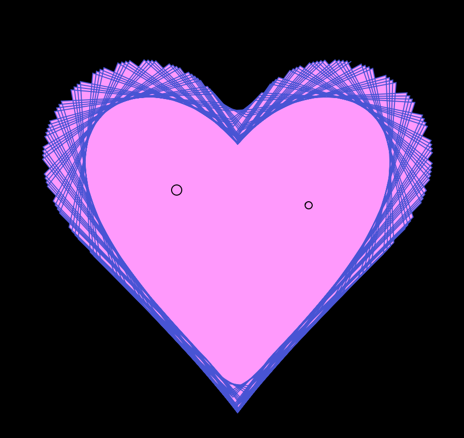
To begin, I liked the movement that was created by Tom’s example epitrochoid curve, so I went to the link he provided on Mathworld and read about the curve. I understood that I could make the petals interactive by adding a click into the program and changing the value of b in the curve equation. So at this point, my program allowed from 1 to 5 petals depending where in the click cycle the user is.
An example of a 3 petal curve
Then, I thought back to one of the previous labs, where we would draw circles with variable red and blue fill values, which I really enjoyed aesthetically. So, I made the blue value variable dependent upon the mouseX value and the red value variable upon the mouse Y value.
High mouseX, low mouse YHigh mouseY, low mouseX
Finally, I really enjoyed the jittery star from the class example from our lecture on Randomness and Noise, so I decided I wanted to add noise. Because the curve is drawn with a series of points, I added noise randomness to each of the points, affecting both the x scale and the Y scale. Overall, I enjoy how the final project came out. I think it would be a cool addition to the header of a website, especially if I’m able to make the background transparent.
An example with all three elements (petal variation, color, and noise) added in
A video loop which cycles through all sets of data of the Project Ukko data
Immediately, I was intrigued by Moritz Stefaner’s work, specifically his Project Ukko: a visualization of seasonal wind prediction data. Project Ukko presents a thematic map of wind data using lines of varying opacity (prediction accuracy), thickness (wind speed), tilt and color (trend of wind speed). Stefaner outsources his computational data from clients, which is processed by another group called RESILIENCE, so unfortunately I cannot find much about the algorithm behind his work, but I can tell that Stefaner put a lot of effort into the process of his visualization. He asks questions like “What are the main views?”, “What needs to be available immediately, what on demand?”, and “How important is each part?”. I admire that he keeps the design process, that I myself have to go through in my major, central to his work. Furthermore, the final piece is both beautiful and highly functional. For someone not entrenched in the data, it is still an easy visualization to process; but it can easily become a deeply detailed source. It is minimalistic in that it includes only the necessary parts, yet it still feels so rich.
var nPoints = 100;
var x = 1;

function setup() {
    createCanvas(480, 480);
    textSize(20);
    textAlign(CENTER, CENTER)
}

function draw() {
    background(0);
    noStroke();
//draws text on screen that changes with every mouse click
    if (x == 1) {
        fill(255, random(200), random(200), 220);
        text('我爱你', width/2, height/2);
    } else if (x == 2) {
        fill(255, random(200), random(200), 220);
        text('i love you', width/2, height/2);
    } else if (x == 3) {
        fill(255, random(200), random(200), 220);
        text('te amo', width/2, height/2);
    } else if (x == 4) {
        fill(255, random(200), random(200), 220);
        text('사랑해', width/2, height/2);
    } else if (x == 5) {
        fill(255, random(200), random(200), 220);
        text('愛してる', width/2, height/2);
    } else if (x == 6) {
        fill(255, random(200), random(200), 220);
        text('♡', width/2, height/2);
    }
//the code below this line starts drawing curves
//draws first curve/heart in top left corner
    fill(188, 0, 56, 200);
    drawEpitrochoidCurve();
//draws curve/heart in top right corner
    push();
    translate(width, 0);
    drawEpitrochoidCurve();
    pop();
//draws curve/heart in bottom left corner
    push();
    translate(0, height);
    drawEpitrochoidCurve();
    pop();
//draws curve/heart in bottom right corner
    push();
    translate(480, 480);
    drawEpitrochoidCurve();
    pop();
}

function mousePressed(){
    if (x == 1){
        x = 2;
    } else if (x == 2){
        x = 3;
    } else if (x == 3){
        x = 4;
    } else if (x == 4){
        x = 5;
    } else if (x == 5){
        x = 6;
    } else if (x == 6){
        x = 1;
    }
}

function drawEpitrochoidCurve() {
// Epicycloid:
 // http://mathworld.wolfram.com/Epicycloid.html
    var x;
    var y;
    var a = map(mouseX/3, 0, width, 0, 500);
    var b = a / 8;
    var h = constrain(mouseY / 8.0, 0, b);

    beginShape();
    for (var i = 0; i < nPoints; i++) {
        var t = map(i, 0, nPoints, 0, TWO_PI);
        x = (a + b) * cos(t) - h * cos(((a + b) / b) * t);
        y = (a + b) * sin(t) - h * sin(((a + b) / b) * t);
        vertex(x, y);
    }
    endShape();
}
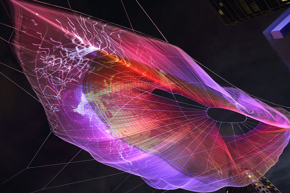
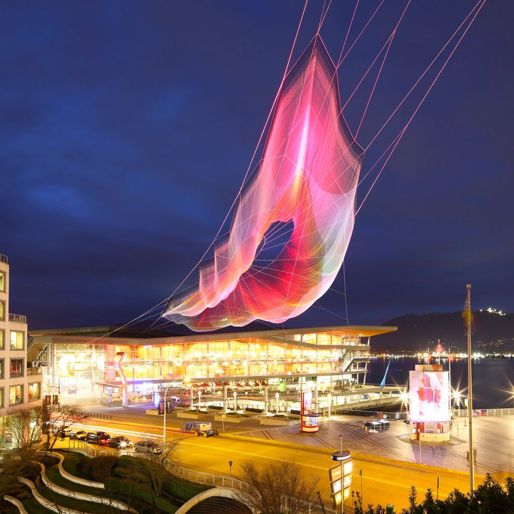
The project I chose to look at this week was Aaron Koblin’s Unnumbered Sparks, when I first visited his website I was immediately drawn to the striking visuals of the piece. On a surface level, it looks like a massive, ethereal, floating structure reminiscent of a net. But it isn’t just so, as the colors and striking visuals that are displayed across this structure are all controlled in the background by a single website. I really admire how it is an artwork that engages its viewers and promotes interactions between viewers themselves, as well as, between viewers and the artwork. By logging onto a website, people are enabled to draw their own distinct patterns or visuals which are then projected up onto this sculpture.
It was impressive the amount of thought given into the piece, not only from a computational standpoint. There were also considerations of how the sculpture would interact with the environment and environmental factors such as the wind. It also looked at the different experiences it would create for people depending on the distance at which they view the sculpture. Behind all these considerations, is the computational aspect itself which lent itself not only to the aesthetic of the final artwork but also the ideation and planning of the artwork too. Koblin described the process in where they built the whole 3D modeling environment itself directly in Chrome through WebGL, using that as a tool to help them sample light from the virtual sculpture and project that onto the real life object.
![[OLD SEMESTER] 15-104 • Introduction to Computing for Creative Practice](../../../../wp-content/uploads/2023/09/stop-banner.png)