LO 07: Information Visualization

Flight Patterns by Aaron Koblin

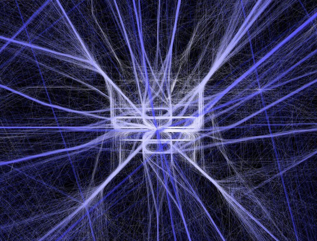
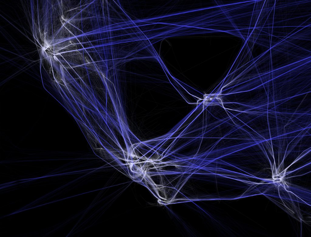
Aaron Koblin’s Flight Patterns Visualization exhibits strings of colorful lines, representing the movement and compactness of flight pathways. Koblin uses data values from Processing programming environment to map and plot certain routes of air traffic occurring over North America. For areas where there prevails high overlapping air traffic, the intersection points have an intense white color and a slight shine, whereas the other lines seem to relatively fade out into the dark background. I found his particular style of generating art really intriguing with the capability to control the vivid light as well as its quality of glowing effect, and I really love the overlapping colors of lines that produces this mesmerizing illumination. I admire how he used algorithms as well as loop or conditional functions to create such entrancing artwork and I believe his artistic sensibility emerges from his interest in science visualization.

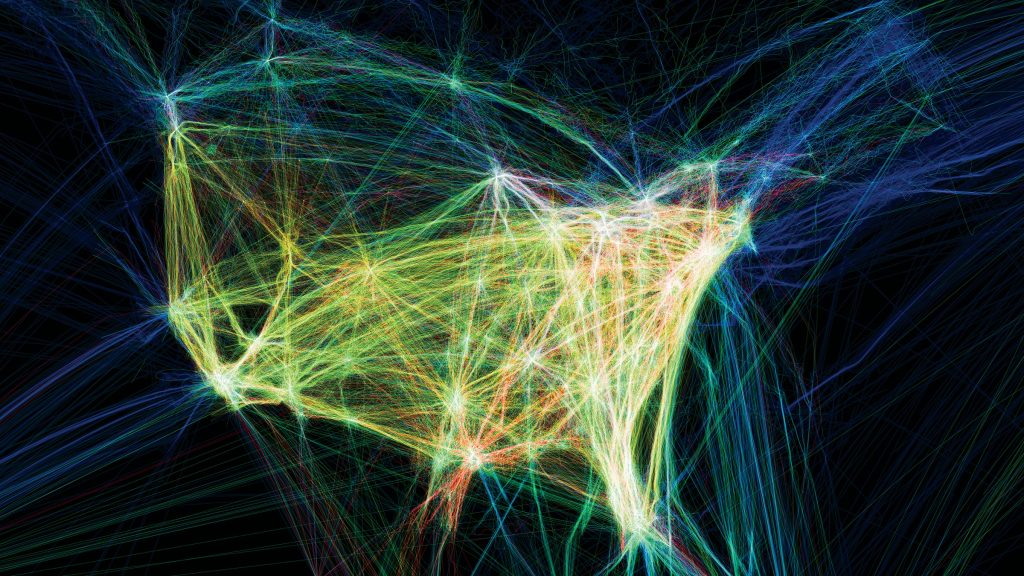
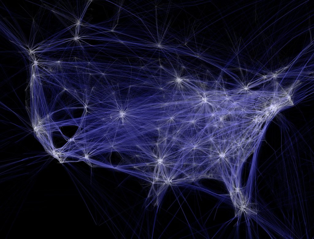
Reference: http://www.aaronkoblin.com/project/flight-patterns/

Project 07: Composition with Curves

sketchDownload


var bgR;
var bgG;
var bgB;
var x;
var y;

function setup() {
    createCanvas(480, 480);
    frameRate(10);
}

function draw() {
    bgR = map(-mouseY, 0, height, 50, 100); //select random background colors
    bgG = map(-mouseX, 0, width, 50, 200);
    bgB = map(-mouseY, 0, height, 0, 100);
    background(bgR, bgG, bgB);
    translate(220, 220);
    for (var c = 1; c < 5; c ++){ //draw the curve
        for (var d = 1; d < 5; d ++){
            push();
            translate(c * 10, d * 10);
            drawEpicycloidPedalCurve(); //reference to link -- https://mathworld.wolfram.com/EpicycloidPedalCurve.html
            pop();
        }
    }
}

function drawEpicycloidPedalCurve() {
    var a = map(mouseX, 0, width, 15, 100); //parameter of the curve moves with the mouse
    var b = map(mouseY, 0, height, 15, 50);
    noFill();
    stroke(mouseX, mouseY, 180);
    strokeWeight(0.8);

    push();
    beginShape(); //draw the curve
    for (var i = 0; i <= 600; i ++) {
        var theta = map(i, 0, 100, 0, PI); 
        x = (a+b)*cos(theta) - b*cos(((a+b)*theta)/b); //epicycloids are given by the parametric equations
        y = (a+b)*sin(theta) - b*sin(((a+b)*theta)/b);
        vertex(x, y);
    }
    endShape();
    pop();
}
The pedal curve of an epicycloid with pedal point at its origin

For this project, I wanted to iterate a flower-like shape using parameter equations so I decided to draw Epicycloid Pedal Curve as the composition. I played with mouseX and mouseY as well as random RGB colors across the canvas so the user has the freedom to explore with unique variations of epicycloid pedal curve patterns.

Project 07 – Composition with Curves

sketch
/* Nami Numoto
 * Section A
 * mnumoto@andrew.cmu.edu
 * Project 07 - Composition with Curves
 */

var nPoints = 100;
var CYCLOID = 0;

function setup() {
    createCanvas(480, 480);
    frameRate(10);
}

function draw() {
    background(0);
    // draw the curve in the middle and iterate 3x
    translate(width / 2, height / 2);
    for (i = 0; i < 3; i ++) {
        drawCycloid();
        rotate(90);
    }
    rotate(mouseX / 50);
}

function drawCycloid() {
    // Cycloid:
    // https://mathworld.wolfram.com/Cycloid.html
    
    var x;
    var y;
    
    var a = constrain(mouseX / 2, 0, 200);
    var b = constrain(mouseY / 2, 0, 200);

    stroke(240, 3, 252);
    noFill();
    beginShape();
    for (var i = 0; i < nPoints; i++) {
        var t = map(i, 0, nPoints, 0, TWO_PI);
        x = a * (t - sin(t));
        y = a * (1 - cos(t));
        vertex(x, y);
    }
    endShape();
}

I had a hard time figuring out the math behind the functions, but well, I guess I ended up getting it in the end. It’s not very fancy, but I iterated a Cycloid function three times to make a sort of 3-way yin&yang, minus the outer circle.

Cycloid function without any transformations
Started constraining x and y to mouseX and mouseY and rotating the canvas with mouseX
3 iterations with aforementioned constraints and transformations

Looking Outwards 07 – Data

https://ocean.rachelbinx.com/coral-map (can’t embed :<)

This happens to be an ongoing project, but I looked into Rachel Binx’s “Ocean Vis” collection of maps.
Binx is a data visualization specialist who bridges locational data with
She’s created maps of the oceans and their various biomes and species (coral specifically).
It caught my eye because I’d never seen a map that highlighted the oceans and was honestly initially confused as to the orientation.
I also began to feel more critical about my internalized definition of a map – I always saw them as land-oriented before (if someone asked me to draw the contour of an ocean I’d be really lost).

Map of various biomes in our oceans
Map of coral species distributions (interactive)

Project 07

sketch

//Tim Nelson-Pyne
//tnelsonp@andrew.cmu.edu
//Section C
//Project-07-Composition With Curves

//size of hypocycloid
var a;
//number of cusps in the hypocycloid
var n;
//x coordinate of points on graph
var x;
//y coordinate of points on graph
var y;
//total number of points to generate
var nPoints;

function setup() {
  createCanvas(480, 480);
  background(0);
  nPoints = 1000;

  
}

function drawHypocycloid (a, n) {
  push();
  translate(240, 240);
  stroke(255, 0, 0);
  strokeWeight(0.2);
  //changes the fill color based on mouseX
  fill(map(mouseX, 0, 480, 0, 255), 0, map(mouseX, 0, 480, 0, 255));
  

  for (var i = 0; i <= nPoints; i++) {
    t = map(i, 0, 1000, radians(0), radians(13 * 360))
    //equation for x value of hypocycloid
    x = (a/n) * ((n-1) * cos(t) - cos((n-1)*t));
    //equation for y value of hypocycloid
    y = (a/n) * ((n-1) * sin(t) - sin((n-1)*t));
    //draws hypocycloid using elipses centered at points along the graph
    ellipse(x, y, map(abs(x), 0, 240, 0, 25), map(abs(y), 0, 240, 0, 25));
    
  }
  pop();
}

function draw() {
  background(0);
  //sets a based on mouseY
  a = map(mouseY, 0, 480, 20, 100);
  //sets n based on mouseX for first shape
  n = map(mouseX, 0, 480, HALF_PI, 5);
  //draw first shape
  drawHypocycloid(a, n);
  //sets n based on mouseX for second shape
  n = map(mouseX, 0, 480, -10, -HALF_PI);
  //draw second shape
  drawHypocycloid(a, n);

  
}

I created an interactive visualization of multiple hypocycloids.

Project: Curve with Composition

luca curve

//lucacao
//section D

var np = 200;


function setup() {
    createCanvas(480, 480);
}

function draw() {
    background(127, 222, 255);
    stroke(229, 116, 188);
    fill(229, 116, 188);
   
        push();
        translate(120,120);
        drawEightCurve();
        pop();//draw first shape

        push();
        translate(240,240);
        drawEightCurve();
        pop();//draw second shape

        push();
        translate(360,360);
        drawEightCurve();
        pop();//draw third shape

        push();
        translate(360,120);
        drawEightCurve();
        pop();//draw fourth shape

        push();
        translate(120,360);
        drawEightCurve();
        pop();//draw fifth shape

}

function drawEightCurve(){
    var x;
    var y;
    var t;
    var a = mouseX/2;


    beginShape();
    for (var i = 0; i < np; i++){
        var t = map(i,0,np,0,TWO_PI);
        x = a*(sin(t*5));//x parametric
        y = a*(sin(t*5))*cos(t*5);//y parametric
        vertex(x,y);//draw shape
    }
    endShape();


}

I found this project quite challenging because it requires an understanding of parametric functions, which I am not too familiar with. I watched some Khan Academy and learned the general features of the functions. I wanted to make my shapes change in size, so I used “mouseX” to control that. The function that I chose also creates a dynamic composition. Most of my process was actually changing around the variables and see what it does to the shapes. Overall, I am happy with the outcome.

LO 7

Fleshmap Listen

Fernanda Viegas and Martin Wattenburg

This data visualization maps the frequency of references to specific body-parts within different musical genres. I think this gives some interesting and entertaining insight into how the body is talked about in music. This data visualization probably required some type of AI to recognize and categorize words that refer to specific body parts. I think this is an example of data visualization being used creatively to get at an unusual question.

http://hint.fm/projects/listen/

LO7

For this weeks looking outwards I chose to look at Aaron Koblin’s flight patterns. Together with colleges from UCLA, Koblin developed a Processing program to analyze and visualize flight patterns over North America. Koblin does’t elaborate on the mechanics of his algorithm, but from the images he has up on his website it looks like he made color and thickness a function of flight frequency, which makes the final product look like a colored pencil-like piece, with webbed spots around airports. This obviously makes for a really effective depiction of the flight patterns in question as it makes really clear where and from large chunks of flights go, but it’s also really visually appealing as a work of pure art.

<href="http://www.aaronkoblin.com/project/flight-patterns/" target='_blank'>flight patterns<\href>

Curves

I really like the dichotomy in this project between calm and chaos. I wanted a pretty simple curve(s) on a plain background that change from very simple and still to complex and chaotic. I set the colors to make it seem like a star or spreading entropy or something. I hope you enjoy!!

sketch
var nPoints = 100;

function setup() {
    createCanvas(400, 400);
    frameRate(10);
}


function draw() {
    background(255);

    // draw the frame
    fill(0);
    noStroke();
    stroke(0);
    noFill();

    // draw the curve
    push();
    translate(width / 2, height / 2);
    drawCurve();
    pop();
}

//--------------------------------------------------
function drawCurve() {
    // Hypotrochoid
    // https://mathworld.wolfram.com/Hypotrochoid.html

    var x;
    var y;

    var a = constrain(map(mouseX, 0, width, 50, 150), 50, 150);
    var b = a / constrain(map(mouseX, 10, width-10, 1, 8), 1, 8);
    var h = b;
    var ph = mouseX / 50.0;

    var n = 12;

    for (var j = 0; j < n; j++) {
        var c = map(j, 0, n, 0, 256);
        stroke(256-c,114,c);
        beginShape();
        for (var i = 0; i < nPoints; i++) {
            var t = map(i, 0, nPoints, 0, TWO_PI);
            var r = map(mouseY, 0, height, 0, 5)

            x = (j/n)*(a - b) * cos(t) + (j/n)*h * cos(ph + t * (a - b) / b);
            y = (j/n)*(a - b) * sin(t) - (j/n)*h * sin(ph + t * (a + b) / b);
            vertex(x + random(-r,r), y + random(-r,r));
        }
        endShape(CLOSE);
    }

}

Project 07: Composition with Curves

project 07 sketch copy

var nPoints = 100;

function setup() {
	createCanvas(480, 480);
}

function draw() {
	background(153,0,76);
	
	//centered in the middle of the canvas 
	translate(240, 240);
	rotate(mouseX/50);
	
	//drawing the functions created 
	strokeWeight(4);
	noFill();
	stroke(255);
	drawHypotrochoidCurve();
	stroke(40,63,141);
	drawEpitrochoidCurve();
}

//Hypotrochoid Curve
function drawHypotrochoidCurve() {

	var x;
	var y;
	var a = map(mouseX, 0, width, 0, 100);
	var b = a / 10;
	var h = constrain(mouseY, 0, height, 0, 250);

	//curve formula
	beginShape();
	for (var j = 0; j < nPoints; j ++) {
		  var t = map(j, 0, nPoints, 0, TWO_PI);
		  x = (a - b) * cos(t) + h * cos(((a - b) / b) * t);
		  y = (a - b) * sin(t) - h * sin(((a - b) / b) * t);
		  vertex(x, y);
	}
	endShape();
} 

//Epitrochoid Curve
function drawEpitrochoidCurve() {

	var x;
	var y;
	var a = map(mouseX/5, 0, width, 0, 100);
	var b = a / 10;
	var h = constrain(mouseY/5, 0, height, 0, 250);

	//curve formula 
	beginShape();
	for (var j = 0; j < nPoints; j ++) {
		  var t = map(j, 0, nPoints, 0, TWO_PI);
		  x = (a + b) * cos(t) - h * cos(((a + b) / b) * t);
		  y = (a + b) * sin(t) - h * sin(((a + b) / b) * t);
		  vertex(x, y);
	}
	endShape();
}

I enjoyed the straightforward nature of this assignment. For the two curves I chose, the Mathworld website provided clear formulas to use. It was interesting to play around with the constrain and map functions and see how the alterations of my curves changed as I, for instance, divided the width by 10 or multiplied the mouseX by 5. I also added in some rotation. In the project, as you move the mouse from left to right, the curves become more compressed. As you change the mouseY value, the curves become smaller and change in shape. I wanted to have the curves look smooth at some points (such that they look like two squiggly lines) and then more angular at other positions.

This is what the curves look like when the mouse is in the upper right hand corner.
This is what the curves look like when the mouse is in the middle right side.