Project 07: Composition with Curves

sketch
//Christy Zo
//Section C

var nPoints = 400;
function setup() {
    createCanvas(480, 480);
}

function draw() {
    background(220);
    push();
    translate(width / 2, height / 2);
    drawEpitrochoidCurve();
    pop();
    push();
    translate(width / 2, height / 2);
    drawEpicycloidCurve();
    pop();
    push();
    translate(width / 2, height / 2);
    rotate(radians(90)); //rotating Epicycloid to create a radial pattern
    drawEpicycloidCurve();
    pop();
    push();
    translate(width / 2, height / 2);
    rotate(radians(45));
    drawEpicycloidCurve();
    pop();
    push();
    translate(width / 2, height / 2);
    rotate(radians(135));
    drawEpicycloidCurve();
    pop();


}

function drawEpicycloidCurve() {
    // Epicycloid:
    // http://mathworld.wolfram.com/Epicycloid.html
    
    var x;
    var y;
    
    var a = constrain(mouseY,0, height);
    var b = constrain(mouseX, 0, width);
    //var h = constrain(mouseY / 8.0, 0, b);
    //var ph = mouseX / 50.0;
    noFill();
    stroke(0);
    beginShape();
    for (var i = 0; i < nPoints; i++) {
        var t = map(i, 0, nPoints, 0, TWO_PI);
        
        x = 4 * b * cos (t)* cos (t)* cos (t);
        y = a * sin (t) *sin (t)* sin (t);
        
      vertex(x, y);
    }
    endShape(CLOSE);

}

function drawEpitrochoidCurve() {
    // Epicycloid:
    // http://mathworld.wolfram.com/Epitrochoid.html
    
    var x;
    var y;
    
    var a = mouseX;
    var b = a / 2.0;
    var h = constrain(mouseY / 8.0, 0, b);
    var ph = mouseX / 120.0;
    
    fill(mouseX, mouseY, mouseX);
    beginShape();
    for (var i = 0; i < nPoints; i++) {
        var t = map(i, 0, nPoints, 0, TWO_PI);
        
        x = (a + b) * cos(t) - h * cos(ph + t * (a + b) / b);
        y = (a + b) * sin(t) - h * sin(ph + t * (a + b) / b);
        vertex(x, y);
    }
    endShape(CLOSE);
    
}

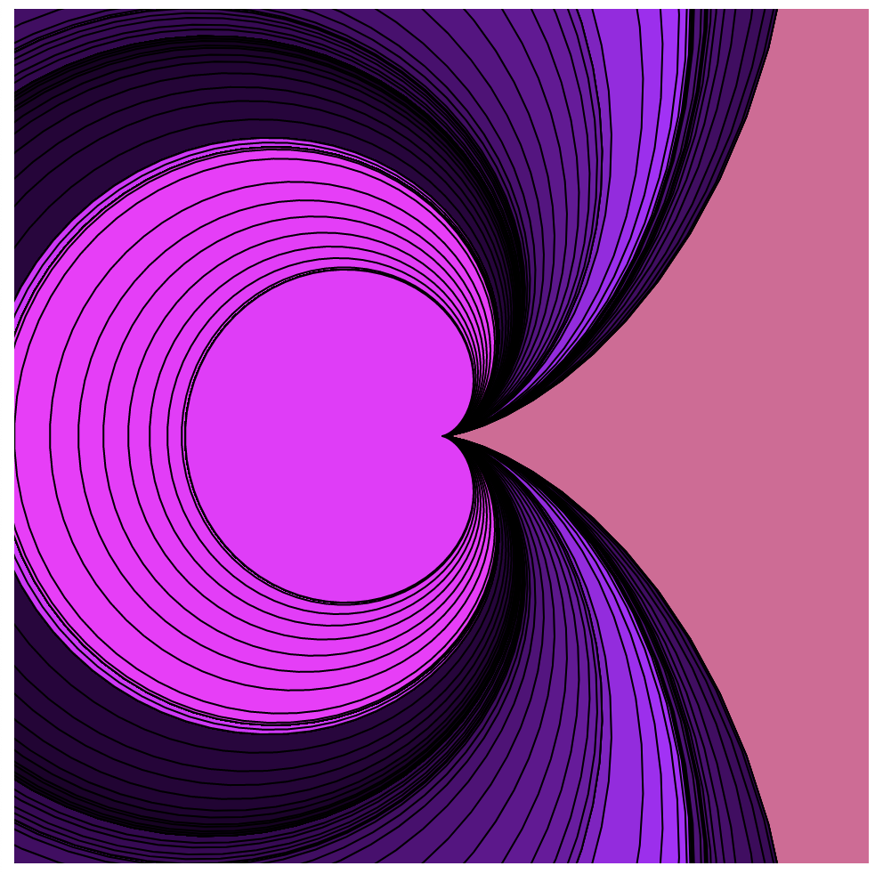
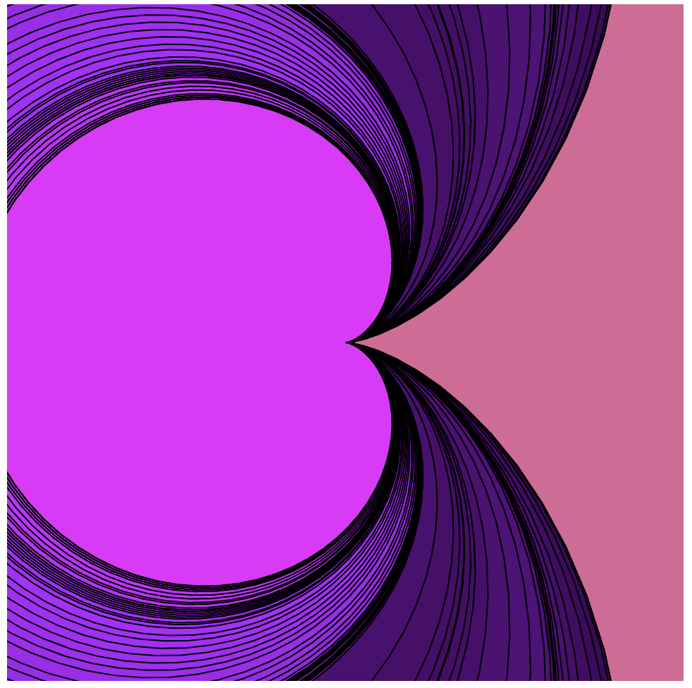
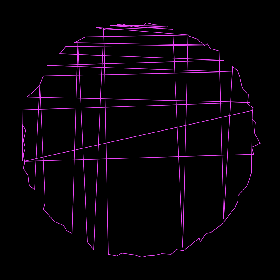
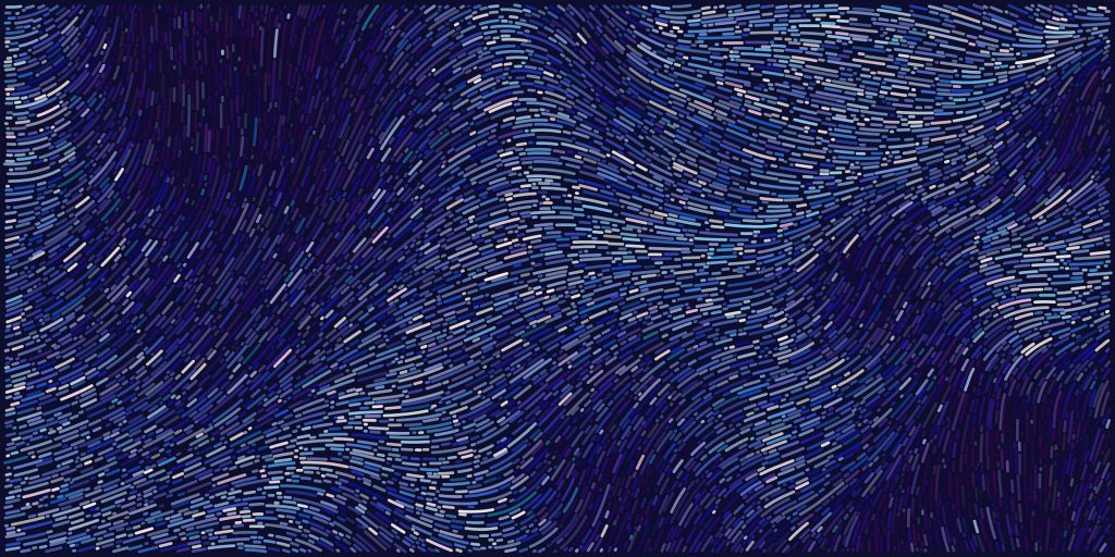
In this project, I wanted to create something that not only shows horizontal and vertical change, but something that goes diagonally too. I was inspired by how stars twinkle and their strokes/beams of light reduce and increase as it sparkles.

Free Drawings Of Stars Download Free Clip Art Free - Christmas Star  Coloring Page - Png Download - Full Size Clipart (#267769) - PinClipart
sample image of star

snippets of code:

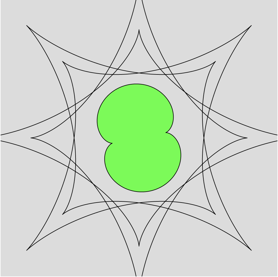
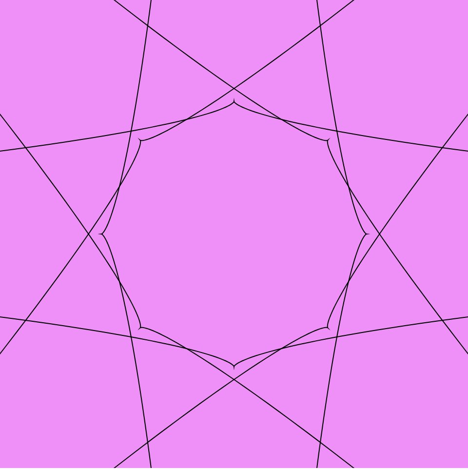
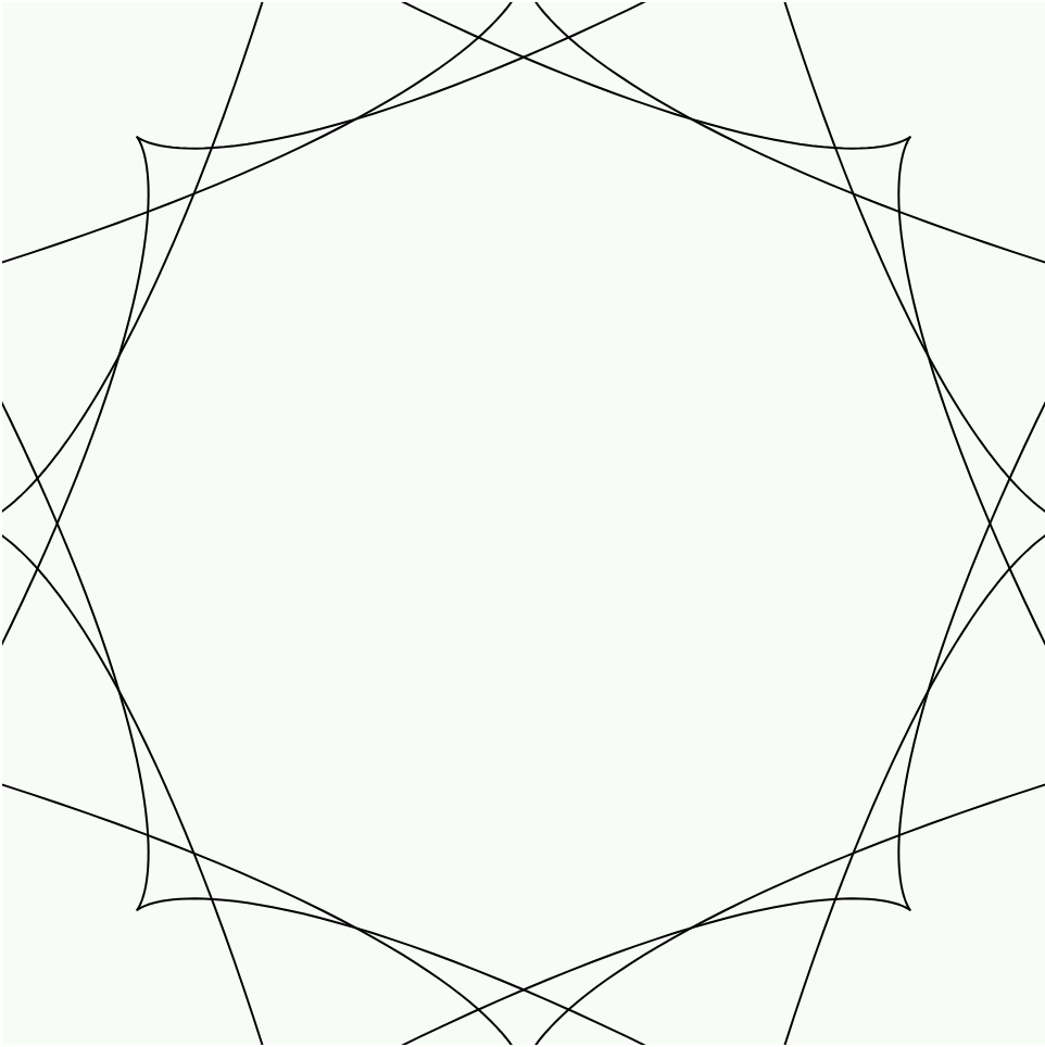
As the cranioid in the center increases in size, the color changes from black-green-pink-white in a gradual scale.

Looking Outwards 07: Information Visualization

Maps and globes always intrigue me because there are so many different versions of them, visualizing and emphasizing different categories of information. This version of a digital globe by UnstableGround that shows the temperature rise due to climate change came to me as a very strong example that appropriately uses color and dimensions to convey information to the viewer.

UnstableGround (2021)

Before taking this course, I had no particular thoughts about how these projects would be created, but now I wonder what kind of code would be used to create this. The algorithm for color would surely be associated with the data of climate change (the higher the temperature, the darker the shade of red), but I wonder how the 3D aspect of the project would be coded, and if it would be possible with p5.js.

Looking Outwards 07: Information Visualization


Project Title: Peak Spotting

Year of Creation: 2017

Artists: Moritz Stefaner

As the user moves from left to right, the data becomes more specific.

This project is an application that integrates data points which allows users to inspect data on custom developed visual tools, such as animated maps. I admire this project because it provides actionable information that can be used to make improvements with regards to passenger loads in trains; for example, there are features that allow users to spot traffic bottlenecks. I admire the aesthetics, because it is coherent and straight to the point. I admire this because the data is readable with distinct colors and organization is such that the process of finding information is streamlined. I know that the creator did some prototyping with Tableau to see what forms would be useful for each specific feature. Then Stefaner began prototyping with d3 and through this was able to compare different rendering techniques to select the most effective representation. The creator’s work is focused on balancing analytical and artistic aspects to support data-driven decision making. The final form of Peak Spotting perfectly encapsulates such sensibilities; it is largely due to his creative prioritization that the data is able to be as useful as it is. He aims to create work that draws people’s attention quickly, and this does just that by drawing people into the graphics and then keeping them interested with the content.

LO-Information Visualization

The project I choose for this week LO is the Unnumbered Sparks by Janet Echelman in 2014. The reason I find this interesting is that the form and color of this installation catches my attention immediately after I glimpsed it on the project website. After my research on it, I’m amazed by its scale and the audience controlled display. Instead of having fixed light beams, the creator actually pass the control over to the audiences so that it creates a connection between people and their surroundings. The way Janet Echelman put this installation together is inspiring as well. In order to create a canvas in such scale, he looked for the right material and decided to go with Honeywell Spectra fiber, a lightweight, durable material 15 times stronger than steel by weight. This project embodies the infusion of art and technology, expanding people’s understanding of art and material density, form, and flexibility.

Unnumbered Sparks, Vancouver, Canada, 2014

Project 07: Curves

sketch
//Anthony Pan
//Section C

//Cardioid Curve Interaction
//polar coordinate equation r = a*(1-cos(theta))
//parametric equation
    //x = a * cos(t) * (1 - cos(t))
    //y = a * sin(t) * (1 - cos(t))
//mouseX change colors
//mouseY changes how many are drawn


function setup() {
    createCanvas(480, 480);
    background(220, 100, 150);
}

function draw() {
    //var x1 = 0
    //var y1 = 0

    push();
    //drawRect(x1,y1); //draw another shape
    translate(width/2, height/2);
    drawCardioidCurve();
}


function drawCardioidCurve() {
    var x;
    var y;

    var a = 80;
    var h = mouseX; //mouseX interaction
    var h1 = map(mouseY, 0, 480, 0, 256); //mouseY interaction

    fill((h1 * 0.7)%256, 0, h1);
    beginShape();
    for(var i = 0; i < 101; i++) {
        var theta = map(i, 0, 101, 0, TWO_PI);

        x = (h + a) * cos(theta) * (1 - cos(theta));
        y = (h + a) * sin(theta) * (1 - cos(theta));
        vertex(x, y);
    }
    endShape(CLOSE);
}

For this project, I wanted to create a curve that would be drawn multiple times as the user moved mouseX. I chose to create a heart using the cardioid function and chose purple/pink as my color for the heart. I wanted it to feel like you were drawing hearts repeatedly that would change color and dimensions based on the mouseX and Y positions.

For the process, I did something very similar to the technical assignment this week, utilizing an equation to draw the different points on the curve rather than the noise function.

Looking Outwards 07: Computational Data Visualization

This week I took a look at some artists who specialize in computational data visualization. In particular, I took a look at Chris Harrison’s piece, Visualizing the Bible. This piece drew me in particular because the bible has always been something I have been so fascinated with. The combination of technology and a piece of world history felt refreshing and innovative. Harrison was able to visualize 63,000 cross-references within the bible to create a stunning piece that “honored and revealed the complexity of the data at every level”. A couple of other pieces were also made following the conclusion of the bible arc piece. Harrison wanted to capture the story of the bible and more specifically the people and the places within the bible. He used a spatial clustering algorithm to show the different connections between the 2619 biblical names. These pieces create new and refreshing ways to view classic pieces of human history. They give us a different perspective on how things can be interpreted.

Chris Harrison’s Bible Visualization

Looking Outwards 07: Information Visualization

“Melting Memories” by Refik Anadol is one of my favorite digital works as a designer. The website itself which presents the work is immersive and dynamic which is so fitting to the work. Anadol is a pioneer in the aesthetics of machine intelligence and researches practice centered around the discovery and development of data narratives. His work addresses the challenges of computing which imposed on humanity and what it means to be an individual in the age of AI. The perception and experience of time and space he creates work around is enriched in environments which are so immersive and create a multi-dimension perception of space. His specific piece “Melting Memories” is a reference to Anadol’s unexpected interconnections between philosophical works and academic inquires which take memory as it’s principal theme. The work is a digital “video” format which is 2-dimensional but appears as if it is 3-dimensional, reaching out to the viewer. The work is a slow burn which mimics liquified colors to represent time and perception of humans.

Project 07: Mathematical Curves

sketch

//Alana Wu
//ID: alanawu
//Project 07 Mathematical Curves

var nPoints1 = 40;
var nPoints2 = 550;
var nPoints3 = 100;
var whichCurve = 1;


function setup()
{
    createCanvas(480, 480);
    background(0);
    stroke (255);

}

function draw()
{
    translate (width/2, height/2);
    if (whichCurve == 0)
    {
        rotate (radians (constrain (mouseY, 50, height - 50)));
        sinusoidSpiral (); 
    }
    if (whichCurve == 1)
    {
        rotate (radians (mouseX));
        archiSpiral();
    }
    if (whichCurve == 2)
    {
        astroidCurve();
    }

}

//https://mathworld.wolfram.com/SinusoidalSpiral.html
function sinusoidSpiral () //r^n = (a^n)cos(n*theta)
{
    var x;
    var y;
    var a = mouseX/10;
    var b = constrain (mouseX/10, 2, 9);
    var theta = radians (0);

    fill (mouseX - 100, mouseY - 100, mouseY - 100);
    beginShape();
    for (var i = 0; i < nPoints1; i++)
    {
        var theta = map(i, 0, nPoints1, 0, TWO_PI);
        x = a * (b*cos(theta) - cos(b * theta));
        y = a * (b * sin(theta) - sin(b * theta));
        vertex (x, y);
    }
    endShape(CLOSE);
}

//https://mathworld.wolfram.com/ArchimedeanSpiral.html
function archiSpiral ()
{
    var x;
    var y;
    var a = mouseX/10;
    var n = 10;

    push();
    background(0);
    noFill();
    stroke(255);
    strokeWeight(.2);
    beginShape();
    for (var i = 0; i < nPoints2; i++)
    {
        var theta = map (i, 0, nPoints2, 0, TWO_PI*2);
        x = a * cos (theta) * (theta)^(1/n);  //x = rcos(theta)
        y = a * sin(theta)*theta^(1/n) + random(-5, 5); //x = rsin(theta)
        stroke (mouseX, 0, mouseY);
        vertex (x, y);

    }
    endShape(CLOSE);
    pop();
}

//https://mathworld.wolfram.com/AstroidRadialCurve.html
function astroidCurve ()
{
    var x;
    var y;
    var a = 200;

    push();
    background(0);
    stroke(mouseX, mouseX/10, mouseY + 30);
    noFill();
    beginShape();
    for (var i = 0; i < nPoints3; i++)
    {
        var theta = map (i, 0, nPoints3, 0, TWO_PI);
        x = a * (cos (theta))^3 + random (-5, 5);
        y = a * (sin(theta))^3 + random (-5, 5);
        print (x);
        print (y);
        vertex (x, y);
    }
    endShape(CLOSE);
    pop();
}


//which shape is drawn changes when mouse is clicked
function mousePressed ()
{
    whichCurve++;
    if (whichCurve == 3)
    {
        whichCurve = 0;
    }
}


For this project, I chose to use a sinusoidal spiral, an archimedes spiral, and an astroid radial curve. I spent a lot of time altering the parameters to see how they affected the shapes. To add user interaction, I had different aspects of the shapes change with the mouse location, while which curve drawn changed as the mouse was clicked. I particularly liked playing with the colors and rotations of sinusoidal spiral.

Doing this project also made me wonder how other mathematical concepts can be visualized, and whether or not that could help people understand certain mathematical concepts better.

LO: Randomness

Blue Literal, Tyler Hobbs

This project, by Tyler Hobbs, is a generative piece that uses a custom algorithm to generate this distinct visual “painting.” I admire it firstly because it’s simply beautiful and mesmerizing to look at. Also, the artists’ website says that he strives to create work that strikes a balance between “the cold, hard structures that computers excel at, and the messy, organizing chaos we observe in the natural world around us.” Likewise, this piece in particular is obviously a digital artwork, but also looks strikingly like waves of an ocean or like some organic surface with hills, valleys, shadows, twists and turns– making it neither completely inorganic or organic, neither completely machine nor natural. I wasn’t able to find much information on the exact random algorithms, but with the specification of the piece having 16 iterations, it seems that the algorithm makes this “Blue Literal” image randomly, just with the bounds and specifications of Hobbs’ code, so that every time, it creates this image of these small, short lines of different shades of blue traveling in different but slowly changing directions, with the shades of blue also changing in relation to the lines around it, creating this gradient/wave effect. Again, the specificity of the aesthetic with the combination of a random generation makes it both distinctly computer-generated and simultaneously distinctly Hobbs’ art.

Project 06: Abstract Clock

sketchDownload
// Jiyeon Chun
// Section C
// jiyeonch@andrew.cmu.edu 
// Project-06-A

var glowsize = 200; //sec
var waxDrip; //min
var candleHeight = 180; //hour

function setup() {
    createCanvas(300, 480);
}

function draw() {
    background(136, 39, 39);

    //get current time
    var H = hour();
    var M = minute();
    var S = second();

//second to glow toggle
    if (S%2 == 0) {
        glowSize = 180;
    } else {
        glowSize = 200;
    }

//hour to candle height
    candleHeight = 180+(H*5);

//minute to wax drip
    waxDrip = candleHeight+30+M;

//glow
    noStroke();
    fill(255, 176, 0,50);
    ellipse(150,candleHeight-40,glowSize);
    
//candle
    noStroke();
    fill(198, 187, 141);
    rect(120,candleHeight,60,220);

//background
    noStroke();
    fill(136, 39, 39);
    rect(0,400,300,220);

//dish
    noStroke();
    fill(151, 127, 33);
    quad(80,390,100,430,200,430,220,390);

//dish handle
    strokeWeight(8);
    stroke(151, 127, 33);
    fill(136, 39, 39);
    ellipse(232,400,40);

//flame
    noStroke();
    fill(255, 176, 0);
    ellipse(150,candleHeight-40,40,50);
    triangle(131,candleHeight-48,150,candleHeight-95,169,candleHeight-48);

//wax
    strokeWeight(8);
    stroke(237, 229, 195);
    line(120,candleHeight,180,candleHeight);
    line(158,candleHeight,158,waxDrip); //longone
    line(170,candleHeight,170,waxDrip-20); //shortone

//bible verse
fill(241, 240, 217);
    noStroke();
    textSize(12);
    textAlign(CENTER);
    text("MATTHEW 25:13",246,470);
}