LO 07: Data Visualization

Link: https://impfdashboard.de/
Project: Visualizing the vaccination progress in Germany
Creators: Nand.io

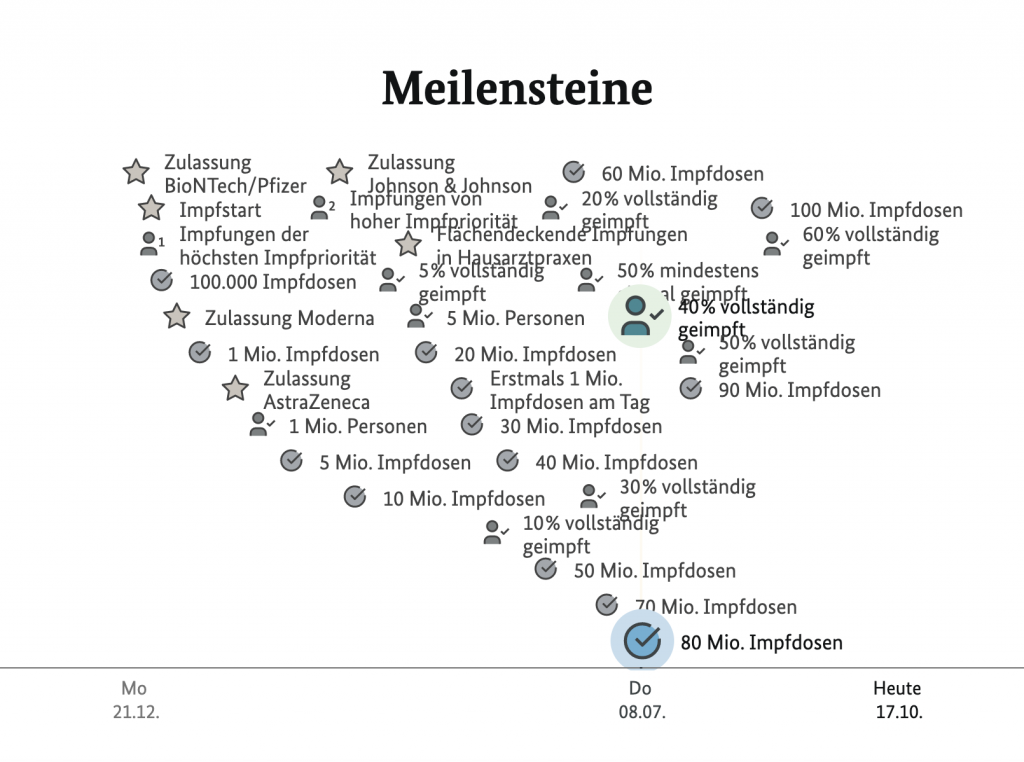
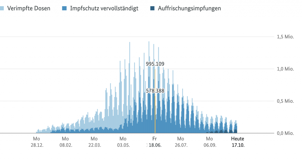
The project that I found interesting was one from Nand.io which visualizes vaccination progress in Germany. On the web page that they made, there are a plethora of interactive maps that the user is able to hover over and see the progression of vaccination rates. A part that I found extremely interesting was their tracking of different milestones within the pandemic (see below). The user is able to see a timeline with different milestones all piled on top of each other. They can then hover over different sections and see more information about them and when they took place. This is something I’ve never seen before in tracking covid cases or vaccinations which I think is really interesting to visualize. What I admire most about this project is that it is using data visualization for a very important purpose. I think especially now, being able to make progress tangible and visual can help people move forward and be hopeful for change.

Project: 07 Curves

sketch
//Jacky Lococo
//jlococo
//Section C
var nPoints = 50; // points on the epispiral and ranunculoid
function setup() {
    createCanvas(480, 480);
}

function draw() {
    background(255);
    push()
    translate(width/2, height/2)
    rotate(mouseX/2, mouseY/2)
    epispiralOne() //espiral - will repeat this shape to make more spiral lines
    epispiralOne()
    rotate(mouseX/4, mouseY/2)
    epispiralOne()
    ranunculoid() //flower curve -- will repeat to create spirals
    rotate(mouseX, mouseY)
    scale(2.0)
    ranunculoid() //flower curve scaled by factor of 2
    ranunculoid()
    scale(0.5)
    ranunculoid()
    pop()

    push()
    scale(2.0) //scaled up flower in top left corner
    ranunculoid()
    pop()
    ranunculoid() // flower in top left corner

    push()
    translate(width, height)
    ranunculoid()// flower in bottom right corner
    scale(2.0)//scaled up flower in right corner
    ranunculoid()
    pop()

    ellipse(width/2, height/2, mouseY/30, mouseY/30 ) //creates scaling ellipse


}

function epispiralOne(){ //episprial with two curves
    var a = 40
    var b = a / 2.0;
    var h = mouseX
    var ph = mouseX / 50.0
    noFill()
    strokeWeight(2)
    stroke(0, 100, mouseY)
    beginShape();
    for (var i = 0; i < nPoints; i++) {
        var t = map(i, 0, nPoints, 0, TWO_PI);
        x = (a + b) * cos(t) - h * cos(ph + t * (a + b) / b); //formulas
        y = (a + b) * sin(t) - h * sin(ph + t * (a + b) / b);
        vertex(x,y)
    }
    endShape()

}

function ranunculoid(){ // type of Epicycloid with four petals
    var a = mouseY / 30 // changes the size of the shape
    noFill()
    stroke(mouseX, 0, 100) // changes just the red value 
    strokeWeight(1)
    beginShape();
    for (var i = 0; i < nPoints; i++) {
        var t = map(i, 0, nPoints, 0, TWO_PI);
        x = a*(6 * cos(t) - cos(6*t)); //formulas
        y = a*(6 * sin(t) - sin(6*t));
        vertex(x,y)
    }
    endShape()

}


Looking Outwards – 07

This project is called Flight Patterns by Aaron Koblin. 

Flight Patterns (North America)

This is the visualization of the dataset of air traffic in North America. I think this project is very interesting in that each line created represents a different path, and in the end, the general form created reminds the audience of the form of North America on the map. The points of destinations of
“meeting points” that are overlapped often are white, and the paths, in general, have different colors to give diversity to the work and emphasize each unique flight pattern. As indicated from the official site, the dataset of the patterns was plotted using a processing programming environment. 

Link

Project 07: Composition with Curves

sketch
var nPoints = 100;
var EPITROCHOID = 0; 
var CRANIOID = 1; 

var curveMode = EPITROCHOID;


function setup() {
    createCanvas(480, 480);
    frameRate(5);
}


function draw() {
    background(200,200,255);
    
    // curve
    push();
    translate(width / 2, height / 2);
    switch (curveMode) {
    case EPITROCHOID:
        drawEpitrochoidCurve();
        break;
    case CRANIOID:
        drawCranioidCurve();
        break;
    }
    pop();

    //moving shape
    let x = mouseX;
     let y = mouseY;
     let ix = width - mouseX;  // Inverse X
    let iy = height - mouseY; // Inverse Y
    ellipse(x, height/2, y, y);
     fill(255);
     noStroke();
    ellipse(ix, height/2, iy, iy);
}

function drawEpitrochoidCurve() {

    var x;
    var y;
    
    var a = mouseY;
    var b = mouseX;

    noStroke();
    fill(255,200,200);

    beginShape();
    for (var i = 0; i < nPoints; i++) {
        var t = map(i, 0, nPoints, 0, TWO_PI);
        
        x = 4 * b * cos (t)* cos (t)* cos (t);
        y = a * sin (t) *sin (t)* sin (t);
        
      vertex(x, y);
    }
    endShape(CLOSE);
    
}

LO 07: Information Visualization

Flight Patterns by Aaron Koblin

Aaron Koblin’s Flight Patterns Visualization exhibits strings of colorful lines, representing the movement and compactness of flight pathways. Koblin uses data values from Processing programming environment to map and plot certain routes of air traffic occurring over North America. For areas where there prevails high overlapping air traffic, the intersection points have an intense white color and a slight shine, whereas the other lines seem to relatively fade out into the dark background. I found his particular style of generating art really intriguing with the capability to control the vivid light as well as its quality of glowing effect, and I really love the overlapping colors of lines that produces this mesmerizing illumination. I admire how he used algorithms as well as loop or conditional functions to create such entrancing artwork and I believe his artistic sensibility emerges from his interest in science visualization.

Reference: http://www.aaronkoblin.com/project/flight-patterns/

Project 07: Composition with Curves

sketchDownload


var bgR;
var bgG;
var bgB;
var x;
var y;

function setup() {
    createCanvas(480, 480);
    frameRate(10);
}

function draw() {
    bgR = map(-mouseY, 0, height, 50, 100); //select random background colors
    bgG = map(-mouseX, 0, width, 50, 200);
    bgB = map(-mouseY, 0, height, 0, 100);
    background(bgR, bgG, bgB);
    translate(220, 220);
    for (var c = 1; c < 5; c ++){ //draw the curve
        for (var d = 1; d < 5; d ++){
            push();
            translate(c * 10, d * 10);
            drawEpicycloidPedalCurve(); //reference to link -- https://mathworld.wolfram.com/EpicycloidPedalCurve.html
            pop();
        }
    }
}

function drawEpicycloidPedalCurve() {
    var a = map(mouseX, 0, width, 15, 100); //parameter of the curve moves with the mouse
    var b = map(mouseY, 0, height, 15, 50);
    noFill();
    stroke(mouseX, mouseY, 180);
    strokeWeight(0.8);

    push();
    beginShape(); //draw the curve
    for (var i = 0; i <= 600; i ++) {
        var theta = map(i, 0, 100, 0, PI); 
        x = (a+b)*cos(theta) - b*cos(((a+b)*theta)/b); //epicycloids are given by the parametric equations
        y = (a+b)*sin(theta) - b*sin(((a+b)*theta)/b);
        vertex(x, y);
    }
    endShape();
    pop();
}
The pedal curve of an epicycloid with pedal point at its origin

For this project, I wanted to iterate a flower-like shape using parameter equations so I decided to draw Epicycloid Pedal Curve as the composition. I played with mouseX and mouseY as well as random RGB colors across the canvas so the user has the freedom to explore with unique variations of epicycloid pedal curve patterns.

Project 07

sketch

//Tim Nelson-Pyne
//tnelsonp@andrew.cmu.edu
//Section C
//Project-07-Composition With Curves

//size of hypocycloid
var a;
//number of cusps in the hypocycloid
var n;
//x coordinate of points on graph
var x;
//y coordinate of points on graph
var y;
//total number of points to generate
var nPoints;

function setup() {
  createCanvas(480, 480);
  background(0);
  nPoints = 1000;

  
}

function drawHypocycloid (a, n) {
  push();
  translate(240, 240);
  stroke(255, 0, 0);
  strokeWeight(0.2);
  //changes the fill color based on mouseX
  fill(map(mouseX, 0, 480, 0, 255), 0, map(mouseX, 0, 480, 0, 255));
  

  for (var i = 0; i <= nPoints; i++) {
    t = map(i, 0, 1000, radians(0), radians(13 * 360))
    //equation for x value of hypocycloid
    x = (a/n) * ((n-1) * cos(t) - cos((n-1)*t));
    //equation for y value of hypocycloid
    y = (a/n) * ((n-1) * sin(t) - sin((n-1)*t));
    //draws hypocycloid using elipses centered at points along the graph
    ellipse(x, y, map(abs(x), 0, 240, 0, 25), map(abs(y), 0, 240, 0, 25));
    
  }
  pop();
}

function draw() {
  background(0);
  //sets a based on mouseY
  a = map(mouseY, 0, 480, 20, 100);
  //sets n based on mouseX for first shape
  n = map(mouseX, 0, 480, HALF_PI, 5);
  //draw first shape
  drawHypocycloid(a, n);
  //sets n based on mouseX for second shape
  n = map(mouseX, 0, 480, -10, -HALF_PI);
  //draw second shape
  drawHypocycloid(a, n);

  
}

I created an interactive visualization of multiple hypocycloids.

LO 7

Fleshmap Listen

Fernanda Viegas and Martin Wattenburg

This data visualization maps the frequency of references to specific body-parts within different musical genres. I think this gives some interesting and entertaining insight into how the body is talked about in music. This data visualization probably required some type of AI to recognize and categorize words that refer to specific body parts. I think this is an example of data visualization being used creatively to get at an unusual question.

http://hint.fm/projects/listen/

Project 07: Composition with Curves

project 07 sketch copy

var nPoints = 100;

function setup() {
	createCanvas(480, 480);
}

function draw() {
	background(153,0,76);
	
	//centered in the middle of the canvas 
	translate(240, 240);
	rotate(mouseX/50);
	
	//drawing the functions created 
	strokeWeight(4);
	noFill();
	stroke(255);
	drawHypotrochoidCurve();
	stroke(40,63,141);
	drawEpitrochoidCurve();
}

//Hypotrochoid Curve
function drawHypotrochoidCurve() {

	var x;
	var y;
	var a = map(mouseX, 0, width, 0, 100);
	var b = a / 10;
	var h = constrain(mouseY, 0, height, 0, 250);

	//curve formula
	beginShape();
	for (var j = 0; j < nPoints; j ++) {
		  var t = map(j, 0, nPoints, 0, TWO_PI);
		  x = (a - b) * cos(t) + h * cos(((a - b) / b) * t);
		  y = (a - b) * sin(t) - h * sin(((a - b) / b) * t);
		  vertex(x, y);
	}
	endShape();
} 

//Epitrochoid Curve
function drawEpitrochoidCurve() {

	var x;
	var y;
	var a = map(mouseX/5, 0, width, 0, 100);
	var b = a / 10;
	var h = constrain(mouseY/5, 0, height, 0, 250);

	//curve formula 
	beginShape();
	for (var j = 0; j < nPoints; j ++) {
		  var t = map(j, 0, nPoints, 0, TWO_PI);
		  x = (a + b) * cos(t) - h * cos(((a + b) / b) * t);
		  y = (a + b) * sin(t) - h * sin(((a + b) / b) * t);
		  vertex(x, y);
	}
	endShape();
}

I enjoyed the straightforward nature of this assignment. For the two curves I chose, the Mathworld website provided clear formulas to use. It was interesting to play around with the constrain and map functions and see how the alterations of my curves changed as I, for instance, divided the width by 10 or multiplied the mouseX by 5. I also added in some rotation. In the project, as you move the mouse from left to right, the curves become more compressed. As you change the mouseY value, the curves become smaller and change in shape. I wanted to have the curves look smooth at some points (such that they look like two squiggly lines) and then more angular at other positions.

This is what the curves look like when the mouse is in the upper right hand corner.
This is what the curves look like when the mouse is in the middle right side.

Project-07: Composition with Curves

Composition CurvesDownload
/*Name:Camellia(Siyun) Wang; 
Section: C; 
Email Address: siyunw@andrew.cmu.edu;*/


function setup() {
    createCanvas(480, 480);

    nPoints = 100;
}


function draw() {
    background(245,222,179);
    push();
    translate(width / 2, height / 2);
    drawBulletnose();
    pop();
}

function drawBulletnose(){
    var x;
    var y;
    var a = constrain(mouseX / 2,0,200);
    var b = constrain(mouseY / 2,0,200);

    stroke(240,248,255);
    strokeWeight(5);
    fill(230,230,250);
    beginShape();
    for(var i = 1; i < nPoints; i++){
        var t  = map(i,0,nPoints,0,PI);
        //Bullet Nose
        x = a * cos(t);
        y = b * (1/tan(t));
        vertex(x,y);
    }
    for(var i = 1; i < nPoints; i++){
        var t  = map(i,0,nPoints,0,PI);
        //Bullet Nose
        x = -a * cos(t);
        y = b * (1/tan(t));
        vertex(x,y);
    }
    endShape();


}
   

When doing this assignment, I first browse through the given curve website to see which curve I am most interested in and can possibly create variation in it. When I chose to do the Bullet Nose, I looked at its x and y equation, then realized that to create variation of this form, I need to change t, a, and b. That’s why in my code, I defined a and b first in the draw function, and then defined t in the for loop to draw the shape. Then I set the a and b to be manipulated by mouseX and mouseY.

Bullet Nose 1: Largest MouseX and mouseY
Bullet Nose 2: mouseX smaller, mouseY smaller