For my typology, I objectified “I love you”.
(I would have separated the models into their own 3D viewers, but Sketchfab only allows one upload per month.)

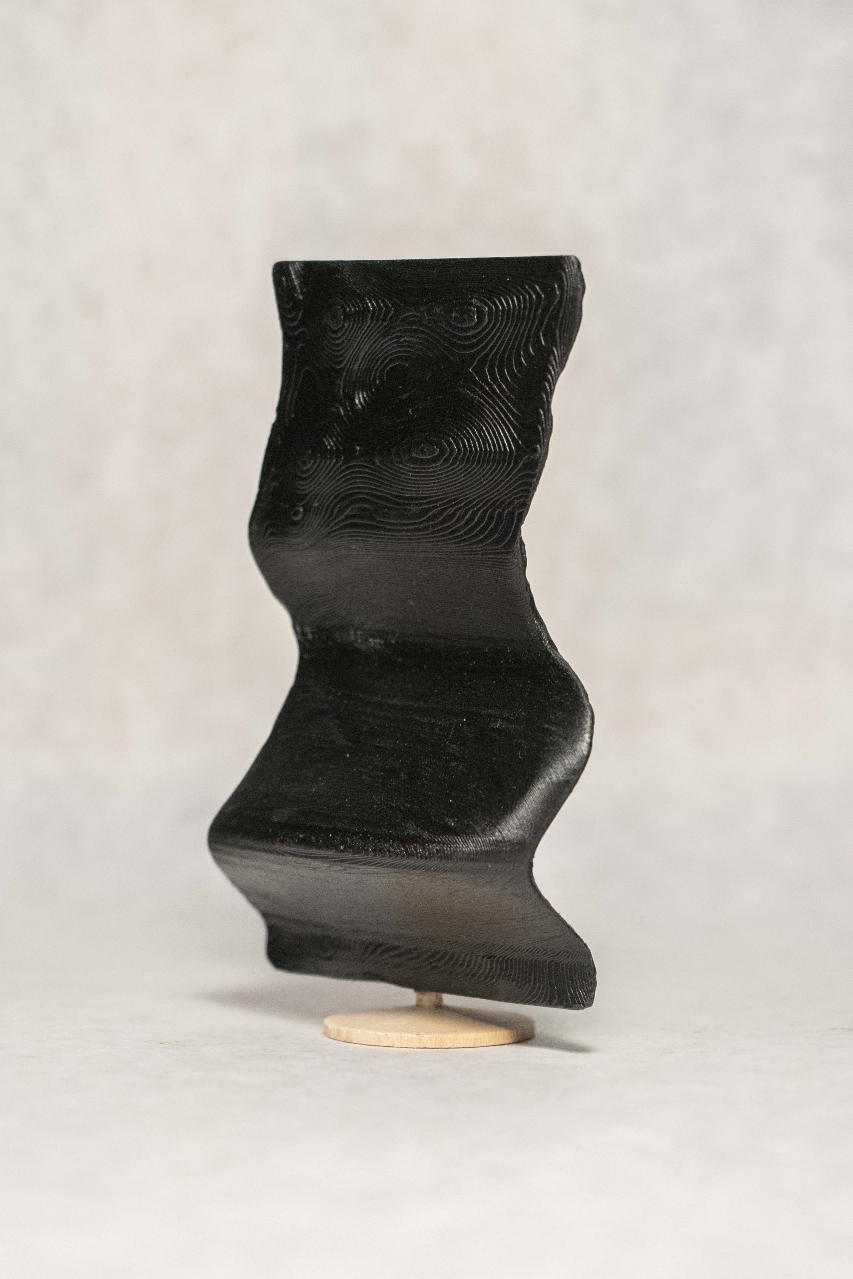
I created 3D sculptures out of the shape that one’s mouth makes over time as they speak the words “I love you” in their first language.
Background
As I’ve watched myself fully commit to art over the last few months, I’ve realized that my practice—and, really, my purpose as a human—is about connecting people. I love people. I love their feelings and their passions, listening to their stories, working together, and making memories. I love love. I want people to experience the exhilaration, sadness, anger, jealousy, and every single powerful emotion that stems from love and empathy.
Having this realization was quite refreshing, as for the last year and I half I have been debating over various BXA programs, majors, minors, and labels. But no longer–I am proudly a creator, and I want to create for people.
Therefore, this project represents both my introduction to the art world as a confident and driven artist and a symbol of my appreciation for those who have helped me get to this point in my life. The people I love are the reason I live, so I wanted to create something that allowed other people to express that same feeling.
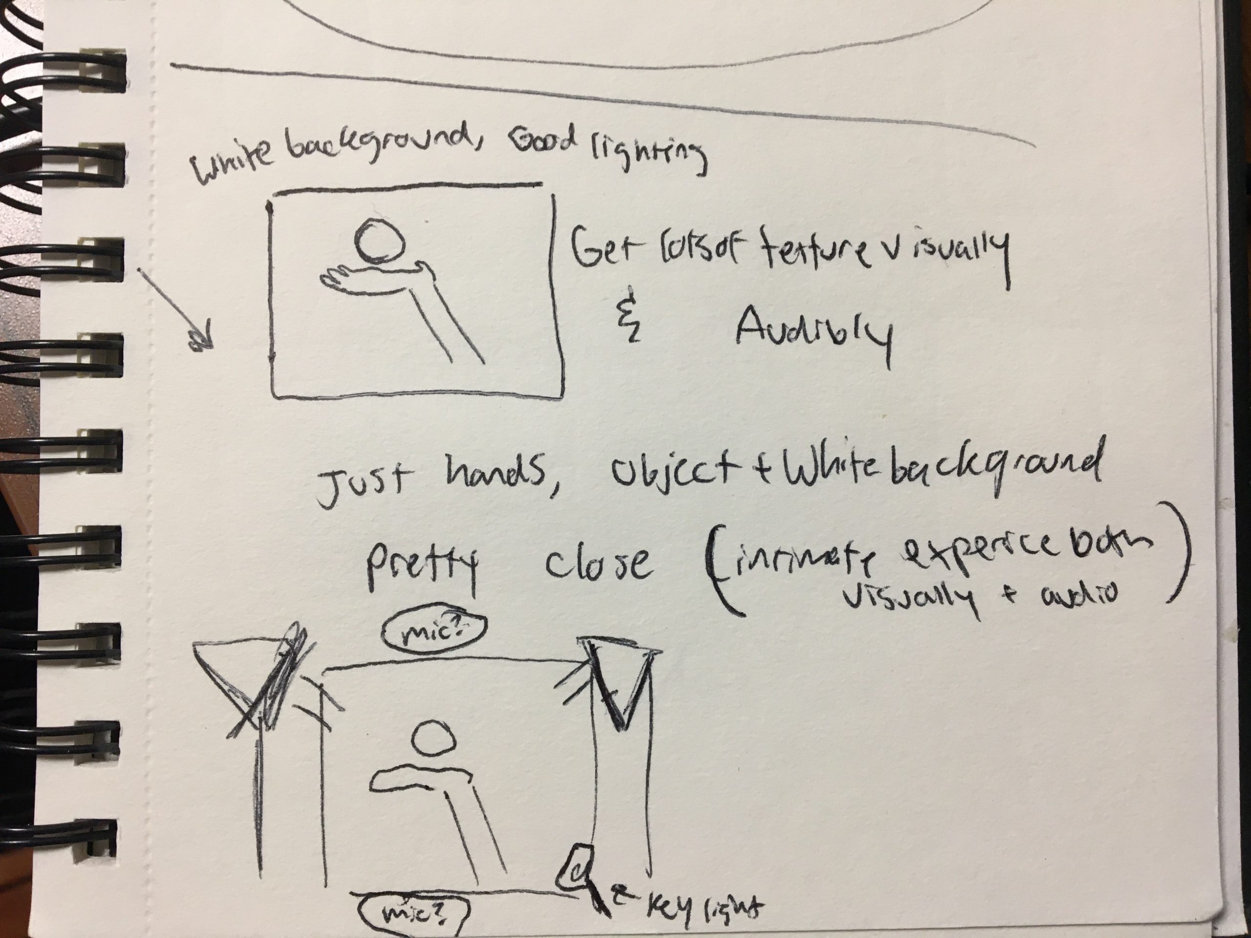
method
My typology machine is quite obnoxious, and the journey I took to figure it out was long.
First, I tested everything on myself.
I recorded myself saying “I love you”.
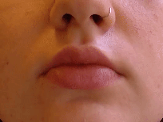
I originally wanted to do everything with a script based on FaceOSC. I wrote such a script, which took a path to a video file and extracted and saved an image of the shape of the lips and the space inside the lips for every frame.
My fear for this method was true: I felt there were not enough keypoints around the lips to provide distinct enough lip-shape intricacies from person to person. Plus FaceOSC is not perfect, so some of the frames had glitched and produced incorrect lip-shapes. This would not do when it came to stitching everything into a 3D model. From here I decided to do it all manually.
Most of these “I love you” videos broke down into about 40 frames, and if not I used every other frame to trim it down.
I opened every single frame of each video in Illustrator, traced the inside of the mouth with the pen tool, and saved all the shapes as DXF files.
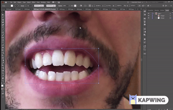
I did this on my own mouth first, but here is Pol’s. At this point I wasn’t sure whether I would be laser cutting or 3D printing for the final product, but I knew laser cutting would be the fastest way to create a prototype, so I compiled all the shapes of my mouth onto one DXF and laser cut them all in cardboard.
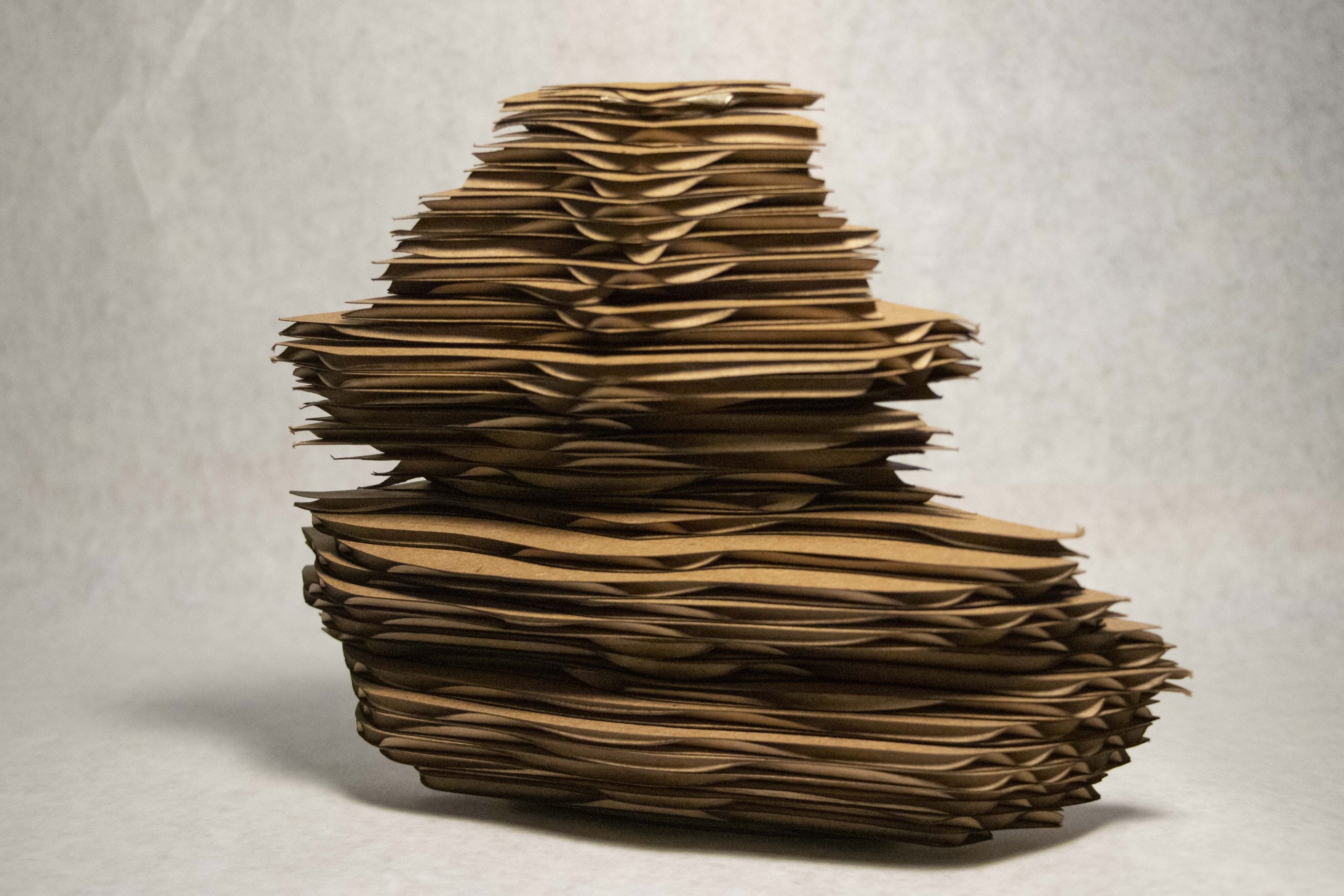
I thought the stacking method would be cool, but it was not. I did not like the way this looked. At this point I buckled down and prepared myself for the time required to 3D print.
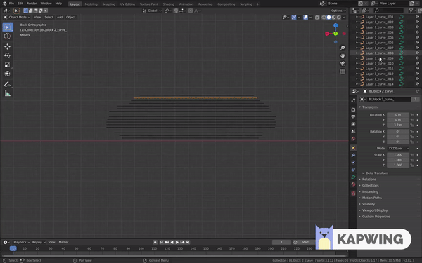
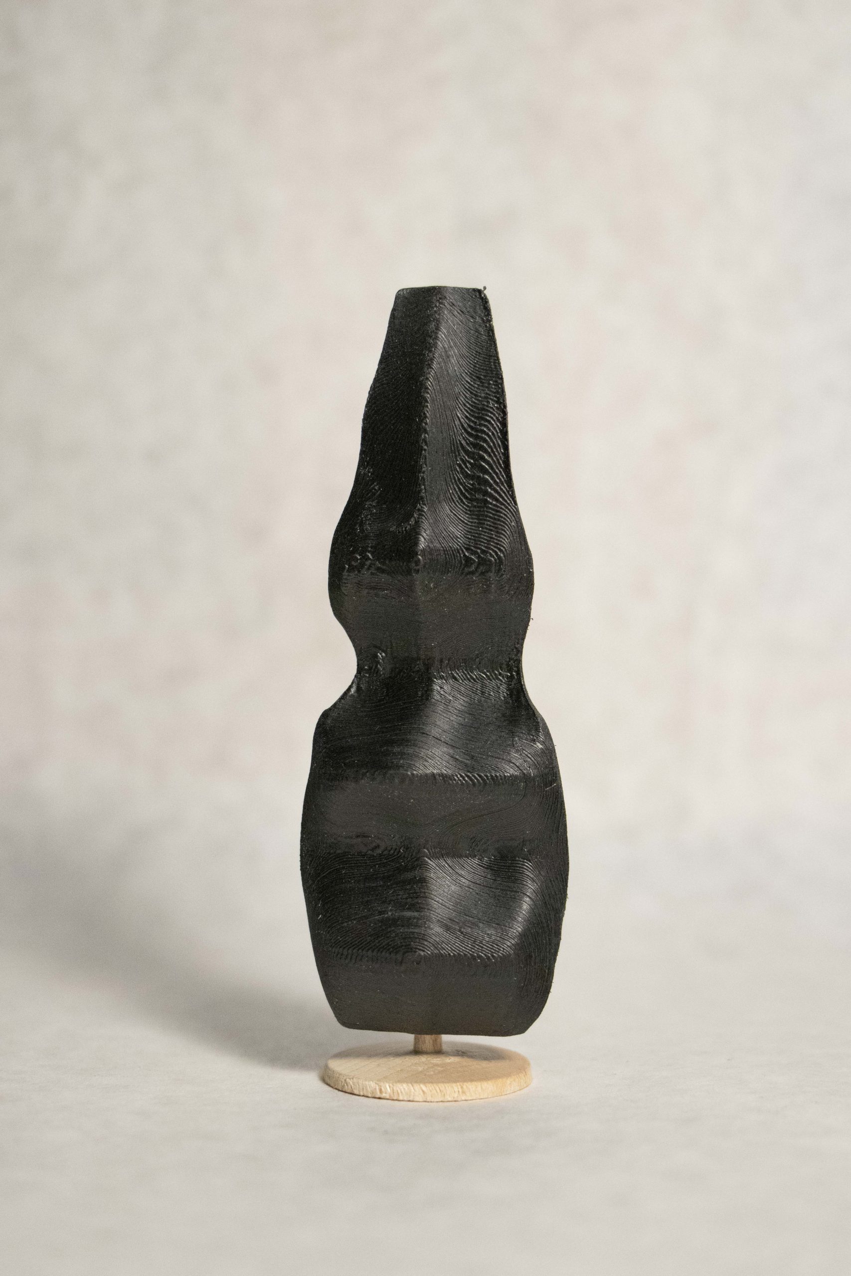
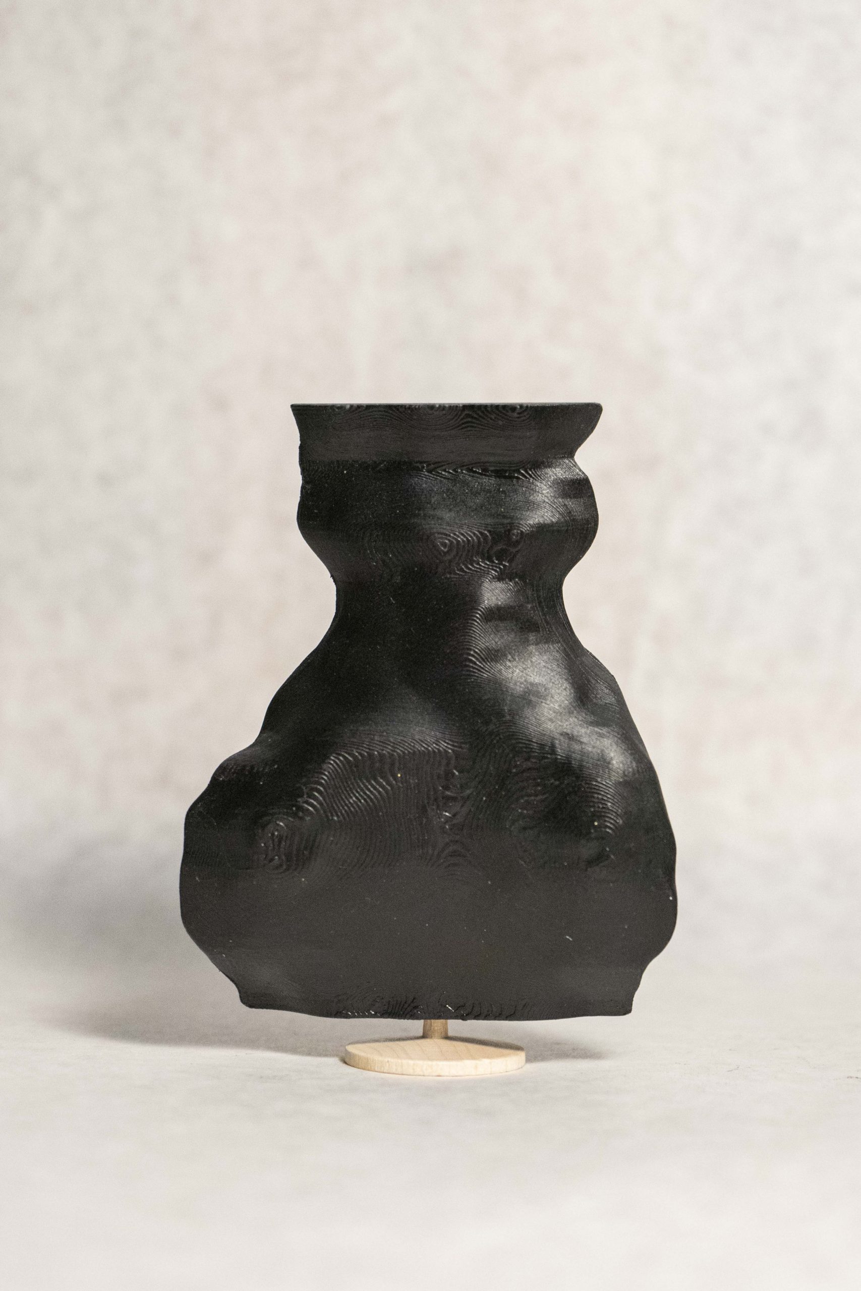
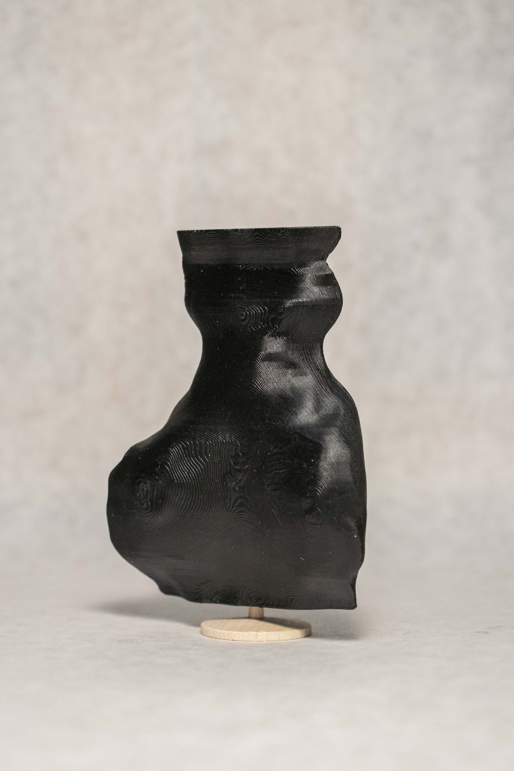
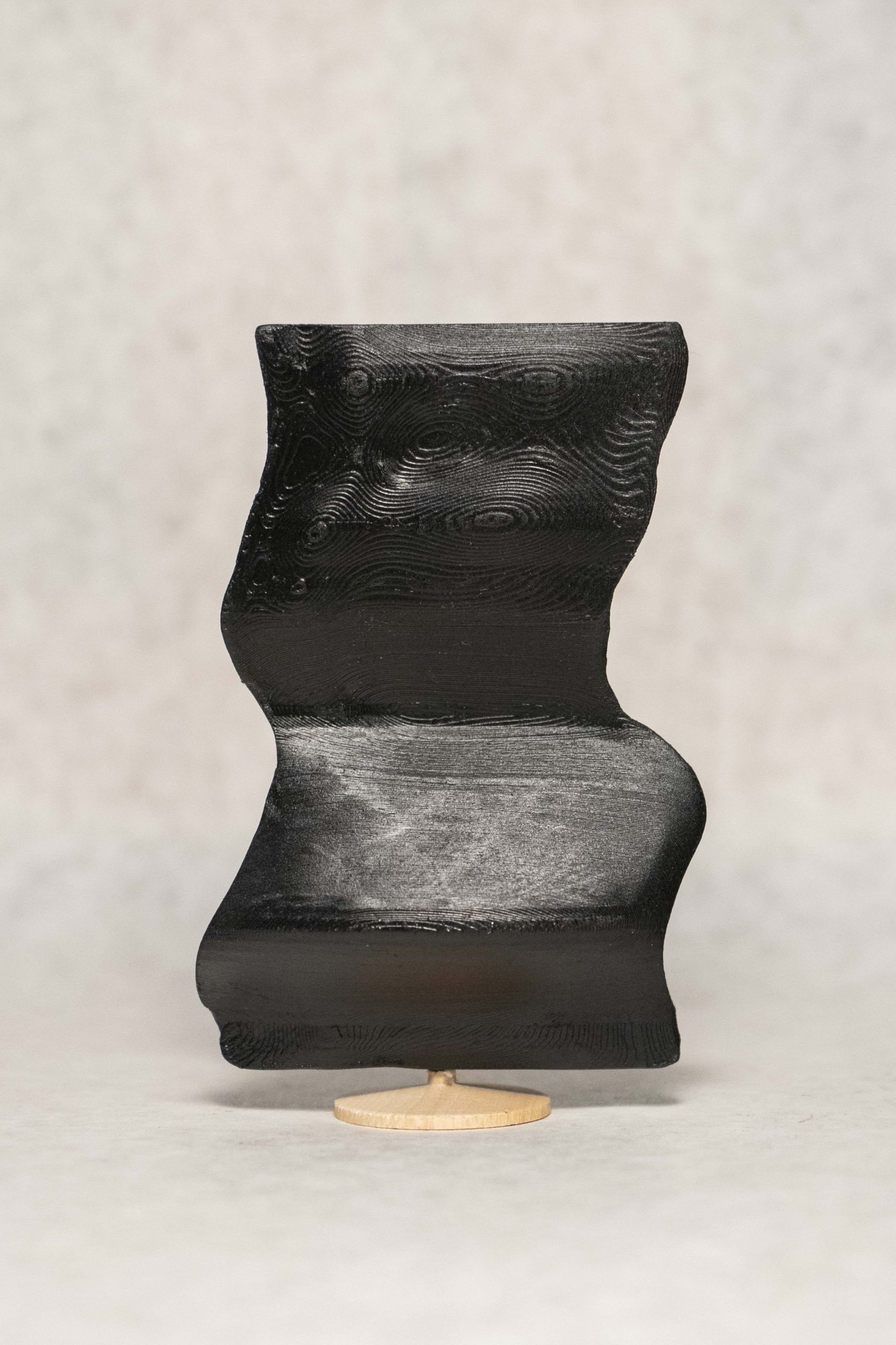
To do this, I manually stacked all the lip-shapes in Blender and stitched them together to create a model.
With the first two models I made, I printed them at a very small scale (20mm).
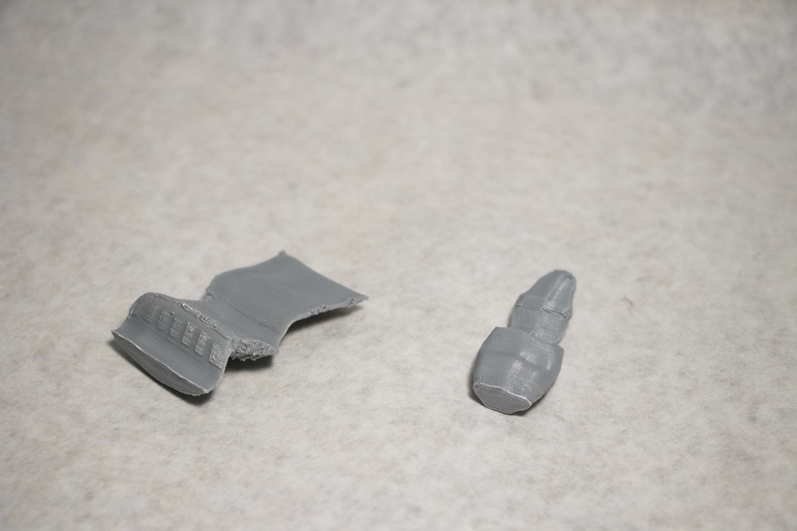
I was definitely happier, but they needed to be bigger.
Finally, I printed them at the size they are at now, which took 12 hours. One incredibly frustrating thing I did not document was the fact that the scaffolding accidentally melded to the actual model, so I spent an hour ripping off the plastic with pliers and sanding everything down. And for the finishing touch I spray painted them black, and attached them to little stands.
Cassie (English)

Policarpo (Spanish)
Ilona (Lithuanian)
discussion
One of the most interesting aspects of this project is that it exemplifies the idiosyncrasies of the ways we communicate. As you can see, some people’s mouths are long and some are short; some enunciate a lot while others don’t; some talk symmetrically while others don’t. So not only are the sculptures physical representations of a mental infatuation, love, but they almost become portraits of the people from which they came. This is a look into the tendencies of the owner–the emotions they feel, the lies they tell, the passion with which they speak, the culture from which they come all influence the shape of their mouths. These sculptures tell the unique story about a person and their connection with the recipient of their “I love you”. As a result, no two sculptures can be the same.
Unfortunately, the manual nature of this process, plus waiting for the 3D printing, allowed me to create only 3 sculptures for the deadline. However, I am definitely not finished with this project.
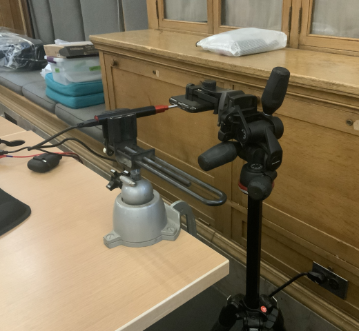
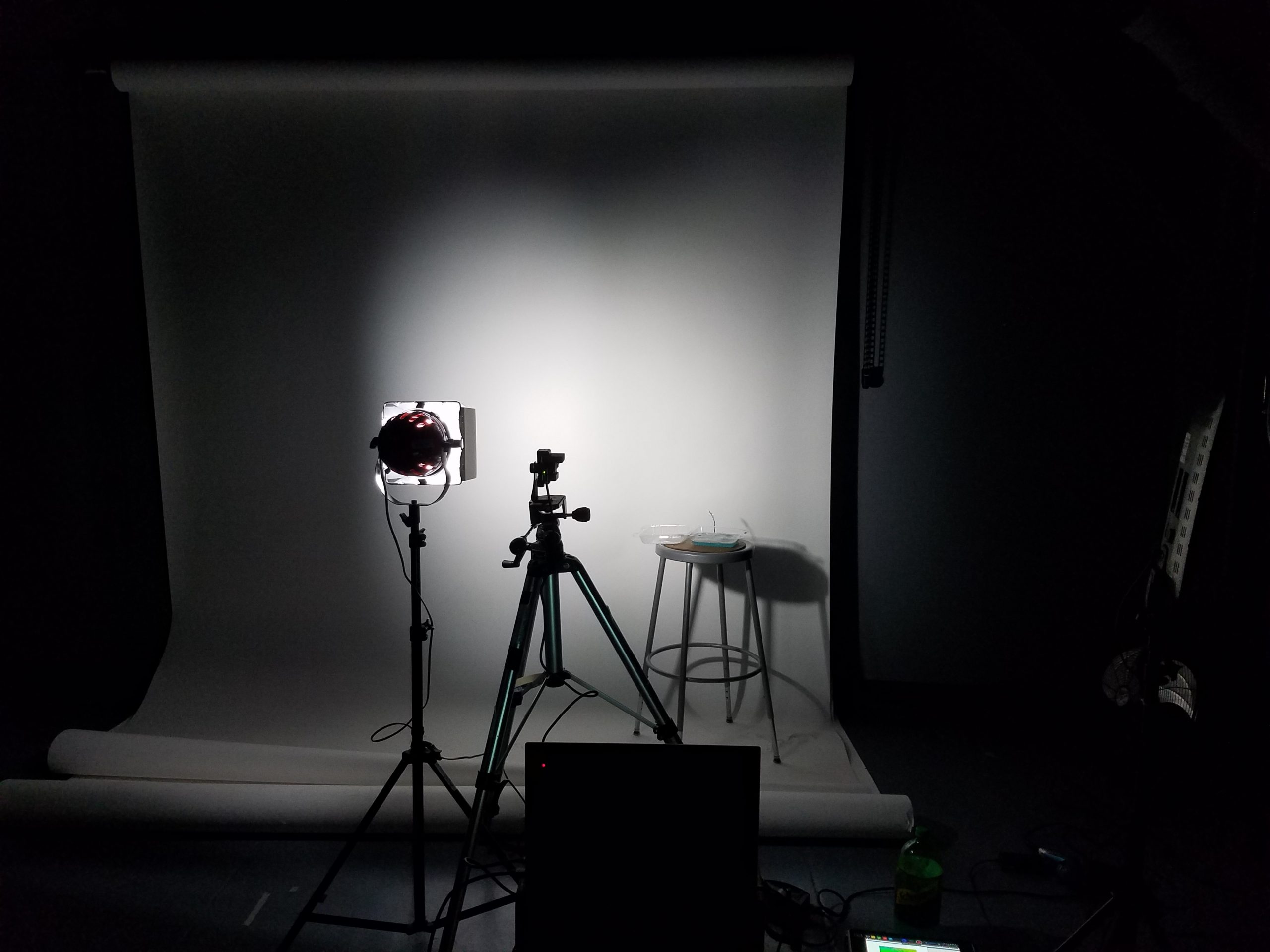 The photo setup I ended up using with the polarization camera, light with circular polarization filter, and my bubble juice.
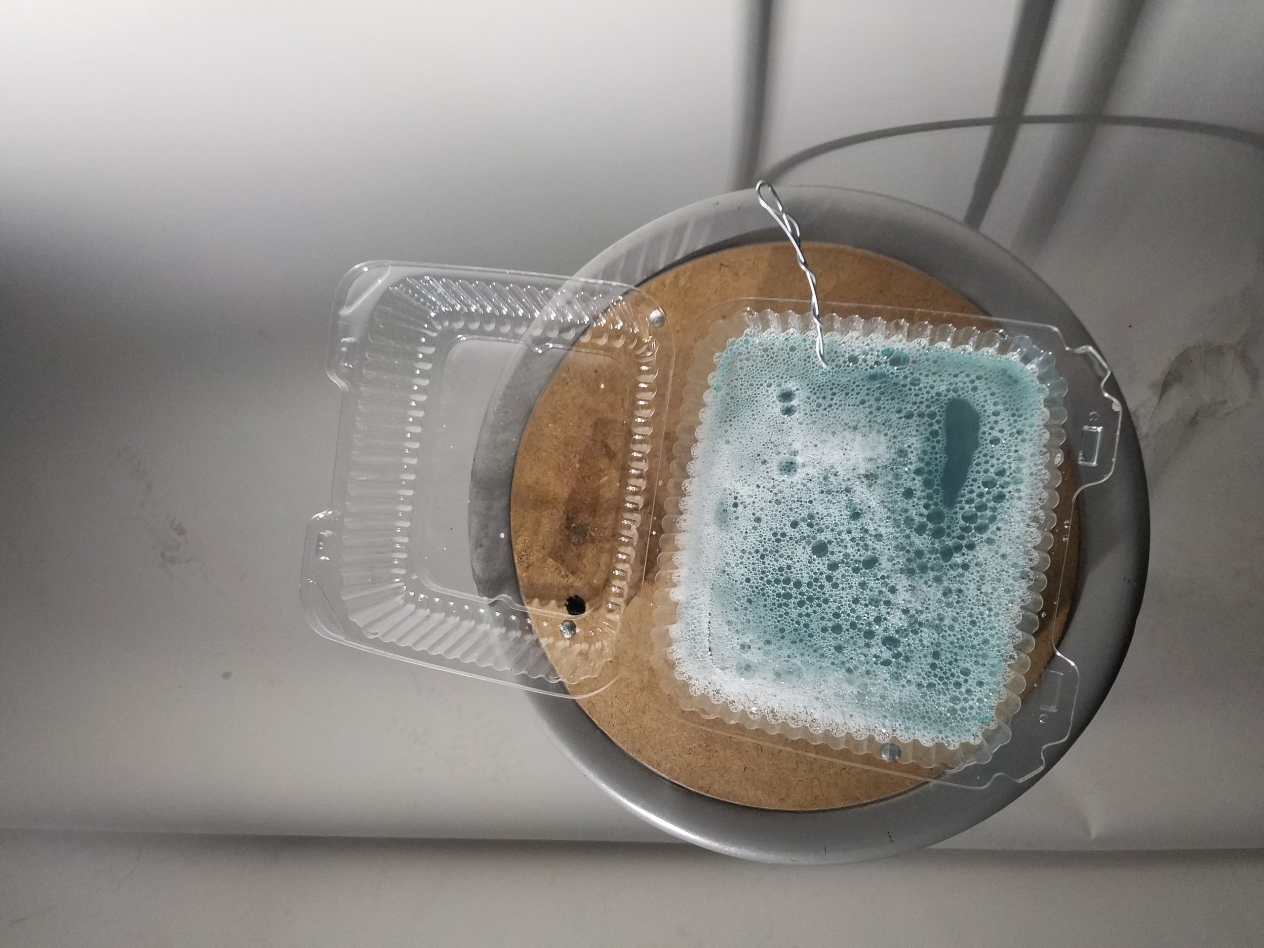 My bubble juice (made from dish soap, water, and some bubble stuff I bought online that’s pretty much just glycerin and baking powder)
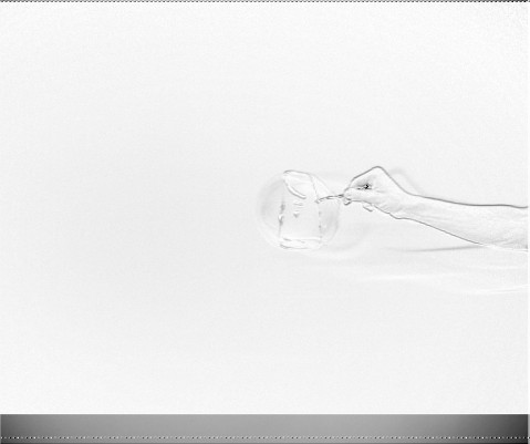
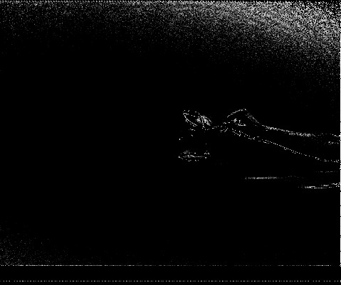
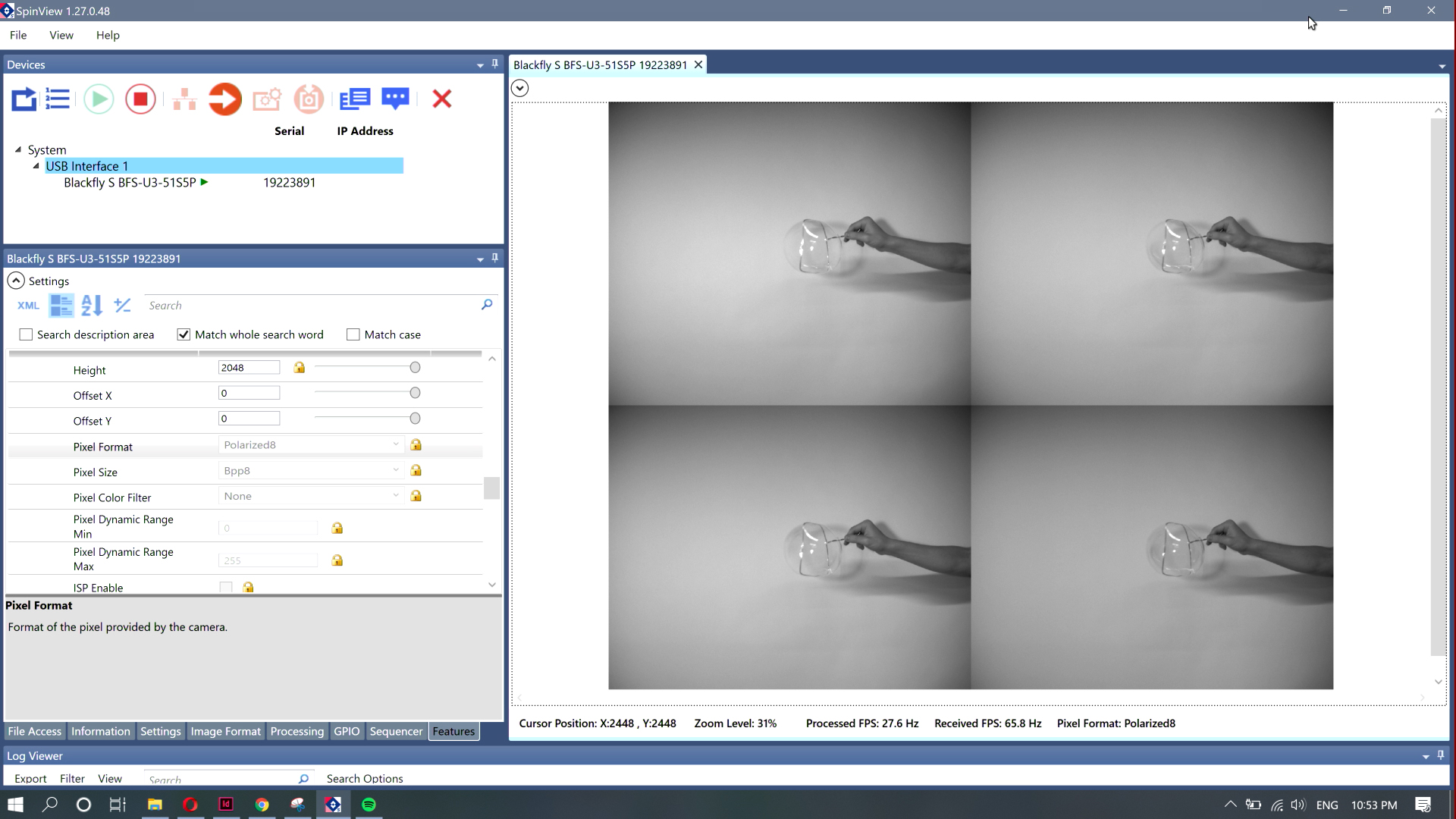 An image of my arm I captured from the screen recording.