agusman-LookingOutwards-05-AFrame

A Frame: A web framework for building virtual reality experiences
A Frame Website

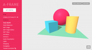
A Frame is a three.js framework that enables creators to construct virtual reality and experiences for the web. It has an entity-component-system architecture, which is a common and desirable pattern in 3D and game dev. According to A Frame, some of the benefits of ECS include:

“- Greater flexibility when defining objects by mixing and matching reusable parts.
– Eliminates the problems of long inheritance chains with complex interwoven functionality.
– Promotes clean design via decoupling, encapsulation, modularization, reusability.
– Most scalable way to build a VR application in terms of complexity.
– Proven architecture for 3D and VR development.
– Allows for extending new features (possibly sharing them as community components).”

What I love about software like this is that it makes a craft (creating virtual reality experiences) that up until now has been so elite and obscure accessible to the masses. It’s about time that the public start to involve themselves more personally with a field that is growing more and more rapidly every day and one that will dominate many top industries and social environments.

It’s also exciting that this platform in particular focuses on web-based experiences. The internet is the world’s most highly accessed mediums and being able to share groundbreaking digital experiences that run efficiently on the web is a big step towards making this craft more prevalant in the world.
HaeWanPark-LookingOutwards-5

Rainbow paper Series By Machineast, 2015

Machineast is a design studio consisting of two designers, Rezaliando and Fizah Rahim. Most of their works are 3D computer graphics. Even though this studio has provided visual solutions to clients, these two designers have also created several personal driven works as artists. ‘Rainbow Paper Series’ is also a project driven by themselves and inspired by their childhood experiences. During the childhood, they both have fascinated by holographic colors. When they have grown up in the 80’s, holographic cartoon and toys were so popular. After grown up, they found the way to express their fascination and nostalgia toward holographic colors in their 3D artwork. The shimmering and shiny surfaces characterized their childhood and give honor to the 80’s era of a hologram. In my opinion, the combination of shiny effects on surfaces and holographic bright colors created interesting visual. This work is nice artistic expression pieces.

Rainbow Paper Series, Machineast

Rainbow Paper Link

amui1-Project-05-Wallpaper

amui1-p5

//Allison Mui
//15-104 Section A
//amui1@andrew.cmu.edu
//Project-05


var x = 50;
var y = 50;


function setup() {
    createCanvas(480,480);
}

function draw() {
    background(187,0,0)
    stroke(234,247,206);
    strokeWeight(1);
    //flower design
    for (xPosition = 40; xPosition < width - 20; xPosition += 100) {
      //don't make lines through middle
      if (xPosition <= 150 || xPosition > 300) {
        line(xPosition,0,xPosition,height);
        var y = 20;
        //loops for height of canvas - 100 arbitrary number
        for (i = 0; i < 100; i++) {
          //checks if odd or even tick
          if (i%2==0) {
            fill(234,247,206);
            //flower shape
            ellipse(xPosition-10,y-10,5,5);
            arc(xPosition-10,y-10,5,15,PI,0);
            arc(xPosition-10,y-10,15,5,HALF_PI,3*HALF_PI);
            //flower stem
            line(xPosition,y,xPosition-10,y-10);
            y+= 30;
          } else {
            //flower stem
            line(xPosition,y-15,xPosition+10,y-25);
            //flower shape
            ellipse(xPosition+10,y-25,5,5);
            arc(xPosition+10,y-25,5,15,PI,0);
            arc(xPosition+10,y-25,15,5,3*HALF_PI,HALF_PI);
          }

        }
      }
    }

    //middle line

    line(width/2,0,width/2,height/2-75);
    line(width/2,height/2+75,width/2,height);
    //middle beads design
    //top half
    ellipse(width/2,50,10,10);
    ellipse(width/2,60,7,7);
    ellipse(width/2,67,5,5);
    //bottom half
    ellipse(width/2,height-67,5,5);
    ellipse(width/2,height-60,7,7);
    ellipse(width/2,height-50,10,10);


    //chinese oriental symbol
    noFill();
    stroke(218,0,0);
    strokeWeight(5);
    ellipse(width/2,height/2,125,125);
    ellipse(width/2,height/2,50,50);
    ellipse(width/2,height/2,20,20)


    //inside of middle symbol
    //rotate 8 times
    for (var i = 0; i <8; i++) {
      push();
      //move to center of canvas
      translate(width/2,height/2);
      //rotate 8 times
      rotate(TWO_PI * i/8);
      strokeWeight(2);
      //design
      line(30,28,35,33);
      line(35,33,40,28);
      line(40,28,30,18);
      line(30,18,20,30);
      line(20,30,35,42);
      line(35,42,55,15);
      line(55,15,35,12);
      line(35,12,33,15);
      line(33,15,44,23);
      pop();
    }

    noLoop();
}

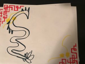
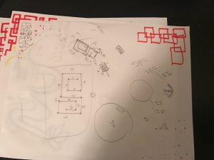
Again, I really enjoyed this project and how challenging it was. Using loops is extremely efficient, however, I found it hard to conceptualize. For my project this week, I wanted to connect it with my culture. I am satisfied with my final product. However, originally, I wanted to draw a dragon. But, it was too hard to figure out curves, quadratic curves, bezier curves, etc. In the future, I’d like to expand upon that and how I can utilize loops to make it easier to draw. I started with sketching and as you can see see from my attached pictures, my wallpaper changed many times throughout the iterations.

Above is my original sketch.

Above is what I used to figure out and conceptualize how to do the for loops with the middle oriental symbol.

rkondrup-Looking-Outwards-05

The Arabesque Wall is a highly complex computer-generated form created by Benjamin Dillenburger and Michael Hansmeyer for the 3DXL exhibition. At almost 10 feet tall, the form was modeled using complex algorithms and subsequently 3D printed as thousands of layers. The Arabesque Wall,a 50 gigabyte file, took months to design and four days to print the sheets, which were then assembled in a four-hour period.
The work is a highly complex form which folds and intersects with its own surface hundreds of thousands of times, producing a form with over 200 million individual surfaces. These complexities are of a level so intricate that humans could not fully conceive of them without the aid of computers. Hansmeyer and Dillenburger believe that this type of application of technology in architecture can augment our understanding and experience of architecture, saying “Architecture should surprise, excite, and irritate. . . it should address not only the mind, but all the senses – viscerally. It must be judged by the experiences it generates.”

juyeonk-LookingOutwards-05

Image result for flume album art


Image result for flume album art


Image result for flume album art


Title: Album art for Flume’s ‘Skin’

Creator: Jonathan Zawada

Year of Creation: 2016

Link to the Project: https://creators.vice.com/en_au/article/jpbxy8/visionaries-jonathan-zawada-interview

Behind The Cover Art Of Flume’s Grammy Winning Album

Link to the Bio of the Artist: http://www.zawada.art/about/


Many people have come across these artworks at least once in the past few years, but never wondered how they were actually made. Behind the Grammy-winning album were the cover artworks created by a digital artist and a designer named Jonathan Zawada.

He has covered a variety of medium and and kinds of artworks such as music video, furniture design and album cover design. And as you can infer from these album arts, a lot of his work is inspired by nature. Nevertheless, he was never really interested in flowers, until he started working for Flume’s album designs. This set of designs include a variety of flowers or flower-inspired images with different colors and textures all generated by computer procedures. The specific algorithm he used generates different appearances of flower petals and “all the tiny little disturbances on the surfaces”. It is ironic how the mathematical programming he used was for the purpose of creating the “airy-feathery I-love-nature” effects. He acknowledges that there are other ways of approaching these natural objects or creating such effects such as hand-paintings or drawings, but he said that he does not necessarily feel like cheating using computer programs to generate these images.


ctv-Project-05-Wallpaper

sketch

//Ty Van de Zande
//Section B
//ctv@andrew.cmu.edu
//Project-05

//canvas size
var cWid = 470;
var cHgt = 470;

//blockForm size
var wid = 50;
var hgt = 70;

//counter
var i = 0;

//some traits of circles and lines
var dia = wid;
var wght = 1;

//points shapes interact with
var xZero = 0;
var xOne = wid*.25;
var xTwo = wid*.5;
var xThree = wid*.75;
var xFour = wid;
var x = [xZero, xOne, xTwo, xThree, xFour];

var yZero = 0;
var yOne = hgt*.25;
var yTwo = hgt*.5;
var yThree = hgt*.75;
var yFour = hgt;
var y = [yZero, yOne, yTwo, yThree, yFour];


function setup() {
    createCanvas(cWid, cHgt);
    
    //splits canvas into cells for each pattern block
    //x-axis
    for(xOff=0; xOff<=cWid/wid; xOff++){
        
        //y-axis
        for(yOff=0; yOff<=cHgt/hgt*2; yOff++){
            
            //calls helper function bg(), sends coordinates
            draw(xOff, yOff);
        }
    }
}


function draw(xOff, yOff){

    ellipseMode(CENTER);
    stroke(200);
    strokeWeight(1);
    
    
    //
    for(i=0; i<xOff; i++) {
        for(j=0; j<yOff; j++){
            
            
    //creates an offset variable for the shapes        
    var xOffset =  i * xOne;
    var yOffset = j * yFour;
            
    strokeWeight(wght);
    
    //rightDownLines
    line(xOne + xOffset, yZero + yOffset, xFour + xOffset, yFour + yOffset);

    
    //leftDownLines
    line(xThree + xOffset, yZero + yOffset, xZero + xOffset, yFour + yOffset);

    //verticalLines
    line(xZero + xOffset*2, yZero + yOffset, xZero + xOffset*2, yFour + yOffset);

    
    //horizontalLines
    line(xZero + xOffset*4, yZero + yOffset/2, xFour + xOffset*4, yZero + yOffset/2);

    
    //ellipses
    noFill();
    ellipseMode(CENTER);
    ellipse(xZero + xOffset*4, yOne + yOffset+8, dia, dia);        
        }
    }
}

This project is based around the Modernist movement (minus color). I am interested in proportions of shape and axis of movement within a static structure. This grid is loosely based on a project I am starting to work on for designing a typeface. Type has four major components: horizontal strokes, vertical strokes, diagonal strokes, and curves. This grid is a dissociation of those elements.

Project 5, odh

odhP5

//Owen D Haft
//Section D
//odh@andrew.cmu.edu
//Project 5

var Right = 0; //Declares the variable for how the series move horizontally 
var Down = 0;  //Declares the variable for how the series move vertically

function setup() {
    createCanvas(479, 479);
    background(150, 120, 200);
}
 
function draw() {
        translate(239, 239); //Moves the array of the series to be centes on the corner
        translate(-480, Down);
        translate(Right, 0);
        for (var y = 0; y < 500; y += 60) {     //Sets up the series of 
            for (var x = 0; x < 500; x += 60) { //intersecting lines
                strokeWeight(2);
                stroke(200, 255, 255);
                line(x, x, y + 80, y - 80);     //Creates the Series of intersecting lines
            };
        };
    Right = Right + 100;
    Down = Down - 100;
}

I chose to play with the criss-cross idea that often shows up on wallpapers. I am a fan of complex but organized patterns so I gave the lines a steroid injection while still keeping them in an array.

dnoh-sectionD-project5-wallpaper

sketch

function setup() {
  createCanvas(480, 480);
  background(220);
}

function draw() {
  for (x = 0; x <= 480;x += 120) {
    for (y = 0; y <= 480; y += 120) {
    //branches thicc
      stroke(105,72,31);
      strokeWeight(2);
      line(x+35,y+0,x+35,y+17);
      line(x+35,y+17,x+58,y+16);
      line(x+58,y+16,x+58,y+75);
      line(x+58,y+75,x+35,y+75);
      line(x+35,y+75,x+35,y+98);
      line(x+35,y+98,x+25,y+98);
      line(x+25,y+98,x+25,y+112);
      line(x+25,y+112,x+35,y+112);
      line(x+35,y+112,x+35,y+120);
      line(x+97,y+0,x+97,y+10);
      line(x+96,y+10,x+83,y+10);
      line(x+83,y+10,x+83,y+28);
      line(x+83,y+28,x+58,y+28);
      line(x+58,y+59,x+84,y+59);
      line(x+84,y+59,x+84,y+96);
      line(x+84,y+96,x+97,y+96);
      line(x+97,y+96,x+97,y+120);
    //branches thin left
      strokeWeight(1);
      line(x+0,y+68,x+13,y+68);
      line(x+13,y+68,x+13,y+78);
      line(x+13,y+78,x+27,y+78);
      line(x+27,y+78,x+27,y+67);
      line(x+27,y+67,x+31,y+67);
      line(x+31,y+67,x+31,y+54);
      line(x+31,y+54,x+58,y+54);
    //branches thin right
      line(x+97,y+10,x+107,y+10);
      line(x+107,y+10,x+107,y+60);
      line(x+107,y+60,x+100,y+60);
      line(x+100,y+60,x+100,y+67);
      line(x+100,y+67,x+120,y+67);
    //leaf top
      stroke(26,175,75);
      strokeWeight(2);
      line(x+7,y+0,x+5,y+2);
      line(x+5,y+2,x+21,y+1);
      line(x+21,y+1,x+22,y+0);
    //leaf 2nd to top
      line(x+35,y+16,x+37,y+26);
      line(x+37,y+26,x+26,y+37);
      line(x+26,y+37,x+25,y+22);
      line(x+25,y+22,x+35,y+16);
    //leaf 3rd to top
      line(x+83,y+28,x+83,y+35);
      line(x+83,y+35,x+101,y+42);
      line(x+101,y+42,x+95,y+28);
      line(x+95,y+28,x+83,y+28);
    //leaf 4th to top
      line(x+84,y+86,x+95,y+77);
      line(x+95,y+77,x+111,y+73);
      line(x+111,y+73,x+101,y+87);
      line(x+101,y+87,x+84,y+86);
    //leaf bottom
      line(x+7,y+120,x+19,y+109);
      line(x+19,y+109,x+25,y+112);
      line(x+25,y+112,x+22,y+120);
    //rose
      stroke(237,71,51);
      line(x+54,y+90,x+40,y+102);
      line(x+40,y+102,x+35,y+112);
      line(x+35,y+112,x+45,y+115);
      line(x+45,y+115,x+58,y+113);
      line(x+58,y+113,x+57,y+97);

      line(x+50,y+94,x+48,y+102);
      line(x+48,y+102,x+51,y+108);
      line(x+51,y+108,x+58,y+113);
      line(x+35,y+112,x+48,y+102);

      noStroke();
      fill(237,71,51);
      triangle(x+53,y+96,x+51,y+102,x+53,y+102);
      triangle(x+51,y+102,x+55,y+101,x+54,y+107);
    }
  }
}

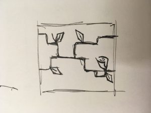
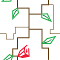
I started with an idea to have geometric natural figures. I started with various sketches, but decided to go with the one posted above. All the branches connect to each other to create a cohesive wallpaper. The sketch was remade in illustrator so I could find the exact pixels/locations of the lines. All in all, this was a fairly tedious project because I had to simply create lines for everything, thus having to check the pixels for everything.

Project-05-Wallpaper-sjahania

sketch

function setup() {
    createCanvas(400, 400);
    background(100,180,180);

    var lineX = 20; // x coordinate of lines
    var arrowX = 15; // y coordinates of arrows and dots
    var arrowY = 20; // y coordinates of arrows and dots

    //outermost loop has the first set of alternating x values
    for (x1 = 0; x1 <= 400; x1 += 40) { 

    	//next loop has the second set of alternating x values
    	for (x2 = 20; x2 <= 400; x2 += 40){

    		//third loop has the y values that increase each iteration
    		for (y = 0; y <= 400; y += 15) {

    			//arrows(leaves)
    			//if statement skips every 4th arrow
    			if (y % 60 != 0) {

    				//make them green
    				stroke(0,120,0);
    				strokeWeight(1);

    				//makes left side of each arrow on the x1 lines
    				line(arrowX + x1, arrowY + y - 5, lineX + x1, arrowY +  y);

    				//makes right side of each arrow on the x1 lines
    				line(lineX + x1, arrowY + y, arrowX + x1 + 10, arrowY + y - 5);

    				//makes left side of each arrow on the x2 lines
    				line(arrowX + x2, arrowY + y - 5 + 30, lineX + x2, arrowY +  y + 30);

    				//makes right side of each arrow on the x2 lines
    				line(lineX + x2, arrowY + y + 30, arrowX + x2 + 10, arrowY + y - 5 + 30);      	
    			} 

    			//dots (flowers)
    			//if statement puts them at the top of each set of arrows
    			if (y % 60 == 0) {

    				//random colors
    				fill(random(0,255), 73, 113);

    				//random sizes
    				strokeWeight(random(5,10));

    				point(lineX + x1, y + 30);
    				point(lineX + x2, y);
    			}	

    			//lines (stems)
    			//make them green
    			stroke(0,120,0);
    			strokeWeight(1);

    			//x1 lines
    			line(lineX + x1, 0, lineX + x1, height);

    			//x2 lines
    			line(lineX + x2, 0, lineX + x2, height);
    		}
    	}
    }
    noLoop();
}

function draw() {
}

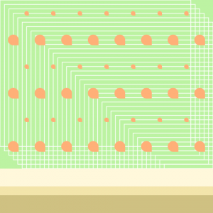
I had a lot of trouble with this because I liked a lot of different designs I found online, but could not picture how to put them in p5.js. In the end, I combined two designs I liked to make a relatively simple pattern that looks kind of like flowers.


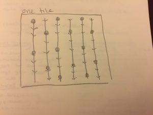
This was my sketch. It was simple but still something I could challenge myself by trying to code.


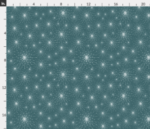
I used this as inspiration for the flower “dots”. The image was titled “Dandelion,” so I thought about just using circle shapes for my flowers.


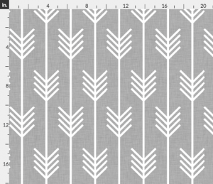
I used this as inspiration for the leaves. I actually started with the arrow design, and then decided they looked like leaves and added to them.

cchau1 – Project05 – Wallpaper

sketch


var w = 60; //adjusts the spacing between seeds
var h = 60; //adjusts vertical distance between seeds
var spaceY = 30; //y-circle offset
var spaceX = 30; //x-circle offset
var rad; //radius of circle component of "seed"
var wid; //width of rectangle component of "seed"
var x = 1;
var y = 1;
var columns;
var spacing = 10; //for the white lined grid-feature

function setup() {
    createCanvas(480, 480);
    background(255,174,185);

    for (var x = 0; x < height; x++) {
      strokeWeight(1.5)
      stroke(255);
      noFill();
      rect(x*spacing,x*spacing,width-50,height-150);
    } //this creates the white lines on the pink watermelon flesh
  //wanted to maintain the "square grid" feature in the corners of the
  //watermelon flesh so I subtracted from the canvas dimensions

    noStroke(); //colors of the rind
    fill(141,213,149);
    rect(0,height-100,width,height);
    fill(56,167,69);
    rect(0,height-60,width,height);
    fill(49,141,60);
    rect(0,height-40, width, height);


    var rowChange = 7;
    for (var row = 0; row < 6; row++) {
      if(row%2==0) {
        rad = 10;
        w = 420/7;
        spaceX = 60;
        wid = 5;
        columns = 7;
      } else{
        rad = 24;
        w = 60;
        spaceX = 30;
        columns = 8;
        wid = 12;
      }

//loop draw the "seeds" and depending on the row #, will alternate
      for (var col = 0; col < columns; col++){
        var py = spaceY + row * h;
        var px = spaceX + col * w;
        fill(52,54,52);
        rect(px,py,wid,wid);
        console.log(px, py);
        ellipse(px, py,rad);
      } //the combination of a square on top of an ellipse creates
        //the shape of a "seed"

    }

    noLoop();
}

function draw() {
}

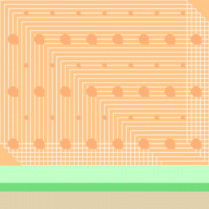
I decided to go for a design that would be more like an entire motif rather than small objects. I had other ideas to do things such as leaves or flowers but after having Founder’s Day for CMU constantly surrounding me, I chose to go for something more quirky: a watermelon. I had some struggle creating the perfect seed “shape” but got a little more creative by overlaying the square on top of the ellipse (using math). I didn’t want to add too much detail since I was going for a more minimalist approach: seeds, rind, and for added “texture”, a loop of rectangles that also crossed to create an eye-catching “grid” design in the corners of the flesh (if you look closely at watermelon, you will see these little white veins).

honeydew version

cantaloupe