ghou-lookingoutwards-09

Looking Outwards on Daniel Noh 

Ross Spiral by Ross Institute

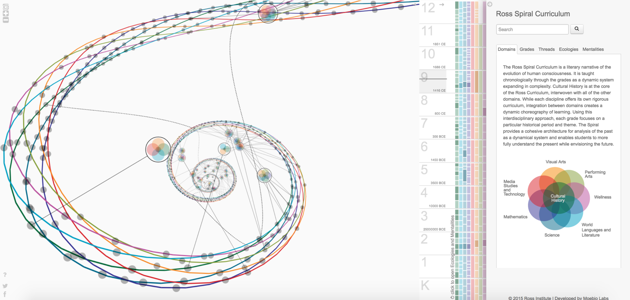
Daniel is a peer from my architecture studio, in this Looking Outwards post I am looking into one of his posts from week 7. Ross institute is a school that focuses on applied, advanced research, modelling, and dissemination, they strive to minimize the delay between research and application. The Ross Spiral represents the data of subjects in curriculum K through 12. in Daniel’s post he has stated that he thinks it is “far more impressive” as a 3D diagram and interactive map compared to a 2D drawing. I think this is an interesting way of representing data meant for spatial learners, however, it did take some time to figure out how to interact with the diagram and extract data from it. I think it would be useful to have a fuller data spreadsheet of how this graph is generated, and what each shape represented.

Ziningy1 – Looking Outward 09

For this week’s Looking Outward, I chose Superwat’s Post on week 7 post of Computational Information Visualization: https://courses.ideate.cmu.edu/15-104/f2017/2017/10/13/svitoora-07-font-map/

Actual Project:http://fontmap.ideo.com/


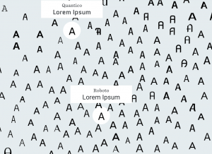
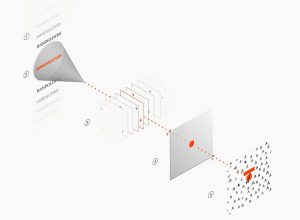
So the Front Map is a exploration from designer at IDEO to address the pain point of designers looking for a proper font. With the aid of utilizing Artificial Intelligence,  the IDEO team was able to create an insightful and valuable tool that facilitate designers’ decision making. The Font Map is a computer(machine learning algorithm) generated visualization of 750 fonts and those font are arranged according to their visual relatedness. It is very impressive as a design student to see this kind of tool designed to help the design process. I indeed agree with what Superwat indicated in his post that the visualization map definitely provide more information on the interaction between fonts. When I was also reading other articles on this project, I found this interesting metaphor commenting the map, “Imagine the map as a country, where the font samples are the locals. As you travel between the different lands, the local dialect changes very slightly. In this example, the dialect is a metaphor for the different fonts that are spread across the map. ” If it is not the computer algorithm, It will be painstaking for people to analyze each font and organizing them into this kind of visualization. Inspired by this project and also looking into the current progress on computer vision, I suddenly felt that we as designers are also entering a new era where computer will be more involved in our design process. Image processing, for example, might able to generate simple similar iterations for a graphic design, which might help the designers making small twists. I can also imagine that image processing technology will help graphic designers to find other designers that may have the similar styles and aesthetics. I am always excited to see how the emerging technology can facilitate creative process such as design and art.

gyueunp – Looking Outwards 09

Circles Within Circles (2016) by Simon Russell

I chose to discuss Clair Sun’s week 4 Looking Outwards post on Simon Russell’s Circles Within Circles. The work is from a series of explorations based on audio and geometry, with its audio being generated from bursts of particles that collide to create what the artist calls an “audio pulse.” As mentioned in her post, the artist used Houdini, Cinema 4D, After Effects, and Audition to create this piece.

I believe that the artist’s aim of creating a satisfying interaction of sound and shape is successfully achieved. The auditory element adds a lot to the visual, which is definitely interesting in itself. I especially like its symmetrical components and its clear beginning and end that are represented by the creation and the destruction of the from, respectively.

More:

Simon Russell’s website

Simon Russell’s Vimeo account

mmiller5-Project-09

sketch

var img
var step = [0, 0, 0, 0];
var i = [0, 0, 0, 0]; //y coordinates of strokes
var j = [0, 0, 0, 0]; //x coordinates of strokes
var vertShift = [];
var horzShift = [];
var check1 = true;
var check2 = [false, false, false, false];
var mx; //x value of the point of convergence
var my; //y value of the point of convergence

function preload() {
    img = loadImage("https://i.imgur.com/9nlcGmA.jpg?1");
}

function setup() {
    createCanvas(img.width, img.height);
    strokeCap(SQUARE);
    frameRate(30);
}

function draw() {
    paintLine();
}

function paintLine() {
    var startx = [0, width, 0, width];
    var starty = [0, 0, height, height];

    //make 4 different stroke paths
    for(var count = 0; count < 4; count ++){
	//checks if all the strokes have reached the point of convergence
	if(check1) {
	    //finds trajectory for stroke to align it with point of convergence
	    mx = mouseX;
	    my = mouseY;
	    step[count] = 0;
	    vertShift[count] = 10 * (my - starty[count]) /
		dist(mx, my, startx[count], starty[count]);
	    horzShift[count] = 10 * (mx - startx[count]) /
		dist(mx, my, startx[count], starty[count]);
	}
	//if stroke hasn't made it to the point of convergence
	if (dist(mx, my,
		 j[count] + startx[count], i[count] + starty[count]) > 10) {
	    //get colors from image
	    var pt1 = img.get(constrain(j[count] + startx[count], 0,
					width - 1),
			      constrain(i[count] + starty[count], 0,
					height - 1));
	    var pt2 = img.get(constrain(j[count] + horzShift[count]
					+ startx[count], 0, width - 1),
			      constrain(i[count] - vertShift[count]
					+ starty[count], 0, height - 1));
	    var col = color((pt1[0] + pt2[0]) / 2,
			    (pt1[1] + pt2[1]) / 2,
			    (pt1[2] + pt2[2]) / 2,
			    200);
	    //draw the stroke
	    stroke(col);
	    strokeWeight(10);
	    line(startx[count] + j[count], starty[count] + i[count],
		 startx[count] + j[count] + horzShift[count],
		 starty[count] + i[count] + vertShift[count]);
	    //advance step and recalculate new positions of strokes
	    step[count] += 1;
	    j[count] = step[count] * horzShift[count];
	    i[count] = step[count] * vertShift[count];
	    print(j);
	    check2[count] = false;
	} else { // if stroke reached the end, set check so it can restart later
	    check2[count] = true;
	}
    }
    //if all strokes are done, allow new point of convergence to be made
    if (check2[0] & check2[1] && check2[2] && check2[3]) {
	check1 = true;
    } else {
	check1 = false;
    }
}

Oh boy, this was a pain.  There were many other ways I went about this, with lines forming randomly, serial rows of lines, and lines targeting the mouse from only 1 position.  Eventually though I got here, and I’m just glad it works.

Kinda filled out version

kyungak-lookingoutwards-09

(Walt Disney Animation Studios, 2012, Paperman)

Link to the original post: https://courses.ideate.cmu.edu/15-104/f2017/2017/09/28/looking-outwards-05-3d-graphics/

As a student that personally admires all of the Disney films, I was very thrilled to come across Sarah’s post about Disney’s 3D graphics in the short film Paperman. Although this film is black and white, the intricate movements and details put into the figures, objects, and backgrounds make the scene live as if they are colored and real. I very much agree with Sarah’s comment about Disney sticking to the older practice of creating animation. The combination of artistic skills enabled the production of such a solid piece of work. Especially after knowing how intense and time consuming it is to draw each frame and convert it to 3D graphic images, I have deep respect to the animators at Walt Disney animation studios.

jknip-SectionA-LookingOutwards-09

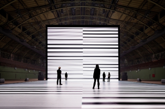
Ryoji Ikeda’s piece at Park Avenue Armory

Ryoji Ikeda’s “The Transfinite” (2011)

I chose to read into Monica’s post on Ryoji Ikeda’s “The Transfinite” installation. I agree with her comments on how the piece is definitely a piece for all ages, as it’s hard not to enjoy the strong visual and auditory sensations effects. Ikeda is able to manipulate scientific data, taking the continuous streams of 0s and 1s to create abstract visuals along with synchronized beats. What’s interesting beyond her analysis is how the artist also leverages 9 small screens mounted around the large installation to allow for free-play by visitors with endless scrolling data. I think this is able to create more context for the viewer and truly allow data to consume them as the artist and space suggests.

http://www.ryojiikeda.com/project/thetransfinite/

http://www.nytimes.com/2011/05/27/arts/design/ryoji-ikeda-the-transfinite.html

https://www.fastcodesign.com/1663965/art-installation-big-as-a-warehouse-turns-data-into-a-trippy-other-world-video

looking outwards – 09 – keuchuka


Nervous Structure (field) (2012) by Annica Cuppetelli and Cristobal Mendoza

For week 2, Shariwa posted about an interactive installation called Notional Field created by Annica Cuppetelli and Cristobal Mendoza by 2012. It is hard to tell whether the project is a projected, surface based object, or if it actually has a 3 dimensional quality. The project itself is confusing in a great way – blurring the line between surface, object, and movement. I agree with most of the blog post, and found the last piece of information discussing the different relationships articulated in the project especially interesting. The artists paid a lot of attention to the details of the project that makes in not only believable (like she mentioned), but also makes the whole project much more human like.

Original blog post

LookingOutwards-09-Chickoff

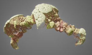
In this Looking Outwards post, I’ll be talking about Michelle Janco’s Looking Outwards post for Week 5 where she focused on a a piece by Mikael Hvidtfeldt Christensen called “Algebraic Decay” which was uploaded on October 19, 2012. Christensen is a physicist who creates 3D generative artworks using open source applications called Structure Synth and Fragmentarium.

Fragmentarium

In terms of Michelle’s assessment of the work, I definitely agree with her that the landscape and makeup of the artwork is very biological and organic. It’s curious that it is difficult to recognize what this form is. There aren’t enough hints, and so the viewer is left to guess whether this is this a cell, a living creature, a landscape, and so on. I enjoy this guessing game and find it important that art has rational elements to ground it, but still remains ambiguous enough that it confuses the viewer and makes them question what they are looking at.

What does frustrate me however is that the background of this work is grey and barren, which only emphasizes the fact that this is computer generated. Whether this was Christensen’s intention or not, I can’t help but be reminded of the dull backdrop of programs such as Maya and Rhino3D. This makes it seem even more unlike something that could actually exist in our world, and fails to convince viewers that it does belong.

mjanco – LookingOutwards09


For this week’s looking outwards I looked at Cora Hickoff’s post about Ian Cheng’s Droning Like a Ur. (https://courses.ideate.cmu.edu/15-104/f2017/2017/08/29/looking-outwards-draft/). This piece is a live simulation that exists continuously by continually generating changes and combinations in his simulations. In Cheng’s words, essentially these are “games that play themselves.” What Cora seemed to admire most about this piece was its ambiguity and the intrigue it evokes by being recognizable and yet still vague and mysteriously unresolved. One thing that could be added to this point, is how the medium serves that attractive quality of the piece. The mysterious use of sound and ambiguous shapes and beings, are well executed from a design standpoint, but this is also served by the medium itself: the digital, computed realm. For instance, if these same images were done as a 3D animated piece, there would be an entirely different viewing experience. The progression and changes of the imagery by the computer itself, endlessly evolving, are what give this world a life of its own. It makes the artist’s hand, or the visual proof of the work that was done by the artist, less recognizable, and therefore more mysterious. This piece gives a lot of control over to the computer. I also agree with Cora’s criticism about the sound being less distinguished, and pushing the ambiguity even further. Again, it would be nice to let the medium and the use of the computer enhance the mysteriousness of the piece.


Looking Outwards – 09

During Week 5, my friend Asher Blackburn made a looking outwards post that I found particularly eye catching since it pertained to one of my favorite music artist’s album art – Flume.

In his post, he talks about Jonathan Zawada and his mathematically computed flowers that are so realistic it was as if they were photoshopped pictures of flowers. Asher, comments on how bold and righteous it is of Zawada to take the harder route of utilizing 3D animations algorithms rather than simply painting the flowers and I would definitely agree. When taking a closer look into the animated flowers, it is truly astounding the realism and detail that the algorithms were able to generate.