Looking Outwards 09: on Looking outwards

This is from Looking Outwards 07 by Jamie.

This Botanicus Interacticus project is by Disney Research. This is a mesmerizing work that is creating a very appealing visual. I agree that one of the interesting aspect of the project is on the development of response through lighting, creating dynamic visual from the static movement. Another thing I see particularly interesting is that we all consider plant as a organism that is alive but something that just cannot move, which sometimes make us think they are not even alive. I feel like this has almost given the personality and method of expression to the plants itself creating personification of the static living being.

karinac-LookingOutwards-09

This is a video posted by Sara Jahanian from Looking Outwards Week 6.  According to her findings, this was produced by CMU’s own 15-112 student, Lingdong Huang. Upon first hearing that randomness is used in art, I didn’t quite believe it. This animation video surely proved me wrong.

I’m very intrigued by how much detail went into this project. The artist first coded algorithms to generate basic forms of the landscape and scenery for a general structure, then randomized the small details to make them unique and stand out differently from one another. The actions of the horse and the hermit are also randomized in the video. I am very impressed by how creative and visually stunning this video is when indeed many factors are simply randomized in the project.

Looking outwards 08: The creative practice of an Individual

Eyeo 2015 – Deray Mckesson and Samuel Sinyangwe from Eyeo Festival // INSTINT on Vimeo.

Work of Deray McKesson and Samuel Sinyangwe link: https://mappingpoliceviolence.org/

Deray and Samuel are both American civil rights activist and supporter/ member of Black lives matter. Interesting fact of Deray is that he has launched the Campaign Zero, which is a policy platform to end police violence. It is a website with ten proposals that are aimed to reduce police violence.

Samuel was also part of the launching Campaign Zero platform. Since the Protests emerged in the wake of 2014 shooting of Michael Brown in Ferguson, Missouri, Samuel worked with Deray since then to work and develop solution to address police violence in America.

I admire their work particularly because of addressing such a crucial and controversial problem that occurs often in America. I personally had close relationship with African-Americans back in California. I was there when my fellow friends were scared of police violence. In order for the information to spread and let people know of the matters, what they are doing such as protests, creating map of police violence and creating visualization of the data are best way to provide awareness to people who have access to digital medias. Their works are straightforward and logically laid out, allowing people and me to understand their challenge, solution and main issue to address.

Sheenu-Looking Outwards-09

http://www.notcot.org/post/62386/

https://www.bmo200.com/

I came across yoonyouk’s first Looking Outwards from Section E and discovered this installation piece that captured my eye. This is an electric “fountain” created for the Bank of Montreal’s 200th Anniversary by BMO workers and artists Jennifer Marman and Daniel Borins. The idea of a “fountain” came to be because BMO wanted to grant wishes to it’s customers through tossing a coin.

How viewers can interact with this piece is by “tossing” a coin on their mobile devices. The piece senses the devices and responds through hundreds of “flip-up” plates that alter the color of the entire structure from white to blue. Numerous animated patterns and ripples can be made on the fountain stream and on the floor.

YoonYouk finds the project enjoyable since it successfully combines art, interaction, and software all in one great piece. She also enjoys how it uses flip-up plates to alter the structure rather than using electronic screens. I can totally agree with all her points. I found this piece enjoyable because of its easy-going interaction with viewers: there is no need to do something complicated. I can also agree that the use of flip up plates makes the piece truly different. If the piece used electronic screens, I believe the magic and uniqueness of the piece would disappear.

Overall, me and yoouyouk found this piece to be truly innovative, unique, and successful.

sijings-lookingoutwards-09

details | Chris Harrison

Link to the ClusterBall


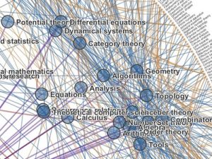
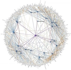
This is a project chosen by Zining Ye. I found this project to be really interesting as I am also interested in the field of data visualization and HCI. I appreciate how he has demonstrated a clear instruction of how the project actually works that I feel very easy to access the whole project. One little suggestion I have is to have the pictures of the actual work to be a little bit larger so the details are better shown. When I was looking at it, I was connected to thinking about web and how our thoughts are also connected and weaving like individual threads. If I was to access this project, I would try to find some specific example of how these levels of Wikipedia category pages and their interconnections connect. Furthermore, I looked into this work on other websites other than Chris’ own website, expecting to find more interesting information of the project. It is demonstrated in “Visual Complexity” that the clustering component of this visualization is vital. As Chris explains: “The mere presence of information isn’t all that interesting; there is no context or relevance to be gleaned. However, the structure of information is revealing about where fields intersect and diverge, and ultimately about how humans organize information”.

Whole Look | Chris Harrison
Detailed Connections | Chris Harrison

Movie of the ClusterBall

mecha-lookingoutwards-09

Proteus

For this looking outwards, I decided to look into Allissa’s Looking Outwards post on the game Proteus. Ed Key released the game in 2013, allowing users to explore this generated world.

I really liked Allissa’s mentioning of the change in soundtrack depending on the user’s location as well as the time of day. While I did not actually purchase the game myself to play it, I liked the way Allissa described the features in the game in regards to randomly generated topography, flora, fauna, and structures.

While I do agree that the gameplay is slightly limited in the sense that what you can do involves walking around the world and listening to music, I think that is what makes the game so satisfactory. The calm and elegant simplicity of the design paired with the limited gameplay gave it its own aesthetic and atmosphere.

juyeonk-LookingOutwards-09

Credit to Ryu Kondrup and his post on The Mylar Typology by Paul Prudence

Title: The Mylar Typology

Artist: Paul Prudence

Year of Creation: 2017

Link to the Project: http://www.transphormetic.com/The-Mylar-Topology

Link to the bio of the Artist: http://www.transphormetic.com/Biography


While I was browsing through the Looking Outwards posts I came across multiple artworks that caught my attention. Among these, Ryu’s post on the audiovisual artwork titled The Mylar Typology by Paul Prudence seemed especially interesting for its unique concept and the high-tech methods that was used to create the artwork.

The Mylar Typology is a combination of an ever-evolving visual abstract landscape (that was created by closely filming the reflections on the Mylar sheets and distorting them) and the oscillating tones that are supposed to affect our brainwaves in a way that would make us feel relaxed. Both the oscillating visual art and the audio that are synchronized to each other work as stimuli to our brains by affecting the frequency, amplitude, and periodicity of the brainwaves that are shared by the optical and visual waves as well.

It’s interesting to me how the artist combined both the visual and the audio aid to double the effect that his work has on the audience. I had come across multiple ‘relaxing sounds that are good for studying and relaxation’ that incorporate oscillating sounds but none of them had a visual aid that is just as abstract and science-based as this one.

I also admire the high-technological aspect of the artwork; unlike most other artwork or music that is supposed to calm you down by evoking a peaceful memory or having a mild tone that is associated with a calm atmosphere, this artwork literally manipulates a part of our brain to make us feel relaxed. Without the help of the scientific studies on brains or modern technology that can detect the brain waves and produce them as well, this artwork could have not existed.


alchan-Looking Outwards 9

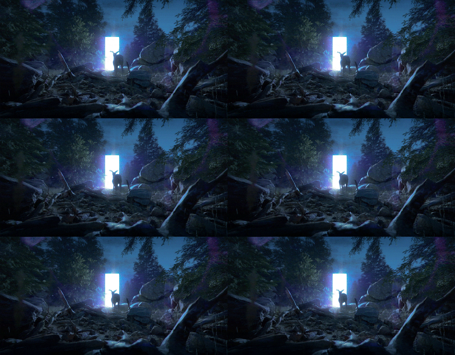
(Jakub Javora, Dark Forest, 2016)

I came across Jackie’s post on Jakub Javora’s work and was really drawn in by the style and slight animation. Though I’ve grown to be less impressed by how “realistic” something is rendered and more interested with different methods of stylization, I think that the level of realism works well in this piece. Like Jackie, also I really appreciate the narrative level the artist brought into the work. The glowing rectangle (doorway? light?) adds an element of mystery to the piece, which combined with the lighting and the movement of the deer work to create an overall atmosphere of mystery.

jwchou-LookingOutwards-09


A screenshot of NYCHenge. The red lines show the streets that align with the sun during ManhattanHenge.

A few weeks ago, my friend Allissa featured NYCHenge in her Looking Outwards post. NYCHenge is a product of Carto, a company that uses location data to help businesses.

It’s a really cool interactive map that displays ManhattanHenge, which happens with the sun’s position is lined up with the city’s east-west streets during sunset or sunrise. The map shows which streets line up with the direction of the sun on a particular day.

Allissa found the project interesting because of how particular and unique its goal was. I agree with her, because it’s often interesting to see projects about something relatively small and intriguing, because so many projects seem to focus on solving big, wicked problems.

I also love projects about mapping, and I’ve written some of my other Looking Outwards posts on projects that use mapping/geography.

Allissa said that non-New Yorkers would probably have trouble identifying the streets, and I fully agree. Another critique I have for the project is that for the tool to be more useful, they could incorporate sunset times and sunset forecasts. Obviously, if it’s going to be overcast, there’s no point to watch the sunset.


ashleyc1-Section C- Looking Outwards-09

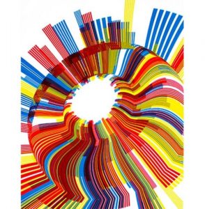
Marius Watz’s Arcs04-00
Marius Watz’s Arcs04-01

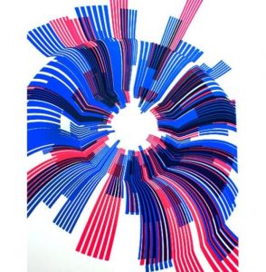
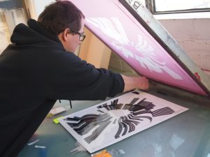
I was really inspired by Hae Wan Park’s post from week 6 about Marius Watz and Jer Thorp’s collaboration for the Random Number Multiples Series curated by Christina Vassallo. This project was a computational collection in which Watz and Thorp created a program that would track how many times a specific word was used throughout the New York Times and visually display that information in cyclic shapes with lots of bold, layered colors. What is special about this project is that the final design was a screen printed poster.

The ‘Arc’ Series – Process of Screen Printing

I agree with Hae Wan that this project is interesting mainly because it’s a combination of computational information design and the traditional process of screen printing. I’d go further to explain that this relationship is needed because the conceptual inspiration came from physical newspapers and to reprint this information into a new physical form elevates the project to thinking not only about societal themes but also how we take in information today.

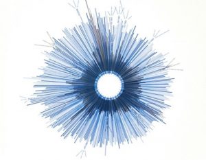
Jer Thorp’s Hope/Crisis

I disagree with Hae Wan when they say that this is just artistic expression. This process is unique because there’s this relationship to taking something digital and making it tangible and physical but I think Hae Wan should have talked more about the conceptual thinking behind the project because it does have some political undertones to it. For example, Je Thorp’s piece Hope/Crisis tracks how much the NY Times printed the words Hope and Crisis which is overwhelming just to see in amount but also makes you realize that we use the word hope more than crisis and has a sentimental reflection that despite living with current and recent devastations, humans still remain hopeful of a better future-something that’s conceptually interesting and equal to the unique process of creating this project.

Sources:

https://creators.vice.com/en_us/article/vvzxkb/random-numbers-screen-printed-generative-art-nyc-event

https://creators.vice.com/en_us/article/4x47bw/overcoming-manual-inadequacy-an-interview-with-marius-watz

What is Random Number?

http://blog.blprnt.com/blog/blprnt/random-number-multiples