Bettina-LookingOutwards-09-SectionC

I perused through my peers’ looking outwards to come across this fun web toy, frankenSimulator.
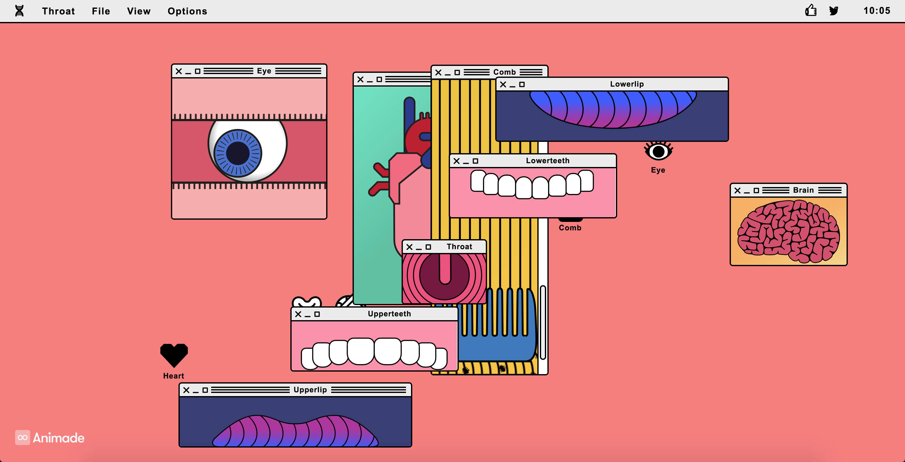
Above: screenshots of compositions I made on the interactive site.

As a designer with an art background, I’ve been toying with the balance of form and function in my work. Often I aim for my work to have a purpose and achieve a particular goal. But other times, I simply want to satisfy myself and make something fun and pretty. It’s delightful to come across a piece that simply seems pretty, but I could also imagine it having functional applications. Such types of work could be used for promotional events, branding a product, film, or company release. It could also be a “hook” for a more serious campaign.

I could see a piece like this using concepts of primitive/complex shapes as we’ve learned in class, as well as objects and animation with arrays that we’re beginning to learn.

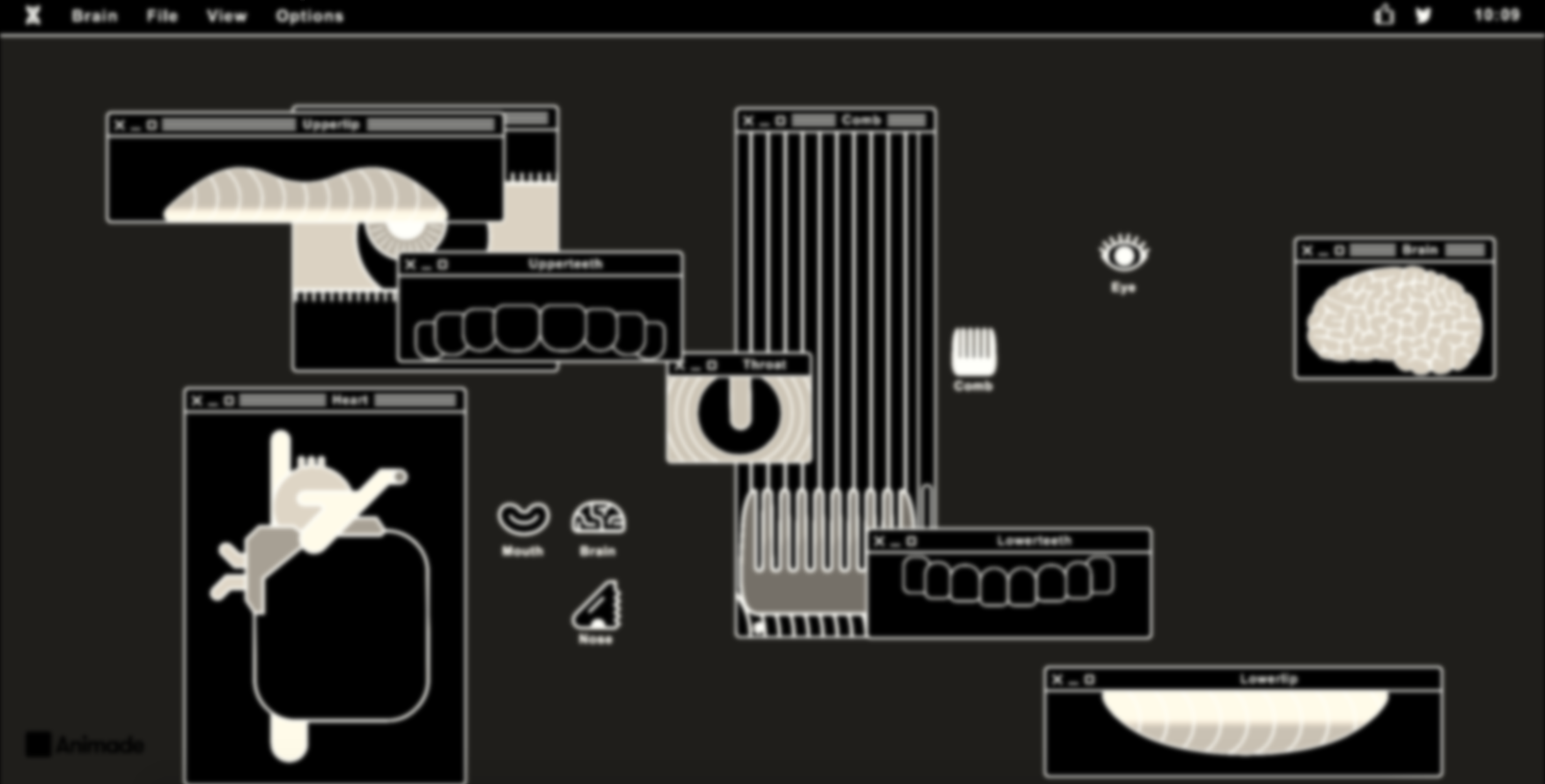
Thanks to this peer’s post, I was able to also look into the studio behind this piece, Animade, who works on various interactive/motion pieces. As I’ve been getting more into animation and illustration this semester, I am happy to add this studio’s work to my repertoire of knowledge!
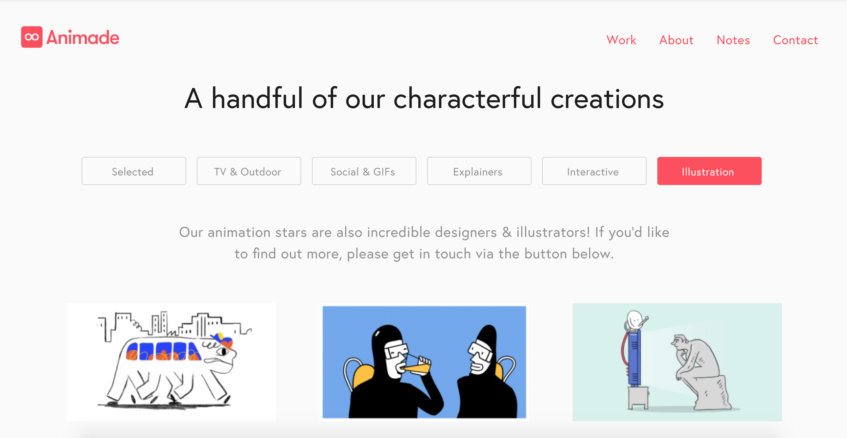
Above: screenshot of Animade’s work on their site

jiaxinw – LookingOutwards 09

Nayeon talked about this interesting project THE TRANSFINITE (2011) from Ryoji Ikeda, a Japenese sound and media artist in her LookingOutwards-04. (Here is the link to Nayeon’s post: https://courses.ideate.cmu.edu/15-104/f2017/2017/09/22/nayeonk1-lookingoutwards-04/)

This is the project video:

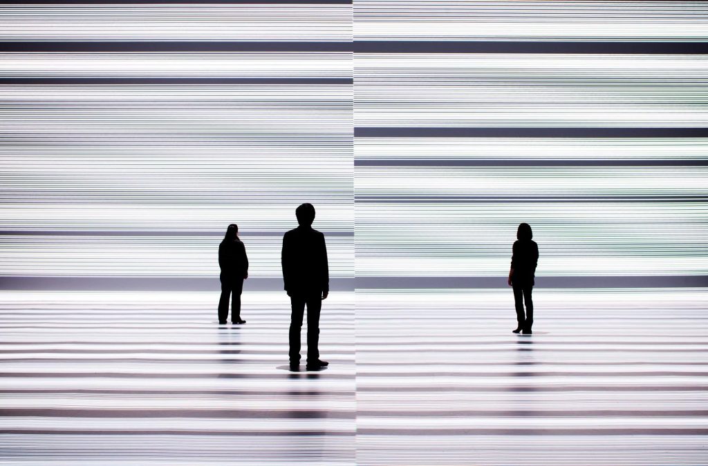
Nayeon mentioned that she was attracted by how Ryoji Ikeda has created a dimension for combining the sound and installation art together, and I would like to say I totally agree with it. The video is very immersive for me to feel the changing vision and audio inside the big art installation space. The vision went well with the sound, and the whole wide empty space created a feeling of the theater with all the media going on. Even the audience who just stood at or randomly walked by the installation, as an outsider I considered they were a part of the stage. One interesting point that Nayeon mention in her post is that ” In his work, sound, time and space are composed by a mathematical way so that physical features of sound could reach to audience’s perception and feeling”, and it is very surprising for me. I was impressed by how Ryoji Ikeda uses technology to help convey his ideas but give audience better experience at the same time.

THE TRANSFINITE by Ryoji Ikeda

Jdbrown – Looking Outwards 9 – Browns & Lozano-Hemmer

For the first interesting piece someone else has posted, I chose this work, posted by “HDW” and created by Daniel Browns. His work is really interesting – in particular this cover artwork that he did for William Gibson’s republished books. One of my favorite styles of geometric art is the “sprawling city” genre, used in Inception and Dr. Strange. So when I saw Browns’s work, I got very excited.

Another piece that I found interesting was Rafael Lozano-Hemmer’s work on this algorithm that randomly deletes 1–10 friends from your Facebook profile, once installed. What’s interesting to me about this piece is its simplicity – the concept being, “would you notice the absence of this person if they were deleted without your knowledge?” It’s an interesting interrogation into modern friendships – what does it mean if you never notice one of your friends missing? This piece starts to ask that question.

Josh


juyeonk-LookingOutwards-08


Artist: Sarah Williams

Year: 2014

Link to the Artist’s Website: http://civicdatadesignlab.mit.edu/

Link to the Brief Bio of the Artist: http://eyeofestival.com/2014/speaker/sarah-williams/


Sarah Williams is currently an Assistant Professor of Urban Planning and the Director of the Civic Data Design Lab at the MIT School of Architecture and Planning. Her work at Civic Data Design Lab focuses mainly on digitally visualizing urban patterns and data for the purpose of making them more accessible to the general public.

I was amazed at the scope and the variety of data that her team and she have created in the past. The scale of her maps range from few blocks in the city to the entire country and include general topics like population, transportation and urban growth as well as some less familiar topics such as natural disaster and the route of the New York Fashion Designers. However multifaceted the topics and ranges of her maps may be, they all have a single purpose: to deliver the information in the most efficient and helpful way. She creates these informational maps to solve the growing urban problems such as traffic, congestion, pollution and other social problems and to inform the audience of how their city looks like in both quantitative and qualitative terms.

In her presentation she mentioned that there are 6 elements of data visualization. This was a good way to organize different aspects of data visualization and to offer a clear steps to how you may visualize the data on your own. I was impressed by the fact that she included the “being open with data” as one of the elements because it seems to imply how open and friendly the society has become, that information and data is something to be shared and not to be kept secret from others.

LookingOutwards 08-ssontag

Currently the Senior Curator of the Department of Architecture and Design as well as the Director of R&D at The Museum of Modern Art, Italian born design visionary has curated multiple exhibitions emphasizing the connection between design and innovation. Antonelli received a laurea degree in architecture from the Politecnico di Milano university in 1990 and eventually went on to lecture at several institutions including the University of California, Los Angeles and Harvard University. Although having never worked as an architect, Antonelli’s focus on maximizing functionality through design resonates with the mindset I have as I pursue a degree in architecture. Her exhibition “Safe: Design Takes Risk”, utilizes aspects of design that are both creative and functional. Consisting of conceptual models of automobiles, articles of clothing, and other everyday objects, the exhibition truly brings to the light the direct relationship between the way an object is designed and it’s efficiency.

Looking Outwards 08

I looked at the 2012 lecture given by Fernada Viegas and Martin Wattenberg. Viegas is a Brazilian scientist who focuses on information visualization, she attended MIT. Wattenberg is an American scientist who is known for his data visualizations for companies like IBM and Google, he attended Brown, Stanford, and UC Berkeley.

I find what they do incredibly interesting and important. It isn’t to obvious how imperative data visualization is, but if data is not shown in a way that people can understand or are attracted to, they will not look at it. What I admire about how they work it that they account for the attractiveness of the visualizations, they go beyond just making the data legible. For example, with their visualization of wind speed and direction, they chose to depict the invisible force of wind in a way that actually makes they viewer “see” it, I knew that i was looking at wind, even though I, nor anyone, have never seen wind before. What I like most about their presentation is that they show the process work, the steps to their final product.


I specifically like the Wind Case Study (around minute: 17:30)


Martin Wattenberg: http://www.bewitched.com/

Fernada Viegas: http://fernandaviegas.com/

LookingOutwards-08-sjahania

Jake Barton is a pioneer in blending technology, digital media, and architecture into emotional and engaging digital media experiences for museums, companies, and public places. He received a Bachelor in Science of Speech from Northwestern, and then continued his education at NYU where he was awarded a MPS in Interactive Telecommunications. He is the founder of Local Projects, a firm based out of New York City specializing in creating innovative story-telling experiences that captivate audiences. In his own words on Local Projects’ website, he and his firm “create bold new ideas and bring them to life.” I admire the fact that he utilizes an interdisciplinary team of artists, coders, and architects to create his work because it recognizes that fact that collaboration is key to success in art and in life. Out of all his amazing projects, I enjoy his work for the National September 11 Memorial & Museum the most. In this project, he brings victims’ stories to life which inspires personal connections between them and the visitors. This strategy of appealing to qualities of humanity is something that I can utilize in the future to engage my audience with my work.

abradbur – Looking Outwards – 08

Zach Lieberman at Eyeo 2011

Zach Lieberman actually holds a degree in the fine arts, and says that it was mostly by accident that he fell into working with technology. He’s become somewhat of a giant in the art and coding industry, as he was one of the co-creators of openFrameworks and open source C++. As an interactive new media artist, he describes his three muses as drawing, movement, and magic.

I chose to watch Zach’s first Eyeo presentation firstly because I remembered watching clips of his earlier presentation in lecture, and I recalled really enjoying his presentation style. However after watching this first presentation I’ve come to truly admire him for the creativity combined with the innovation of his works. A throughline comparing his projects would demonstrate that a common theme in his work is the relationship with and the effect it has on people. He stresses the humanity behind his work, and creates these sort of exhibits where people can come together. This is also evident in his Open Source materials and his Poetic School for computation.

I enjoyed Zach’s presentation because you felt how sincerely he cared about his work. He wasn’t professional and cold on stage, performing with gimmicks and flashy graphics like some might. He let his work and the reactions people had to it speak for itself. He conversed with the audience in his speech, rather than talking down at them, and he let his humor show through. That’s why his talk was able to pull me in for an entire 50 minutes, rather than bore me to death in the first 15.

Night Lights 2009

dnoh-sectionD-lookingoutwards08

Person: Kyle McDonald

Kyle McDonald terms himself as an “artist working with code”. He, I believe, is based on Los Angeles, California and studied computer science and art.

Honestly, I didn’t find his presentation to be too great, both content and presentation wise. First of all, he did not even have a presentation ready, rather he had folders with images and videos he showed to the audience through the Macbook’s preview function. But I guess, as he emphasized in the beginning of his speech, this was a more “informal presentation”. However, after looking through a couple of his projects, I was captured by his creativity and coding sense.

For example, he had an installation/project in Korea and Japan where he connected the two countries through facial recognition. I found it intriguing that he, someone who had experimented with facial swapping since at least 2011, was able to develop his knowledge within this field enough to categorize and match people so fluidly through merely positioning and expressions.

Much like this installation he had projects that made a computer force a person to draw themselves in contour (blind) where the program and machine moved the hand of the person based on what facial features and shape the machine was able to grasp.

ikrsek-Looking Outwards-09

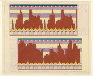
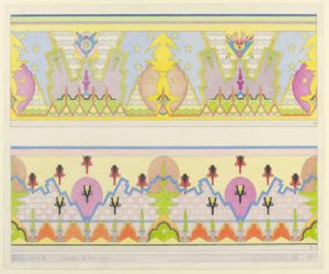
For this Looking Outwards, I decided to look into one of the projects that Ashley Chan wrote about. She decided to talk about some of the colorful illustrated works of John De Cesare – specifically about how he renders visual interpretations of musical scores through first studying music theory and creating a “complex algorithmic language” to interpret said musical scores. I’d say that I agree with much of her commentary on his work in the way it looks and acts as a visual representation of music – and the quote she gave from an analysis done on his work by Cooper Hewitt was extremely insightful regarding the way that he works. Particularly regarding her commentary on how Cesare’s work is unique from that of other artists who decide to visually represent score.

I’d venture to say however, that she left out some very fascinating information regarding the artist himself, for example the fact that he didn’t start doing this work until he was in his 60’s or so – he was born in Italy in 1890 and immigrated to the United States when he was a child. It should also be noted that De Cesare was not a musician, nor had he any musical training at the time he decided on doing this and that’s when he really dove himself into the deep history musical theory and the basics of such. As a notorious problem-solver, he couldn’t help but pick away at the complex idea of translating something entirely auditory into a visual art form, whilst still managing to maintain an aesthetically pleasing design and doing the score itself justice.


DRAWING, 147-137#2B, APRIL 14, 1964
DRAWING, STUDY 152-137A-B, FEBRUARY 24, 1966


Link to the Looking Outwards:
https://courses.ideate.cmu.edu/15-104/f2017/author/ashleyc1andrew-cmu-edu/