hschung-LookingOutwards-05

2016 AICP Sponsor Reel – Dir Cut from Method Studios on Vimeo.

When I think of impressive or inspiring 3D computer graphics, I am intensely drawn to this animated video that worked with Major Lazer’s “Light It Up.” Deluxe’s Method Studios was hired by production company RSA to produce this video. They used motion capture technology in conjunction with procedural animation and dynamic simulations. It has a variety of different characters with wildly unique body types and interesting textures that are not usually paired with human figures, and works in sync with music as well. I am intrigued by this video every time I watch it, because it looks so believable, and yet the textures and behaviors of the people dancing in the video would never make sense in real life. I really like it because its creators were able to take his imaginative characters and render them believably so that other people could see his creation. It’s so fantastically imaginative and entertaining.

elizabew – looking outwards – 05 – SectionE

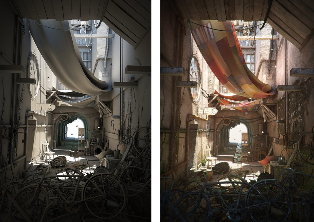
“The Race Day” is a 2D image using 3D computer graphics made by Peter Nowacki that was based off of the concept art “Old Back Street” by Gary Tonge. The image was created using software such as Maya, Photoshop, 3ds Max, V-Ray, and After Effects. According to the artist, “First I used Maya, then I exported the whole scene to 3ds Max and used V-Ray. Textures were done in Photoshop and final composition and post – work in After Effects”.

What I really love about it is not only how realistic the image looks, but how visually interesting it is. The shadows that cascade over a multitude of objects while the light shines through where the canopy doesn’t cover almost creates a story. The attention to detail is inspiring. It was almost hard to believe it wasn’t a photo. The artist themselves talked about how they enjoyed adding details to the image day by day and how they were inspired by the the world and music around them. 

For more information about this project and to see more of his work — click here to visit his behance page. 

dayoungl Looking Outwards -05

I wasn’t very familiar with 3d graphic artists so I had to do some google search to look for interesting artworks. Among the artists I found Daniel Aristizabal’s artworks most intriguing. Aristizabal is a Colombia-based artist who describes his works as “pop surrealism”. He is a fan of bold colour contrasts, scientific references, and geometric shapes. He makes use of everyday objects and turns them into something surreal and interesting. Aristizabal explains that he considers sketching process in his notebook the most important part of his art-making process; despite the 3d tools he can take advantage of, Aristizabal states that he likes the feeling of brainstorming with paper and pencil. Then, the artist use a computer program, Cinema 4D, to visualize his sketches.

I think 3D in the same way I think illustration. I start to doodle around a concept. Words, sketches, random thoughts. Whatever pops into my mind, I draw it on my notepads. After that I know what elements I need to create on Cinema 4D. A lot of the stuff I use is based on imagery and objects that I had when I was a little kid—finally I’m able to get that out into the world.

LookingOutwards-05-sjahania

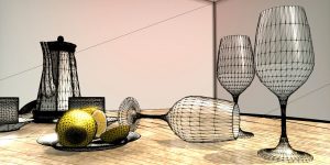
The Graphics Codex is a website and app I found that teaches people how to make basic graphics using programming. It has a series of “courses” with projects that allow people to practice the skills they learn. The project I was the most interested in is called “Meshes.” It involves using geometrical shapes (mostly triangles) to create three-dimensional pictures. The course explains how to think topographically, and gives the ins and outs of using algorithms to program the actual displays.


This is an example of how one would use triangles to create 3D shapes in computer graphics. The triangles are left in to show a map, and to get the people seeing the image to “think topographically.”

One thing I found interesting is the course’s definition of topography. It explains that topography is the connectedness of the points on a two-dimensional surface in three-dimensional space. I learned that while the “mesh” part animates in graphics, the actual connectedness stays the same, and this is an important point in computer graphics.

website link: http://graphicscodex.com/projects/meshes/index.html

agusman-LookingOutwards-05-AFrame

A Frame: A web framework for building virtual reality experiences
A Frame Website

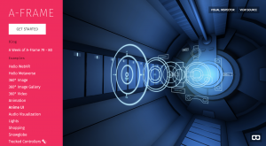
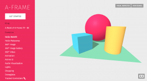
A Frame is a three.js framework that enables creators to construct virtual reality and experiences for the web. It has an entity-component-system architecture, which is a common and desirable pattern in 3D and game dev. According to A Frame, some of the benefits of ECS include:

“- Greater flexibility when defining objects by mixing and matching reusable parts.
– Eliminates the problems of long inheritance chains with complex interwoven functionality.
– Promotes clean design via decoupling, encapsulation, modularization, reusability.
– Most scalable way to build a VR application in terms of complexity.
– Proven architecture for 3D and VR development.
– Allows for extending new features (possibly sharing them as community components).”

What I love about software like this is that it makes a craft (creating virtual reality experiences) that up until now has been so elite and obscure accessible to the masses. It’s about time that the public start to involve themselves more personally with a field that is growing more and more rapidly every day and one that will dominate many top industries and social environments.

It’s also exciting that this platform in particular focuses on web-based experiences. The internet is the world’s most highly accessed mediums and being able to share groundbreaking digital experiences that run efficiently on the web is a big step towards making this craft more prevalant in the world.

HaeWanPark-LookingOutwards-5

Rainbow paper Series By Machineast, 2015

Machineast is a design studio consisting of two designers, Rezaliando and Fizah Rahim. Most of their works are 3D computer graphics. Even though this studio has provided visual solutions to clients, these two designers have also created several personal driven works as artists. ‘Rainbow Paper Series’ is also a project driven by themselves and inspired by their childhood experiences. During the childhood, they both have fascinated by holographic colors. When they have grown up in the 80’s, holographic cartoon and toys were so popular. After grown up, they found the way to express their fascination and nostalgia toward holographic colors in their 3D artwork. The shimmering and shiny surfaces characterized their childhood and give honor to the 80’s era of a hologram. In my opinion, the combination of shiny effects on surfaces and holographic bright colors created interesting visual. This work is nice artistic expression pieces.

Rainbow Paper Series, Machineast

Rainbow Paper Link

rkondrup-Looking-Outwards-05

The Arabesque Wall is a highly complex computer-generated form created by Benjamin Dillenburger and Michael Hansmeyer for the 3DXL exhibition. At almost 10 feet tall, the form was modeled using complex algorithms and subsequently 3D printed as thousands of layers. The Arabesque Wall,a 50 gigabyte file, took months to design and four days to print the sheets, which were then assembled in a four-hour period.
The work is a highly complex form which folds and intersects with its own surface hundreds of thousands of times, producing a form with over 200 million individual surfaces. These complexities are of a level so intricate that humans could not fully conceive of them without the aid of computers. Hansmeyer and Dillenburger believe that this type of application of technology in architecture can augment our understanding and experience of architecture, saying “Architecture should surprise, excite, and irritate. . . it should address not only the mind, but all the senses – viscerally. It must be judged by the experiences it generates.”

juyeonk-LookingOutwards-05

Image result for flume album art


Image result for flume album art


Image result for flume album art


Title: Album art for Flume’s ‘Skin’

Creator: Jonathan Zawada

Year of Creation: 2016

Link to the Project: https://creators.vice.com/en_au/article/jpbxy8/visionaries-jonathan-zawada-interview

Behind The Cover Art Of Flume’s Grammy Winning Album

Link to the Bio of the Artist: http://www.zawada.art/about/


Many people have come across these artworks at least once in the past few years, but never wondered how they were actually made. Behind the Grammy-winning album were the cover artworks created by a digital artist and a designer named Jonathan Zawada.

He has covered a variety of medium and and kinds of artworks such as music video, furniture design and album cover design. And as you can infer from these album arts, a lot of his work is inspired by nature. Nevertheless, he was never really interested in flowers, until he started working for Flume’s album designs. This set of designs include a variety of flowers or flower-inspired images with different colors and textures all generated by computer procedures. The specific algorithm he used generates different appearances of flower petals and “all the tiny little disturbances on the surfaces”. It is ironic how the mathematical programming he used was for the purpose of creating the “airy-feathery I-love-nature” effects. He acknowledges that there are other ways of approaching these natural objects or creating such effects such as hand-paintings or drawings, but he said that he does not necessarily feel like cheating using computer programs to generate these images.


mmirho – Looking Outwards 5 – 3D Art

I’m very interested in the concept of rendering 3D water.

This is present in video games, yes, but I see it as a blockade in most 3D generation. It’s been a problem ever since 3D graphics were conceptualized; making rendered water realistic. I’ve seen only a few examples of legitimately fluid water, and here’s one such example.

The reason it’s so difficult is it required physics engines to calculate the positions of each piece and make the whole flow of the 3D water natural.

Unfortunately, liquids have so many individual points within them, that it’s nearly impossible to calculate them all.

I’m unaware of what artists dabble in this type of art, but I know it requires teams or animators and programmers to get even remotely right.

I think the processing engines we are creating now will be able to handle such types of programs, and 3D generation, in general, will improve.

Looking Outwards 05

https://cdna.artstation.com/p/assets/images/images/000/189/312/large/stefan-morrell-cablecorner2.jpg?1443928214

I looked at the work of the concept artist Stefan Morrell. I admire this piece specifically for its homage to classic architecture, but then for his futuristic additions. As someone who frequently has to render my work for work in architecture, I am greatly impressed by his details and clean render. I would imagine he had to let his computer render for hours to get the level of detail it appears to show. I am even more impressed with his expert use of Photoshop to add a more realistic feel the his piece. He titled the work “Cable Corner” and it was created in 2014. He modeled and rendered the piece in 3Dsmax, then used Photoshop for final touches.