dayoungl Looking Outwards -09

yoonyoung’s looking outwards 1

For this week’s Looking Outwards, I looked into my friend Yoonyoung’s first Looking Outwards post which highlights the BMO200 Fountain. (The topic of the first looking outwards post was investigating technological art or design that inspires you.) BMO is a bank in Montreal and this fountain was made in celebration of the 200th anniversary of the bank. I found her post on this piece of object interesting because the project was made with not only the artists but also the members and the employees under BMO. Although there isn’t much written about the specific contributions the employees of the bank made to the final piece, the idea of interactive imagery of water falling into a pond is stunning; with this piece, the users can “throw” a coin of wish on their mobile devices. I think the interactive portion of the project is a great representation of how machines and technology is able to copy or iterate human motion. The idea behind this is that interaction can happen separately from just a single visual space but also the individual users’ devices too. The YouTube video above is a good compilation of the process of the project from the beginning to end.

yunzhous-LookingOutward-09

Post: Isabella Ouyang, Looking Outwards 06

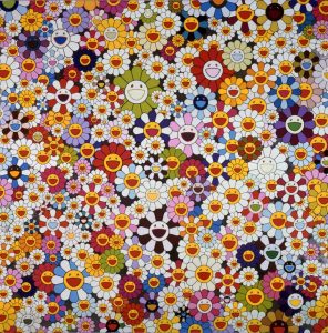
For looking outward 09, I chose Takashi Murakami’s artwork because his work shows me good art doesn’t need too much complexity. When I think about computer-generated art I always think of complicated shapes, colors, visual effect, etc. However, as Isabella says in her post: “after scaling, coloring, placing “randomly”, it can create a sense of depth out of the superflat drawing”, even simple single prototype (the flower) can make appealing effect.

Also, the “randomness” used in the art is not completely random. Takashi Murakami must have constrained the size of the flowers, saturation of the color and composition deliberately. For example, there are always some small to medium sized white flower in between colorful flowers to balance out the various color and create harmony. I think that’s very important.

(Takashi Murakami, Flowers, flowers, flowers, 2010)


LookingOutwards-09-ssontag

In my peer, Sara Jahanian’s, most recent Looking Outwards she looked into the work of Jake Barton. Personally I found his work and her post about his work very compelling. She wrote about her appreciation of his work as work that is breaking ground by bringing together a diverse groups of creators to produce experiences like none other. His firm Local Projects specializes in storytelling through an interactive space. This is actually a field of work that I am extremely interested in pursuing. Using my space making skills learnt in Architecture school and a growing background in coding and hopefully human computer interaction, I will one day make spaces as dynamic and impact full as the his work called “A Museum of Collective Memory.” This space is a memorial for those who experienced the tragedy of Sept 11.

Here is Their Website.

Here is  a Video about the Project

hannajan-LookingOutwards-09

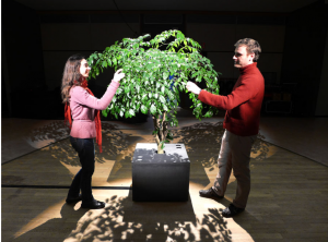
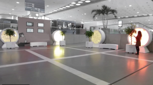
Pictured above are two people interacting with the Lumifolia artwork.
Shadow of a woman exploring the art piece.

For my Looking Outwards Post this week, I looked at the very first Looking Outward Post by Rachel Park from the first week of classes. She wrote about an art piece made by the duo Scenocosme: Gregory Lasserre and Anais met den Ancxt called Lumifolia (press for link). This interactive garden “questions sensitivity, artistic, and musical relationships with the plants and the environment” according to its official website. The closer the human’s touch, the brighter the lights shine.

I agree with Rachel that the idea behind this art piece is both very refreshing and also innovative. It can be used for a greater purpose such as a future public installation in more uninteresting areas. However, I also thought of how this piece could be used for safety measures in dark allies such as in urban areas.

Rachel also mentioned the unique design of the art piece, which encouraged human interaction. I also thought of the tree model they used for this particular art piece. Maybe, there is a more subtle message that encourages more interaction between humans and nature in this specific art piece. The message can be seen with the bright light that shines specifically only when the human touch comes closer to the tree model itself.

It reminded me once again that my art can be used for more than just aesthetic purposes. It can beautify the setting that surrounds it, but can also help serve the usability of that area also.

Below, is an interactive video of the art piece.


lookingoutwards-09 Thomas Wrabetz

My looking outwards of someone else’s looking outwards is the Ross Spiral curriculum from week 7 (data visualization).

Ross Spiral Curriculum

The original looking outwards

I agree that the visualization is quite cool and nicely suggests the spiral nature of k-12 education (most of it anyways- in my british elementary school all we spiraled through was the tudors). However I am skeptical about the computational nature of the spiral- i.e., it seems to just be a linear sequence of topics arranged into a spiral, and not reflecting an actual data computation that would reveal the spiral-like nature of data on certain parameters of k-12 curricula.

HaeWanPark-LookingOutwards-9

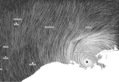
Wind Map by Fernanda Viegas & Martin Wattenberg


Wind Map, US
Hurricane Issac, 2012

This wind map is generated based on a nearly real-time data from National Digital Forecast Database. It is revised by one hour. Two creators, Fernanda Viegas and Martin Wattenberg implement entire map only with using HTML and Javascript. With this map, people can immediately read the continuously changing flow, density, and direction of winds over all areas of the United States. Also, it highlights a region with the high-speed wind. They depicted the movement of air simply with the visual motion. I admire their work because it is able to communicate the specific types of information to audiences. People might understand what it tells about without many explanations. Also, the quality of quite simple but elegant visualization with motion and black and white color scheme looks really nice and makes me very intriguing to this work.

Wind Map

Jonathan Perez Looking Outwards 9

For this weeks Looking Outwards, I found ikrsek’s looking outwards 5 to be particularly interesting, which discussed the work of Hayden Zezula.

Hayden Zezula is an animator who creates designs for companies such as HBO, Adidas, and Adult Swim. To sum his work up in a word… unsettling.

A lot of Zezula’s work, to me, explores the relationship between 2D and 3D. This perhaps differs or expands a bit from ikrsek’s description of his work as a “3D style on a 2D screen”.

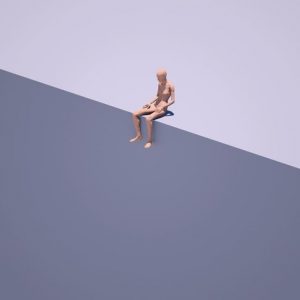
Hayden Zezula’s “end”, a gif depicting a 3D human leaning over and covering his/her face with his/her hands in a 2D landscape.

This image on “end” for instance, shows a 3 dimensional figure sitting on a pretty 2 dimensional surface. The relationship between the two is both visually and thematically interesting.

Also, as ikrsek mentions, much of Zezula’s work has to do with texture. This, to me, is the most interesting aspect of his work.

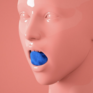
Hayden Zezula’s “Options” gif, displaying a plastic-like human face and a fuzzy, synthetic tongue

The image above shows the kind of unsettling contrast between textures that Zezula likes to use. In fact, it’s much more unsettling if you watch the gif, since part of texture/material is shown through movement (for example, the tongue sort of ripples when it hits the top of the mouth). Not only is this visually really interesting, but actually I think Zezula is working with deeper ideas of the relationship between synthetic and organic things, like how organic things like humans and plants can be defiled by synthetic things; How what should be organic can be “replaced” by something synthetic; and how unnatural organic things can be when twisted and manipulated.

Check out his work for yourself at

his instagram: https://www.instagram.com/zolloc/

or his website: http://zolloc.com/work/


atraylor – Looking Outward 09 – Section B

For this post, I want to respond and add to my classmate’s post on the Disney short Paperman, directed by John Kahrs. I saw this video discussing the computer graphics and techniques a while back, and thought it would give more context to how the 3d and 2d images are combined.

I really love this short because hand drawn animation has a certain charm which is hard to replicate with cg (really, this goes for most practical effects when they are well executed). What the original post didn’t mention is that not all of the 2d lines or effects were drawn frame by frame. Disney used software to compute in-betweens on key frames which acted like 3d blend shapes, tangents to place lines, and motion vectors to determine texture placement.

hschung-LookingOutwards-09

I looked at my friend Tiffany’s post about Marpi’s meditative installation art named “The Wave.” The display uses open source shaders by Jaume Sanchez powered by Three.js. It’s a serene, sizeable touchscreen display of waves, made up of soft, curved shapes and strokes. People can interact with the display and guide the movement of the water particles. I wasn’t sure if they really behaved like water particles, but it’s interesting that Marpi calls the shapes water particles; though the shape and behavior doesn’t necessarily follow the behavior of real water, I can bring myself to believe that if we had magical powers to control water with gestures, that it would move in this manner. I agree with Tiffany that it’s a very pleasant and soothing visual to look at. The slow movement and soft curves are comforting and satisfying to watch as they change direction and shape. The video below showing people interacting with “The Wave” was posted a year ago.

The Wave from Marpi on Vimeo.

Link to my friend’s Looking Outwards post:

thlai-Looking-Outwards-05

nayeonk1-LookingOutwards-09

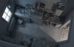
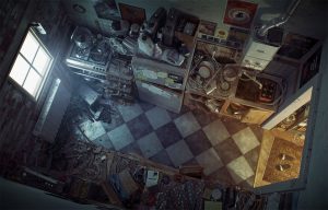
Jiaxin wrote a blog post about CG artist Cornelius Dämmrich. His works look like awesome illustrations, but he uses multiple graphic softwares to create lighting, texture and shading. Since I have interest on concept art, this blog post just caught my eyes. Jiaxin said there is no specific story behind his work, but as I see, I can read the story behind it. Story doesn’t necessarily mean to have narrative. If it has detailed concept for background and atmosphere, it can be a story too. In his work, amount of details tell a lot of things. I love how he uses lighting to tell a story. Strong contrast from the image gives a feeling on isolation, and also antipation for something.

Here are more images I found on his websites.

Until the light takes us 2013(in progress)
Until the light takes us 2013(Final work)

Jiaxin’s post
Cornelius Dammrich’s website