mmirho – Looking Outwards 9 – Morphogenic Creations

I enjoyed reading Hamza’s post on Andy Lomas’s Morphogenic Creations.

The project, according to Hamza, was on display at the LACDA on September 29th of this year.

This is Hamza’s original post:

hqq – secE – lookingOutwards05

I think this project is especially interesting, simply because it caught my eye extremely well. The way the form twitches and moves felt like it made sense, that it was natural, or at least based on natural phenomenon. I was listening to music at the time, and I was mesmerized by the movement and unnerved. However, I agree with Hamza that a big part of the allure is the space it creates between the “Cells”. That’s part of what makes it fit in my mind because we don’t tend to interpret shapes as much as we interpret the space between them and the spaces they shape.

aboyle-Looking Outwards-09

For this looking outwards, I chose to look at Angela Rubin’s post on the Kinematic Petals Dress, which can be found at https://courses.ideate.cmu.edu/15-104/f2017/2017/09/13/aerubin-lookingoutwards-03/. The dress was created by Nervous System and commissioned by The Museum of Fine Arts, Boston. It was presented at the exhibition #techstyle, which ran from March 6 to July 10, 2016. I think that the project is incredibly cool—planning a dress on a model and then 3D printing it sounds like something out of a sci-fi movie.

Angela brings up some very good points in her discussion of the project. I hadn’t thought about the disadvantages of the project until she mentioned them. For example, shell structures can only move in one direction, which prevents the 360 movement other fabric is capable of. Additionally, I wholeheartedly agree with her assessment that the Kinematic Petals dress has an amazing amount of customizability.

One thing I would add to the discussion is how the aesthetic of the dress was tailored to the medium it was created in. Just by looking at the dress, I get the sense that it is not a typical store-bought dress. The interlocking petals look almost futuristic. I could tell the goal wasn’t to simply make a dress with a computer; it was to test the boundaries of fashion and technology.

abradbur – Looking Outwards- 09

beyond the edge

A post shared by agatha (@eggbadger) on

alchan-Looking Outwards 05

I chose this post by alchan(andrew ID leaves their true name a mystery), because I really enjoyed the style of artwork she chose to write about. I’m a big fan of low poly, soft colored, images and animations and works of art, and “Crystal Shore” (February 21, 2017) by Agatha Yu was especially soothing for me to look at. Usually video games are criticized or made fun of for low poly graphics, but in reality this style makes for some very intriguing art pieces and graceful animations. I would agree with alchan in that low poly lends itself to create entirely new art styles instead of video game or true to life graphics. Said simply, low poly images like this one and all others by Agatha Yu have a bouncy, fun, simplicity to them, while also remaining strikingly elegant.

Here is Agatha Yu’s Instagram.

Here is Crystal Shore.

creyes1-LookingOutwards-09


Screen capture from the Pictooptic website, showing icons for “Empathy”

I had recently stumbled upon my friend Yoonyoung Kim’s feature of Pictooptic, an extension of The Noun Project, an initiative to collect and celebrate the universal language of visual icons, with new icons being submitted to the site every day. With Pictooptic, icons that relate to the entered word are randomly assembled to create these visually fascinating Rorschach-like mirror images. Yoonyoung really enjoyed the “spontaneity and whimsical nature of the generator” and I feel that sums it up perfectly. The generator creates a wonderful blend of playful icons from creators the world over that allows the user to see the striking similarities and fascinating differences that come from condensing a word into a single icon.


Screen capture from the Pictooptic website, showing icons for “Charm”


An introductory video about The Noun Project

Yoonyoung’s Looking Outwards post can be found here, and more information about The Noun Project can be found on their website.

rkondrup-Looking-Outwards-09

Upon discovering the work of Beeple, as reviewed by danny noh in Looking Outwards, I was amazed at the idea of the projects which this man undertakes every SINGLE DAY, FROM SCRATCH. Honestly the things he draws would take me months, yet somehow the man produces amazing AMAZING graphic work at an incredible pace and without falling into stylistic ruts or creative dead-ends. I only wish danny noh had better stressed how unbelievably intricate and beautiful and amazing this work is, considering the production rate of one EVERY SINGLE DAY wowza. For 3308 consecutive days !
The idea of this project as a continuous daily task is one which I am a big fan of because building up a library of work which is a visual, tangible reminder of one’s progress in a task like graphic design is something which produces a concrete sense of accomplishment and meaning. Personally, I would like to pursue a similar sort of project initiative in order to further my own design skills and build a portfolio of completed work.


cduong-Looking Outward 09

Ryu’s Looking Outward : https://courses.ideate.cmu.edu/15-104/f2017/2017/09/02/rkondrup-looking-outwards-01/

Link: https://hackaday.com/2017/08/08/a-hypnotizing-interactive-art-piece-for-visualizing-color-theory/


The video shows the colors being put in each cylinder and shows how it changes the drawing on the screen.

This project is to better understand the RGB theory and make it more tangible by using physical paint mixing. They used three water-filled containers (one red, green, and blue) to adjust the colors on the screen in a drawing.

I agree with Ryu’s thoughts about the project when he talks about how this is an effective method for communicating the abstract idea of RGB color. They make it very clear what is happening in the painting by adding one color at a time in the cylinders and seeing the colors change gradually on screen. Something that he didn’t mention that I feel is that this gives people a better understanding of how each color, RGB, can affect how a person is feeling when looking at a painting. In the GIF you can see that it starts out as blue and then ends with having red too, which changes a cool feeling to a warm feeling and really allows the viewer to understand how much color can affect how they feel when looking at something.

rgroves – Looking Outwards 09

For this Looking Outwards I read Isadora Krsek’s post about Giorgia Lupi and Stephanie Posavec’s eyeo talk, which focused on their year long project Dear Data. She did a great job going into detail about the two artist’s backgrounds and careers, which helped explain why the two would be so attracted to collaborating with each other. They are both extremely successful and knowledgable in the fields of design and data representation, and all that combined experience allowed this project to become something really beautiful. The only thing I would change from Isadora’s post would be to include some pictures of the postcards, which are incredibly beautiful, intricate, and painstaking. It’s also fascinating how the two of them come up with methods of representing the same kinds of data. Sometimes they come up with very similar methods, like in drawing that represents times they loved their SOs versus times they were annoyed by them:

Other times, like in these drawings which track all the times the two artists complained, it’s impossible to tell that the two drawings represent the same kind of data.

Considering they made 52 postcards, this project is an absolute goldmine of inspiration for anyone interested in data or data art.

I should also mention that I love the double meaning of the title, which both references the medium of postcards and the love the artists have for data itself.

https://courses.ideate.cmu.edu/15-104/f2017/author/ikrsekandrew-cmu-edu/

danakim-LookingOutwards-09

Claire’s Looking Outward post on Flume’s “Skin” album cover caught my eye as I was scrolling through her page. In my opinion, Zawada did an excellent job in successfully representing this relationship between the music and the album cover art for “Skins”. The contrast between organic and synthetic is directly shown through Zawada’s use of soft and hard textures alongside the soft and vibrant colors that emphasize these textures. I agree with Claire when she says that Zawada’s use of mathematical programming to create organic objects is ironic. I feel that Zawada was able to show the potential and complexity of computer programming by recreating a natural object that looks so realistic.

“Skin”; Jonathan Zawada


“Skin”; Jonathan Zawada

Claire Koh’s Looking Outward 09

Behind Cover The Art Flume’s Grammy Winning Album


sntong-Looking Outwards 09: on Looking Outwards

I viewed the Botanicus Interacticus project by Disney Research (in collaboration with Philipp Schoessler, Jonas Loh/Studio NAND, Munehiko Sato) as an interesting project that aims to bridge the gap between our ability to understand, and communicating, to nature and to understand how nature will react. By projecting images around the plants due to the physical interaction by other objects around it starts to allow us to read, empathize the world plants experience in their perspective. It also suggests ideas of Deep Ecology that strive for a more responsible stance of human activity in this era of Anthropocene. As I did not focus on much of the technical implications the project which Jamie did in her post, I am fascinated by the cultural implications the project begins to tease out.

Interactions of the person with the plant produces amazing visual images


mjeong1-Looking Outwards-09-Section A

Link to Hae Wan Park’s Looking Outwards06

Link to Maius Watz

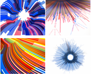
Marius Watz, “Arcs04-01” and “Arcs-04-01″
Jer Thorp,” RGB – NYT Word Frequency, 1981 – 2010″ and “Hope/Crisis – NYT Word Frequency, 1981 – 2010”

Random Number Multiples by Marius Watz and Jer Thorp

What I admire about Marius and Jer’s “Random Number Multiple” series is that the artist never neglect the beauty of traditional craft while embracing new digital interface through computer generated design. They used computer software to generate complicated geometry and screen-printed the final work. In Haewan’s post, she admired Marius Watz’s “Arc” series for its intentionality given to it random shape. The artists does not just randomly shape the geometry but they precisely calculate the geometry they want.

I agree with her that the randomness is generated by certain rules through a definite computer software to satisfy a statistical test. It seems random but it is actually generated by mathematical processes. I really admire their process of working. They effectively take advantage of computer generated design to visualize complicated statistical data and they also used traditional way to print it. Its nice combination expands more possible ways of executing art expression.