Project-07-Curves-Veronica

sketch

/*
Veronica Wang
Section B
yiruiw@andrew.cmu.edu
Project 07
*/

var nPoints = 100;


function setup() {
    createCanvas(480, 480);
    frameRate(10);
}


function draw() {
    background(255);
   
    // draw the curves
    push();
    translate(width / 2, height / 2);
    drawEpitrochoidCurve();
    drawHypotrocoidCurve();
    pop();


}

//--------------------------------------------------
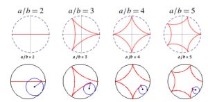
function drawEpitrochoidCurve() {
    // Epicycloid:
    // http://mathworld.wolfram.com/Epicycloid.html
    
    var x;
    var y;
    
    var a = 60.0;
    var b = a / 3.0;
    var h = constrain(mouseY / 2, 0, width / 5);
    var ph = mouseX / 50.0;
    
    noFill();
    stroke('red');
    strokeWeight(3);
    beginShape();
    for (var i = 0; i < nPoints; i++) {
        var t = map(i, 0, nPoints, 0, TWO_PI);
        
        x = (a + b) * cos(t) - h * cos(ph + t * (a + b) / b);
        y = (a + b) * sin(t) - h * sin(ph + t * (a + b) / b);
        vertex(x, y);
    }
    endShape(CLOSE);  
}

function drawHypotrocoidCurve(){
    //Hypocycloid
    //http://mathworld.wolfram.com/Hypotrochoid.html
    var x;
    var y;

    var a1 = 200;
    var b1 = a1 / 3.0;
    var h1 = constrain(mouseY / 2, 0, width / 5);
    var ph1 = mouseX / 10.0;

    noFill();
    stroke('red');
    strokeWeight(3);

    beginShape();
    for (var i = 0; i < nPoints; i++) {
        var t = map(i, 0, nPoints, 0, TWO_PI);
        
        x = (a1 - b1) * cos(t) + h1 * cos((ph1 + (a1 - b1) / b1) * t);
        y = (a1 - b1) * sin(t) - h1 * sin((ph1 + (a1 - b1) / b1) * t);
        vertex(x, y);
    };
    endShape(CLOSE);
}


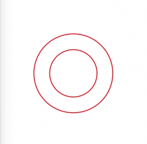
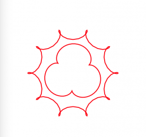
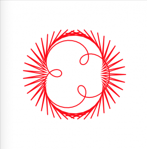
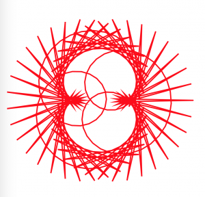
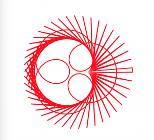
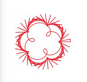
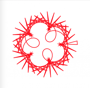
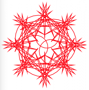
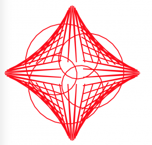
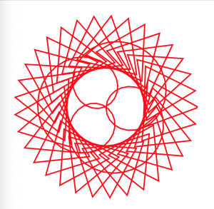
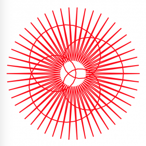
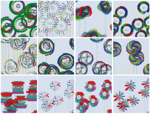
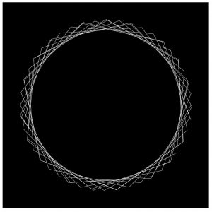
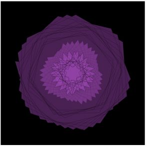
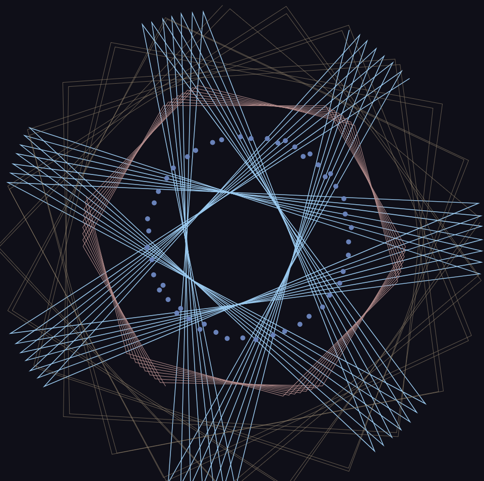
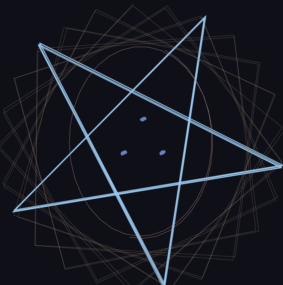
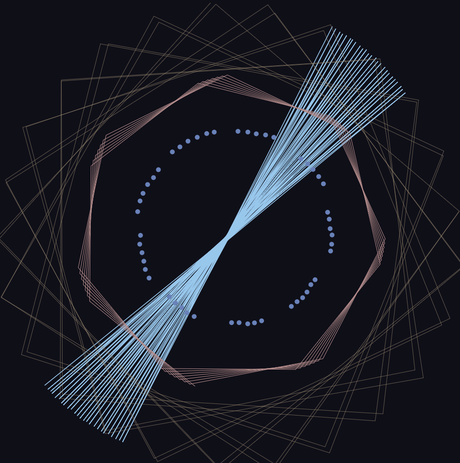
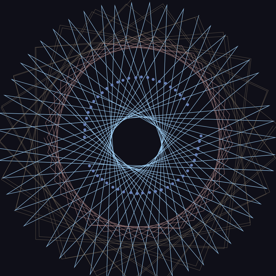
In this project, I used both the hypotrochoid and epitrochoid curves to create interesting compositions. I played around with the amplitude, divisions, diameters, etc of the curve functions. I think it’s interesting how sometimes the animation can sort of explain how the hypotrochoids were generated-when you can see a straight line rotating at the ‘beginning’ point.


Philip Gates – Looking Outwards 07

Santiago Ortiz – History Words Flow (2014)
http://moebio.com/research/historywordsflow/

I am interested not only in history, but in how we choose to engage with our history: what sticks out as important after many years? What gets emphasized? What gets forgotten?

Ortiz’s information visualization is exciting to me because it depicts exactly this: not an objective history, but an extremely subjective one, using the frequency of words in Wikipedia entries about a specific period of time as a measure. Since Wikipedia is constantly updated, this graphic is a means of representing what, at this moment, the English-speaking internet community views as the most salient details of history stretching back for millennia, and what we imagine our future to be as well.

Though no information is provided on the computational techniques Ortiz used, I imagine he has written an algorithm that scrapes Wikipedia pages and finds the words that occur with the greatest frequency. These then get a colored band proportional to their frequency. The colors Ortiz has chosen presumably speak to his own artistic sensibility, and his own subjectivity is evident in the periods of time he’s chosen to depict (when he switches from centuries to decades to years, etc).

Looking Outwards 07 – Min Lee


                               The Library Project’s Futuristic UI
    The Interface makes every collection and connections visible.

The Library Project created by Spacial Information Digital Lab is a digital interface for browsing all collections and connections at the Columbia University Library in a very visible way. It allows for easy browsing that invites curiosity in the readers. The reason this project stood out to me is its amazingly futuristic UI design. It’s the first step to a modern and forward-looking design for educational purposes. What I particularly admire is the institution’s design choices to make an interface that motivates readers. I could imagine this being a standard piece of technology used for education in the next decade or so.


Source: http://www.visualcomplexity.com/vc/project_details.cfm?id=967&index=967&domain=

ChristineSeo – Project 07 – Curves

sketch

// Christine Seo
// Section C
// mseo1@andrew.cmu.edu
// Project-07

var leftColor;
var rightColor; 
var inBetweenColor;
var scaledVal;

function setup() {
  createCanvas(450, 450);
  rightColor = color(249, 185, 226); 
  leftColor = color(226, 213, 248); 
  inBetweenColor = color(182, 115, 138);
  scaledVal = 0; 
  strokeColor = 0;

}

function draw() {
  background(0);
  translate(width / 2, height / 2); //drawing is place to the center of canvas
  Hypotrochoid();
  angleMode(DEGREES);
}

function Hypotrochoid() {
    scaledVal = map(mouseX, 0, width, 0,1);  //color of the strokes change from left to right
    inBetweenColor = lerpColor(leftColor, rightColor, scaledVal);
    noFill();
    stroke(inBetweenColor);
     if (mouseX < (width / 1.5)) {
      stroke(strokeColor);
      strokeColor = map(mouseX, 0, width, 0, 255);
    }

    var x;
    var y;
    var x2;
    var y2;
    var c = constrain(mouseX, 50, 10, width); //constrained distance of the radius of the circles 
    var r = 175; //radius of outter circle
    var r2 = 5; //radius of inner circle 
    var b = r / constrain(mouseY, 50, height);  //constrained radius of small circles

    beginShape();
     for (var i = 0; i < r; i ++) {

     var t = map(i, 10, r, 10, 360);

     var x = (r + b) * cos(t) - c * cos (((r + b) / b) * t); //Hypotrochoid equation (outter circle)
     var y = (r + b) * sin(t) - c * sin (((r + b) / b) * t);
     var x2 = (r2 + b) * cos(t) - c * cos (((r2 + b) / b) * t); //inner circle
     var y2 = (r2 + b) * sin(t) - c * sin (((r2 + b) / b) * t);
           
     vertex(x, y); //outter circle
     vertex(x2, y2); //inner circle
        }  

    endShape();
}

For this project, I loved exploring all the variety of shapes and forms that the Hypotrochoid function could make. Although the mathematical equations seemed difficult at first, I was able to successfully make intriguing shapes that I wanted to create. I also explored to make colors of the strokes change using the mouse. I have two different sets of Hypotrchnoid in the project, that gives the overall product to have a “core” in the middle of the canvas. If you move the mouse more slowly, you are able to see that there are a lot of different shapes that can be made through your mouse. I found out that the constrain function is very useful in this project and for future projects as well. It is really interesting how it looks like the shapes are rotating consistently; I definitely want to explore more functions such as Hypotrochoid and epitrochoid.

Jenna Kim (Jeeyoon Kim)- Looking Outwards-7

Final Product of OECD data visualization

Exploration of different shapes and colors.

OECD Better life Index, a project by Moritz Stefaner, is a data visualization project that compares the well being of the world based on GDP. The purpose of this way to demonstrate the ranking of the world based on data visualization is to promote and brand OECD as a whole. Your Better Life Index helps the users compare the factors that relate to the GDP: education, environment, education, standard of living, and many more. The index as a whole is an interactive data visualization in which the height of the flower represents the total score of the country. Also, each length of the petal represents the topics like income, jobs, education, health, safety and many more. Therefore, the height of the flower becomes taller if the total score rises up, and the length of each petal becomes longer if the rating of the topic is higher than before. Users can also control the rates of the topics based on what they think is important to their lives. I admire this project because this project really thinks about the users and what they would be interested while using this data visualization. User/ Human centered Design, a creative method of problem solving and having strong ties with human perspective. is one of the most important topics we design students are learning through the CMU design. This project by Stefaner blends this major design concept well with how to make data visualization, one of the topics in 104. The algorithm that generated the work required various tools such as webpack, react, Material UI, and many more. He explored different design tools, and coded to make the final product. His artistic sensibilities are demonstrated in both the process work and the final work. He tried different colors and forms/ shapes to find the right fit for OECD. He looked for shapes and colors that users can view the brand as friendly and organic.
LINK: http://truth-and-beauty.net/projects/oecd-better-life-index
–> Shows the code and the design.

cmhoward-project-07

sketch-131

function setup() {
  createCanvas(400, 400);
}

function draw() {
  background(0);
  fill(186, 85, 211, 100);
  strokeWeight(.25);
  stroke('black');
  drawHypocycloid();
}

function drawHypocycloid() {
  var x;
  var y;
  var theta;
  var nPoints = map(mouseY, 0, height, 50, 100);
    
  beginShape();

  for (var i = 0; i < nPoints; i++) {
    
    push();

    var a = map(mouseX, 0, width, 0, 50);
    var n = map(mouseY, 0, height, 0, 200);
    var d = map(mouseX, 0, width, 10, 20);

    theta = i;

    x = ((a / n) * (n - 1)*cos(theta)) - (d*(cos((n-1)*theta)));
    y = ((a / n) * (n - 1)*sin(theta)) + (d*(sin((n-1)*theta)));

    vertex(x + width/2, y + height/2);
    pop();
  }

  endShape(CLOSE);

  beginShape();

  for (var i = 0; i < nPoints; i++) {

    push();

    var a = map(mouseX, 0, width, 100, 0);
    var n = map(mouseY, 0, height, 400, 0);
    var d = map(mouseX, 0, width, 10, 20);

    theta = i;

    x = ((a / n) * (n - 1)*cos(theta)) - (d*(cos((n-1)*theta)));
    y = ((a / n) * (n - 1)*sin(theta)) + (d*(sin((n-1)*theta)));
    vertex(x + width/2, y + height/2);

    pop();
  }
  endShape(CLOSE);

  beginShape();

  for (var i = 0; i < nPoints; i++) {
    
    push();

    var a = map(mouseX, 0, width, 0, 100);
    var n = map(mouseY, 0, height, 0, 400);
    var d = map(mouseX, 0, width, 10, 20);

    theta = i;

    x = ((a / n) * (n - 1)*cos(theta)) - (d*(cos((n-1)*theta)));
    y = ((a / n) * (n - 1)*sin(theta)) + (d*(sin((n-1)*theta)));

    vertex(x + width/2, y + height/2);
    pop();
  }

  endShape(CLOSE);
}

For this project, I focused on the hypocycloid curve. 

http://mathworld.wolfram.com/Hypocycloid.html

The hypocycloid is based on the idea of a circle, of smaller radius, rolling along the inside of a larger circle, with a point drawing it’s curve throughout the rotation. For my project I first began exploring variations based on the number of points and how adding different variables to the equation could influence it’s shape.

I then began playing around graphically, adding in 3 layers of these hypocycloid curves, and filling in the curves, to almost recreate a flower in bloom. It’s quite interesting to me how these circles are proportional to one another but act quite differently at certain points in the canvas.

I added in the d variable, which creates even more variation, based on the Astroid curve, http://mathworld.wolfram.com/Astroid.htmlwhich is a type of hypocycloid.

Christine Chen-Project-07-Curves

Christine Chen-Project-07-Curves

/*
Christine Chen
Section E
cyc1@andrew.cmu.edu
Project-07-Curves
*/

var nPoints = 100;
var eyeSize = 10;
var pupilSize = 5;

function setup() {
    createCanvas(480, 480);
    frameRate(10);
}

function draw(){
    background(189, 232, 252); //blue

    leaves();
    push();
    translate(width/2, height/2);
    drawHeart();
    pop();
    eye();
    blush();
    mouth();
}

function drawHeart(){
    //color
    noStroke();

    //peach turns "ripe" when its big
    if (mouseY > 130){ 
        fill(255, 178, 182); //light pink
    } else {
        fill(192, 222, 188); //light green
    }

    //heart
    beginShape();
    for (var i = 0; i < nPoints; i++) {
        var t = map(i, 0, nPoints, 0, TWO_PI);

        x = 16 * pow(sin(t), 3);
        y = 13 * cos(t) - 5 * cos(2 * t) - 2 * cos(3 * t)
             - cos(4 * t) * mouseX/90;

        mouseX = constrain(mouseX, 80, 70);
        mouseY = constrain(mouseY, 80, 200);

        x = map(x, -1, 15, -1, mouseY);
        y = map(y, -1, 15, -1, mouseY);

        vertex(x, y);
    }
    endShape(CLOSE);
}

function eye(){
    fill(0); //black
    var eyeLX = width/2 - 20 - mouseY/10;
    var eyeRX = width/2 + 20 + mouseY/10;
    ellipse(eyeLX, height/2, eyeSize, eyeSize); //left eye
    ellipse(eyeRX, height/2, eyeSize, eyeSize); //right eye
}

function blush(){
    noStroke();
    fill(229, 51, 60); //red
    var blushLX = width/2 - 20 - mouseY/7;
    var blushRX = width/2 + 20 + mouseY/7;
    ellipse(blushLX, height/2 + 15, eyeSize + 20, eyeSize); //left 
    ellipse(blushRX, height/2 + 15, eyeSize + 20, eyeSize); //right 
}

function mouth(){
    fill(232, 91, 98); //dark pink
    ellipse(240, 260, mouseY/10, mouseY/10);
}

function leaves(){
    noStroke();
    fill(112, 230, 134);

    //bigger leaves
    var leafLX = width/2 - 70;
    var leafRX = width/2 + 70;
    ellipse(leafLX, height/2 + 100, 150, 100); //left 
    ellipse(leafRX, height/2 + 100, 150, 100); //right 

    //smaller shadows on top
    fill(107, 221, 129);
    ellipse(leafLX + 20, height/2 + 90, 110, 80); //left 
    ellipse(leafRX - 20, height/2 + 90, 110, 80); //right 
}


I was initially just playing with the heart curve. Then when I made it pink, the idea of making it into a peach came to my mind. When the peach is small, it is unripe and so it is green. Once it gets big(once mouseY is larger than a particular point) it becomes ripe(pink). I initially wanted to play around with the curve even more, but I realized that doing so would make the shape not a heart, which wouldn’t work with the idea of a peach. Thus, I just play around with making the curves change “rationally”(so it keeps the shapes of a heart) according to the mouse positions.

Unripe State
Ripe state


Vicky Zhou – Project 07 – Curves

sketch

/*Vicky Zhou
Section E
vzhou@andrew.cmu.edu
Project_07_Curves*/

var nPoints = 50; //amount of mapped out points
var EPITROCHOID1 = 0; // parametric form 
var HYPOTROCHOID = 0; //parametric form

function setup() {
    createCanvas(480, 480);
}

function draw() {
	background(15, 15, 25);
	translate(width/2, height/2);
	//draw light blue epitrochoid curve
	drawEPITROCHOID1();
	//draw light pink hypotrochoid curve
	drawHYPOTROCHOID();
	//draw orange circle epitrochoid curve
	drawEPITROCHOID2();
	//draw yellow circle epitrochoid curve
	drawEPITROCHOID3();
}

function drawEPITROCHOID1() {
	push();
	stroke(140, 200, 240);
	strokeWeight(0.75);
	noFill();
	var x; //x pos
	var y; //y pos
	var t = 90; //angle variable
	var b = constrain(mouseX / 100, 0, 10); //outside curve variable
	var h = map(mouseY, 0, mouseY, 30, height/2); //height variable
	beginShape();
	for (var i = 0; i < nPoints; i ++){
		var a = map(i, 0, nPoints, 0, TWO_PI); //inside circle size variable 
		x = (a + b) * cos(t) - h * cos (((a + b) / b) * t); //parametric eq1
		y = (a + b) * sin(t) - h * sin (((a + b) / b) * t); //parametric eq2
		vertex (x + random(0, 2), y + random(0, 2));
	}
	endShape();
	pop();
}

function drawHYPOTROCHOID() {
	push();
	strokeWeight(0.5);
	stroke(190, 140, 140);
	noFill();
	var x; //x pos
	var y; //y pos
	var t = constrain(mouseX / 10, 0, 100); //angle variable
	var b = 5; //outside curve variable
	var h1 = constrain(mouseX/ 2, width/4, width/3); //height variable 1 
	var h2 = constrain(mouseY/2, width/3, width/2); //height variable 2
	beginShape();
	for (var i = 0; i < nPoints; i++){
		var a = map(i, 0, nPoints, 0, TWO_PI); //inside circle size variable
		x = (a - b) * cos(t) + h1 * cos(((a - b)/b) * t);
		y = (a - b) * sin(t) + h2 * sin(((a - b)/b) * t);
		vertex(x, y);
	}
	endShape();
	pop();
}

function drawEPITROCHOID2() {
	push();
	noStroke();
	fill(100, 130, 190);
	var x; //x pos
	var y; //y pos
	var t = 100; //angle variable
	var b = constrain(mouseX / 100, 0, 10); //outside curve variable
	var h = constrain(mouseX/2, 0, 100); //height variable
	beginShape();
	for (var i = 0; i < nPoints; i ++){
		var a = map(i, 0, nPoints, 0, TWO_PI); //inside circle size variable 
		x = (a + b) * cos(t) - h * cos (((a + b) / b) * t); //parametric eq1
		y = (a + b) * sin(t) - h * sin (((a + b) / b) * t); //parametric eq2
		ellipse(x + random(-1, 1), y + random(-1, 1), 5, 5);
	}
	endShape();
	pop();
}

function drawEPITROCHOID3() {
	push();
	stroke(160, 140, 110);
	strokeWeight(0.3);
	noFill();
	var x; //x pos
	var y; //y pos
	var t = 190; //angle variable
	var b = constrain(mouseX, 0, 5); //outside curve variable
	var h = map(mouseY, 0, mouseY, 30, height/2); //height variable
	beginShape();
	for (var i = 0; i < nPoints; i ++){
		var a = map(i, 0, nPoints, 0, TWO_PI); //inside circle size variable 
		x = (a + b) * cos(t) - h * cos (((a + b) / b) * t); //parametric eq1
		y = (a + b) * sin(t) - h * sin (((a + b) / b) * t); //parametric eq2
		vertex(x + random(-5, 5), y + random(-3, 3));
	}
	endShape();
	pop();
}

This project was incredibly satisfying to make! Although it was a bit of a struggle at first to understand what each variable manipulated in the curve, plugging in random values and seeing what was affected was helpful and how I learned how to manipulate my curves into the desired look. I added a bit of “jitter” effect to my curves as well because I enjoy how they make the piece feel like it is constantly interactive even when the user is not altering the curves. For future iterations and/or ideas I think it would be interesting to incorporate equations that are not necessarily parametric, explicit, and/or polar.

Example 1
Example 2
Example 3
Example 4

Audrey Zheng – Project – 07

sketch

//Audrey Zheng
//Section A
//audreyz@andrew.cmu.edu
//Project-07


function setup() {
    createCanvas(400, 600);
}

function draw() {
	background(81,60,85);
    push();
    translate(width / 2, height / 3);

	drawHypotrochoid();
	drawHypocycloid();
	drawEpicycloid();

	pop();

	drawFlower(40,20);
    
}

function drawFlower(x,y) {

    translate(x, y);
	drawHypotrochoid();
	drawHypocycloid();
	drawEpicycloid();


}

function drawHypotrochoid() {
	var x;
	var y;

	var a = 100; //radius
	//var a = map(mouseX,0,width, 50,90);
	var b = 20; //spirograph radius

	//var b = map(mouseX,0,width,5,20);
	 //distance pen to center of spirograph

	var h = map(mouseX, 0, width, 40,60);

	
	//var h = map(mouseX, 0, width, 40,60);

	angleMode(DEGREES);
	stroke(189,230,137);
	fill(82,82,115);

	beginShape();


	for (var t = 0; t < 360; t++) {
		x = (a - b) * cos(t) + h * cos(((a - b)/b) * t);
		y = (a - b) * sin(t) - h * sin(((a - b))/b * t);


		vertex(x,y);


	}

	endShape(CLOSE);


}

function drawHypocycloid() {
	var x;
	var y;

	var a = 50; //radius
	//var a = map(mouseX,0,width, 50,90);
	var b = 10; //spirograph radius
	var n =  a/b;

	angleMode(DEGREES);

	stroke(98,210,159);
	fill(57,138,166,70);

	beginShape();
	var multiple = map(mouseY,0,height, -1,1)

	for (var phi = 0; phi <360; phi ++) {
		
		x = (a/n) * ((n-1) * cos(phi) - cos((n-1) * phi));

		y = (a/n) * ((n-1) * sin(phi) + sin((n-1) * phi));

		vertex(multiple *x,multiple *y);

	}
	endShape(CLOSE);
}

function drawEpicycloid() {
	var x;
	var y;

	var a = 40; //radius
	//var a = map(mouseX,0,width, 50,90);
	var b = 5; //spirograph radius

	angleMode(DEGREES);


	beginShape();


	var multiple = map(mouseY, 0, height, 1,2);;

	for (var phi = 0; phi <360; phi ++) {
		
		x = (a+ b) * cos(phi) - b * cos(((a + b)/b) * phi);

		y = (a + b) * sin(phi) -  b * sin(((a+b)/b) * phi);

		vertex(multiple *x, multiple *y);


	}
	endShape(CLOSE);

}


Catherine Coyle – Looking Outwards – 07

Information visualization can make a huge difference in how viewers feel about certain data and how it comes across. For this week, I decided to do my looking outwards post on the Fitbit CES animations done by Rachel Binx. She was one of the designers that was recommended on our website and I like her work a lot.

Fitbit Animations from Rachel Binx on Vimeo.

Above is a preview of her animations for this project.

For this work, I assume that she was given heart-rate/Fitbit data to work from and made these clean looking animations to visualize it. I would assume that the algorithms behind it are basic because it is mostly displaying different charts and numbers, rather it is the art that accompanies it that makes the work admirable. She wrote the animations so that they feel very smooth and fit the ‘Fitbit’ general aesthetic which I admire a lot.