![[OLD FALL 2017] 15-104 • Introduction to Computing for Creative Practice](../../../../wp-content/uploads/2020/08/stop-banner.png)
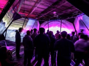
Chris Sigrue is an artist, programmer, teacher, and inventor. I enjoyed her lecture and the audience participation in her works (something we have not really seen yet). There were a lot of really interesting and innovative exhibits: because of the audience participation, there was a level of unexpected and renewing novelty that went beyond even ordinary randomness.
Category: Section C
Ziningy1-Looking Outward 1-Looking outwards 08
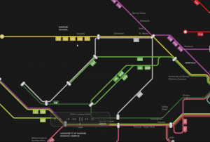
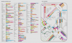
I am always very interested in how data can be used to create meaningful visualizations. So as I was browsing through the Eyeo Festival, I immediately spotted theSpeaker Sarah Williams and her project on the Nairobi Transportation System. Sarah William is a associated professor of technology and urban planning at MIT, and also the director of the Civic Data design Lab. So she started her presentation by introducing what is motivating her doing what she has being working on. With a strong interest in using data to facilitate urban planning, She promotes while we are massively collecting and researching data, we should pay more attention on how wecan use the data. Thus regarding the data visualization, she indicated that new visualization of data exposing pattern in the world and revolute the way people perceive information. And many examples was shown in her presentation specifically mapping systems. Williams also indicate there is legitimacy in map that “map is powerful, power is the ability to do work, which is what maps do, they work.” After introducing the motives and her research areas, Sarah Williams started to talked about the Digital Matatus project she did. Digital Matatus is a collaborative Mapping system for public transits in Nairobi. So in Nairobi, Matatus are the current loosely self-organized “bus” system. However due todiverse Matatus companies that lack of a uniformed organization, Nairobi people are having a hard time to make sense of the entire matatus system and navigate effectively through them. So Williams and her team collaborated with students from the University of Nairobi and collected data locally with the Matatus drivers and frequent passenger, who can identify different routes and stops. After the data is collected, they developed this visualization with color coded routes along with the GTFS compatible data structure. It is interesting on how they dealt with the huge chaotic data and draw the map diagrammatically along 45-90 angles so that the user will be able to make sense of directions much more easily. The map also become the official matatus map in Nairobi and instantly have many of the users from the local Nairobi citizens, so it is really inspiring that how a simple visualization would actually affect a community by facilitating a more efficient transportation system. On the hand, I really admire the fact that Williams make the data completely open to the public so that the government and other tech organization can build upon it. Base on the data, several digital application are made for easier access to the Matatus schedule as well as cash-free cards for faster payments. Overall, witnessing all the design process and changes being made in the Nairobi society, I am really inspired on how data and visualization can solve social problems in a such effective way.
LookingOutward-08
For this weeks looking outward post, I chose to look at Jesse Louis-Rosenberg and Jessica Rosenkrantz’s (both co-founders) speech where they talked about the work of their design studio, Nervous System.
Jesse is an artist, computer programmer and maker who studied math at MIT.
Jessica is a designer, programmer and artist who architecture and biology at MIT. They began by introducing their background and explaining the main three areas of focus that the projects of their studio stems from: science and nature, digital fabrication and co-creation. Their project, the hyphae lamps, was their initial example of combining science and natural patterns with digital fabrication.
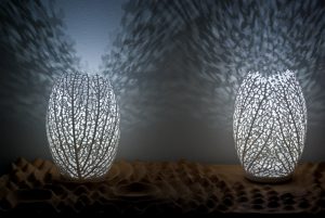
Using their various projects, the two co-founders go on to describe their design ideals and the design philosophy of their company, having a huge focus on new technology and the interaction of digital fabrication and technology with nature and design. Throughout their presentation, they describe various design problems and challenges they faced and the solutions they created, connecting the solution to other new problems in order to transition from topic to topic.
http://n-e-r-v-o-u-s.com/about_us.php
Eyeo 2015 – Jesse Louis-Rosenburg and Jessica Rosenkrantz from Eyeo Festival // INSTINT on Vimeo.
aerubin-LookingOutwards-08-Section-C
Ben Rubin is a media artist currently based in New York City. He received a B.A. from Brown University and an M.S. afterwards from the MIT Media Lab. His artwork is displayed all around the world including the San Jose Museum of Art, the Reina Sofia Museum in Madrid, and the Fondation Cartier pour l’art contemporain in Paris. One of his most recent creations is the Shakespeare Machine for the Public Theater in New York which displays text on a chandeliered of quotes and adjectives Shakespeare wrote. Currently, he is a professor at the Bard MFA program and at the Yale School of Art.
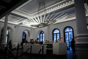
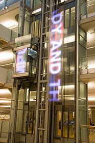
Mr. Rubin gave a talk at the EYEO Festival in 2013 about his projects and inspiration. He began his talk by speaking about the importance of words and language in our society. He believes language is able to “write, transmit, interpret, regard, understand, perform, analyze, receive, and read,” and he desires these attributes in his artwork. This is why the major majority of his works all feature words. His first major project was inspired by the first text display ever in New York City. He implemented the conveyor belt design of horizontal words on an elevator shaft. This work would read the recent books checkout in a library, but would only show the word as the elevator was moving.
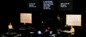
Another project he spoke about was the time when he worked closely with Steve Reich, one of the most innovative and well know of the living contemporary composers. Together, they made a program that translated works into syllabic rhythms that can be given to percussionists to perform. Steve Reich then added music on top of this to create a vocal composition accompanied by percussion that emulated the speech in drums. It is amazing how words can be so impactful in artwork, very similar to many of the beliefs of choral music that tells a story with words and music instead of just the notes. This is in correlation with artwork as he utilizes words and art to evoke a much deeper emotion than when they are separate.
eeryan-LookingOutwards-08
L05, also known as Carlos Garcia, is a member of the Detroit based collective, Complex Movements, a group that aims to address social justice issues through multimedia performance art. Their current project “Beware of Dandelions” is a mobile art installation made up of a 400 square foot dome like structure. Viewers go inside the dome as the piece, which combines performance, hip hop, and generative design. This piece seeks to communicate about community organization, function as an oral history archive and as performance art. I was interested in Complex Movement’s work because of the approach Beware of Dandelions took to local social justice, turning it into an artistic attraction that allows visitors and locals to engage in the issue in a captivating manner.
Link to Complex Movement’s website
karinac-LookingOutwards-08
This is Complex Movements, an artist collective based in Detroit, Michigan, that connects the complex sciences to social justice movements.
For those that do not know what the complex sciences are, it is explained as a study of complex systems, systems with many parts that interact to produce global behavior that cannot easily be explained in terms of interactions between the individual constituent elements.
Knowing this, Complex Movements uses the complex sciences by integrating their original music into visual arts exhibitions and mobile art installations to create a new way to deliver social justice messages of organizations and individuals who do not feel like they have a voice.
In their recent project, Beware of the Dandelions, Complex Movements uses a 400-square foot polyhedron to visually project sci-fi narratives to their audience. The man behind the visuals and animations is Wes Taylor, who hold graduate degree in 2-D design from the Cranbrook Academy of Art and is currently a Senior Assistant Professor of Art & Design at Lawrence Tech University. What I love about his work is that he created a new way to express the art of storytelling through the uses of computer graphics and music. Looking at the intersection of computer systems and social movements to generate interactive visuals that really speak to its audience is what really inspired me.
Link to Artist Site
https://emergencemedia.org/pages/complex-movements
Artist works
ashleyc1-Section C-Looking Outwards-08
Paolo Ciuccarelli is part of a research design group, DensityDesign, in conjunction with a university in Italy. At Eyeo, Ciuccarelli talked about The Poetics of Data Experiences: how to visualize big data that displays the information that is expressive of time, space and emotion. Ciuccarelli uses the term info-poetry to teach that design should play with rhetoric and emotion, ensure the meaning of the message is understandable, make it reproducible and potentially open source it. He shows several examples of his student’s work where they essentially create projects that encapsulate data reflective of contemporary society and present it in a manner that follows the main info-design principles. It’s a step upward from a regular infographic; visually representing data in a way that will elicit emotion. I was drawn to example projects that really utilized media to express data as it was stronger than just using a computer to create a generative body.
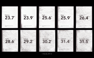
There was a project called Crumpled Italia where pieces of paper are displayed in a grid to represent different countries. Each piece of paper was crumbled to a percentage that matched the statistic of domestic abuse in the country. I found that piece extremely profound as it really elicits empathy without being exposed to a “gory” image which is what info-poetry is about. I find the general topic of representing and visualizing data fascinating. Ciuccarelli explains that he was fascinated with understanding complex systems and using data visualization to make sense of them as well as teach to others. As a person, I share that same fascination and would be interested in learning how to fuse generative computer graphics and tangible materials with design.
Essentially, his form of presenting data is the same in which he enjoys using graphics to communicate ideas and numbers but rendering them in such a way that the viewer experiences an emotional response. I noticed a lot of the times, the viewer is responding to abundance of data but the data is also elevated by variables such as color and music. This is a good example for myself to reference when thinking about how presentation and documentation of information should display not only the data itself but the context, mood and tone of the data.
ikrsek-Looking Outwards-08
For this Looking Outwards, I couldn’t help but do research on more than one artist – and I felt like in discussing one of the projects I saw and loved, it was essential to discuss the histories of each artist instead of just focusing on one thing.
Georgia Lupi is an information designer, artist, and author from Italy who utilizes data as her medium through which to tell stories and spread information. She originally started out as an architecture student, but transferred into design. She is also the co-founder of Accurat, a New York City based data-driven design firm. Her body of work reflects her job as a data-designer, and much of her work literally pertains to figuring out intuitive ways to visualize data to viewers that are disconnected from the meaning of such information. One such piece is permanently installed in the MoMA at the moment which acts as an interpretive landscape for a fashion exhibition that occurred earlier this year
Stephanie Posavac is also a designer based out of the UK (but U.S. born) who tends to favor data as a medium for her work (specifically language, literature, and science) and earned her MFA in communication design, while her background lies in book design and text visualization. She focuses majorly on the visual representation of language or numbers and both have had their work exhibited in the Museum of Modern Art. Her body of work also greatly reflects the way that she uses data and design (but focuses more on the design aspect in her work). An example of one of her pieces would be this collaborative project she did with David McCandless, where he provided content and text and she decided how to visually present the idea. Her main focus was getting people to want to look at something they normally would care to look at, and I think that drawing attention to things people don’t notice or avoid is very important to her practice as a designer and data analyst.
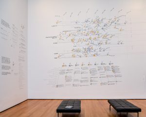
Now “Dear Data”, a project that is still going on, and which they collaborated to create is a project in which you can clearly see both of their interests lying in. “Dear Data” is a collaboration not only amongst themselves, but among the people who want to be involved as well – anyone who chooses to contribute becomes a part of this project. In short, the dear data project is a serious of postcards detailing how their week was regarding one topic (i.e. love life, pet life, work, etc.) sent between these two artists, on the front is the data which could be seen as just nice illustrations by anyone who does not understand, and then on the back lies the key, or in other words – how to read the drawing on the front. The idea was to create a collection of data that not only had some coherency but that could support hundreds of different kinds of stories form anyone who decides to participate. For them, it became a way of looking at their lives, and trying to put different aspects into a new context both visually, and in terms of meaning. The discussion topics themselves became performances, and art projects. This project is something that I genuinely admire because of the intricacy and care it holds for the artists, and even for those looking in from the outside. All of the information is personal, and it was started in an attempt to really connect with another person – what it’s led to is even more beautiful in that it not only fulfills everything the artists wanted from it, but goes beyond and inspires new ideas/realizations regarding the visualization of data and in a way brings back some magic for each of these artists in their respective fields.
They started off the presentation by talking about themselves/who they are how they met, which is a great segway into their collaborative piece considering it is not only their first collaboration but it is how they are getting to know one-another. They were also extremely confident and used some humor in discussing themselves and their work, which is something that’s important when you present if you want to be sure to grab an audience’s attention and respect. They go on to talk about the way they relate to design and their methods of working before actually discussing the project itself, allowing for a lot of build-up and a good foundation in terms of why this project was even of interest to them. They set the audience up to listen and think about data-design and how the work they discuss addresses it in a clever way through giving insight into the way that they work.
Speaker Websites
Giorgia Lupi:
http://giorgialupi.com
Stephanie Posavec:
http://www.stefanieposavec.com
Lecture video:
sijings-lookingoutwards-08
Janet Echelman (born 1966) is an American sculptor and fiber artist. She graduated from Harvard University in 1987. Her sculptures have been displayed as public art, often as site-specific installations. She starts working with a Hamble material. She first studied Chinese calligraphy at Hong Kong University where she encountered a building/architecture made by bamboo which has a strength she admired during an earthquake. In 1997, Echelman won a Fulbright Senior Lectureship and traveled to India with the intention of giving painting exhibitions. For Janet’s work, I really appreciate how she can flexibly manipulate materials and media. I remember in this talk, she first discussed how her material cannot arrive on time and results in her changed choice of using the material. Instead of waiting, she used a local material, the fishing net. She then discovered how the adaptability of it –the ever-changing form of the interaction of the wind.
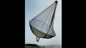
For most of her work, she will design on applications first to construct precise shape with gentle movement. She figured out to use the variable of a machine to create a pattern of hand-made patterns. To let more industrial workers work on her piece, she created her own language of how to make these patterns for the workers. She analyzes the photos of the sky and graphs the saturation with software that is developed by her studio. This software helped her to create images that describe the imagined shape during the day and night time, with wind and without.
Throughout the whole presentation, she presented with pretty self-explanatory pictures and animations. Her instructions are calm, slow and really natural. The anecdote jokes she shared about really helps to add layers on her overall presentation. She also demonstrates a really clear timeline with the different stage in her life and artwork, from her basically new to the medium and material to the place where she mastered it and combine with sound, climate change, and etc.
Janet Echeiman’s talk on Inst-Int Festival
Bettina-LookingOutwards-08
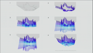
Derek Watkins‘s work piqued my interest because his ethos relates to my design methodology, and his approaches relates to an independent study I’m doing this semester.
Watkins works at New York Times where he tells interprets how to tell stories in ways more than just written word and still image. He includes animations and interactive elements to add layers of information to the otherwise standard scrolling-interaction the reader needs to go through. I appreciate his statement in the Eyeo 2017 video, that it’s not about “video journalism” or “photojournalism”, it’s about understanding the nature of the content and what form best communicates the essence of the content to readers. That sentiment of identifying concept and purpose before creating form relates to my design practice; it’s an approach I notice people from other disciplines have trouble grasping– people (myself included) struggle with ambiguity and strive for a tangible grasp of what the thing they’re making is.
Nevertheless, when we let go of preconceived notions of what a form should be, we evolve news sites from pages of text to interactive data visualizations. I hope to apply similar approaches, both conceptually and formally, to an independent study I’m working on where I want to communicate the different lenses I’ve interpreted The Little Prince through in a web format.
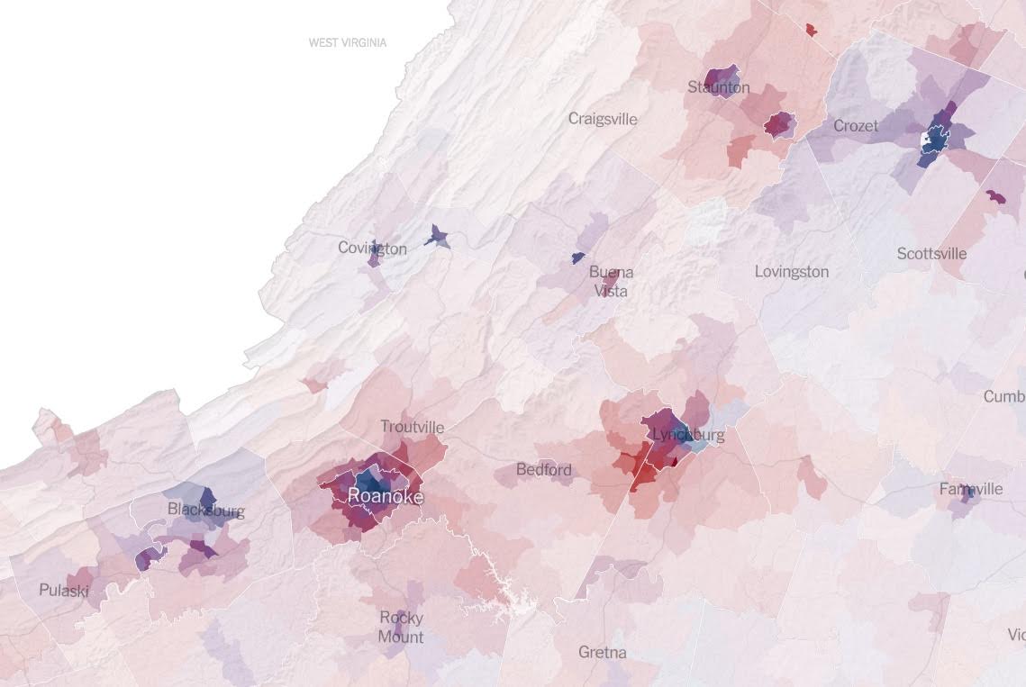

Above: images from Watkin’s work in New York Times articles.