var Emma;
var z = .5;
function preload() {
  Emma = loadImage("https://i.imgur.com/pWLCrQJ.jpg"); //image from imgur
}
function setup() {
  createCanvas(400, 400);
  background(0);
  for (var i = 0; i < width/2; i+=z) {
    for (var j = 0; j < height/2; j+=z) {               //nested for loop image sized
      var pixelColor1 = Emma.get(i, j);                 //storing pixels info
      var pixelBrightness1 = brightness(pixelColor1);   //sampling brightness of pixles
      noStroke();
      fill(256, 0, 256, pixelBrightness1 + 30);              //solid color brightness from image
      ellipse(i, j, z, z);                              //draw new image using colors
    }
  }
  for (var k = 0; k < width/2; k+=z) {
    for (var l = 0; l < height/2; l+=z) {
      var pixelColor2 = Emma.get(k, l);
      var pixelBrightness2 = brightness(pixelColor2);
      noStroke();
      fill(256, 256, 256, pixelBrightness2 + 50);
      ellipse(k + width/2, l + width/2, z, z);
    }
  }
  for (var m = 0; m < width/2; m+=z) {
    for (var n = 0; n < height/2; n+=z) {
      var pixelColor3 = Emma.get(m, n);
      var pixelBrightness3 = brightness(pixelColor3);
      noStroke();
      fill(0, 256, 256, pixelBrightness3 + 30);
      ellipse(m + width/2, n, z, z);
    }
  }
  for (var x = 0; x < width/2; x+=z) {
    for (var y = 0; y < height/2; y+=z) {
      var pixelColor4 = Emma.get(x, y);
      var pixelBrightness4 = brightness(pixelColor4);
      noStroke();
      fill(256, 256, 0, pixelBrightness4 + 30);
      ellipse(x, y + width/2, z, z);
    }
  }
}
Category: Section C
afukuda-LookingOutwards-09
RASTER by Kyuha Shim
[Vimeo video showcasing RASTER]
This project caught my eye because I learnt about the De Stijl movement in an architectural history course, therefore it is of some familiarity to me. It also intrigued me, as the project takes something that was originally handcrafted and mimics it through the use of technology. To do this, one must fully understand the meaning behind the artistic style. I concur with my peer, that Shim is able to “combine both an advanced knowledge of De Stijl work both technically but visually.” I think, however, that RASTER is on the verge of losing the essence of what is De Stijlism; De Stijl advocates pure abstraction and universality by a reduction to the essentials of form and color, simplifying visual compositions to the vertical and horizontal, using only black, white and primary colors. Through manipulating the resolution of the grid, RASTER may become too intricate to be considered “De Stijl”.
Link |
http://www.kyuhashim.com/ [Shim’s website]
https://courses.ideate.cmu.edu/15-104/f2017/2017/09/02/lookingoutwards-01-2/ [Peer’s Looking Outwards post]
Ziningy1 – Looking Outward 09
For this week’s Looking Outward, I chose Superwat’s Post on week 7 post of Computational Information Visualization: https://courses.ideate.cmu.edu/15-104/f2017/2017/10/13/svitoora-07-font-map/
Actual Project:http://fontmap.ideo.com/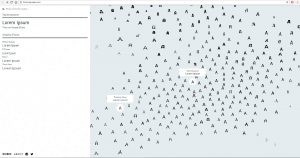
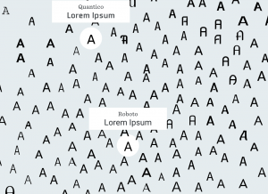
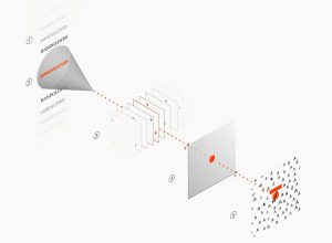
So the Front Map is a exploration from designer at IDEO to address the pain point of designers looking for a proper font. With the aid of utilizing Artificial Intelligence, the IDEO team was able to create an insightful and valuable tool that facilitate designers’ decision making. The Font Map is a computer(machine learning algorithm) generated visualization of 750 fonts and those font are arranged according to their visual relatedness. It is very impressive as a design student to see this kind of tool designed to help the design process. I indeed agree with what Superwat indicated in his post that the visualization map definitely provide more information on the interaction between fonts. When I was also reading other articles on this project, I found this interesting metaphor commenting the map, “Imagine the map as a country, where the font samples are the locals. As you travel between the different lands, the local dialect changes very slightly. In this example, the dialect is a metaphor for the different fonts that are spread across the map. ” If it is not the computer algorithm, It will be painstaking for people to analyze each font and organizing them into this kind of visualization. Inspired by this project and also looking into the current progress on computer vision, I suddenly felt that we as designers are also entering a new era where computer will be more involved in our design process. Image processing, for example, might able to generate simple similar iterations for a graphic design, which might help the designers making small twists. I can also imagine that image processing technology will help graphic designers to find other designers that may have the similar styles and aesthetics. I am always excited to see how the emerging technology can facilitate creative process such as design and art.
sijings-lookingoutwards-09
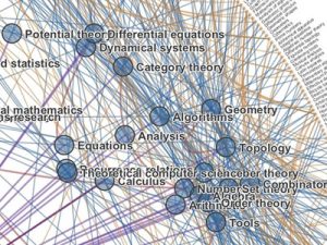
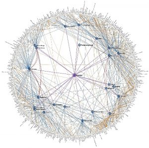
This is a project chosen by Zining Ye. I found this project to be really interesting as I am also interested in the field of data visualization and HCI. I appreciate how he has demonstrated a clear instruction of how the project actually works that I feel very easy to access the whole project. One little suggestion I have is to have the pictures of the actual work to be a little bit larger so the details are better shown. When I was looking at it, I was connected to thinking about web and how our thoughts are also connected and weaving like individual threads. If I was to access this project, I would try to find some specific example of how these levels of Wikipedia category pages and their interconnections connect. Furthermore, I looked into this work on other websites other than Chris’ own website, expecting to find more interesting information of the project. It is demonstrated in “Visual Complexity” that the clustering component of this visualization is vital. As Chris explains: “The mere presence of information isn’t all that interesting; there is no context or relevance to be gleaned. However, the structure of information is revealing about where fields intersect and diverge, and ultimately about how humans organize information”.

ashleyc1-Section C- Looking Outwards-09
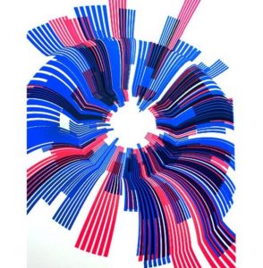
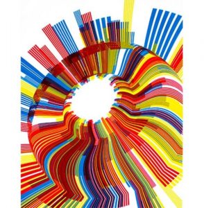
I was really inspired by Hae Wan Park’s post from week 6 about Marius Watz and Jer Thorp’s collaboration for the Random Number Multiples Series curated by Christina Vassallo. This project was a computational collection in which Watz and Thorp created a program that would track how many times a specific word was used throughout the New York Times and visually display that information in cyclic shapes with lots of bold, layered colors. What is special about this project is that the final design was a screen printed poster.
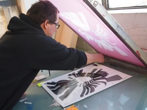
I agree with Hae Wan that this project is interesting mainly because it’s a combination of computational information design and the traditional process of screen printing. I’d go further to explain that this relationship is needed because the conceptual inspiration came from physical newspapers and to reprint this information into a new physical form elevates the project to thinking not only about societal themes but also how we take in information today.
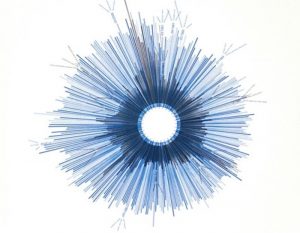
I disagree with Hae Wan when they say that this is just artistic expression. This process is unique because there’s this relationship to taking something digital and making it tangible and physical but I think Hae Wan should have talked more about the conceptual thinking behind the project because it does have some political undertones to it. For example, Je Thorp’s piece Hope/Crisis tracks how much the NY Times printed the words Hope and Crisis which is overwhelming just to see in amount but also makes you realize that we use the word hope more than crisis and has a sentimental reflection that despite living with current and recent devastations, humans still remain hopeful of a better future-something that’s conceptually interesting and equal to the unique process of creating this project.
Sources:
https://creators.vice.com/en_us/article/vvzxkb/random-numbers-screen-printed-generative-art-nyc-event
https://creators.vice.com/en_us/article/4x47bw/overcoming-manual-inadequacy-an-interview-with-marius-watz
http://blog.blprnt.com/blog/blprnt/random-number-multiples
Bettina-LookingOutwards-09-SectionC
I perused through my peers’ looking outwards to come across this fun web toy, frankenSimulator.
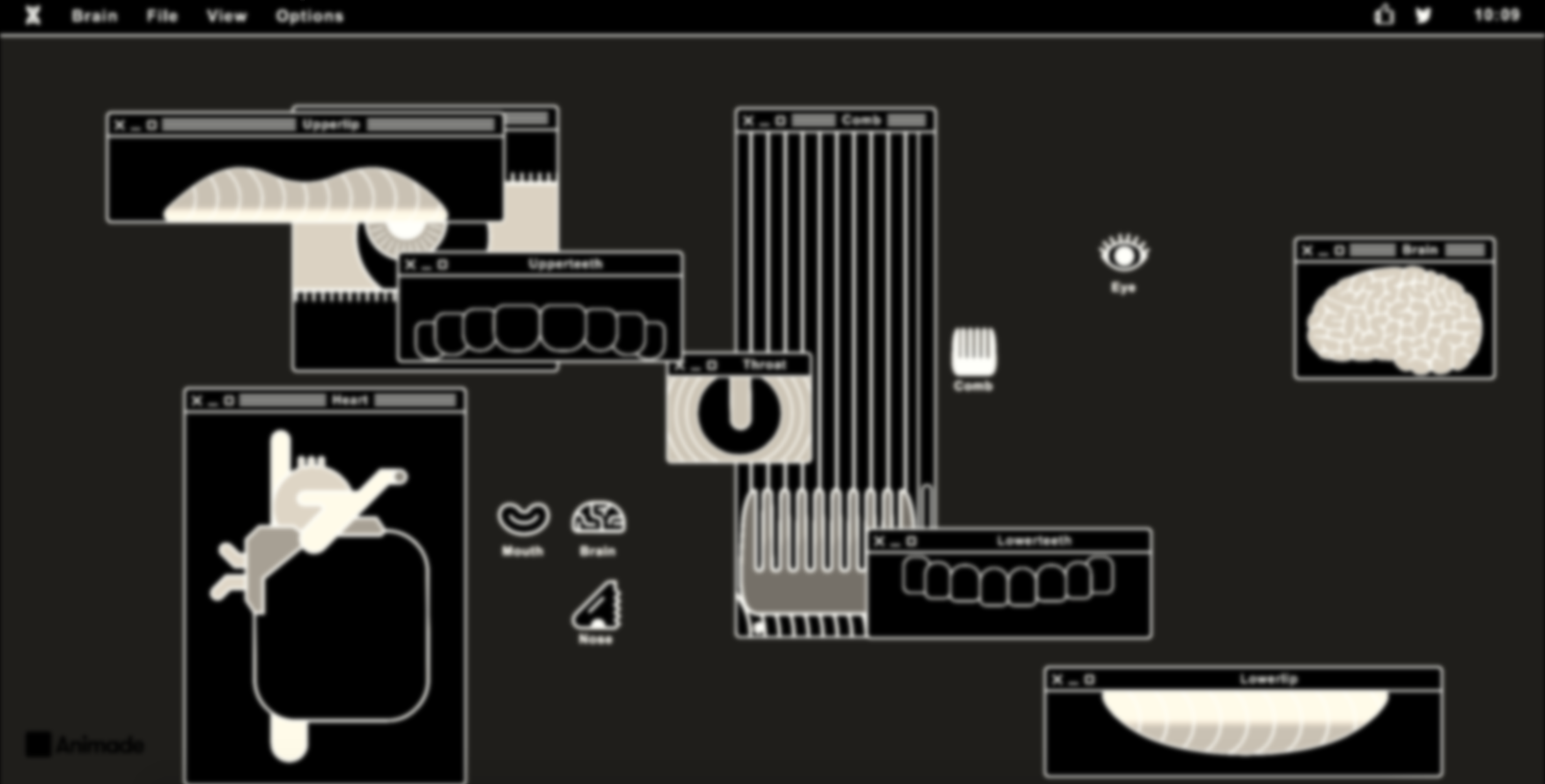
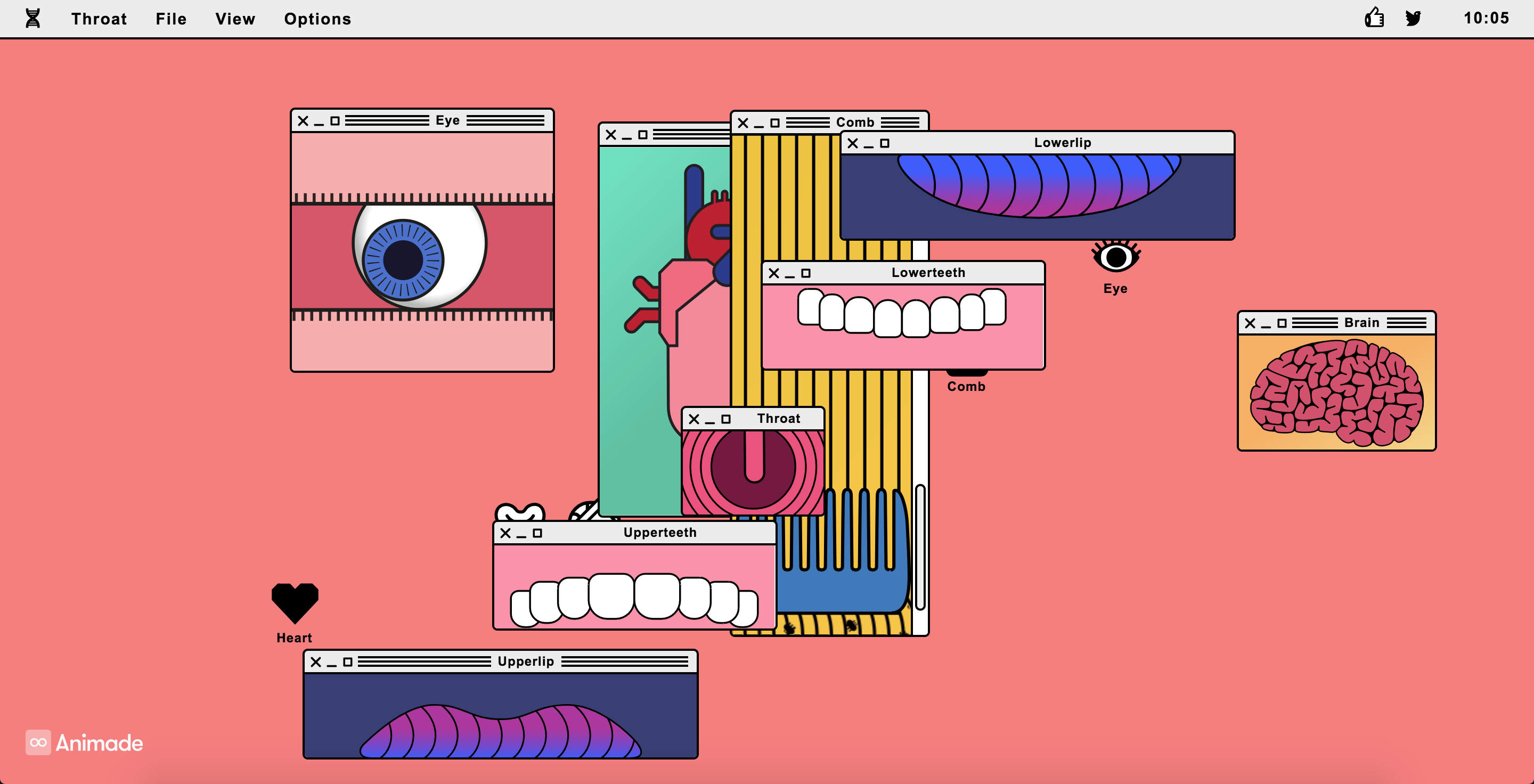
Above: screenshots of compositions I made on the interactive site.
As a designer with an art background, I’ve been toying with the balance of form and function in my work. Often I aim for my work to have a purpose and achieve a particular goal. But other times, I simply want to satisfy myself and make something fun and pretty. It’s delightful to come across a piece that simply seems pretty, but I could also imagine it having functional applications. Such types of work could be used for promotional events, branding a product, film, or company release. It could also be a “hook” for a more serious campaign.
I could see a piece like this using concepts of primitive/complex shapes as we’ve learned in class, as well as objects and animation with arrays that we’re beginning to learn.
Thanks to this peer’s post, I was able to also look into the studio behind this piece, Animade, who works on various interactive/motion pieces. As I’ve been getting more into animation and illustration this semester, I am happy to add this studio’s work to my repertoire of knowledge!
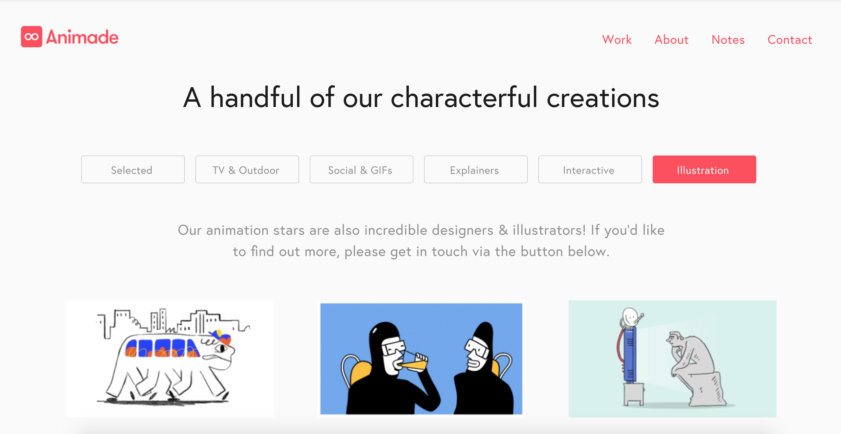
Above: screenshot of Animade’s work on their site
Jdbrown – Looking Outwards 9 – Browns & Lozano-Hemmer
For the first interesting piece someone else has posted, I chose this work, posted by “HDW” and created by Daniel Browns. His work is really interesting – in particular this cover artwork that he did for William Gibson’s republished books. One of my favorite styles of geometric art is the “sprawling city” genre, used in Inception and Dr. Strange. So when I saw Browns’s work, I got very excited.
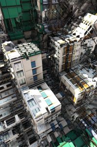
Another piece that I found interesting was Rafael Lozano-Hemmer’s work on this algorithm that randomly deletes 1–10 friends from your Facebook profile, once installed. What’s interesting to me about this piece is its simplicity – the concept being, “would you notice the absence of this person if they were deleted without your knowledge?” It’s an interesting interrogation into modern friendships – what does it mean if you never notice one of your friends missing? This piece starts to ask that question.
Josh
LookingOutwards-08-sjahania
Jake Barton is a pioneer in blending technology, digital media, and architecture into emotional and engaging digital media experiences for museums, companies, and public places. He received a Bachelor in Science of Speech from Northwestern, and then continued his education at NYU where he was awarded a MPS in Interactive Telecommunications. He is the founder of Local Projects, a firm based out of New York City specializing in creating innovative story-telling experiences that captivate audiences. In his own words on Local Projects’ website, he and his firm “create bold new ideas and bring them to life.” I admire the fact that he utilizes an interdisciplinary team of artists, coders, and architects to create his work because it recognizes that fact that collaboration is key to success in art and in life. Out of all his amazing projects, I enjoy his work for the National September 11 Memorial & Museum the most. In this project, he brings victims’ stories to life which inspires personal connections between them and the visitors. This strategy of appealing to qualities of humanity is something that I can utilize in the future to engage my audience with my work.
abradbur – Looking Outwards – 08
Zach Lieberman at Eyeo 2011
Zach Lieberman actually holds a degree in the fine arts, and says that it was mostly by accident that he fell into working with technology. He’s become somewhat of a giant in the art and coding industry, as he was one of the co-creators of openFrameworks and open source C++. As an interactive new media artist, he describes his three muses as drawing, movement, and magic.
I chose to watch Zach’s first Eyeo presentation firstly because I remembered watching clips of his earlier presentation in lecture, and I recalled really enjoying his presentation style. However after watching this first presentation I’ve come to truly admire him for the creativity combined with the innovation of his works. A throughline comparing his projects would demonstrate that a common theme in his work is the relationship with and the effect it has on people. He stresses the humanity behind his work, and creates these sort of exhibits where people can come together. This is also evident in his Open Source materials and his Poetic School for computation.
I enjoyed Zach’s presentation because you felt how sincerely he cared about his work. He wasn’t professional and cold on stage, performing with gimmicks and flashy graphics like some might. He let his work and the reactions people had to it speak for itself. He conversed with the audience in his speech, rather than talking down at them, and he let his humor show through. That’s why his talk was able to pull me in for an entire 50 minutes, rather than bore me to death in the first 15.
Night Lights 2009
ikrsek-Looking Outwards-09
For this Looking Outwards, I decided to look into one of the projects that Ashley Chan wrote about. She decided to talk about some of the colorful illustrated works of John De Cesare – specifically about how he renders visual interpretations of musical scores through first studying music theory and creating a “complex algorithmic language” to interpret said musical scores. I’d say that I agree with much of her commentary on his work in the way it looks and acts as a visual representation of music – and the quote she gave from an analysis done on his work by Cooper Hewitt was extremely insightful regarding the way that he works. Particularly regarding her commentary on how Cesare’s work is unique from that of other artists who decide to visually represent score.
I’d venture to say however, that she left out some very fascinating information regarding the artist himself, for example the fact that he didn’t start doing this work until he was in his 60’s or so – he was born in Italy in 1890 and immigrated to the United States when he was a child. It should also be noted that De Cesare was not a musician, nor had he any musical training at the time he decided on doing this and that’s when he really dove himself into the deep history musical theory and the basics of such. As a notorious problem-solver, he couldn’t help but pick away at the complex idea of translating something entirely auditory into a visual art form, whilst still managing to maintain an aesthetically pleasing design and doing the score itself justice.
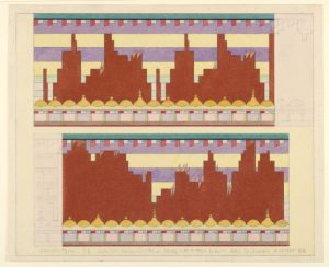
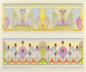
Link to the Looking Outwards:
https://courses.ideate.cmu.edu/15-104/f2017/author/ashleyc1andrew-cmu-edu/
![[OLD FALL 2017] 15-104 • Introduction to Computing for Creative Practice](../../../../wp-content/uploads/2020/08/stop-banner.png)