cduong-Looking Outward-07

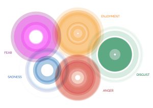
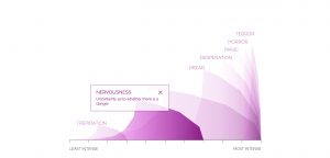
“Emoto” is an installation that represents the global response around the London 2012 Olympic Games based on millions of twitter messages. Using this data they created a physical sculpture. The sculpture represents message volumes, per hour, and horizontal bands that move up and down according to the amount of tweets they get each time. What I admire about this project is the creativity of it and the physical forms that it creates. It just looks really aesthetically pleasing and so complex at the same time. What captured my attention the most was that I thought they were buildings at first, which they could be seen as from far away since they are just abstract lines based on data collection. People can also look at it and get a vague idea of what kinds of responses were obtained for specific events during the Olympics like a certain person winning a gold medal or breaking a world record.

I’m not sure how the code for this project works but I think that the program is always updating and always being connected to a specific type of tweet that the program looks for to update the physical data sculpture.

This project was specifically made based on people’s reactions to a specific event, which gives a sense of what types of projects this company makes and also gives a gauge of what kinds of interests they like since they picked such a specific event like the 2012 London Olympics.

Project: Emoto – Installation
Creator: Studio Nand
Year: 2012
Link: http://www.nand.io/projects/clients/emoto-installation/


A video of what the project looks like when activated

yunzhous-project-07

sketch

function setup() {
    createCanvas(480, 480);
    angleMode(DEGREES);
}

function draw() {
    background("lightcyan");
    curve1();
    curve2();
}

function curve1(){
    //astroid
    beginShape();
    stroke(178, 240, 241);
    noFill();
    translate(width/2, height/2);
    for (var i = 0; i < mouseX/2; i ++){ //mouseX controls number of curves
        LimMouseX = constrain(mouseX, 0, width);
        var a = map(LimMouseX, 0, width, 10, 80); //relate to mouseX
        var theta = map(i, 0, mouseX, 20, 360);
        var x = 2 * a * cos(theta) + a * cos(2 * theta);
        var y = 2 * a * sin(theta) - a * sin(2 * theta);
        vertex(x, y);
    endShape();
    rotate(mouseX); //rotate according to position of mouseX

    }
}
function curve2(){

    //Epicycloid Involute
    beginShape();
    stroke(178, 230, 241);
    noFill();
    for (var i = 0; i < mouseX; i ++){ //mouseX controls number of curves
        LimMouseX = constrain(mouseX, 0, width);
        var a = map(LimMouseX, 0, width, 0, 80); //relate to mouseX
        var theta = map(i, 0, mouseX/5, 20, 360);
        var b = map(mouseY, 0, height, 0, 50);
        var x2 = (a+b)*cos(theta) - b*cos(((a+b)/b)*theta);
        var y2 = (a+b)*sin(theta) - b*sin(((a+b)/b)*theta);
        vertex(x2, y2);
    endShape();
    }
}

For this project, I started with researching for curves. I found astroid and epicycloid involute to be interesting and not overly complicated. I wrote two for loops to create multiple curves, and the curves rotate to create repetition. The curves are centered at the canvas and as mouseX and mouseY moves, they generate different pattern


aboyle-Project 07-Curves

aboyle curves

//Anna Boyle
//Section D
//aboyle@andrew.cmu.edu
//Project 07 Curves

function setup() {
    createCanvas(480,480);
}

function draw() {
    background(38,48,97)
    //draws all the stars/moons
    //Placement and size deliberately chosen by me
    push();
    translate(width/2, height/2-30);
    drawHypotrochoid()
    pop();
    push();
    translate(50,100);
    scale(0.2,0.2);
    drawHypotrochoid();
    pop();
    push();
    translate(400,50);
    scale(0.15,0.15);
    drawHypotrochoid();
    pop();
    push();
    translate(220,40);
    scale(0.1,0.1);
    drawHypotrochoid();
    pop();
    push();
    translate(100,350);
    scale(0.25,0.25);
    drawHypotrochoid();
    pop();
    push();
    translate(30,240);
    scale(0.1,0.1);
    drawHypotrochoid();
    pop();
    push();
    translate(420,400);
    scale(0.2,0.2);
    drawHypotrochoid();
    pop();
    push();
    translate(360,340);
    scale(0.1,0.1);
    drawHypotrochoid();
    pop();
    push();
    translate(410,180);
    scale(0.17,0.17);
    drawHypotrochoid();
    pop();
    push();
    translate(50,430);
    scale(0.1,0.1);
    drawHypotrochoid();
    pop();
    fill(255)
    //text to show how many sides there are
    textSize(20)
    text("SIDES:",15,30)
    text(sides,85,30)
    textSize(30)
    //"Goodnight, moons" when circles
    //"Goodnight, stars" when star-shaped
    if (mouseY<100){
        celestial="moons"
  } if (mouseY>380){
        celestial="stars"
  } if (mouseY>=100 & mouseY<=380){
        celestial="."
        fill(38,48,97)
  }
    text ("Goodnight, ", 130, 410)
    text(celestial,285,410)

}

//how many sides there are
var sides=4

function drawHypotrochoid(){
    var x;
    var y;
    //makes the shapes bigger or smaller
    var a=constrain(mouseX/4, 40, 130);
    var b=a/sides
    var h=constrain(mouseY/16, 0, b)
    var ph=mouseX/50
    var nPoints=100
    noStroke()
    fill(243,250,142)
    //the equation for the curve
    beginShape();
        for (var i=0; i<nPoints; i++){
        var t=map(i, 0, nPoints,0,TWO_PI);
        x = (a-b) * cos(t) + h * cos(ph + t*(a-b)/b);
        y = (a-b) * sin(t) - h * sin(ph + t*(a-b)/b);
           vertex(x,y)
    }
    endShape(CLOSE);
}

//If mouse is pressed, another side is added
//stays between 4 and 8 sides
function mousePressed(){
    sides=sides+1
      if (sides>8){
          sides=4
  }
}

For the type of curve, I selected hypotrochoid. (http://mathworld.wolfram.com/Hypotrochoid.html). Since it was fairly similar to epitrochoid curves, I referenced the example while I was writing my code. I had some trouble making it look like what I wanted it to; for a while, it was only a circle that got thinner or wider as you moved the mouse. Eventually I figured out that the number you divide variable a by is the number of sides. When I increased that number, it looked a lot more like the example image given on mathworld.wolfram.com. I made it so the curve starts with four sides, but you can add up to eight by clicking the mouse.  You can make the curve bigger or smaller by moving the mouse from left to right or vice versa.

Somewhere along the line I realized that the two extremes were a circle and a star shape, so I made it a sky full of celestial objects and I added the text “Goodnight, moons” and “Goodnight, stars” when the mouse was at the top and the bottom.

I wish I had done more to experiment visually, but overall I enjoyed this project!

aboyle-Looking Outwards-07

“The Creatures of Prometheus” is a generative visualization of the ballet composed in 1801 by Beethoven. It was created as part of a series of self-initiated studies by Simon Russell that explore the connection between audios and visuals. Russell was assisted by Alex Eckford, Greg Felton, and Alan Martyn. It can be found at http://www.creativeapplications.net/sound/the-creatures-of-prometheus-generative-visualisation-of-beethovens-ballet-with-houdini/. The visualization is entertaining to watch and it makes the audience think about their conceptions of music and color. I also think that the little stick figure composer at the bottom is adorable.

According to the website, the “animation is driven mainly through a MIDI file. The Houdini setup reads the notation and emits particles using the pitch to derive their height and amplitude to derive their speed. As the volume of each note increases it also effects the colour emitted.” The setup also takes into account the previous note when determining the height of the current note. The little conductor is keyframed, but his movements are exaggerated depending on the volume.

The creator could have been inspired by the idea of synesthesia, which is a phenomenon where two senses are intertwined so that people can see music or hear colors. The creator also could have been inspired by Disney’s Fantasia 2000, which beautifully gives visuals to many classical musical compositions. Regardless of possible inspirations, it’s very clear that the creator has a love for visuals, music, computation, and the combinations thereof.

hyt-Looking-Outward-07: Data Visualization

When I was searching for the project, I was intrigued by Project Ukko, a seasonal wind and weather visualizing web application developed by Truth and Beauty Operations. It is a elegant-looking interfaces that utilizes dashed lines and colors to reflect a thematic map with wind prediction  data around the world. Particularly, the categories of quantitative data are visualized through attributes such as opacity, line’s thickness, angle, and color hues. And on the side panels, you would also have access to the more detailed analytic data for further reference. The final results were produced through d3.js, coffeescript, pixi.js. I think this link is also helpful in terms of understanding the designer’s process of having the creative solution: http://truth-and-beauty.net/projects/ukko.

jennyzha – looking outwards 07

This project stemmed from a request made by the Dalai Lama himself, in 2014, to design an Atlas of Human Emotion. The purpose of the atlas was to design a map that would ultimately guide emotional travelers, and help people find a state of calm.

A couple of key atlas concepts include the fact that emotions are at the core of what makes us human and are distinct from one another. Furthermore, these emotions have several states, varying in intensity which, within each emotion, each emotional state has actions associated with it caused by a trigger. Finally, each emotion is associated with a particular Mood and a clearer understanding of one’s Emotions can contribute to the feeling of a Calm State.

What I really love about this is how much consideration went into the flawless integration and transition of the data into the visualization. It’s attention to detail, keeping the key Atlas concepts in mind throughout the creation process, making sure different features would represent those different concepts.

Atlas of Emotions

jennyzha – project 07

sketch

// Jenny Zhang
// Section D
// jennyzha@andrew.cmu.edu
// Project 07 

//http://mathworld.wolfram.com/Epitrochoid.html

function setup() {
  createCanvas(480, 480);
}

function draw() {
  background(255, 200, 200);
  translate(width/2, height/2);  // moving the drawing to center 

  drawEpitrochoid();
}

function drawEpitrochoid() {

    var n = 1500;          
    noFill();
    stroke(255);

    var x;
    var y;
    var h = constrain(mouseX, 0, 480); //distance between radius of smaller circle to the curve drawn (contrained and varied between left and right borders)
    var a = 300;    //radius of bigger circle
    var b = a/constrain(mouseY, 0, 480);  //radius of smaller circle (constrained to the left and right borders)


    beginShape();
        for (var i=0; i < n; i++) {

            var t = map(i, 0, n, 0, TWO_PI);

            var x = (a + b) * cos(t) - h * cos (((a+ b)/b)*t); //epitrochoid equation
            var y = (a + b) * sin(t) - h * sin (((a+ b)/b)*t); //epitrochoid equation
           
            vertex(x, y);
        }  
    endShape();
}

I really enjoyed playing around with all of the possible varying numbers in this project and am very pleased with the outcome. Moving your mouse very slowly throughout the canvas you’re able to see so many different beautiful designs made by the epitrochoid curves.

Project-07-Chickoff-Checkered Shape

sketch

//Cora Hickoff
//Section D
//chickoff@andrew.cmu.edu
//Project-07

var nPoints = 100;
var CYCLOID = 0; 

var titles = ["<><><><><><><><><><><><><><><><><><><><>"];
var curveMode = CYCLOID;


function setup() {
    createCanvas(400, 400);
    frameRate(10);
}

function draw() {
    background(224, 200, 197, 90);

      for (var y = 0; y < height; y += 5) {
        for (var x = 0; x < width+25; x += 50) {
            fill(255, 240, 250, 20);
            ellipse(x, y, 10, 5);
        }
    }
    
    // draw the frame
    fill(200, 0, 0); 
    noStroke();
    text(titles[curveMode], mouseX / 3, mouseY / 3);
    stroke(0);

    fill(200, 0, 0); 
    noStroke();
    text(titles[curveMode], mouseX / 3, mouseX / 2);
    stroke(0);

    noFill(); 
    strokeWeight(0);
    rect(0, 0, width-1, height-1); 

    // draw the curve
    push();
    translate(width / 2, height / 2);
    switch (curveMode) {
    case CYCLOID:
        drawCycloidCurve();
        break;
    }
    pop();
}

//--------------------------------------------------
function drawCycloidCurve() {
    // Cycloid:
    // http://mathworld.wolfram.com/Cycloid.html

    var a = 9.0;
    var b = a / 3.0;
    var h = constrain(mouseY / 20.0, 80, b);
    var ph = mouseX / 50.0;
    
    fill(205, 20, 20, 90);
    strokeWeight(1);
    beginShape();
    for (var i = 0; i < nPoints; i++) {
        var t = map(i, 0, nPoints, 0, TWO_PI);
        
        x = b - 4 + (t - sin(t)) - h * sin(ph + t * (a * b) / b);
        y = b + (1 - cos(t)) - h * cos(h + t * (a + b) / b);

        //places curve in middle of canvas
        vertex(x - 12, y - 20);
    }
    endShape(CLOSE);

    var a = 9.0;
    var b = a / 6.0;
    var h = constrain(mouseY / 20.0, 80, b);
    var ph = mouseX / 50.0;
    
    fill(205, 160, 160, 200);
    noStroke();
    beginShape();
    for (var i = 0; i < nPoints; i++) {
        var t = map(i, 0, nPoints, 0, TWO_PI);
        
        x = b - 4 + (t - sin(t)) - h * sin(ph + t * 2 * (a * b) / b);
        y = b + (1 - cos(t)) - h * cos(h + t * (a + b) / b);

        //places curve in middle of canvas
        vertex(x - 12, y - 20);
    }
    endShape(CLOSE);
    
}

In this project, I wanted to make the final product very soothing to look at, as well as aesthetically pleasing. My process with this was to play around with color and shape until I got this result which uses the same shape twice but changes some attributes such as color, opacity, strokeWeight (or lack thereof).

creyes1-Project-07-Curves

creyes1 Project-07

//Christopher Reyes
//Section D
//creyes1@andrew.cmu.edu
//Project-07 (Composition with Curves)

var nPoints = 10000;

function setup() {
    createCanvas(480, 480);
    background(57, 64, 83);
}

function draw() {
    background(57, 64, 83);
    noStroke();

    //Darker circle
    fill(78, 74, 89);
    ellipse(width/2, height/2, 250, 250);

    //Lighter inner circle
    fill(110, 99, 98);
    ellipse(width/2, height/2, 200, 200);

    //Orbitals
    orbiter(0, 360, 200, 10);
    orbiter(0, 360, -200, 10);
    orbiter(360, 0, 175, 20);
    orbiter(360, 0, -175, 20);

    //Biggest, green rose
    push();
    translate(width/2, height/2);
    roseCurve(50, 200, 0, 10,
              [124, 174, 122],
              map(mouseY, 0, height, 1, 2.5));
    pop();

    //Medium rose
    push();
    translate(width/2, height/2);
    angleMode(DEGREES);
    rotate(180+45);
    angleMode(RADIANS);
    roseCurve(50, 180, 0, 10,
              [131, 144, 115],
              map(mouseY, 0, height, .5, 2));
    pop();

    //Smallest, white rose
    push();
    translate(width/2, height/2);
    angleMode(DEGREES);
    rotate(180-45);
    angleMode(RADIANS);
    roseCurve(0, 140, 0, 10,
              [255, 255, 255, 150],
              map(mouseY, 0, height, .1, .8));
    pop();

}

//Draws a rose curve where a and b values are determined by mouse position
function roseCurve(amin, amax, bmin, bmax, col, thickness) {
    var x;
    var y;
    var r;

    //Determines size of petals
    var a = map(mouseY, 0, height, amin, amax);
    //Determines number of petals
    var b = map(constrain(mouseX, 0, width), 0, width, bmin, bmax);

    noFill();
    stroke(col);
    strokeWeight(thickness);
    beginShape();
    for (var i = 0; i < nPoints; i++) {
        var t = map(i, 0, nPoints, 0, TWO_PI);

        r = a*sin(b*t);

        x = r * cos(t);
        y = r * sin(t);
        vertex(x, y);
    }
    endShape();
}

//Draws an ellipse that rotates around center according to mouse position
function orbiter(angleMin, angleMax, y, size) {
    push();
    translate(width/2, height/2);
    angleMode(DEGREES);
    rotate(map(mouseX, 0, width, angleMin, angleMax));
    noStroke();
    fill(110, 99, 98);
    ellipse(0, y, size);
    angleMode(RADIANS);
    pop();
}

I had forgotten how much I liked math and playing around with graphs, so I really enjoyed the time I spent with this project. Before I started my code, I explored and experimented a lot with Desmos, an online graphing calculator, and manipulated different variables of each equation to see what kind of movement I could get.

I ultimately went with the rose curve, a polar graph that’s visually interesting in not only its form, but in the way that the curve is drawn and generated. The main variables in the curve determine both the rose’s size and the amount of petals on it, so I decided to map both those variables to the mouse’s position and see what came out of it.

I’m definitely pleased with the final result, although I had initially wanted to make the orbitals travel in a sine wave around the circle, but it began to take a toll on the program’s ability to run smoothly, and ultimately settled on having it rotate without depending on a formula.

daphnel-Project07-Curves

Heart

var nPoints=300;

function setup() {
    createCanvas(480, 480);

}
function draw() {
    background(255, 230, 238, mouseX);
    var angle = mouseX/300;
    //draws the curve
    for(i=1; i<4; i++){
        push();
        translate(width/2,height/2);
        rotate(angle*mouseY/100);
        drawHeartCurve();
        //http://mathworld.wolfram.com/HeartCurve.html
        pop();
    }
}

function drawHeartCurve(){
    var x;
    var y;
    var a = constrain(mouseX/100,0,width);

    fill(255, 230, 238);
    stroke(255, 179, 204);
    strokeWeight(2);

    beginShape();
    for(var i = 0; i<nPoints; i++){
        var t= map(i,0,nPoints,0,TWO_PI);
        x =a * (16 * sin(t)* sin(t)* sin(t));
        y =a * ((13 * cos(t))-(6*cos(2*t))-(2*cos(3*t))-cos(4*t));
        vertex(x,y);
        vertex(x*i*a,y*i*a);
    }
    endShape(CLOSE);
}

I first spent a while trying to find curves that I was interested in. I thought about making a Quadrifolium but after looking around more, I found the Heart Curve. I tried fiddling around with it a little and then got the heart to show up. I then tried to add some other things to it which resulted in the lines next to the heart.