jwchou-LookingOutwards-08

Rachel Binx

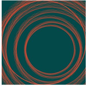
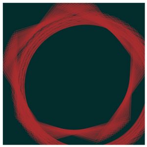
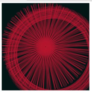
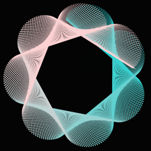
Rachel Binx is an avid traveler and designer. She has a data visualization background, and finds it natural to convert her experiences to data points to visualize. She has a double degree in math and art history from Santa Clara University (go NorCal!) She works at Netflix currently.

She created a company that creates jewelry, called Meshu, based on geographic locations on a map that people have visited. She found that the backstories/meaning behind the jewelry was intensely meaningful and personal.


Meshu, customized jewelry.

Her work also touches upon manufacturing goods with customized, personal touches using forward looking technologies like 3d printing, and laser-cutting.

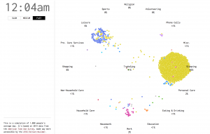
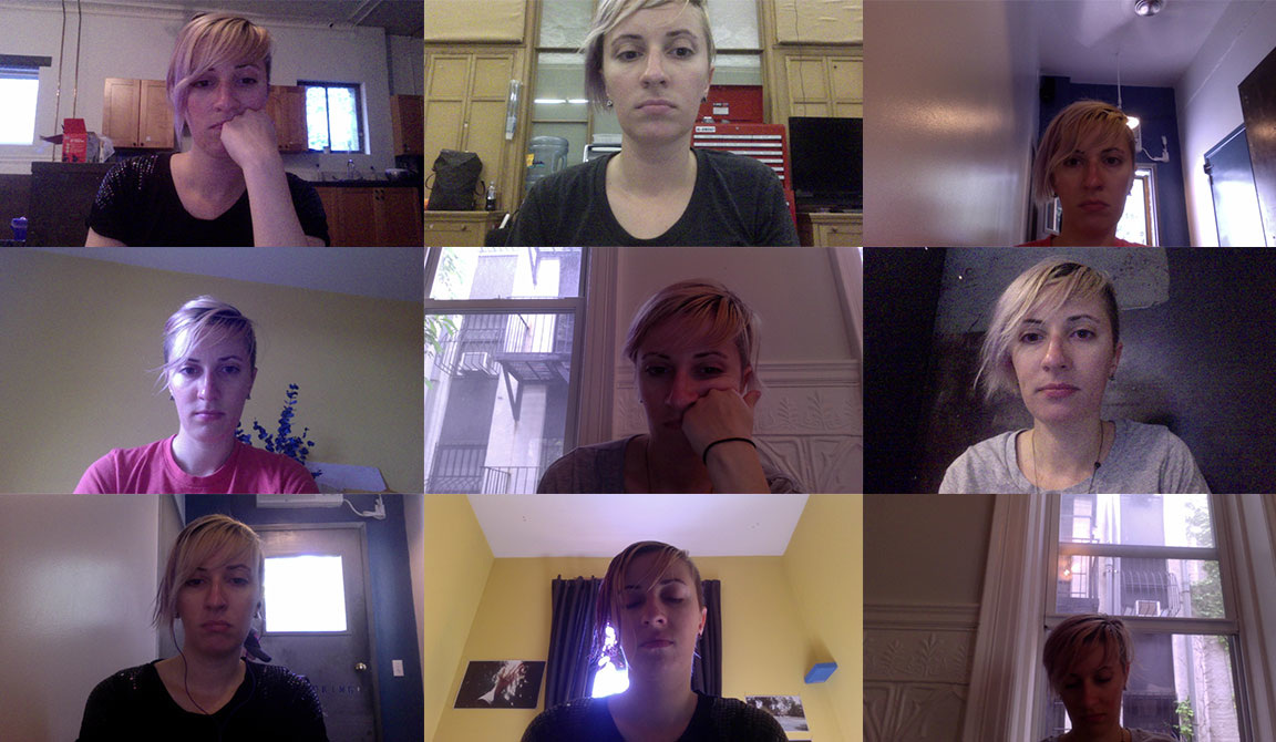
Another project of Binx’s is WifiDiary, where she programmed her computer to take a photo of her every single time she connected to a different wifi hotspot.

I really admire how she uses tools and technology to really enhance her projects, such as laser-cutting/3D printing. I’m actually really glad I stumbled upon her work because I love geography, and have always been personally interested in mapping out my own personal experiences. Often, data visualization seems like a lot of heavy statistics, but personalizing it and using it to reflect on your own emotional experiences is a powerful way to use it.

I actually don’t think she’s that effective of a presenter. Her tempo varies a lot, and she seems a bit too nervous about her own work. She should own it more. But she is fine at getting her points across.

Website


rmanagad-lookingoutwards-08-sectionE

Speaker: Molly Wright Steenson

Link to Speaker Bio: http://www.girlwonder.com/ http://eyeofestival.com/speaker/molly-wright-steenson/


Molly Wright Steenson is a designer and architect currently holding the position of the chair of the MDes program at the School of Design at Carnegie Mellon University. Her work in architectural history and designing human systems directly contributes to the ongoing development of Transition Design, a design practice founded in 2013 at Carnegie Mellon that investigates design’s role in making transitions towards preferable, sustainable futures. Specifically, her work focuses on the effects of existing, emerging, and nascent technologies on city systems (and, subsequently, the city in its next larger context — in a region, a region in a country, a country on the globe) as well as one the people that inhabit these cities.

As a designer currently focused on contributing to Transition Design, Molly’s work is influential to my approaches — I see evaluating things in its next larger context as essential in understanding how the designed products, spaces, and messages affect peoples from different breadths of cultures. As a presenter, I see her tactic of making apt references to relatable material as as useful — if the audience can empathize with the content, it makes the content easier to understand.

rmanagad-project07-curves

sketch

//Robert Managad
//Section E
//rmanagad@andrew.cmu.edu
//Project-07

var nPoints = 850

function setup() {
    createCanvas(400, 400);
  	frameRate(25);
}

function draw() {

	//color set-up
	var r = map(mouseX, 0, width, 160, 200);
	var g = map(mouseY, 0, height, 20, 60);
	var b = map(mouseY, 0, height, 20, 60);
	noFill();
	//modification of background and strokecolours
	background(2, g, b);
	stroke(r, g, 47);
	strokeWeight(0.5);
	translate(width/2, height/2);
	Hypotrochoid();
}

function Hypotrochoid (){
	// equations for recollection
	// x= (a-b)cost + hcos(((a-b)/b) * theta)
	// y= (a-b)sint + hsin(((a-b)/b) * theta)
	var x;
    var y;
    var h = 200;
    //variables to modify displacement from center.
    var a = map(mouseX, 0, width, 0, 10);
    var b = map(mouseY, 0, height, 0, 15);
    var c = map(mouseX, 0, width, 0, 5); 
    var d = map(mouseX, 0, width, 0, 50);
    beginShape();
      for(var i = 0; i < 500; i ++) {
        var theta = map(i, 0, width/2, 0, 360);
        x = (a - b) * cos(theta) + h * cos(((a - b)/b) * theta);
        y = (a - b) * sin(theta) - h * sin(((a - b)/b) * theta);
        vertex(x , y);
      }
    endShape();
    beginShape();
      for(var i = 0; i < nPoints; i ++) {
        var theta = map(i, 0, width, 0, 360);
        x = (c - d) * cos(theta) + h * cos(((c - d)/d) * theta);
        y = (c - d) * sin(theta) - h * sin(((c - d)/d) * theta);
        vertex(x + noise(2) * width/3, y + noise(2) * width/3);
      }
    endShape();
}


My primary goal for this project was familiarizing myself with curve equations, and their applications to existing shape structures. My first attempt with a conchoid was unsuccessful — I was not able to produce a visible result — so I moved on to hypotrochoids and applied similar plans to it. Below are curve sketches I examined to contribute to my final program:


adev_LookingOutwards_07_data_visualisation

A Day in the Life of Americans

A Day in the Life of Americans
by NATHAN YAU, Flowing Data

I really love this data visualisation because its really dynamic, aesthetic and informative. It also has this interesting bird’s eye view of people and how they live their lives. It has this sense of removal and perspective. It really is about people just being people in their daily activities and movement. It’s also really interesting to see rush hours where activity rapidly changes like 9:00 am or 5:00 or 6:00 pm; there literally is a visual rush of little dots across the page.

Its so fascinating because the designer has managed to make everyday activities and mundane movements extremely engaging. It also has this strange voyeuristic quality to it, where you literally watch people do very normal things. I feel like I could watch this for hours and never be bored. It is satisfying and yet makes me want to know more about these individual trends and movements.

gyueunp – Looking Outwards 07

This is a sample demo that was created using Newk, a browser-based application for Networks Visualization. It is currently being developed by Santiago Ortiz with the aim of presenting a visualization of the network of Twitter conversations of the company’s employees.

To the right of the network visualization are sections that provide information for the viewers, such as “network and nodes metrics.” There is also an interaction guide that succinctly outlines the instructions on how to obtain information through the visualization. The intersecting lines are joined by nodes, which are photos of employees. They change colors as the cursor hovers over the nodes, displaying the interaction among the employees in a single glance.

This example is fascinating in that it presents us with information that could be personal to the employers. The fact that this seemingly complex network is only a week of conversations makes me rethink about the significance of our online conversations that we often take for granted, due to its simple accessibility.

hqq – LookingOutwards-07

Above: Zoomed and static network visualization of Twitter connections by Santiago Ortiz.

Santiago Ortiz, founder of Moebio Labs, is a visual scientist and designer, whose work uses expressive network theory to demonstrate physical and metaphorical connections between people and their surroundings. Ortiz believes that data visualization is most effective not in the form of static charts and graphs, but as fluid, moving pieces of art. Ortiz’s analysis of connections on Twitter between different followers in different locations exemplifies this belief perfectly. The analysis considers a variety of metrics to highlight important information on who is tweeting, who they connect with, how often they connect, and even why they connect the way they do. The visualization uses a series of nodes and lines to create webs between different users who connect with each other. Subtle nuances such as line thickness and node size highlight other important statistics such as the amount of communication and popularity. Moreover, the analysis is fluid. From the webpage, you can zoom in, click, and slide metrics to reveal more information.

juyeonk-Project-07-Curves-Section E

sketch

//Claire Koh
//Section E
//juyeonk@andrew.cmu.edu
//Project-07


function setup() {
    createCanvas(480, 480); //sets the size of the canvas 
}


function draw() {
    background(0);
    translate(width/2, height/2); //so that the shapes would begin from the center of the canvas
    drawStar();
    drawRose();
}


//this function will generate the outer shape. There is no specific name for this curve. I invented this 🙂 Also it's called drawStar because it'll draw a star if you move your mouse towards the furthermost right side of the canvas. 
function drawStar() {
    var flicker = random(240, 255); //will be used to make the star flicker 
    var transparency = random(100,200); //also will be used to make the star flicker by controlling its transparency
    var gradient = map(mouseX, 0, width, 0, 255)
    var a = constrain(mouseX, 50,480);
    var n = constrain(mouseX, 50,480);
    
    if (a != 480) {
        push();
        rotate(mouseY/300);
        fill(0);
        strokeWeight(0.7);
        stroke(200,255-gradient,255-gradient);
        beginShape();
            for (var t=0; t <= 2 * PI; t+= PI/100) {
                var x = 0.5 * a * cos(n * t); 
                var y = 0.5 * a * sin(n * t); 
                vertex(x, y);
            }  
        endShape();
    }
    
    
    //when the a value of the equation reaches 480, the curve's stroke color and fill color will change
    else {
        push();
        rotate(mouseY/300);
        fill(flicker, 200, 200, transparency);
        strokeWeight(2);
        stroke(255);
        beginShape();
            for (var t=0; t <= 2 * PI; t+= PI/100) {
                var x = 0.5 * a * cos(n * t); 
                var y = 0.5 * a * sin(n * t); 
                vertex(x, y);
            }  
        endShape();
        pop();
    }
}


//this function will draw the fixed rose in the middle of the canvas
function drawRose() {
    //http://mathworld.wolfram.com/Rose.html
    var a = map(mouseX, 0, width, 0, 40);
    var n = map(constrain(mouseX, 0, width), 0, width, 0 , 6);
    var r;
    
    noFill();
    strokeWeight(1);
    stroke(255);
    
    push();
    rotate(mouseY/300)
    beginShape(); // will draw the rose shape in the middle 
        for (var t=0; t <= 2 * PI; t+= PI/100) {
            r = a*sin(n*t);
            x = r * cos(t);
            y = r * sin(t)
            vertex(x,y);
        }
    endShape();
    pop();
    
}


For this project I wanted to create a set of symmetrical curves that are somewhat related to each other for the sake of aesthetics and clarity.

The shapes starts with a square and a point in the very middle. But as you move your mouse sideways you’ll notice the outer curve changes to a drastic degree while all the inner curve is doing is just drawing more rose petals at a time. The outer shape doesn’t have a specific name; it was a result of an incorrect rose petal function but I am satisfied at how it turned out because of the variety of shapes it could create.
I added a bit of fun by making the star flicker at the end when the outer shape is complete.

(Final form)


hqq – secE – project 07 – curves

hamza

//hamza qureshi
//hqq@andrew.cmu.edu
//section e
//project 07 - curves

function setup(){
    createCanvas(480,480);
    angleMode(DEGREES);
}

function draw(){
    background(130,120,150);
    stroke(40,40,60);
    strokeWeight(0.25);
    noFill();
    translate(width/2,height/2); //moves shapes to center of canvas
    drawEpitrochoid(); //calls function to draw epitrochoid
    stroke(200,200,240);
    drawHypotrochoid(); //calls function to draw hypotrochoid
}

function drawEpitrochoid(){
    var p = width/2; //variable to call bounds of rotational shift
    var a = map(mouseX,0,width,0,40); //remaps x-value of mouse location to adjust center diameter
    var b = map(mouseY,0,height/2,0,80); //remaps y-value of mouse location to adjust radius of petals
    var h = 75; //number of lines
    beginShape();
    for (var i = 0; i < p; i++){
        var t = map(i,0,mouseX/30,0,360); //remaps i-value to correspond angularly
        var x = (a + b) * cos(t)-h*cos(t*(a+b)/b); //equations for epitrochoid
        var y = (a + b) * sin(t)-h*sin(t*(a+b)/b);
        vertex(x,y);
        endShape();
    }
}

function drawHypotrochoid(){
    var p = width/2;//variable to call bounds of rotational shift
    var a = map(mouseX,0,width,0,10); //remaps x-value of mouse location to adjust center diameter
    var b = map(mouseY,0,height/2,0,20);//remaps y-value of mouse location to adjust radius of petals
    var h = 50;//number of lines
    beginShape();
    for (var i = 0; i < p; i++){
        var t = map(i,0,mouseX/15,0,360); //remaps i-value to correspond angularly
        var x = (a + b) * cos(t) + h*cos(t*(a+b)/b);//equations for hypotrochoid
        var y = (a + b) * sin(t) - h*sin(t*(a+b)/b);
        vertex(x,y);
        endShape();
    }
}

In my exploration of a dynamic image using curve functions, I chose to draw an epitrochoid and a hypotrochoid. I appreciated the fact that both shapes are essentially inverses of each other. I wanted to also work the algorithms so that one would sit within the other, but the smaller one would increase in size less exponentially than the larger one. This creates an interesting sequence of shapes that produces a variety of silhouettes of the outer curve shape while maintaining a consistently shaped interior shape.

jwchou-Project07-Curves

sketch 66

// Jackie Chou
// Section E
// jwchou@andrew.cmu.edu
// Project-07-Curves

function setup() {
    createCanvas(480, 480);
    frameRate(60);
    angleMode(DEGREES); //change angle mode
}

//goal: draw a flower with a center that pops up as the flower takes form
//then flower abstracts and center dissapears

function draw() {
    background(200, 210, 253);
    var R = map(mouseX, 0, width, 200, 255); //change stroke color of flower as mouseX changes
    var G = map(mouseX, 0, width, 140, 250);
    var B = map(mouseX, 0, width, 60, 130);

    drawRanunculoiud(); //draw curve function

    //flower center
    translate(-width/2, - height/2); //move flower center to center
    fill(170, 80, 130); 
    
    if (mouseX < 200 & mouseX > 50) {   //draw flower center when flower starts to be visible
    var ellipseSize = map(mouseX, 0, 200, 80, 0)
    noStroke();
    ellipse(width/2, height/2, ellipseSize, ellipseSize);
}

function drawRanunculoiud(){
    beginShape();
    noFill();
    stroke(R, G, B); 
    translate(width/2, height/2); //move curve to center


    for (var i = 0; i < width/5; i++){ //mouseX controls number of curves
        constrain(mouseX/3, 100, 300); //constrain mouseX

        var x;
        var y;

        var a = map(mouseX, 0, width, 30, 10);
        var t = map(i, 0, mouseX, 10, 360);

        //Ranunculoid http://mathworld.wolfram.com/Ranunculoid.html
 		x = a * (6 * cos(t) - cos(6 * t));
        y = a * (6 * sin(t) - sin(6 * t));
        vertex(x, y);

    endShape();
    }
}
}

For this project, I had a bit of a hard time implementing the equation. However, looking and actually studying the diagrams on the site helped me understand what each variable affected the curve.

I eventually created a Ranunculoid, which looks like a flower with 5 pedals. When the mouse moves to the right, the flower grows but then eventually abstracts. When the form looks like a flower, a center disk forms. However, when the form abstracts, the center disk dissappears.

The first three frames showcase the growth of the flower.


The next three frames showcase the abstraction.

jooheek – Project07 – Curves

sketch

//JooHee Kim
//Section E
//jooheek@andrew.cmu.edu
//Project-07


//This project is based on the epicycloid formula
//http://mathworld.wolfram.com/Epicycloid.html
function setup() {
    createCanvas(480, 480);
    angleMode(DEGREES);
}

function draw() {
	background(0,30);
	
	//moves lines to the middle of canvas
	translate(width/2, height/2);
	
	//draws 5 curve shapes in different sizes
	for (var curveSize = 0; curveSize < 10; curveSize += 2) {
		//draws lines on every angle of the curve in degrees mode
		for (var i=0; i<360; i++) {

			//variable that remaps mouseX from 0 to 12
			//represents "a" in original formula
			var M = map(mouseX, 0, width, 0, 12);

			//represents "b" in original formula
			var b = 5;

			//variables of line coordinates drawn according to the epicycloid curve formula
			//substitutes with M so that the size and number of petals change according to mouseX
			var lineX1 = curveSize*((M+b)*cos(i-100) - b*cos(((M+b)/b)*i-100));
			var lineY1 = curveSize*((M+b)*sin(i-100) - b*sin(((M+b)/b)*i-100));
			var lineX2 = curveSize*((M+b)*cos(i) - b*cos(((M+b)/b)*i));
			var lineY2 = curveSize*((M+b)*sin(i) - b*sin(((M+b)/b)*i));

			//draw line with variables
			stroke(i, 210, 210, curveSize);
			line(lineX1, lineY1, lineX2, lineY2);
		}
	}

}

After looking at the types of curves that were given to us, I decided to choose the epicycloid. It uses a parametric equation:


I first tried to figure out how the graph works in coding, and after trying out many options I liked using lines with graph formula. Although I thought this project was simpler than other projects, I found it fun using curve formulas to represent curves in different ways. I first started out with one curve shape but found that putting it in a for loop that varies in sizes makes it more interesting. I also had fun playing with the opacity in both the background and lines.

Before I put it in a for loop and put opacity in it

*There are more curves when looked on the browser than when looked in this WordPress blog.