![[OLD FALL 2017] 15-104 • Introduction to Computing for Creative Practice](../../../../wp-content/uploads/2020/08/stop-banner.png)
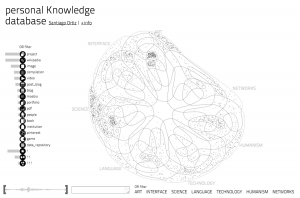
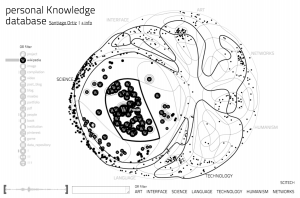
Ideo’s Font Map
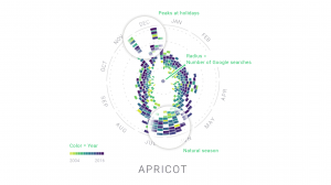
As a designer, choosing font can sometimes be daily a chore. Each font has certain characteristics, historical associations, and aesthetic associated with it. Currently, searching for fonts in most software is an extremely tedious task scrolling through a long list of alphabetically sorted font names that sometimes bears no association with what it actually looks.
Ideo’s Font Map solved a problem that communication designer have been faced for centuries since the invention of lithography and the printing press: choosing the font. The algorithm of this font map is highly complex. By using artificial intelligence, the machine is trained to notice fonts’ visual characteristic by being fed 750 web fonts. Afterwards, the each font’s visual characteristic is mapped onto a 2D plane whereby similar fonts cluster close to one another and different fonts are further apart. This particular project by Kevin Ho uses a lot of vectors and AI external modules that are beyond my technical expertise to accomplish the task. Although the algorithm that is being used in this project is beyond my level of understanding, I hope to one day understand it.

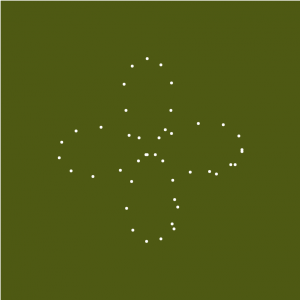
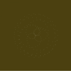
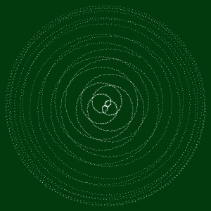
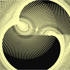


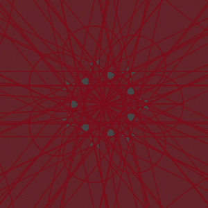
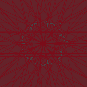
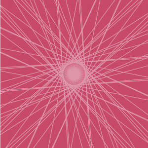
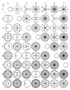 However, the addition of the interactive quality using mouseX and mouseY led to forms that are more fascinating and intricate than the stagnant rose. I’m glad that the project requirement pushed me to enable a broader range of possible compositions.
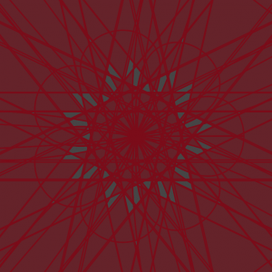
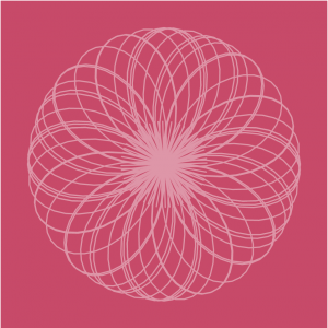
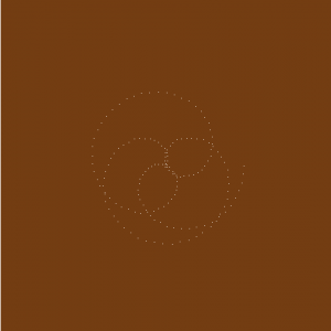
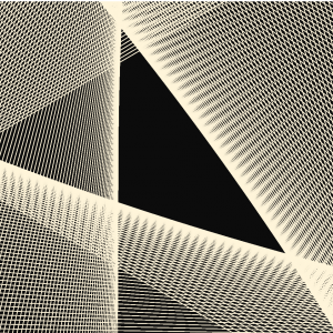