//SunMin Kim
//Section E
//sunmink@andrew.cmu.edu
//project-07

// http://mathworld.wolfram.com/Epicycloid.html

function setup() {
  createCanvas(480, 480);
  frameRate(10);
}

function draw() {
  background(139, 181, 115);
  //drawing is moving in the center
  translate(width/2, height/2);

  //draw the curve
  drawEpitrochoid();

}

function drawEpitrochoid() {
    var nPoints = 500;
    strokeWeight(1);
    fill(86, 149, 204);
    stroke(228, 213, 110);

    var x;
    var y;

    var h = constrain(mouseY, 0, 480);
    //radius of bigger ellipse
    var a = mouseX / 2;
    //radius of smaller ellipse
    var b = mouseX / 400;


    beginShape();
    for(var i = 0; i < nPoints; i ++){
        var t = map(i, 0, nPoints, 0, TWO_PI);
        //epitrochoid equation (x position)
        var x = (a + b) * cos(t) - h * cos (((a+ b)/b)*t);
        //epitrochoid equation (y position)
        var y = (a + b) * sin(t) - h * sin (((a+ b)/b)*t);

        vertex(x, y);
    }

    endShape();
}
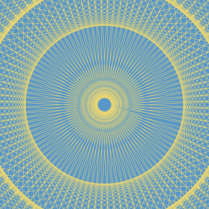
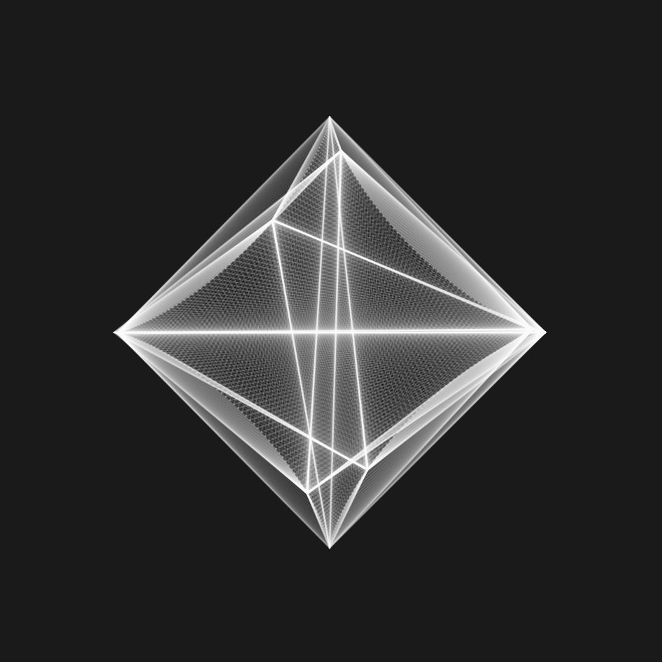
For this project, after reading the sample codes, I was excited to create art using various curves. Thus I took benefit of the formula provided in Wolfram Mathworld website and created this project. Throughout this project, I struggled the most when thinking about appropriate values for each variable. I feel good with the outcome that I successfully used each variable to display what I wanted to show.
//Sheenu You
//Section E
//sheenuy@andrew.cmu.edu
//Project 07
var nPoints = 100;
function setup() {
    createCanvas(480, 480);
    background(0);

}
function draw(){
	background(218,205,188)
	drawLoopFlower();

}

function drawLoopFlower() {
	//SHIFTS SHAPE INTO CENTER OF CANVAS
	translate(240,240);
	//MULTIPLIES SHAPE
	//MATH VARIABLES
	for (var o=0; o<80; o++){
	var x;
	var y;
	var a=o*.5+mouseX/5
	var b=mouseX/30;

	stroke(56+o*1,82-o*1,139-o*1);

	noFill();

	//STARTS SHAPE
	beginShape();

	//MATHEMATICAL EQUATION FOR EPIcyCLOID
	//x=(a+b)cos(theta)-bcos((a+b)/b*theta)
	//y=(a+b)sin(theta)-bsin((a+b)/b*theta)
	//ellipse(240,240,a,a)

	for (var i =0; i<nPoints; i++){
		var t = map(i,0,nPoints,0, TWO_PI);
		x=(a+b)*cos(t)-b*cos(((a+b)/b)*t+80)
		y=(a+b)*sin(t)-b*sin(((a+b)/b)*t+80)
		//x=o*a*((b-1)*cos(t)+cos((b-1)*t))/b
		//y=o*a*((b-1)*sin(t)-sin((b-1)*t))/b
		vertex(x,y);
	}
	//END SHAPE
	endShape(CLOSE);
}

}
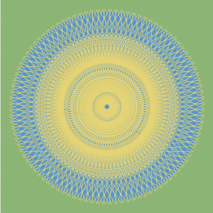
Many curve compositions posted on site inspired me to make this curve. I used a for loop to multiply the number of curves so it can create a much more visually appealing and interesting picture. I also found a color palette I liked and used it in this image. I transformed the common Hypotrochoid curve in the example into a beautiful and much more interesting shape.
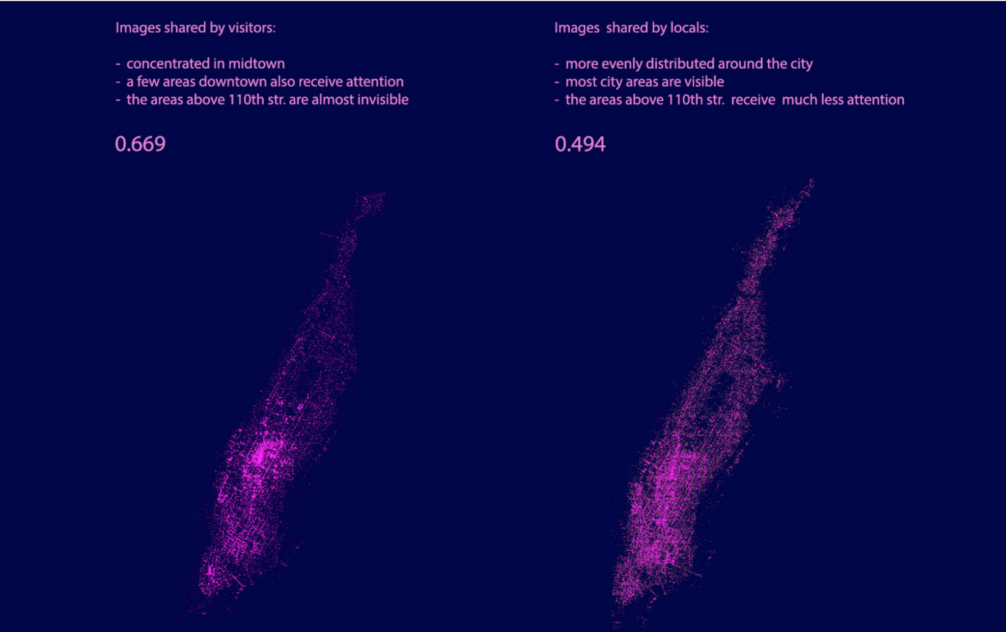
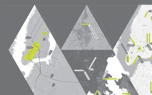
Inequaligram, a project worked on by Lev Manovich and Agustin Indaco, is a project that focused on analyzing public Instagram images in Manhattan over a period of five months. The point of the project was to measure and correlate the economic equality with how much people share between different parts of the city.
I really look up to this project since it tackles a new modern day social issue relating to inequality that many people are affected by in one way or another. The result was interesting in that after analyzing over 7 million photos, they found that the inequality of these images were actually higher than inequalities between different standards of living of the locals; and that the inequality of visitors’ images is even larger than extreme income inequality. Poor areas show much less while rich areas have become “social media rich”.
data-visualization between photos taken by locals/visitors
In order to generate the dataset for this research, Lev Manovich and Agustin Indaco used Instagram images with location information to collect their data while using the standard measure of inequality (Gini index) to measure the social inequality. In order to visualize all this data, they plotted locations of 200,000 random images from their dataset.
//
// Supawat Vitoorapakorn
// Svitoora@andrew.cmu.edu
// Section E
//
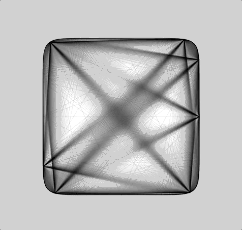
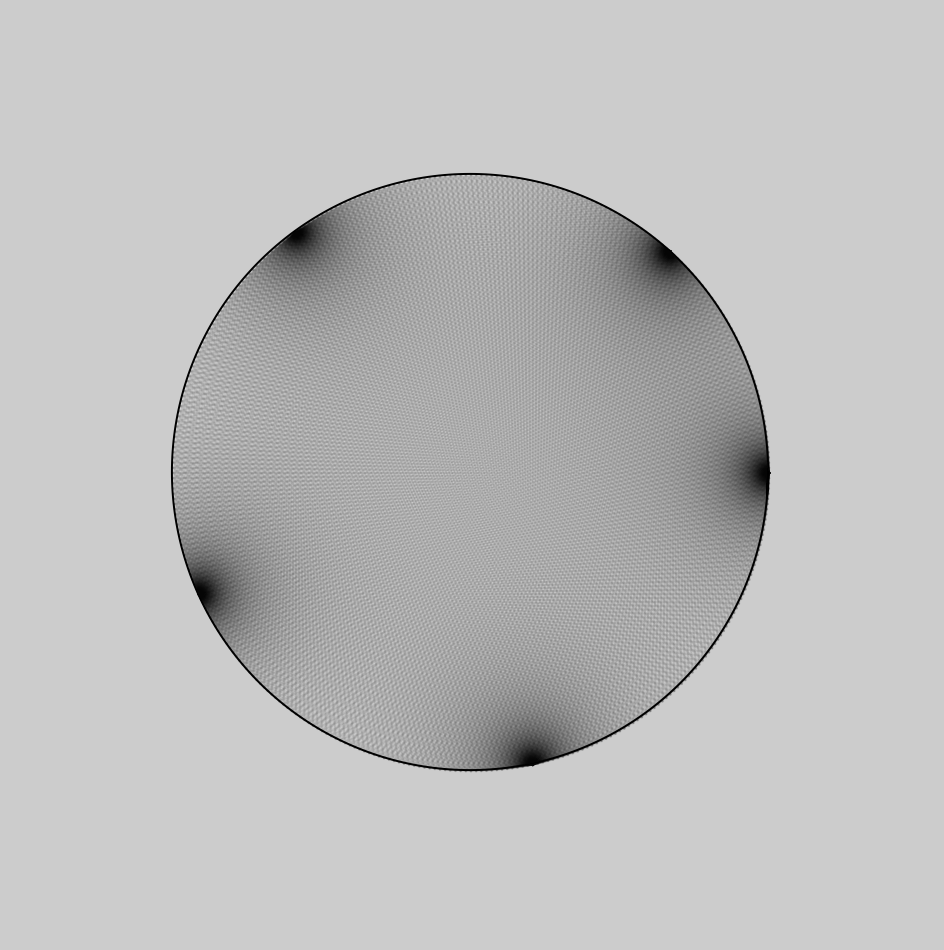
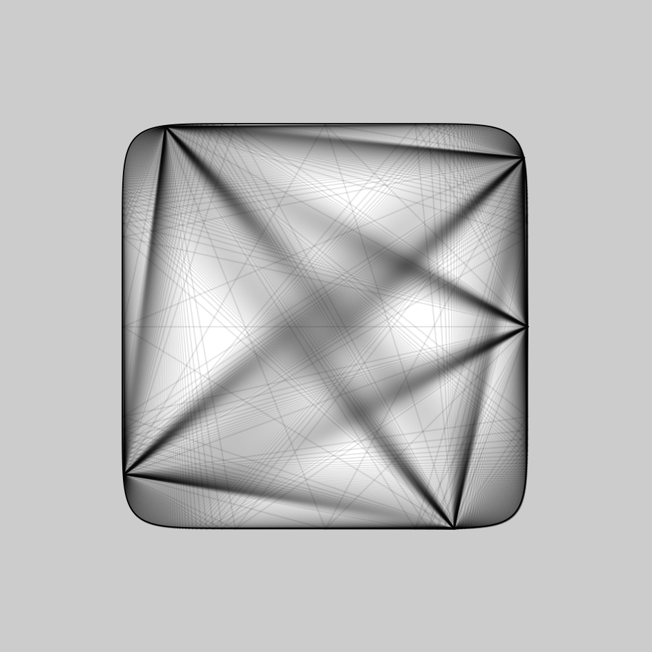
// Squircle
// Equation from:
// https://en.wikipedia.org/wiki/Superellipse
w = 480;
h = 480;
//Signum function
function sgn(x) {
if (x > 0) {
return 1
}
if (x == 0) {
return 0
}
if (x < 1) {
return -1
}
}
//------------------------
var SQUIRCLE = []; // Array for nodes
var theta;
var a = w * .33 // Squircle width
var b = h * .33 // Squircle height
var n = 3.5 // roundness
// Create nodes for squircle
function create_squircle(x, y) {
this.x = x;
this.y = y;
}
// Calculate Squircle's X position from theta
function squircle_x() {
angleMode(DEGREES);
return abs(cos(theta)) ** (2 / n) * a * sgn(cos(theta))
}
// Calculate Squircle's Y position rom theta
function squircle_y() {
angleMode(DEGREES);
return abs(sin(theta)) ** (2 / n) * b * sgn(sin(theta))
}
// Create Squircle based on an interval of theta
// and push its node into an array
function make_squircle() {
angleMode(DEGREES);
//Plot every interval degree of squircle
interval = 1;
for (theta = 0; theta < 360; theta += interval) {
x = squircle_x(theta);
y = squircle_y(theta);
SQUIRCLE.push(new create_squircle(x, y))
}
}
var gon = 60;
var min_gon = 45;
var max_gon = 160;
var SWITCH = 1;
// Create a bounce loop animation from drawing lines
function gon_loop() {
print(SQUIRCLE.length)
if (gon == max_gon) {
SWITCH = -1;
print("inversing");
};
if (gon == min_gon) {
SWITCH = 1;
}
gon += SWITCH;
}
// Draws Squircle from array
function draw_squircle() {
//Draw Shape
if (inverse == 1) {
fill(255);
} else {
fill(0);
}
beginShape();
strokeWeight(1);
for (i in SQUIRCLE) {
x = SQUIRCLE[i].x
y = SQUIRCLE[i].y
curveVertex(x, y);
}
//Force Close Shape
curveVertex(SQUIRCLE[5].x, SQUIRCLE[5].y);
endShape(CLOSE);
connect_lines();
}
// Connect a point in squircle to every point
function connect_lines() {
//Add lines
if (inverse == 1) {
stroke(0, 0, 0, 255 * .1);
} else {
stroke(255, 255, 255, 255 * .1)
}
for (i in SQUIRCLE) {
x_0 = SQUIRCLE[i].x
y_0 = SQUIRCLE[i].y
for (i in SQUIRCLE) {
if (i % (gon) == 0) {
// %gon used to skip certains nodes
// to not overload the computer
x_1 = SQUIRCLE[i].x
y_1 = SQUIRCLE[i].y
line(x_0, y_0, x_1, y_1);
}
}
}
}
//------------------------
function setup() {
createCanvas(w, h);
background(255 * .75);
make_squircle();
print(SQUIRCLE.length / 2, SQUIRCLE.length / 6)
}
//------------------------
// Use mouseX to control the roundeness of squircle
function control_roundness() {
mousePos = (abs(mouseX - (w / 2)) / (w / 2));
mousePos = constrain(mousePos, 0, 1);
roundness = map(mousePos, 0, 1, .2, 10);
n = roundness;
SQUIRCLE.length = 0;
make_squircle();
}
//Use mouseY to control size of squircle
function control_size() {
mousePos = (abs(mouseY - (h / 2)) / (h / 2));
mousePos = constrain(mousePos, 0, 1);
size = map(mousePos, 0, 1.2, .175, .35);
a = w * size;
b = h * size;
SQUIRCLE.length = 0;
make_squircle();
}
function mouseClicked() {
inverse = inverse * -1;
}
//------------------------
var inverse = 1; // incerts color
function draw() {
if (inverse == 1) {
background(255 * .8);
} else {
background(255 * .1)
}
control_roundness();
control_size();
gon_loop(); //bounce animation for connecting line
//Draw Closed Shape
push()
translate((w / 2), (h / 2)) // center drawing
draw_squircle();
pop()
}
Squircle
For my equation, I picked the superellipse equation which is capable of creating a squircle. I stumbled upon this equation on MathWorld:
Since this equation is not particularly helpful, I went on Wikipedia and found the parametric equation for the superellipse:
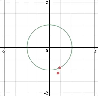
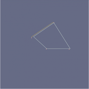
At first, I was a bit confused about what the signum sgn() function is, but after some googling, I understood it and was able to replicate the function easily in javascript. Initially, I thought about doing a spirograph whereby a pen would rotate around the moving point and generate a drawing with variable orbital roundness:
Initial Idea sketched on Desmos.
Variable Density
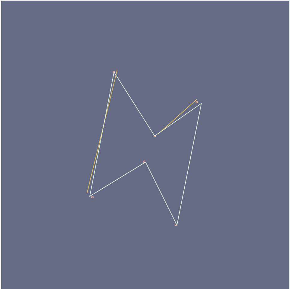
After re-building my equation in javascript, I found that the curve was denser in some area than others. This I believe is caused by the way that I parametrically constructed this curve via iterating from 0 to 360˚ and pushing the nodes into an array:
Notice how the nodes are denser near the corners.
Had this been constructed through Calculus, these variable densities wouldn’t occur. But since these variable densities existed, I decided to take advantage of it use it as nodes to do a string art. These are the results:
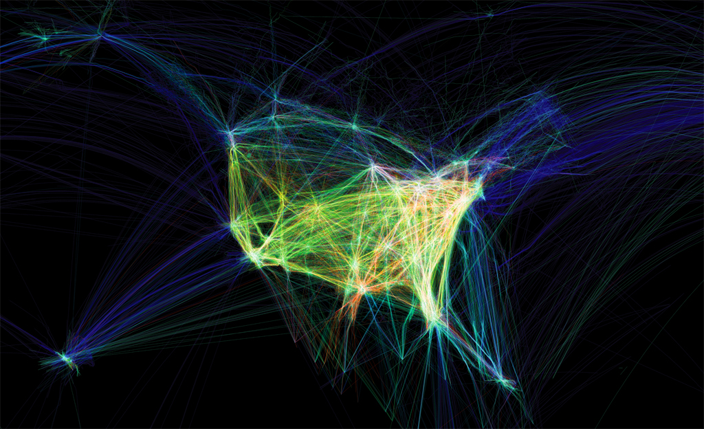
Video: showing the paths of airplanes over North America in different colors.
Title: Flight Patterns
Artist: Aaron Koblin
Year of Creation:
Link to the Project: http://www.aaronkoblin.com/project/flight-patterns/
Link to the Bio of the Artist: http://www.aaronkoblin.com/project/about/
This project was intended to visualize the air traffic above North America over the course of a day. Originally, this work was made as a part of the experiments for the larger project called “Celestial Mechanics” by Aaron Koblin and their colleagues named Scott Hessels and Gabriel Dunne at UCLA. They attained the flight information from the Federal Aviation Administration, analyzed the data and plotted them using the Processing programming environment. Colors and special effects were added later using Adobe After Effects and Maya.
//Yoon Young Kim
//Section E
//yoonyouk@andrew.cmu.edu
//Project07

var a = 50; //size of the rose curve
var nPoints = 100; //number of points on the curve

function setup(){
    createCanvas(480, 480);
    frameRate(10);
    noLoop();
}

function drawRoseCurve() {
    background(207, 212, 255); // blue background color

    stroke(145, 85, 112); //dark purple outline color
    strokeWeight(5);
    fill(204, 120, 157); //dusky pink fill color

    var t; //theta of the equation

    push();
    beginShape();

    translate(width/2, height/2);
    for(i = 0; i<mouseX; i++){ //number of points drawn based on the movement of mouseX
        var t = map(i, 0, mouseX + 40, 0, TWO_PI); //polar equation for the Rose Curve


        var r;
        var n = 4; // number of petals - when n is even, the function turns to 2n, therefore will create 8 petals

        r = a*cos(n*t); // drawing the Rose curve

        x = r *cos(t); //converting from polar to Cartesian
        y = r *sin(t); //converting from polar to Cartesian
        vertex(x, y);

    }
    endShape();
    pop();

}

function mouseMoved() {
    a = a + 1; //increasing the size of the flower when the mouse moves
    if(a>200){
        a=50;
    }
    drawRoseCurve();
}
I thought it was originally difficult to plug in the curve equations since we had to consider radians and Cartesian vs. polar equations. I wanted to do a rose curve because I was interested in how the lines would loop around in a flower like shape. In order to integrate the mouse movement with my curve I used the map function in order to determine the number of points of my curve. Therefore, as you move the mouse back and forth the loops will draw or undraw depending on the movement. Unfortunately, I was still unable to figure out how to make the entire curve close properly.
//Elizabeth Wang
//Section E
//elizabew@andrew.cmu.edu
//Project 07: Composition with Curves
var nPoints;
var angle;
function setup() {
createCanvas(480, 480);
angleMode(DEGREES);
frameRate(15);
}
function draw() {
background(102,106,134);
angle = map(mouseX, 0, mouseY, 0, 360);
translate(width/2, height/2); //keeps shape centered
push();
rotate(angle);
drawAstroidCurve(); //calls to function drawShape
pop();
}
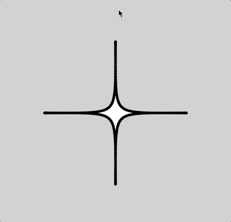
function drawAstroidCurve(){
var a = map(mouseX, 20, mouseY, 20, 30);
nPoints = map(mouseX, 0, mouseY, 0, 20);
beginShape(); //prevents object from adding on top of itself
for (i = 0; i < nPoints; i++){
var xr;
var yr;
var qx;
var qy;
var t = map(i, 0, nPoints, 0, 360);
//http://mathworld.wolfram.com/Astroid.html
var x = a*pow(cos(t), 3); //astroid curve's parametric equations
var y = a*pow(sin(t), 3);
//http://mathworld.wolfram.com/AstroidRadialCurve.html
xr = x + 12*a*cos(t)*pow(sin(t), 2); //quadrifolium of astroid curve
yr = y + 12*a*pow(cos(t), 2)*sin(t);
noFill();
strokeWeight(1);
vertex(xr + (-10, 5), yr + random(-10, 5)); //keeps the shape "shaking"
stroke(255,180,162);
ellipse(xr + (-10, 5), yr + random(-10, 5), 3,3); //shaking ellipses
stroke(223,243,227);
if ((i % 2 == 0) & (i > 1)) { //dotted line
stroke(232,197,71);
line(qx, qy, xr, yr);
}
qx = xr;
qy = yr;
}
endShape(CLOSE);
}
Still images:
Reflection
For my curve, I ended up choosing the quadrifolium of the astroid radial curve. When I started, I had a lot of trouble with radians and ended up accidentally translating my entire shape to move around a circle. Finally when I figured out what I did wrong and changed radians to angle, I wanted to make my shape not only “shake”, but to make it more dynamic; so I added a “backdrop” of dotted lines to give my shape more depth while also adding shaking dots. Overall I’m really happy with how it turned out and it reminds me of installations that demonstrate the vibrations of sound and/or music.
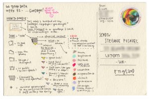
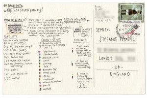
Dear Data by, Georgia Lupi and Stefani Posavec http://www.dear-data.com/all/Dear Data by, Georgia Lupi and Stefani Posavec http://www.dear-data.com/all/
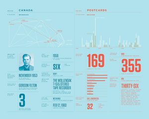
Stefanie Posavec is a designer who works with data projects that are related to language, literature, or science. She uses data as a source visualize hand-crafted works. One of her most admirable work is “Dear Data”, which is a collection of postcards that includes data that shows something about two people’s personalities. This project began when Lupi and Posavec were curious if they could know each other by few colored pens marked on the postcards. By spending hours on each postcard they could make a detailed postcard that enables them to share their personalities. Lupi mainly encoded data in a way that presents different noises she heard in 32 weeks, and Posavec’s card was filled with brightly colored rectangles.
I was excited to see some of the postcards they made because I have not seen many data visualizations that use color encoding to represent certain emotions or condition. The algorithm generated in their work is human thoughts to programme and display data through visualization. After seeing many works based on mathematically generated algorithms, it was refreshing to understand the data through a different perspective.
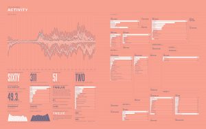
I chose the work of Nicolas Felton because I had found out about him back when I was in high school, and I thought everything he did at the time was just through adobe programs, not through computation or coding! His work is really fascinating as he essentially records every moment of his life for an entire year (every year), and then complies them into informational graphics for an annual report on each January 1st. He uses processing to create graphs and charts, and then exports them into Adobe InDesign to create his reports. He’s even created an app which sends users reminders to record data, and essentially collects, and categorizes the user’s everyday data.
![[OLD FALL 2017] 15-104 • Introduction to Computing for Creative Practice](../../../../wp-content/uploads/2020/08/stop-banner.png)