![[OLD FALL 2017] 15-104 • Introduction to Computing for Creative Practice](../../../../wp-content/uploads/2020/08/stop-banner.png)
/*
katie chen
katieche@andrew.cmu.edu
project 07
section E
*/
function setup() {
createCanvas(480, 480);
}
function draw() {
background(255, 210, 190);
var mx = constrain(mouseX, 60, 450);
push();
beginShape();
// points
var n1 = 400;
// big circle radius
var a1 = 100;
// small circle radius
var b1 = map(mx, 0, width, 0, 10);
// distance from center of the interior circle to P (what draws the line)
var h1 = map(mx, 0, width, 0, 300);
noFill();
stroke(255, 222, 221);
strokeWeight (0.2);
translate(width/2, height/2); //center the object
for(var i = 0; i < n1; i++) {
var t = map(i, 0, n1, 0, TWO_PI);
var x1 = (a1-b1)*cos(t) + h1*cos(t*(a1-b1)/b1)
var y1 = (a1-b1)*sin(t) + h1*sin(t*(a1-b1)/b1)
vertex(x1, y1);
endShape();
}
pop();
push();
beginShape();
// points
var n = 400;
// big circle radius
var a = map(mouseY, 0, height, 0, 200);
// small circle radius
var b = 10;
// distance from center of the interior circle to P (what draws the line)
var h = map(mouseX, 0, width, 0, 200);
noFill();
stroke(255, 231, 226);
strokeWeight (0.2);
translate(width/2, height/2); //center the object
for(var i = 0; i < n; i++) {
var t = map(i, 0, n, 0, TWO_PI);
var x = (a-b)*cos(t) + h*cos(t*(a-b)/b)
var y = (a-b)*sin(t) + h*sin(t*(a-b)/b)
vertex(x, y);
endShape();
}
pop();
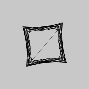
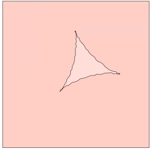
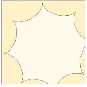
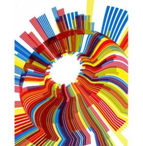
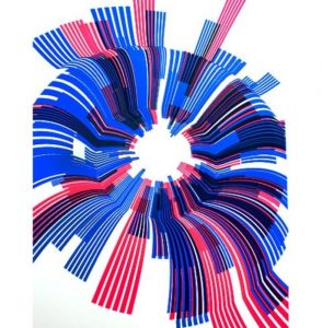
}I wanted to create 2 shapes, one that has less points and shows more of the shape being drawn, and one that’s super complicated. The pinker shape is more complicated so I constrained it before it jumbles into a solid donut shape.
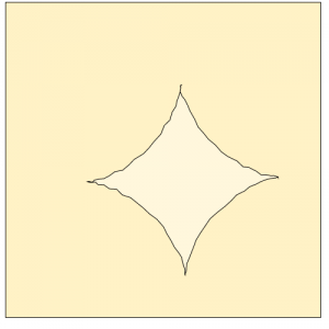
The white line shape is what I like more since if you place your mouse near the center-left hand side of the canvas and move your mouse from the top to the bottom of the canvas, you can kind of see the spirograph being drawn. Moving your mouse from left to right makes the swirls bigger.