//Jiyoung Ahn
//Section A
//jiyounga@andrew.cmu.edu
//Assignment -07- project

var nLines = 300;// the amount of lines

function setup() {
  createCanvas(550, 550);
  function decreaseLevel(){
  level = level-10;

 }

}

function draw() {
  background('lightpink');
  myShape();
}

function myShape() {

  var h = constrain(mouseY/5, 0, 200); //constrain shape
  var w = constrain(mouseX/5, 0, 200);//constrain shape

  var colR = map(mouseY, 0, height, 20, 30);//changes color on y
  var colG = map(mouseY, 0, height, 0, 160);
  var colB = map(mouseY, 0, height, 300, 76);

  fill(colR, colB, colG);

  push();
  translate(height/2, width/2);
  beginShape();
  for (var i = 0; i < nLines; i++) {
    var t = map(i, 0, nLines, 0,  TWO_PI);

    var x = 200 * pow(cos(t * w),3);
    var y = 200 * pow(sin(t * h),3);


    curveVertex(x , y); // adding curve edges
  }
  endShape();
}
function mousePressed(){
  nLines = random(5, 360); // the number of lines and points shows randomly when mouse is Pressed

}
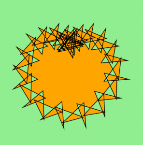
I used Astroid Radial Curve to create this form. I wanted to create a form with complexed lines, and get a doodle-like form. Random shapes are created when mouse is clicked. Overall shapes look like that they have random shapes however it also keeps the pattern at the same time.
//Yugyeong Lee
//Section A (9:00AM)
//yugyeonl@andrew.cmu.edu
//Project-07
var nPoints = 1000;
var radiusA = 100;
var radiusB = 20;
var n = 7;
var X;
var colorG;
var colorB;
var angle;
var scaleA;
function setup() {
createCanvas(600, 600);
}
function draw() {
background(224, colorG, colorB);
stroke(255);
strokeWeight(3);
X = constrain(mouseX, 0, width);
//background color changes based on mouseX
colorG = map(X, 0, width, 200, 100);
colorB = map(X, 0, width, 150, 100);
//the shapes rotate based on mouseX
angle = map(X, 0, width, 0, 4 * TWO_PI);
//the shapes change sizes based on mouseX
scaleA = map(X, 0, width, 0, 2);
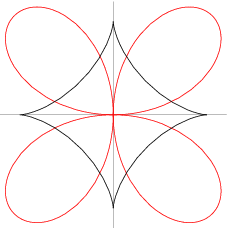
//the epicycloid (the outer shape)
push();
translate(width/2, height/2);
scale(scaleA, scaleA)
rotate(angle);
beginShape(LINES);
for (var i = 0; i < nPoints; i++) {
var theta = map(i, 0, nPoints, 0, 6 * TWO_PI);
var px = (radiusA + 2 * radiusB) / radiusA * ((radiusA + radiusB) * cos(theta) + radiusB * cos((radiusA + radiusB) / radiusB * theta));
var py = (radiusA + 2 * radiusB) / radiusA * ((radiusA + radiusB) * sin(theta) + radiusB * sin((radiusA + radiusB) / radiusB * theta));
vertex(px, py);
}
endShape(CLOSE)
pop();
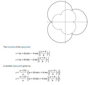
//involute of the epicycloid (the in-between shape)
push();
translate(width/2, height/2);
scale(scaleA, scaleA)
rotate(-angle);
beginShape(LINES);
for (var i = 0; i < nPoints; i++) {
var theta = map(i, 0, nPoints, 0, 6 * TWO_PI);
var px = (radiusA + radiusB) * cos(theta) - radiusB * cos((radiusA + radiusB) / radiusB * theta);
var py = (radiusA + radiusB) * sin(theta) - radiusB * sin((radiusA + radiusB) / radiusB * theta);
vertex(px, py);
}
endShape(CLOSE)
pop();
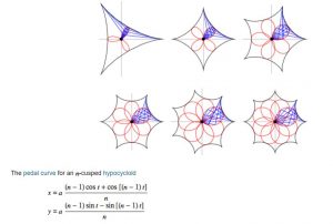
//pedal curve for an n-cusped hypocycloid (the inner shape)
push();
translate(width/2, height/2);
scale(scaleA, scaleA)
rotate(angle);
beginShape(LINES);
for (var i = 0; i < nPoints; i++) {
var theta = map(i, 0, nPoints, 0, 6 * TWO_PI);
var px = radiusA * (((n-1)*cos(theta) + cos((n-1)*theta)) / n)
var py = radiusA * (((n-1)*sin(theta) + sin((n-1)*theta)) / n)
vertex(px, py);
}
endShape(CLOSE)
pop();
}
I was intrigued by the idea to create flower shapes utilizing epicycloid and hypocycloid formula. I mapped the background color, size of the flower shapes, as well as its rotation to the position of mouseX. Because there are three layers of pedals, I alternated the direction of each rotation to create a more interesting shape. Also, by increasing the size of the flowers based on mouseX, the shapes appear as if it’s approaching you.
//Mairead Dambruch
//mdambruc@andrew.cmu.edu
//Section C
//Project-07-A
var nPoints = 100;
function setup() {
   createCanvas(800, 150);
}
function draw() {
   background(255);
   for (var dist = -50; dist < 800; dist = dist + 100){
   push();
   translate(dist, 110);
   drawCycloid();
   pop();
}
}
function drawCycloid () {
  var x;
  var y;
  var a = 20;
  var yfactor = mouseX / 25;//makes waves!
  var colR = map(mouseY, 0, height, 151, 0);//changes color of waves
  var colB = map(mouseY, 0, height, 209, 111);
  var colG = map(mouseY, 0, height, 255, 189);
  noStroke();
  fill(colR, colB, colG);
  beginShape();
  for (var i = 0; i < nPoints; i++){
    var t = map(i, 0, nPoints, 0, TWO_PI);
    x = a * (t - sin(t + yfactor));//equations for cycloids
    y = a * (1 + cos(t));
    vertex(x, y);
}
endShape(CLOSE);
}
I was at first very scared for this project since it was using math equations. After getting the initial shape I had a lot of fun playing with possible interactions the mouse could have with the equation. In this project I wanted to create an animation of waves that crash as you move your mouse across the horizontal axis. The waves change color as you move your mouse across the vertical axis. I really enjoyed learning about the many ways you could alter math equations to create animations and had fun by using trial and error to discover new ways to move the object.
// Simin Li
// Section C
// siminl@andrew.cmu.edu
// Project 7

//Archimedean Spiral
//r = a * pow( theta, 1 / n)
var nPoints = 100; //number of points in each individual spiral
var radius; // radius of the polar function
function setup() {
    createCanvas(640, 640);
    frameRate(8);
}

function draw() {
	background(0);
	var X = constrain(mouseX,0,width);
	var Y = constrain(mouseY,0,height);
	//it wont work if cursor is off canvas
    var gap1 = map(X , 0, width, 0, 6);
    var gap2 = map(X, 0 , width, 4,0);
    var ellipseD = map(Y, 0 , height, 0, 4);
    var R = map(Y, 0 , height, random(0,255), random(0,255));
    var G = map(X, 0 , width, random(0,255), random(0,255));
    var B = map(X + Y, 0 , width + height, random(0,255), random(0,255));
    //RGB values are randomly selected and then influenced by X and Y to make 3 colors
    var angle = map(X,0,width,0,3 * TWO_PI);
    color1 = color(R,G,B);
    color2 = color(G,R,B);
    color3 = color(R,B,G);
    //three colors are used to fill the three spirals in the center


    spiral(width / 2 ,height / 2,gap1 + 2,ellipseD + 2,color3,angle,1);//largest spiral
    spiral(width / 2 ,height / 2,gap1 + 1.2,ellipseD + 1,color2,angle,1);//larger spiral
    spiral(width / 2 ,height / 2,gap1,ellipseD ,color1,angle,1); //small spiral
    //center spiral group

    spiral(width / 4 ,height * 3 / 4,gap2 + 2,2,255,angle,1);
    spiral(width / 4 ,height * 3 / 4,gap2 + 1,2,255,angle,1);
    spiral(width / 4 ,height * 3 / 4,gap2,2,255,angle,1);
    //bottom left spiral group

    spiral(width * 3 / 4 ,height * 3 / 4,gap2 + 2,2,255,angle,1);
    spiral(width * 3 / 4 ,height * 3 / 4,gap2 + 1,2,255,angle,1);
    spiral(width * 3 / 4 ,height * 3 / 4,gap2,2,255,angle,1);
    //bottom right spiral group

    spiral(width * 3 / 4 ,height / 4,gap2 + 2,2,255,angle,1);
    spiral(width * 3 / 4  ,height / 4,gap2 + 1,2,255,angle,1);
    spiral(width * 3 / 4  ,height / 4,gap2,2,255,angle,1);
    //top right spiral group

    spiral(width / 4 ,height / 4,gap2 + 2,2,255,angle,1);
    spiral(width / 4 ,height / 4,gap2 + 1,2,255,angle,1);
    spiral(width / 4 ,height / 4,gap2,2,255,angle,1);
    // top left spiral group
 }
 function spiral(spiralX,spiralY,gap,ellipseD,shade,angle,tightness){
 //draw spiral at spiralX,spiralY
 //the gap between each loop is gap
 //the diameter of the small circles or squares that make up the spiral is ellipseD
 //fill with shade
 //rotate by angle
 //tightness controls how wound up the spiral is
 //when tightness = 1 it is the famous Archimedes' spiral
push()
    translate(spiralX, spiralY);
    //coordinates of center of spiral
    rotate(angle);
    for (var i = 0; i < nPoints; i++) {
        var theta = map(i, 0, nPoints,0,  6 * TWO_PI);
        //map theta so there will be nPoints of squares or circles drawn
        radius = gap * pow( theta, 1 / tightness);
        var px = radius * cos(theta);
        var py = radius * sin(theta);
        //coordinates of squares or circles
        noStroke();

        fill(shade);
        if(i % 2 == 0){
        rectMode(CENTER);
        rect(px - 5, py - 5, ellipseD, ellipseD);}
        else{
        ellipse(px - 5, py - 5, ellipseD, ellipseD);
        }
        //alternate squares and circles
    }
pop();
}
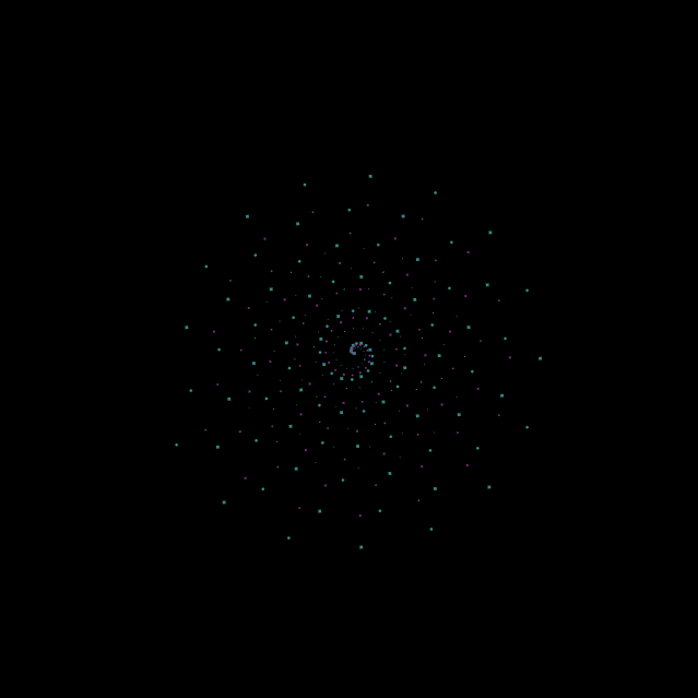
I searched through the functions provided on math world and selected this spiral because it had a simplicity to it, yet it could have so many different forms. I created this starry night image because spirals remind me of stars. A problem that I had to deal with was that if you put too many circles in a single spiral each ring would align and look less interesting.
Stage 1: a single spiral group that cannot rotate when mouse is moved
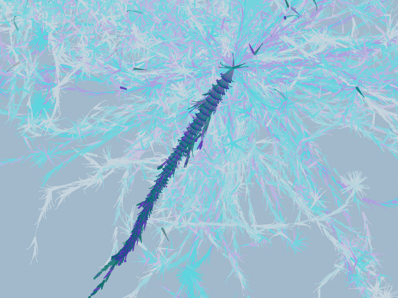
Facebook Flowers is a project by Rachel Binx and Stamen Design that visualizes how posts are shared on Facebook. Her animations show in less than a minute how single posts are distributed and redistributed in the Facebook community in the course of 3 months. Binx uses WebGL to turn data like gender, time since first shared and times posts have been shared into beautiful flower like images. After trying several ways to visualize this data Binx decided that having curves branch out of each individual could best exhibit the connections made through online interaction. The more shares a post gets the more branches it generates. Posts reposted at an earlier stage fade to white gives you the sense of time and the way different genders have different colors adds to the animation’s complexity and Dynamicity.
Experimenting with colors in Facebook Flowers by Stamen Designs
What’s interesting is that this project can tell stories in an abstract manner. In the flower of Marvin the Martian you can see at 10 seconds and 20 seconds there is a sudden burst at the original point. This tells you that there was someone very influential who reposted the image and caused a ripple of effects. In addition, the end of the video, which is 3 months in real time, everything goes white. The epidemic like post is no longer reposted and loses its popularity. It gives me a sense of how all it takes is an influential person to launch something to stardom and an equally short amount of time for this once omnipresent epidemic to lose its popularity.
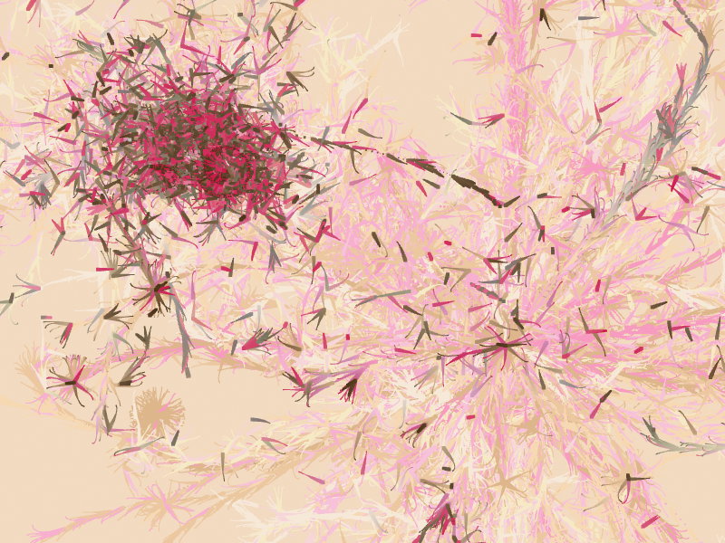
Lisa Jevbratt created several visualizations of data sets, but the one that most caught my eye was “Migration” created in 2005. She essentially mapped out the “migration interface” of websites from 1999-2004, and represented them through these little blobs of color that reminded me of tie-dye.
This image is taken from Jevbratt’s migration website, and it depicts the change in migration for the different websites over the course of 5 years through the little blobs of color. If you follow the link below, you can see how if you click on one of the blobs, it will give you a set of data (IP addresses) that describes the said migration of the websites.
The link to Jevbratt’s 2005 Migration project is here.
The study originated in 1999, but had to be updated in 2005 due to the growth of technology and the need to keep up with it. The image and link above are for the updated version, while information about the original can be found at the link here.
I could not find a lot about the algorithms used in this visualization, but according to the description of the original project (linked above), the websites were randomly generated and their images were recorded so as to map out “all web servers in the database.” Because this study took place over the course of a few years, it also analyzes the changes made to such websites and the database over time.
This visualization is unique both in it’s subject of study as well as in its method of representation. We typically assume that data should be neatly mapped out and displayed, but this contradicts that in it’s messy yet understandable representation.
I chose the bicorn curve, which looks somewhat like an upside down smiley face, which is why I reversed it. I made the mouseX control the width, and the mouseY control the depth of the curve as well as the size of the dots drawing it.
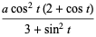
Knowing about the creation of the stars and the universe is interesting to people but it grabs more attention when those are transformed into sounds, images, and vibrations. Ryoichi Kurokawa artistically showed the evolution of the galaxy and the stars by only focusing on sensorial and experiential. It grabs people’s attention because they can experience inception and how this whole universe was created. This project mainly uses sound, movement, and light to realistically portray what could possibly happen in the galaxy. Ryoichi had access to data to the secrets of the creation of the universe. Ryoichi gave the viewers enlightenment and delight by beautifully visualizing the galaxy through a screen.
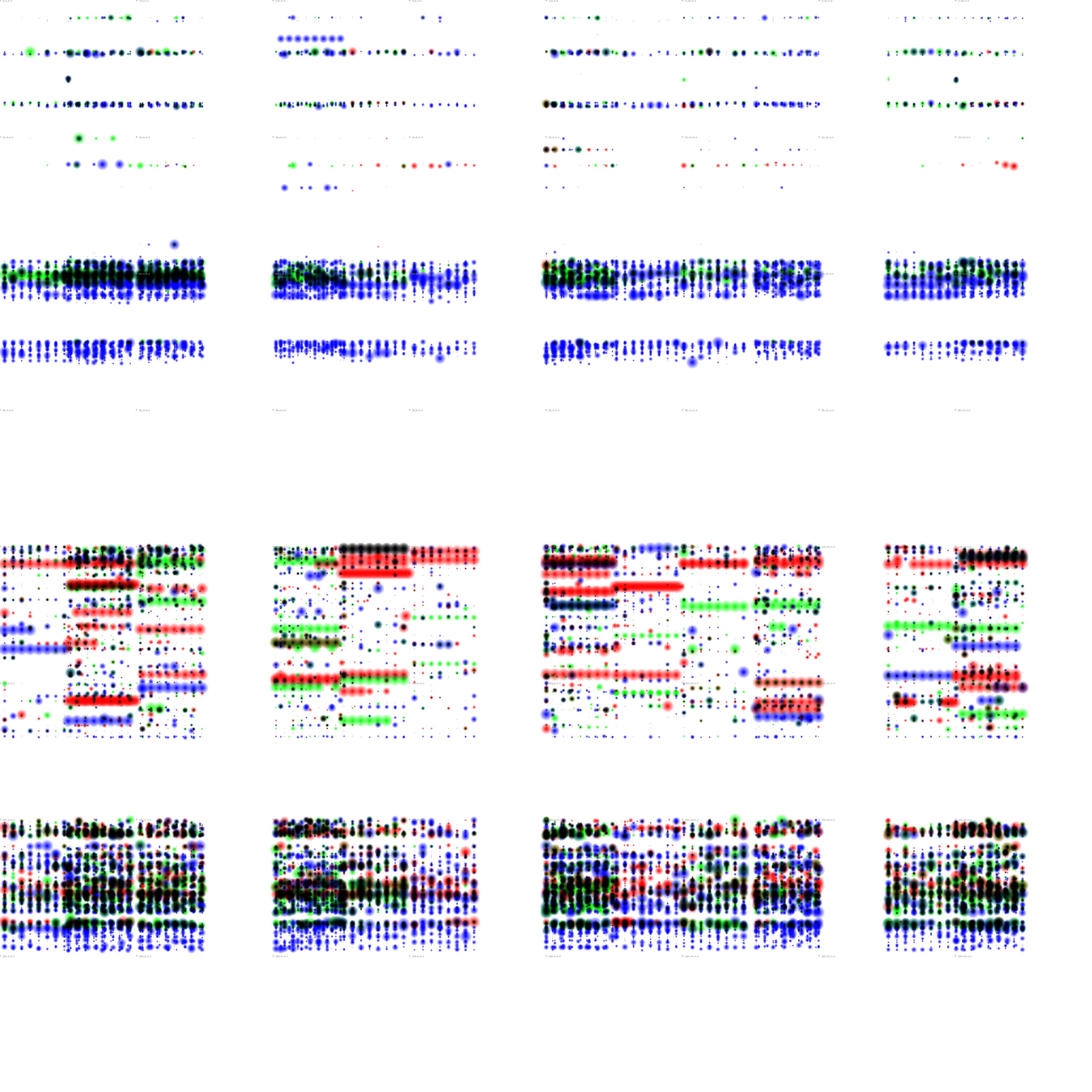
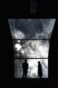
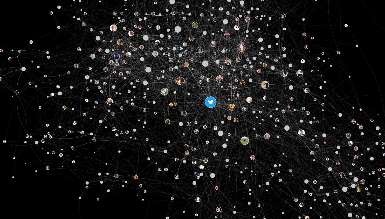
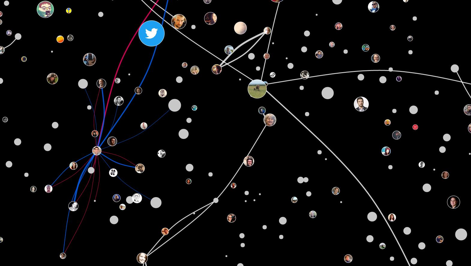
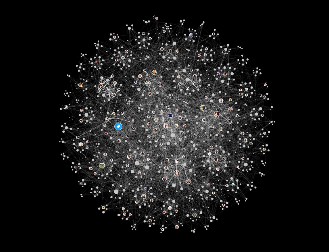
In 2013, Moebio Lab, lead by Santiago Ortiz, created a visualized map of all conversations made in Twitter in a week period of February 15th to 22nd. Moebio Lab is a team of data scientists who concentrate on exploring creative and effective ways of visually representing empirical and textual data. A lot of their work forms a cluster of various data according to parameters such as hierarchy and frequency.
In this project, the threads are representation of the relationship between tweeter users according to tweets, retweets, tags, and comments. In a big picture, they are barely legible in individual sense, but the density of the threads show which and which has stronger relationship to each other. As the clusters are zoomed in, we are able to figure out which users are directly related in what way. The representation allows for the users to read the global and local interaction in the web sense.
This is a useful resource that could be applied in specific to creating statistics of public census, individual profiling, and human networking, which are useful to government organizations, job hunt/head-hunters, and consumer analysis branch of corporations. It leaves a possibility for development, as it could be more powerful if combined with statistical graph representation of the data.
var nPoints = 100;
var x;
var y;


function setup() {
    createCanvas(680, 620);
}


function draw() {
    background(106,187,244); //blue background
    peach(60, 190, 100); //top left peach
    peach(80, width-200, 100); //top right peach
    peach(90, 200, height-270); //bottom left peach
    peach(70, width-190, height-240); //bottom right peach
}

//a general function that will draw a peach with given variables
function peach(a, shiftX, shiftY) {
    push();
    translate(shiftX, shiftY);
    rotate(radians(270));
    var a;
    var b = a / 2;
    var h = constrain(mouseY/8, 0, b);
    var ph = mouseX/50;
    beginShape();
    for (var i = 0; i < nPoints; i++) {
        var t = map(i, 0, nPoints, 0, TWO_PI);
        x = a * cos(t) * (1-cos(t)) - h * cos(ph + t * a);
        y = a * sin(t) * (1-cos(t)) - h * sin(ph + t * a);
        fill(244,148,106);
        vertex(x, y);
    }
    endShape(CLOSE);
    pop();
}
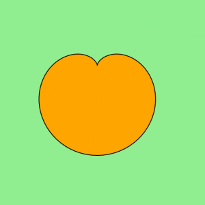
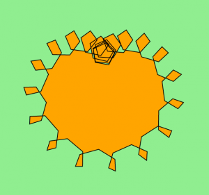
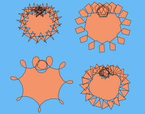
For this project, I made a bunch of “peaches” that start off looking like normal peaches while your mouse is at the top of the canvas. Once your mouse goes down the canvas, the edges of each of the peaches creates a new shape. Moving your mouse left or right changes the rotation of those edge shapes. The original curve that I found on the MathWorld website was called a “Cardioid”. I rotated it 270˚ in order to look more like a peach. Then while playing around with the values set in my curve equation, I found that I could create different-looking edge shapes, like how the top left curve’s edges seem to make star shapes, and the bottom left curve’s edges create more of a loop shape.
I started off with the peach shape:
I then played around with making edge shapes that grow and rotate based on mouse location:
And then changed the colors and created a grid of varying peaches, with varying edge shapes!
![[OLD – FALL 2016] 15-104 • COMPUTING for CREATIVE PRACTICE](../../../../wp-content/uploads/2020/08/stop-banner.png)