![[OLD FALL 2017] 15-104 • Introduction to Computing for Creative Practice](../../../../wp-content/uploads/2020/08/stop-banner.png)
Upon discovering the work of Beeple, as reviewed by danny noh in Looking Outwards, I was amazed at the idea of the projects which this man undertakes every SINGLE DAY, FROM SCRATCH. Honestly the things he draws would take me months, yet somehow the man produces amazing AMAZING graphic work at an incredible pace and without falling into stylistic ruts or creative dead-ends. I only wish danny noh had better stressed how unbelievably intricate and beautiful and amazing this work is, considering the production rate of one EVERY SINGLE DAY wowza. For 3308 consecutive days !
The idea of this project as a continuous daily task is one which I am a big fan of because building up a library of work which is a visual, tangible reminder of one’s progress in a task like graphic design is something which produces a concrete sense of accomplishment and meaning. Personally, I would like to pursue a similar sort of project initiative in order to further my own design skills and build a portfolio of completed work.


Category: Section D
cduong-Looking Outward 09
Ryu’s Looking Outward : https://courses.ideate.cmu.edu/15-104/f2017/2017/09/02/rkondrup-looking-outwards-01/
Link: https://hackaday.com/2017/08/08/a-hypnotizing-interactive-art-piece-for-visualizing-color-theory/
The video shows the colors being put in each cylinder and shows how it changes the drawing on the screen.
This project is to better understand the RGB theory and make it more tangible by using physical paint mixing. They used three water-filled containers (one red, green, and blue) to adjust the colors on the screen in a drawing.
I agree with Ryu’s thoughts about the project when he talks about how this is an effective method for communicating the abstract idea of RGB color. They make it very clear what is happening in the painting by adding one color at a time in the cylinders and seeing the colors change gradually on screen. Something that he didn’t mention that I feel is that this gives people a better understanding of how each color, RGB, can affect how a person is feeling when looking at a painting. In the GIF you can see that it starts out as blue and then ends with having red too, which changes a cool feeling to a warm feeling and really allows the viewer to understand how much color can affect how they feel when looking at something.
danakim-LookingOutwards-09
Claire’s Looking Outward post on Flume’s “Skin” album cover caught my eye as I was scrolling through her page. In my opinion, Zawada did an excellent job in successfully representing this relationship between the music and the album cover art for “Skins”. The contrast between organic and synthetic is directly shown through Zawada’s use of soft and hard textures alongside the soft and vibrant colors that emphasize these textures. I agree with Claire when she says that Zawada’s use of mathematical programming to create organic objects is ironic. I feel that Zawada was able to show the potential and complexity of computer programming by recreating a natural object that looks so realistic.
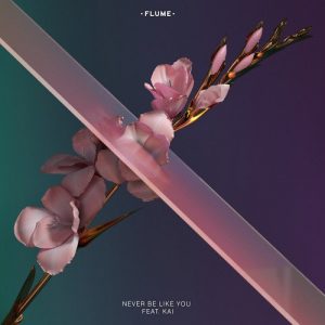
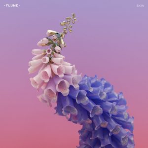
Claire Koh’s Looking Outward 09
Behind Cover The Art Flume’s Grammy Winning Album
cduong-Project 09-Portrait
//Name: Colleen Duong
//Email: cduong@andrew.cmu.edu
//Section: D
//Project-09

var jathryn;


function preload() {
  jathryn = loadImage("https://i.imgur.com/ALuxxJ8.jpg");
}

function setup() {
  createCanvas(600, 800);
  background(0);
  jathryn.loadPixels();
  imageMode(CENTER);
  frameRate(2000);

}

function draw() {
    var px = random(width);
    var py = random(height);
    var ix = constrain(floor(px), 0, width-1);
    var iy = constrain(floor(py), 0, height-1);
    var color = jathryn.get(ix, iy);
  	var d = random(5, 20);

//Draws the rain-like lines automatically
    push();
    stroke(color);
    strokeWeight(2);
    line(px-random(10), py-random(10), px + d, py + d);
    pop();
    //ellipse(px, py, d, d);

//Draws the ellipses with your mouse
    var mouseColor = jathryn.get(mouseX, mouseY); //changes color depending on where mouse is located based on picture colors
    noStroke();
    fill(mouseColor); //fills the circle colors according to picture color
    var ellipsesize = random(5, 15);  //randomizes the size
    ellipse(mouseX, mouseY, ellipsesize, ellipsesize);  //creates circles when drawing over
}
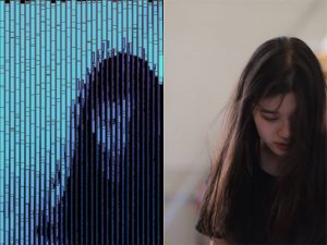
I wanted to somewhat mimic rain falling on a window so i tried to make it look random (since rain goes crazy in the wind) and then I allowed the viewer to draw randomly sized circles anywhere your mouse goes on the canvas, which was mostly for me because I was getting a little impatient.
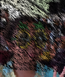
What it looks like when I just let the rain fall
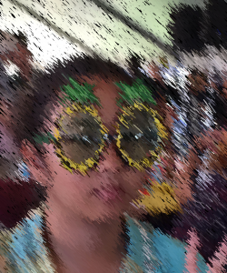
What it looks like after I started drawing circles to get the completed image
ghou-Project-09-Portrait
//Grace Wanying Hou
//15-104 Section D
//ghou@andrew.cmu.edu
//Project 09

//global variables
var sw = [];
var a = 0;
var r = 2;
var rx = [];
var ry = [];

function preload(){
    var imageurl = "https://i.imgur.com/S483jxr.jpg";
    dp = loadImage(imageurl);
}

function setup(){
    createCanvas(380,300);
    dp.loadPixels();
    background(240,245,250);
    for (var i=0; i<10; i++){ //randomizing where spirals are
        rx[i] = random(380);
        ry[i] = random(300);
        sw[i] = random(2,8);
    }
}

function draw(){
    noStroke();
    a += 0.1;
    r += 0.1;
//setting up spirals
    var x = rx[0] + r * -cos(a);
    var y = ry[0] + r * sin(a);
    var pointcolour = dp.get(floor(x),floor(y));
    fill(pointcolour);
    ellipse(x,y,sw[0]);

    var x1 = rx[1] + r * -cos(a);
    var y1 = ry[1] + r * sin(a);
    var pointcolour1 = dp.get(floor(x1),floor(y1));
    fill(pointcolour1);
    ellipse(x1,y1,sw[1]);

    var x2 = rx[2] + r * -cos(a);
    var y2 = ry[2] + r * sin(a);
    var pointcolour2 = dp.get(floor(x2),floor(y2));
    fill(pointcolour2);
    ellipse(x2,y2,sw[2]);

    var x3 = rx[3] + r * -cos(a);
    var y3 = ry[3] + r * sin(a);
    var pointcolour3 = dp.get(floor(x3),floor(y3));
    fill(pointcolour3);
    ellipse(x3,y3,sw[3]);

    var x4 = rx[4] + r * -cos(a);
    var y4 = ry[4] + r * sin(a);
    var pointcolour4 = dp.get(floor(x4),floor(y4));
    fill(pointcolour4);
    ellipse(x4,y4,sw[4]);

    var x5 = rx[5] + r * cos(a);
    var y5 = ry[5] + r * sin(a);
    var pointcolour5 = dp.get(floor(x5),floor(y5));
    fill(pointcolour5);
    ellipse(x5,y5,sw[5]);

    var x6 = rx[6] + r * cos(a);
    var y6 = ry[6] + r * sin(a);
    var pointcolour6 = dp.get(floor(x6),floor(y6));
    fill(pointcolour6);
    ellipse(x6,y6,sw[6]);

    var x7 = rx[7] + r * cos(a);
    var y7 = ry[7] + r * sin(a);
    var pointcolour7 = dp.get(floor(x7),floor(y7));
    fill(pointcolour7);
    ellipse(x7,y7,sw[7]);

    var x8 = rx[8] + r * cos(a);
    var y8 = ry[8] + r * sin(a);
    var pointcolour8 = dp.get(floor(x8),floor(y8));
    fill(pointcolour8);
    ellipse(x8,y8,sw[8]);

    var x9 = rx[9] + r * cos(a);
    var y9 = ry[9] + r * sin(a);
    var pointcolour9 = dp.get(floor(x9),floor(y9));
    fill(pointcolour9);
    ellipse(x9,y9,sw[9]);

}
I was a little inspired by the post-expressionism art period and Van Gogh’s paintings and his swirling brush strokes to create this portrait. I think the most difficult part of this project was setting up the variables. Overall I really enjoyed working on this; I wanted to set up a for() loop to create the 10 spirals but in the end I was unsuccessful although I am still thoroughly proud of my work.
daphnel-Looking Outwards-09
I chose to discuss Jiaxin Wen’s Looking Outwards post from Week 4. The work she chose was a Cloud Piano created by David Brown in 2014. I found this piece of work particularly interesting for relatively similar reasons to the ones she wrote. The Cloud Piano plays piano pieces based on cloud movement. I think that although a programmed machine playing a piano may not have as much emotion and excitement as would if a real person was playing it, the art of it is still beautiful. I also liked how the creator combined an everyday aspect of nature with a form of music. Since I tend to find the movement of clouds intriguing at times when I look at them, I admire the fact that there are people out there that may have the same feelings and me but have more of a capability to make something out of that feeling.
Jihee Kim_SectionD_Project-09-Portrait
//Jihee Kim
//15-104 MWF 9:30
//jiheek1@andrew.cmu.edu
//Project 9 Portrait
//section D

var baseImage;
var fillR = 97; // Red value of rectangles
var fillG; // Green value of rectangles (subject to change later)
var fillB = 226; // Blue value of rectangles


//load image
function preload() {
    var portraitUrl = "https://i.imgur.com/HgOmFTq.jpg";
    baseImage = loadImage(portraitUrl);
}

function setup() {
    createCanvas(320, 480);
    background(0);
    baseImage.loadPixels(); // turn the base image into a collection of pixels
    frameRate(2000);
    // grid on canvas
    // draw verticle lines that fall down from top to bottom
    // in between the gaps of rectangles
    for (var y = 0; y < height; y ++) {
        for (var x = 9; x < width; x += 10) {
            stroke(175 - y/2, 100, 145); // apply a color gradient to the lines
                                         // color changes from red to blue
                                         // from top to bottom of canvas
            strokeWeight(1);
            line(x, y, x, height); // draw line
        }
    }
}

function draw() {
    // x and y position of pixels that are to be picked
    var pixelX = floor(random(0, width)) * 10; // get rid of horizontal overlaps
                                               // by spacing the pixels by the
                                               // maximum width of rectangles
                                               // that are to be drawn
    var pixelY = floor(random(0, height));

    // extract the color of each randomly chosen pixel
    var iX = constrain(pixelX, 0, width - 1); // make x coordinates
                                                     // integers (no decimals)
    var iY = constrain(pixelY, 0, height - 1); // make Y coordinates
                                                     // integers (no decimals)
    var cp = baseImage.get(iX, iY); // get the color at the pixel

    // the width, length, outline and fill of the rectangles are to be mapped
    // to the brightness of the color of each pixel
    var rectWidth = map(brightness(cp), 0, 100, 1, 10); // brighter the color
                                                        // wider the width
    var rectLength = map(brightness(cp), 0, 100, 6, 50); // brighter the color
                                                         // longer the length
    var strokeC = map(brightness(cp), 0, 100, 0, 100); // brighter the color
                                                       // lighter the outline
                                                       // in greyscale
    var fillG = map(brightness(cp), 0, 100, 50, 255); // manipulate the G value
                                                      // of the fill in respect
                                                      // to the brightness

    stroke(strokeC);
    strokeWeight(1);
    fill(fillR, fillG, fillB);
    rect(iX, iY, rectWidth, rectLength); // draw rectangle representing
                                         // each chosen pixel
}
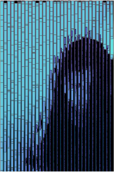
For this project, I created a computational self-portrait. While researching about data analysts in the past looking outwards assignment, I came across an image by dylan mason. Although this image was generated by compiling a lot of selfies throughout a long time, I wanted to mimic some of the qualities shown in this picture: horizontal bars and the balance between blurriness and clarity of the object.
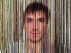
Another inspiration for this project was the eye tracker assignment in which we used the brightness function. I implemented a hierarchical system, using that brightness function to make the width, length, outline and fill of the rectangles relative to the brightness of the color of each randomly chosen pixel on the canvas.
The brighter the color, the wider the width, the longer the length, the lighter the outline of the rectangles. The fill of rectangles are also related to the brightness. The brighter parts of the image are covered with light blue rectangles, while the darker parts of the image are covered with deep blue, almost purple rectangles. The rectangles on the darker parts of the canvas are smaller because I wanted a more detailed feel on the face area. On the other hand, the rectangles on the lighter parts of the canvas are bigger because I wanted to quantify and communicate the vast amount of light that is coming from behind the person (me). Bottom line, I wanted the attention to be drawn to the human figure more than the background and I believe I achieved that goal through elements, including but not limited to size and color.
In the first phase of designing, the there were a lot of overlaps among the rectangles that are derived from randomly chosen pixels. I wasn’t sure if I liked the aesthetics of it. In order to lessen the traffic, I spaced out the distance between the chosen pixels along the x-axis. Spacing out both in the x and y axes would have made the computational portrait a little too ambiguous.
To continue the language of horizontality, I drew a grid that consists of vertical lines that span from the top to the bottom of the canvas. Moreover, the change in color of these vertical lines (from red to blue from top to bottom) adds to the dynamics.
Jihee Kim (Section D)– LookingOutwards-09
LifeObject: Israeli Pavilion Biennale Venezia 2016.
LifeObject was an installation inside the Israel Pavilion in Italy as part of the La Biennale di Venezia of 2016. The project was curated by the architect Ben Bauer. One of the other architects who contributed to the project, Arielle Blonder discusses this installation in press interviews and emphasizes its correlation to nature and society.
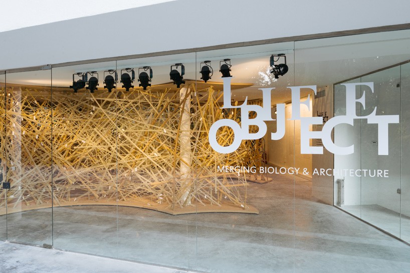
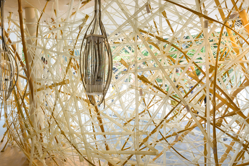
LifeObject, in a way represents a more secure society that is comprised of adaptable, flexible components, as does a bird’s nest. I find this installation interesting because of its attempt to integrate biology to architecture. Architecture ultimately is about living and the inhabitants, including but not limited to people and animals. The fact that the scientists and architects came together and mimicked a bird’s nest to build for people is intriguing and points to many more opportunities in the field.
I agree with Yugyeong that the project opens up more opportunities pertaining to biological designs and materials. To add, I would say that this project provides grounds to explore with 3D printing and computational design because there is a basic algorithm that we can extract from natural behaviors. I would also say that this project not only adds to the architectural field, but to the science field as well. LifeObject basically breaks the boundaries between the two disciplines.
For Designboom’s coverage of the project, visit:
israeli pavilion showcases woven bird’s nest structure at venice architecture biennale
For original looking outwards post:looking-outwards-03-yugyeong-lee
ghou-lookingoutwards-09
Looking Outwards on Daniel Noh
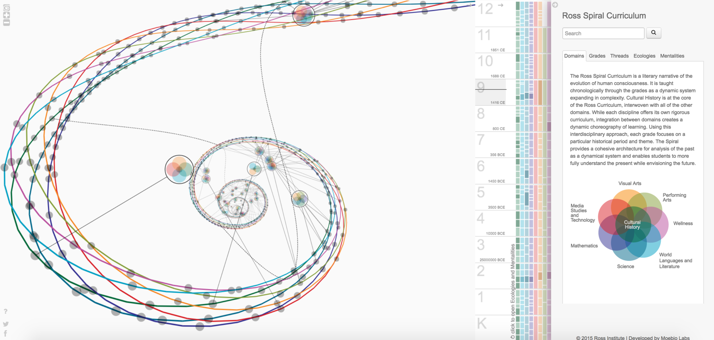
Daniel is a peer from my architecture studio, in this Looking Outwards post I am looking into one of his posts from week 7. Ross institute is a school that focuses on applied, advanced research, modelling, and dissemination, they strive to minimize the delay between research and application. The Ross Spiral represents the data of subjects in curriculum K through 12. in Daniel’s post he has stated that he thinks it is “far more impressive” as a 3D diagram and interactive map compared to a 2D drawing. I think this is an interesting way of representing data meant for spatial learners, however, it did take some time to figure out how to interact with the diagram and extract data from it. I think it would be useful to have a fuller data spreadsheet of how this graph is generated, and what each shape represented.
LookingOutwards-09-Chickoff
In this Looking Outwards post, I’ll be talking about Michelle Janco’s Looking Outwards post for Week 5 where she focused on a a piece by Mikael Hvidtfeldt Christensen called “Algebraic Decay” which was uploaded on October 19, 2012. Christensen is a physicist who creates 3D generative artworks using open source applications called Structure Synth and Fragmentarium.
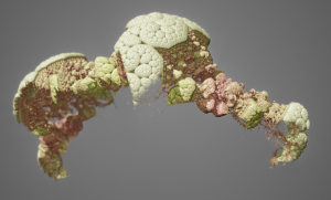
In terms of Michelle’s assessment of the work, I definitely agree with her that the landscape and makeup of the artwork is very biological and organic. It’s curious that it is difficult to recognize what this form is. There aren’t enough hints, and so the viewer is left to guess whether this is this a cell, a living creature, a landscape, and so on. I enjoy this guessing game and find it important that art has rational elements to ground it, but still remains ambiguous enough that it confuses the viewer and makes them question what they are looking at.
What does frustrate me however is that the background of this work is grey and barren, which only emphasizes the fact that this is computer generated. Whether this was Christensen’s intention or not, I can’t help but be reminded of the dull backdrop of programs such as Maya and Rhino3D. This makes it seem even more unlike something that could actually exist in our world, and fails to convince viewers that it does belong.