Looking Outwards – 09

During Week 5, my friend Asher Blackburn made a looking outwards post that I found particularly eye catching since it pertained to one of my favorite music artist’s album art – Flume.

In his post, he talks about Jonathan Zawada and his mathematically computed flowers that are so realistic it was as if they were photoshopped pictures of flowers. Asher, comments on how bold and righteous it is of Zawada to take the harder route of utilizing 3D animations algorithms rather than simply painting the flowers and I would definitely agree. When taking a closer look into the animated flowers, it is truly astounding the realism and detail that the algorithms were able to generate.

LookingOutwards 08-ssontag

Currently the Senior Curator of the Department of Architecture and Design as well as the Director of R&D at The Museum of Modern Art, Italian born design visionary has curated multiple exhibitions emphasizing the connection between design and innovation. Antonelli received a laurea degree in architecture from the Politecnico di Milano university in 1990 and eventually went on to lecture at several institutions including the University of California, Los Angeles and Harvard University. Although having never worked as an architect, Antonelli’s focus on maximizing functionality through design resonates with the mindset I have as I pursue a degree in architecture. Her exhibition “Safe: Design Takes Risk”, utilizes aspects of design that are both creative and functional. Consisting of conceptual models of automobiles, articles of clothing, and other everyday objects, the exhibition truly brings to the light the direct relationship between the way an object is designed and it’s efficiency.

Looking Outwards 08

I looked at the 2012 lecture given by Fernada Viegas and Martin Wattenberg. Viegas is a Brazilian scientist who focuses on information visualization, she attended MIT. Wattenberg is an American scientist who is known for his data visualizations for companies like IBM and Google, he attended Brown, Stanford, and UC Berkeley.

I find what they do incredibly interesting and important. It isn’t to obvious how imperative data visualization is, but if data is not shown in a way that people can understand or are attracted to, they will not look at it. What I admire about how they work it that they account for the attractiveness of the visualizations, they go beyond just making the data legible. For example, with their visualization of wind speed and direction, they chose to depict the invisible force of wind in a way that actually makes they viewer “see” it, I knew that i was looking at wind, even though I, nor anyone, have never seen wind before. What I like most about their presentation is that they show the process work, the steps to their final product.


I specifically like the Wind Case Study (around minute: 17:30)


Martin Wattenberg: http://www.bewitched.com/

Fernada Viegas: http://fernandaviegas.com/

dnoh-sectionD-lookingoutwards08

Person: Kyle McDonald

Kyle McDonald terms himself as an “artist working with code”. He, I believe, is based on Los Angeles, California and studied computer science and art.

Honestly, I didn’t find his presentation to be too great, both content and presentation wise. First of all, he did not even have a presentation ready, rather he had folders with images and videos he showed to the audience through the Macbook’s preview function. But I guess, as he emphasized in the beginning of his speech, this was a more “informal presentation”. However, after looking through a couple of his projects, I was captured by his creativity and coding sense.

For example, he had an installation/project in Korea and Japan where he connected the two countries through facial recognition. I found it intriguing that he, someone who had experimented with facial swapping since at least 2011, was able to develop his knowledge within this field enough to categorize and match people so fluidly through merely positioning and expressions.

Much like this installation he had projects that made a computer force a person to draw themselves in contour (blind) where the program and machine moved the hand of the person based on what facial features and shape the machine was able to grasp.

danakim-LookingOutwards-08

Mimi Onuoha is a Nigerian artist and researcher based in Brooklyn. She explores the implications of computational categorization and data collection. Her main mediums are code, writing, and sculptures. Through these mediums she explores missing data and the ways that people are classified, abstracted, and represented through data collection. Onuoha is currently a research resident at Eyebeam, an Artist in Residence at StudioXX, and a data journalism contributor at Quartz. She graduated from NYU’s Interactive Telecommunications Program in 2013 with an MPS, Master of Professional Studies.

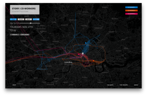
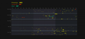
Onuoha focuses on the link between data collection and human relationships and classifications. She shapes her work around daily life a lot and its very interesting how much you can actually learn from this data that she is collecting about individuals. One of her pieces, Pathways, literally tracks the path of groups of people. She uses mobiles to collect data from each group. The use of a mobile phone to collect data is interesting because it opens up the variety of data that she can collect. She used different apps to track which messaging apps the groups used, where they were travelling, as well as how often the group interacted with one another.

Pathways; Mimi Onouha
Pathways; Mimi Onuoha

Onuoha spoke at the Eyeo Festival on June 27, 2017. She starts off the presentation by introducing the core idea of her work, which is data collection, and then proceeded to talk about influences and how that affected the way that she approached her projects. Onuoha introduces a piece of hers that she uses as an example of how she manifests her ideas into her piece and how what she learned from this particular project led to an idea for another project. She presents her work like it is a story. It helps to make the flow much smoother.

Mimi Onuoha

yunzhous-LookingOutwards-08

Robert Hodgin is a artist/coder. He does various type of work, ranging from 2D data visualizations and to immersive 3D simulations. His primary interests include theoretical physics, astronomy, particle engines, and audio visualizations. One fun fact, as a coder, he graduated from RISD with a degree in sculpture.

Hodgin visualizes&simulate data with code. For example, he visualizes fishes’ motion in the sea according to their speed, direction, etc. He visualizes lighting on earth according to data. He is very playful with his work: he gives the fish various shape. I found the playfulness delicate and interesting.

Hodgin’s lecture is very humorous. This actually grabbed my attention and made this 45min assignment engaging rather than tedious. He used metaphors(usually funny ones) to explain his work. For example, in explaining creative coding, he make a short video of painting intuitively until stopped by a bug in the code, with funny sound and visual effect. By doing this the audience would pay full attention to his lecture and easily understand.

This is the full lecture


This is another work by Hodgin I found amazing, “Fish Tornado”

Here is Hodgin’s website


Looking Outwards – 08

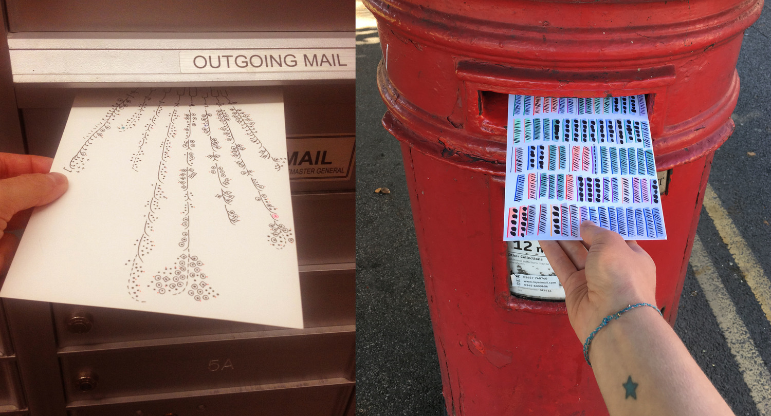
“Dear Data” is by two women, Giorgia Lupi and Stefani Posavec. Lupi is an information designer in NYC, and Posavec is a designer in London. The two women actually only met twice, at EYEO 2013 and 2014, where, in between they had a year-long collaborative data project. The challenge was both in their data collection and in their data visualizations. With every postcard they sent to each other, they would visualize something new in their daily lives, using a new creative visual system.

In their presentation, I love their camaraderie with each other, it makes the entire presentation come alive. Another aspect I really loved was the visualization of everything, i.e. the map of where they lived and the traveling their post cards did. Showing and explaining some of their postcards was also very helpful in regards to really understanding what went on during their processes. I loved how innovative some of the projects were, from using materials such as lipsticks, the design of the visualization, to just the topic of the data, these two women proved to be truly restless in regards to finding something new with every postcard. Nonetheless, overall the entire presentation was extremely powerful because of its structure, and clarity in their thinking, the timeline, and data visualization explanation.

daphnel-LookingOutwards-08

Jake Barton, an American designer based in New York, works a lot with interactive design and focuses on trying to combine technology and emotion to create new things. In this video, Barton talks a lot about creativity and the ways that make it feel like the experience of falling in love. I love how the way Barton tries to create creative and interesting interactive designs and how he is interested about connecting technology and creativity. One of his past projects, which was the Big Heart NYC Project, was an interactive installation that involved a giant cube made of transparent tubes and LED lights. This heart reacts to affection and touch and converts the energy from it into light in the heart. Barton tells us that “appealing to emotions itself can build something big; interactions don’t have to be complicated to make a specific human moment and to make something satisfying.” I love and admire the way he talks about his works and the way he tries to approach every idea he has. Creativity can be fickle and hard to deal with sometimes but in the end, it is also incredibly beautiful and exhilarating to have.


aboyle-Looking Outwards-08

Meejin Yoon received a Bachelor of Architecture from Cornell University in 1995, a Masters of Architecture in Urban Design with Distinction from Harvard University in 1997, and a Fulbright Fellowship to Korea in 1998. Today, she is a Professor and Head of the Department of Architecture at MIT, as well as the co-founded of Höweler + Yoon Architecture LLP and MY Studio. Throughout her career, Yoon has received numerous awards and accolades and her work has been widely recognized for its innovative and interdisciplinary nature. Examples of her past projects can be found at http://mystudio.us/.

Yoon’s body of work is focused on the intersection architecture, technology, and public space. I’m impressed by the strategic way she approaches her work; she pays a lot of attention to the practicality of materials, space, and interactive potential. I also admire the publicness of her work. While it’s difficult to create work to be displayed in a gallery, I think it can be even more difficult to create work that is meant to exist in a public space and tangibly benefit the people who pass through that space. One of her works that I feel encapsulates these aspects is the “public parasol” she created in downtown Phoenix, seen below. It’s official title is shadow play, and it was specifically created to provide shade during the hottest times of the day and let sunlight in during the cooler hours. Yoon also managed to save several tons of material by being strategic with the design.
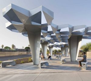
“Shadow Play”, created in 2015 at Roosevelt Street in Phoenix. Photo Credit: http://www.howeleryoon.com/projects/shadow-play 

When watching Yoon’s talk, I noticed her use of visuals right away. She includes so many relevant visuals that it was very rare for the video to be focused on her face. She is also very effective at providing background information that enhances the audience’s understanding of her work. For example, I would have been a little confused with the Mobius strip dress had I not known the cultural differences between how clothing is created. I think I’ll take these ideas to heart when I present my own work in the future. If needed, I’ll try to include any sketches I did and talk about my inspiration(s).

hyt-Looking-Outward-08: Morehshin Allahyari

Artworks

Eyeo 2017 talk: https://vimeo.com/search?q=eyeo+morehshin

Morehshin Allahyari is an artist, thinker and activist originally born in Iran and later immigrated to the US. I was particularly drawn to her work  because of her selected focuses on social and political activism using experimental artforms — animation, 3d printing, web art, etc. Two of the projects that interested me in the lecture was the manifesto of Additivism and Material Speculation on ISIS. Specifically, for the latter one, she created 3D printed objects of old artifacts with a memory drive inside the artifact, supposedly preserving it for future generations for reference. I like the combination that the artist works between physicality and digital preservedness.

More work of hers can be viewed here: http://www.morehshin.com/material-speculation-isis/

(Sorry it seems like the Vimeo links were very hard to embed into this post, so I pasted the address link below.)