HaeWanPark-LookingOutwards-7

YOU’RE NOT THE ONLY ONE WHO HAS TROUBLE PARKING IN NEW YORK CITY

The Sixth Poster of “Flocking Diplomat” Series

This is the last piece of six poster series named Flocking Diplomat representing Parking Violations by Diplomats in New York City between 1998 and 2005. Each different poster is represented same data but in each unique discipline allowing audiences to engage in a different perspective. The last piece was created by Christina Cannella who is a Digital Design Fellow in the Department of Drawings, Prints & Graphic Design at Cooper Hewitt, Smithsonian Design Museum. Each tick on this poster is marking a parking violation by a diplomat in NYC, 1998 – 2005. This was executed by the loop technique (I think it is what we have been learning in past few weeks) of programming that plotted 141,369 geo-coded data points. It is resulting in 16,355 unique locations and pointing out the United Nation which is the source of the diplomats. So, in this data visualization, viewers can see the hidden patterns behind the data. This poster has been exhibited at Cooper Hewitt, Smithsonian Design Museum.

YOU’RE NOT THE ONLY ONE WHO HAS TROUBLE PARKING IN NEW YORK CITY


gyueunp – Project-07: Composition with Curves

Composition with Curves

//GyuEun Park
//15-104 E
//gyueunp@andrew.cmu.edu
//Project-07

//define rose curves by r = cos kθ 
var k = 7/4;

function setup() {
    createCanvas(440, 440);
    frameRate(1000);
}

function draw() {
	background(70);
	
	//change the origin to the center of canvas
	translate(width/2, height/2);

	beginShape();

	stroke(124, 9, 21);
	fill(124, 9, 21, 150);
	strokeWeight(2);
	
	for (var a = 0; a < TWO_PI * 8; a += 0.01){
		var r = map(mouseX, 0, (70 * cos(k * a)), mouseY, (200 * cos(k * a)));
		var x = r * cos(a);
		var y = r * sin(a);
		vertex(x,y);
	}

	for (var b = 0; b < TWO_PI * 4; b += 0.01){
		var r2 = map(mouseX, 0, (40 * cos(k * b)), mouseY, (20 * cos(k * b)));
		var x2 = r2 * cos(b);
		var y2 = r2 * sin(b);
		vertex(x2,y2);
	}

	endShape(CLOSE);
}

I used a rhodonea/rose curve to create a composition that bears a resemblance to a petalled flower. As seen in the code, I used one of the curves defined by , with the value 7 as the numerator and 4 as the denominator in defining k as n/d.

However, the addition of the interactive quality using mouseX and mouseY led to forms that are more fascinating and intricate than the stagnant rose. I’m glad that the project requirement pushed me to enable a broader range of possible compositions.

Screenshots :

amui1 – Project-07-Curves

amui1-p7

//Allison Mui
//15-104 Section A
//amui1@andrew.cmu.edu
//Project-07


//global variables
var nPoints = 100;

function setup() {
    createCanvas(480,480);
}

function draw() {
    background(0,0,63);
    //places bottom left corner
    drawAstroid(70,height-80);
    //places top right corner
    drawAstroid(width-60,80);
    drawRose();
}

function drawAstroid(xPos,yPos) {

    //size
    var a = 30;

    beginShape();
    noFill();


    stroke(255,242,254);
    strokeWeight(1);

    //loops ten times to make layer of astroid
    for (var num = 0; num < 10; num += 1) {
      //test loop
      //print(num);
      //loops through 100 times to make the curve
      for (var i = 0; i < nPoints; i++) {
        //constrains and maps theta to be between 0 and two pi
        var theta = map(i, 0, nPoints, 0, TWO_PI);

        //formulas provided by MathWorld
        x = xPos + a*(cos(theta)**3);
        y = yPos + a*(sin(theta)**3);


        vertex(x,y);

      }
      endShape();
      //decreases size of astroid in accordance with mouseX
      a = a - constrain(mouseX,0,width);
    }
}

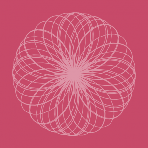
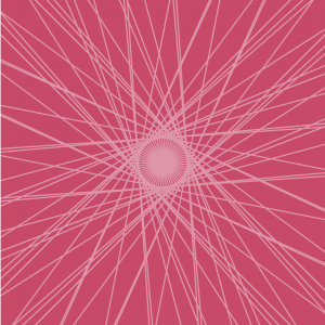
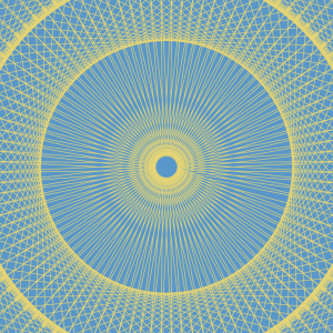
function drawRose() {
    stroke(255,252,201);
    noFill();
    //size of rose inm accordance with mouseX
    var roseA = constrain(mouseX,50,200);
    //number of petals
    var roseFactor = 6;

    //loop through 10 times for extra layers
    for (var roseNum = 0 ; roseNum < 10; roseNum += 1) {
      for (var i = 0; i < nPoints; i++) {
        //constrains theta to be between 0 and two pi
        var roseTheta = map(i,0,nPoints,0,TWO_PI);

        //formulas from mathworld
        r = roseA*sin(roseFactor*roseTheta);

        roseX = width/2 + r*cos(roseTheta);
        roseY = height/2 + r*sin(roseTheta);

        ellipse(roseX,roseY,1,1);
      }
      //decreases size of rose in accordance with mouseX
      roseFactor = roseFactor - mouseX;
      //to test
      // print(roseFactor);
    }
}

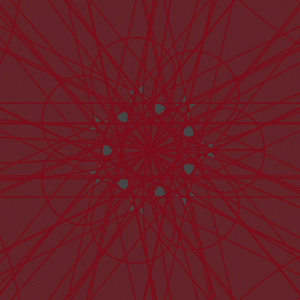
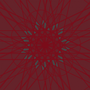
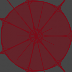
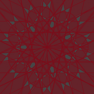
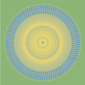
This project was pretty challenging. I found mathWorld extremely useful in showcasing the x and y equations in order to make the shape. However, I found it difficult to come up with a creative idea that implemented the curve shape. What I came up with was inspired by the stars. Overall, I’m satisfied with my end product. However, in the future, I would like to explore more and maybe implement something new using the time function. Another thing that I wish I could have taken more time researching was finding a way to make the astroid curve into a rose curve over the movement of mouseX. But, that was too hard and too much of a time constraint for the time being. Overall, I’m satisfied with my end product which gives off a “sparkly” feel.

ifv-Project-07

sketch

//Isabelle Vincent
//Section E
//ifv@andrew.cmu.edu
//Assignment ifv-07-Project
var y;
var x;
var a;
var t;
var nPoints = 100;
function setup() {
  createCanvas(480,480);
}
function draw(){
  background(199, 74, 105);
  strokeWeight(2);
  translate(width / 2, height / 2);
  //center ray circle
  for(var l = 0; l <60; l++){
    drawRay(l)
  }
  //rotate and overlap looping arc
  for(var i = 0; i < 20; i+=1.5){
    stroke(222, 150, 168);

    if(i==0){
      push();
      drawCurve();
      pop();
    } else {
      push();
      rotate(PI/i);
      drawCurve();
      pop();
    }
  }
}
//drawing ray circ function
function drawRay(count) {
  push();
  rotate(radians(count*6));
  var H = hour();
  var rayH = map(H,0,0,140);
  line(0,0,(width/10),mouseY/4);
  pop();
}
//looping arc func
function drawCurve(){
  var x;
   var y;
   push();

   var a = 80.0;
   var b = a / 2.0;
   var h = constrain(mouseY / 2, 0, height);
   var ph = mouseX / 230;

   noFill();
   beginShape();
   for (var i = 0; i < nPoints; i++) {
       var t = map(i, 0, nPoints, 0, TWO_PI);
       x	=	(b*cos(t))/ph+b*cos(3*t)/(ph)
       y	=	(b*sin(t))/ph-b*sin(3*t)/(ph)
       vertex(x, y);
   }
   endShape(CLOSE);
}

I wanted to make a design that blended curved lines and straight lines. The mouse’s X and Y position affect the shape and size of the curved forms and the length and position of the lines in the cluster.

dnam-Looking Outwards-07

Ross Spiral Curriculm

Looking at computational information visualisation, I looked at Santiago Ortiz’s work, especially the Ross Spiral Curriculum. The graphics showcase the development of the human consciousness. The different colors represent the different aspects in how our brains developed. For example, orange discuss an important evolution in the human mind’s ability to understand the visual arts, whereas navy blue discuss human’s scientific development. The part of the art that really grabbed my attention was not only the beautiful aesthetics that interact with the user’s mouse, but also the clean UI graphics that allowed me to fully understand how to use the tool in a few seconds. You can check out Santiago Ortiz’s spiral here.

rmanagad-lookingoutwards-07-sectione

Creator: Stamen Design

Title of Work: WHO Immunization Report 2016

Year of Creation: 2016

Link to Project Work: https://stamen.com/work/who-immunization-2016/

Link to Artist Bio: https://stamen.com/about/


The WHO Immunization Report visualization created by Stamen Design was created in an effort to improve visualization and public understanding of report data — by combining understandable text with analogous information, the report is inviting and easier to read. As a communications designer, this bridge is especially important — if information is not obviously readable, then the general public would not browse through the data in order to understand it.

The algorithms relevant to how the information was visualized was not explicitly stated by Stamen, however it can be implied that the proportions and colours of some elements (i.e. circle size) are directly affected by the size of the data (i.e. number of unvaccinated children in a country). As a company, Stamen Design creates data visualizations and maps — these algorithms are most likely duplicated and applied to each of their works.

ablackbu-Project-07-Composition with Curves

sketch

var points = 100;

var R = 200;
var G = 100;
var B = 100;

var depth = 3


function setup() {
    createCanvas(400, 400);
    background(0);
}


function draw() {

    //draw curves
    translate(width / 2, height / 2);
    rotate(mouseX/50);
    drawParabolaCurve();
    
    //decide color
    if(mouseX < width/2){
        R = 100;
        G = 100;
        B = 200;
    }else{
        R = 200;
        G = 100;
        B = 100;
    }
}   


function drawParabolaCurve() {
    // Parabola:
    // http://mathworld.wolfram.com/Parabola.html
    strokeWeight(0.1);
    stroke(R,G,B);
    noFill()
    
    //vertex points
    var x;
    var y;
    
    var a = 20;


    beginShape();
    for (var i = 0; i < points; i++) {
        var t = map(i, 0, points, 0, TWO_PI);
        
        //parabolic formula
        x = a * pow(t,depth) / a;
        y = 2 * a * t;
        vertex(x, y);
    }
    endShape(CLOSE);
    
}

For this project I really wanted to do/create something aesthetic. After looking through the algorithms and formulas, I found lots of them that were extremely complicated and hard to understand. I decided to go with something simple (a parabola) and influence it with both movement and color to make it look complex.

I created a formula that draws a more complex grid overtime you move your mouse. It creates a really interesting pattern and it makes the viewer want to make it more built up.

atraylor – Looking Outwards 07 – Section B

A still from the real-time animation.

When looking for works to write about at the beginning of the semester, I stumbled upon this project, A Selfless Society by the RAT.systems team at Queen Mary University of London, which visualizes data from a naked mole-rat colony.  The real time data is taken from the movement of the colony and rendered in an audio-visual animation. The project doesn’t experiment on the naked mole-rats and is purely for observation. The mole-rats have implanted passive integrated transponders that are sensed around the burrow to gather data on their movement and speed which is then used in the animation. The data gathered is being used to understand mole-rat social structure and is being put to other scientific uses. I find this project interesting because it integrates ecology, technology and art. The final result makes you wonder what each key animation means in relation to the actual happenings in the burrow.

sunmink-Project07-Curves

sketch

//SunMin Kim 
//Section E
//sunmink@andrew.cmu.edu
//project-07 

// http://mathworld.wolfram.com/Epicycloid.html

function setup() {
  createCanvas(480, 480);
  frameRate(10); 
}

function draw() {
  background(139, 181, 115);
  //drawing is moving in the center 
  translate(width/2, height/2); 
 
  //draw the curve 
  drawEpitrochoid();

}

function drawEpitrochoid() {  
    var nPoints = 500; 
    strokeWeight(1);
    fill(86, 149, 204); 
    stroke(228, 213, 110);  

    var x; 
    var y;
       
    var h = constrain(mouseY, 0, 480); 
    //radius of bigger ellipse 
    var a = mouseX / 2; 
    //radius of smaller ellipse
    var b = mouseX / 400; 

   
    beginShape();
    for(var i = 0; i < nPoints; i ++){
        var t = map(i, 0, nPoints, 0, TWO_PI);
        //epitrochoid equation (x position)
        var x = (a + b) * cos(t) - h * cos (((a+ b)/b)*t); 
        //epitrochoid equation (y position)
        var y = (a + b) * sin(t) - h * sin (((a+ b)/b)*t); 
           
        vertex(x, y);
    }

    endShape();
}

For this project, after reading the sample codes, I was excited to create art using various curves. Thus I took benefit of the formula provided in Wolfram Mathworld website and created this project. Throughout this project, I struggled the most when thinking about appropriate values for each variable. I feel good with the outcome that I successfully used each variable to display what I wanted to show.

Looking outwards-07

Data visualization is an important part of understanding complex systems because it allows for an intuitive understanding of complex systems. Data is not the answer to problems, but pulling a well informed understanding from data can help experts decide the state and needs of the system. The Tweet Bursts project from Senseable City @mit used public tweets to understand events. Data is valuable because it’s inherently crowdsourced. As natural language processing develops, computational understanding of events can be understood and communicated in realtime. Realtime access to events around the world can help leaders (hopefully) make good decisions.

http://senseable.mit.edu/tweetbursts/