![[OLD FALL 2017] 15-104 • Introduction to Computing for Creative Practice](https://courses.ideate.cmu.edu/15-104/f2017/wp-content/uploads/2020/08/stop-banner.png)
The Rhythm of Food: Moritz Stefaner
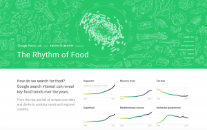
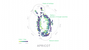
This collaboration with Google News Lab called “The Rhythm of Food” by Moritz Stefaner tries to visualize seasonal patterns in food searches based on twelve years of Google search data related to food. It compares seasons, the year, and the relative search interest of the particular type of food. This is done by representing the seasons on the outer most circle, the colors as the year, and the distance from the center of the circle as the relative search interests.
I find it interesting how this data visualization compares multiple variables that you would never think of comparing. Who knew that there would be a correlation between food searches and the type of year? The way the data is visualized also helps people see that correlation in a way that makes sense. I appreciate how they created their own system or in a sense, computation, to demonstrate data visualization.
They also made an animation making it easier to see the visualization.
Rhythm of Food – flying charts from Moritz Stefaner on Vimeo.