dnoh-sectionD-lookingoutwards-07

Project: Ross Spiral Curriculum

By: Moebio Labs

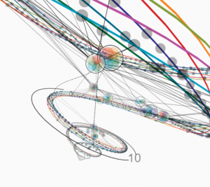
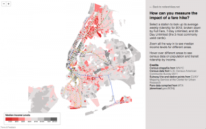
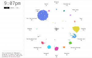
When I first saw this diagram/informational system I did not understand whatsoever what it stood for. However, the moment I saw it, the form and colors just caught my eye. This beautiful diagram demonstrates basically a curriculum that weaves different subjects and assignments into a spiral that is organized from K to 12th grade. I suppose that the creator of this diagram put classes into a certain category, then organized them into specific age levels, then put them into a spiral.

Seeing that this was put into a 3D diagram made it far more impressive as it became an interactive map, rather than simply a diagram.

Looking Outwards 07

This video features two seemingly irrelevant “posters”. One with images of our world, the other with “random” dots. The artist, studio Nand.io, wanted to venture to see what “tomorrow” would look like. In this project titled, Analog Mensch Digital, the poster on the right, with the random dots is the tomorrow. After reading about the project it explains that the random dots are in fact digitally encrypted patterns of the images on the left on the analog poster. The artist wanted to give a new way of looking at the world, the right poster. Basically, the analog poster is only there to give concept and understanding to the digital poster. It would interesting to think about if we in fact needed the digital poster as the reference for the analog.

hschung-LookingOutwards-07

I looked at the work of Periscopic, who describe themselves as a socially-conscious data visualization firm that helps people promote awareness and transparency of information.
On Periscopic’s website, Wes Bernegger explains the process behind the making of a “Feather” Visualization. They used Microsoft Emotion API, which takes images of faces as input and returns a set of emotions for each image- which is interesting because we’re able to rely on machines to examine human faces and pick up what emotions seem present according to facial expressions, which can be so diverse and may need much interpretation to understand. With that technology, Periscopic examined the past inaugural addresses of the presidents, which pulled out emotive data- from 8 emotions. They then plugged their data into Processing to create a visual representation of what they found, which turned into a feather form.
Interestingly enough, Donald Trump’s feather was much more negative and droopy than the feathers of the other presidents’ addresses.
I appreciate that this group attempted addressing emotive data, and that they appropriately used an emotive shape to express it. It’s an easy way to have people interpret their findings at a glance.

http://www.periscopic.com/news/emotions-inauguration

hannajan-lookingoutwards-07

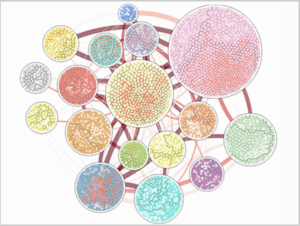
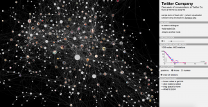
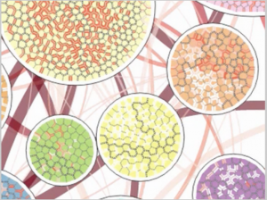
(Above are pictures of the Vorograph of Cody Dunne, Michael Muller, Nicola Perra, Mauro Martino, 2015)

Since this week’s topic was on computational information visualization, I tried to find a project where a custom software was made to collect and/or visualize a dataset, while still being colorful and fun. I stumbled upon the Vorograph of Cody Dunne, Michael Muller, Nicola Perra, and Mauro Martino.

The Vorograph presents three visualizations from IBM research that was developed to facilitate the research of epidemiologists through a combination of representations in population, movement, and disease spread at a local scale while also matching with a zoomable global scale.  Although I don’t know the exact algorithms behind the artistic representation that is shown above, I do know that the data was put through a specific programming that rendered those images.

I admire the very intricate patterns and color detail that went into making those specific patterns. Each of the different circles have a simple yet unique pattern of its own. I admire this because the uniqueness shows the extra effort that was put into making all the different circles. The patterns also show the artists’ artistic sensibilities in how they chose to represent their different data, and the final presentation.


Looking Outwards-07-ssontag-Selfiecity

This work by Moritz Stefaner compiled 3200 selfies taken by people from around the world to analyze the selfie phenomenon of our generation. They “Rich media visualizations (imageplots) assemble thousands of photos to reveal interesting patterns.” There are many parts of this project that analyze different aspects of each selfie and how each selfie was taken. Some of these demographics include, place taken, age of the selfie takers, and gender of the selfie takers. They also analyzed each photo to see how the photo was taken. Whether the person is looking up, down, left or right. It also analyzed their emotions, the tilt of their head, how open their mouth was, and whether or not they are wearing glasses. All of this information was then stored and graphically represented beautifully with sheets of infographics.

The Documentation

Here is a video that compiled their work.

nayeonk1-LookingOutwards-07

Ingrid Burrington is awesome writer, artist and computational information visualizer. I admire her brilliant works including writings and arts besides that fact that she’s also a computer data researcher. she writes about computers, politics, and art. Some of her works use data to creates images and others are computer generated arts that comes with various forms such as installation art or graphic design.
she creates a cloud as of networked infrastructure with her writings. She thinks about how the internet works and a lot of pieces of material infrastructure that goes into creating our fantasy of the cloud as nowhere and everywhere at the same time.

Measuring The Impact of A Fare Hike
The Realm of Rough Telepathy

She has published a book called ‘Networks of New York’ which sketches the physical extrusions of the internet into New york City’s streets and buildings, and makes especial note of how much of that infrastructure has been built as aprt of the post 9/11 surveillance network that NYC has erected over the past 15 years.

You can check more of her works here
Ingrid Burrington Website

adev_LookingOutwards_07_data_visualisation

A Day in the Life of Americans

A Day in the Life of Americans
by NATHAN YAU, Flowing Data

I really love this data visualisation because its really dynamic, aesthetic and informative. It also has this interesting bird’s eye view of people and how they live their lives. It has this sense of removal and perspective. It really is about people just being people in their daily activities and movement. It’s also really interesting to see rush hours where activity rapidly changes like 9:00 am or 5:00 or 6:00 pm; there literally is a visual rush of little dots across the page.

Its so fascinating because the designer has managed to make everyday activities and mundane movements extremely engaging. It also has this strange voyeuristic quality to it, where you literally watch people do very normal things. I feel like I could watch this for hours and never be bored. It is satisfying and yet makes me want to know more about these individual trends and movements.

gyueunp – Looking Outwards 07

This is a sample demo that was created using Newk, a browser-based application for Networks Visualization. It is currently being developed by Santiago Ortiz with the aim of presenting a visualization of the network of Twitter conversations of the company’s employees.

To the right of the network visualization are sections that provide information for the viewers, such as “network and nodes metrics.” There is also an interaction guide that succinctly outlines the instructions on how to obtain information through the visualization. The intersecting lines are joined by nodes, which are photos of employees. They change colors as the cursor hovers over the nodes, displaying the interaction among the employees in a single glance.

This example is fascinating in that it presents us with information that could be personal to the employers. The fact that this seemingly complex network is only a week of conversations makes me rethink about the significance of our online conversations that we often take for granted, due to its simple accessibility.

ljkim looking outward 07

http://https://www.vam.ac.uk/bigglassmic/
Image of Big Glass Microphone

Big Glass Microphone looks at infrastructure in ways that our eyes can’t see. By visualizing the vibrations in a five kilometer long fiber optic cable buried underneath the campus of Stanford University. Fiber optic cables are used to send signals from one another. I’m assuming an algorithm is used to read the vibrations then to interpret it to visuals. In the image above, you can see a building of Stanford. I appreciate this use of computational information visualization because it’s use of fiber optic in unconventional ways. The beauty of re-using resources in different ways is now more than crucial in a resource-depleting time period.

Jonathan Perez Looking Outwards 7

wind map of hurricane isaac

This is a project called Wind Map, by Martin Wattenburg. It takes in surface wind data from the National Digital Forecast Database once per hour, and generates these images based off of that information.

What I enjoy about this project is how it bridges the gap between informational and emotionally representative. Looking at these images, I can both see what the wind patterns were like in that moment and feel the emotion of that wind.


I believe that, when representing information, there is an opportunity to represent much more than just numbers. I almost feel like saying there is a humane obligation to representing more than just numbers… information has real impact in peoples lives, and thus has an emotional quality to it on some scale. Maybe a good example (though maybe a bit extreme) is death counts. Seeing a bar graph of death counts in different wars takes all of the humanity out of that information.

SaveSave