![[OLD FALL 2017] 15-104 • Introduction to Computing for Creative Practice](https://courses.ideate.cmu.edu/15-104/f2017/wp-content/uploads/2020/08/stop-banner.png)
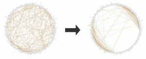
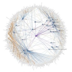
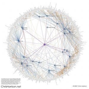
Chris Harrison, CMU HCII professor, is one of the professors I admired in CMU. While I always stalking the projects he lead of the Future Interface Group, I was surprised to find out about some of his amazing data visualization project. The Cluster Ball project is a data visualization he made to represent the structure and interconnection of wikipedia pages. Centered in the graph is a parent node. Pages that are linked from this parent node are rendered inside the ball. Finally, pages that are linked to the latter (secondary) nodes are rendered on the outer ring. Links between category pages are illustrated by edges, which are color coded to represent their depth from the parent node. I found it very intriguing that how Prof Harrison managed to create order and structure out of the extremely chaotic wikipedia pages. The way of visualization not only shows how topics are forming topics groups and the degree of linkages, but also reflect the way people organize informations through seeing where the fields diverge and intersect. The visualization can also presented which area of topics may have more concern from the public(more linkages), and which topics may be omitted(less clustered).