![[OLD FALL 2017] 15-104 • Introduction to Computing for Creative Practice](https://courses.ideate.cmu.edu/15-104/f2017/wp-content/uploads/2020/08/stop-banner.png)
Paolo Ciuccarelli is part of a research design group, DensityDesign, in conjunction with a university in Italy. At Eyeo, Ciuccarelli talked about The Poetics of Data Experiences: how to visualize big data that displays the information that is expressive of time, space and emotion. Ciuccarelli uses the term info-poetry to teach that design should play with rhetoric and emotion, ensure the meaning of the message is understandable, make it reproducible and potentially open source it. He shows several examples of his student’s work where they essentially create projects that encapsulate data reflective of contemporary society and present it in a manner that follows the main info-design principles. It’s a step upward from a regular infographic; visually representing data in a way that will elicit emotion. I was drawn to example projects that really utilized media to express data as it was stronger than just using a computer to create a generative body.
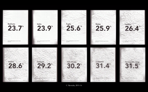
There was a project called Crumpled Italia where pieces of paper are displayed in a grid to represent different countries. Each piece of paper was crumbled to a percentage that matched the statistic of domestic abuse in the country. I found that piece extremely profound as it really elicits empathy without being exposed to a “gory” image which is what info-poetry is about. I find the general topic of representing and visualizing data fascinating. Ciuccarelli explains that he was fascinated with understanding complex systems and using data visualization to make sense of them as well as teach to others. As a person, I share that same fascination and would be interested in learning how to fuse generative computer graphics and tangible materials with design.
Essentially, his form of presenting data is the same in which he enjoys using graphics to communicate ideas and numbers but rendering them in such a way that the viewer experiences an emotional response. I noticed a lot of the times, the viewer is responding to abundance of data but the data is also elevated by variables such as color and music. This is a good example for myself to reference when thinking about how presentation and documentation of information should display not only the data itself but the context, mood and tone of the data.