sunmink-LookingOutwards-07


Dear Data by, Georgia Lupi and Stefani Posavec http://www.dear-data.com/all/

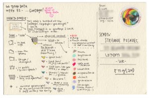
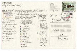
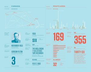
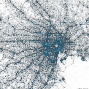
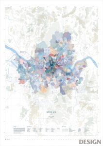
Stefanie Posavec is a designer who works with data projects that are related to language, literature, or science. She uses data as a source visualize hand-crafted works. One of her most admirable work is “Dear Data”, which is a collection of postcards that includes data that shows something about two people’s personalities. This project began when Lupi and Posavec were curious if they could know each other by few colored pens marked on the postcards. By spending hours on each postcard they could make a detailed postcard that enables them to share their personalities. Lupi mainly encoded data in a way that presents different noises she heard in 32 weeks, and Posavec’s card was filled with brightly colored rectangles.

I was excited to see some of the postcards they made because I have not seen many data visualizations that use color encoding to represent certain emotions or condition. The algorithm generated in their work is human thoughts to programme and display data through visualization. After seeing many works based on mathematically generated algorithms, it was refreshing to understand the data through a different perspective.

danakim-LookingOutwards-07

eCLOUD (2007); Dan Goods

The eCLOUD is a permanent installation between gates 22 and 23 at the San Jose International Airport. It is a dynamic sculpture that mimics the volume and behavior of a cloud. The sculpture is made of polycarbonate tiles that change its transparency levels according to real time weather from around the world. A dynamic display shows which city the eCLOUD is displaying and it’s current weather data in real time.The eCLOUD was designed by Dan Goods, Nik Hafermaas and Aaron Koblin.

I admire the project’s sensitivity to it’s environment. The designers did a nice job of finding the right balance between simplicity and complexity to make sure that the installation relates back to its surrounding environment and is not obnoxious. I admire that the installation itself is informative and has a function within the space.

eCLOUD; Dan Goods
eCLOUD; Dan Goods

eCLOUD

katieche – looking outwards – 07

I chose the work of Nicolas Felton because I had found out about him back when I was in high school, and I thought everything he did at the time was just through adobe programs, not through computation or coding! His work is really fascinating as he essentially records every moment of his life for an entire year (every year), and then complies them into informational graphics for an annual report on each January 1st. He uses processing to create graphs and charts, and then exports them into Adobe InDesign to create his reports. He’s even created an app which sends users reminders to record data, and essentially collects, and categorizes the user’s everyday data.

feltron
article

serinal – looking outwards 07 (section C)

Periscopic did a data visualization for “The Emotional Highs and Lows of Donald Trump” during the last Presidential election. I think that this was a really cool way to visually understand one aspect of the election. The Periscopic team used the Microsoft’s Cognitive API Service in order to sort through all the various stages of emotions as well as measure the frequency and intensity of each. There are 7 big categories of emotions and the team at Periscopic discovered that even thought the API could correctly and efficiently categorize and recognize these emotions, they sometimes lumped together things like “mocking” and “dominance” into the bigger categories.

On Periscopic’s site they state: “Our goal with this exploration was to test the API to determine if it could be a viable tool to lend additional data to projects that contain video. While we didn’t complete an exhaustive analysis, we do feel the API reveals valuable patterns that might otherwise be very time-consuming to obtain.” I think that for a company that does data visualization, it is really cool that they take time to do personal projects to explore new forms of data identification and analysis in order to use it in their later practices with different companies and corporations.

One of the many emotions identified
identifying emotions throughout different speeches

Read more about Periscopic’s Donald Trump project here

Sheenu-Looking Outwards-07

http://infosthetics.com/archives/2014/03/browser_plugin_maps_browser_history_as_a_favicon_tapestry.html

This is a project created on accident by CMU student Shan Huang in 2014. It’s a Google chrome plugin that looks through a user’s history and collects all the favicons of all the websites visited. It then organizes all the favicons and arranges them into a large mural based on oldest link to newest. Each image is still functional, so when clicked it will redirect you to the original website. What I really like about this project is how it transforms everyday online browsing into an art form. It also shows us the overwhelming amount of times people use the internet and go on a website in a day or just an hour in just one image. It’s truly a beautiful but also very reflective and realistic piece.

ablackbu-Looking-Outwards-07

The geography of Tweets

https://blog.twitter.com/official/en_us/a/2013/the-geography-of-tweets.html

NEW YORK

in 2013, Twitter’s team for Visual Insights created a project that gave every twitter user a virtual brush that they could mark the location of every tweet they made. Twitter was able to track billions of tweets, since 2009, and place them on a map to track tweet geographic patterns.

Above is Europe, Istanbul, and Tokyo. Every place is incredibly unique and varied. This gave Twitter a lot of helpful data surrounding who and where uses their service.

My favorite part of this experience is that it is so simple. But at the same time it is so complex. There are billions of points that have to be mapped and this is no small feat.

Something else I noticed is not on the land but in the sea. there are dots all over the ocean. This means that they were even able to trace off-coast tweets from maritime traffic.

dayoungl Looking Outwards – 07

Map of seoul represented through patterns
Map of Venezia represented through texts and pictograms of tourist attractions and architectures
Map of Amazon River, Brazil represented in terms of the degree of deforestation

Map of Ozeros (lakes in Russian)

Map is one of the most notable use of information visualization in a way that it is a combination of information based on carefully formulated intention and utility. For creating a map, designers need to take multiple things into consideration: the quality of aesthetics, readability, and most importantly, delivery of information. For this week’s looking outwards, I looked into graphic maps created by Amoeba Group based in Seoul, Korea. Amoeba Group focuses on data visualization, specializing in transferring the data onto a two-dimensional map.

From an interview of CEO of Amoeba Group I found on the web, he states that they first refer to google Earth and Open Street Maps to figure out the the tiniest alleys and streets names when studying the geographical data. Then, they move on to learn about the traditional map-making process, understanding the logistics and the characteristics of maps. Once that’s finished, they move on to understanding the specific geographical and cultural significance of the region of the map.

I found this map project particularly interesting because; first, I was very drawn to the graphic quality of the project; second, map is an area of data visualization that I seemed to have overlooked.

BrandonHyun-LookingOutwards-07

“Musical Buoy in Search Towards a New Shore” (2009), All images courtesy of Nathalie Miebach
The musical score for “Hurricane Noel.”All images courtesy of Nathalie Miebach

Nathalie Miebach is an artist who turns Weather Data into physical artwork just like this “Musical Buoy in Search Towards a New Shore” sculpture and the “Hurricane Noel” musical scores.

Ordinary people would never interpret weather data such as Nathalie Miebach and I find this quite fascinating because this is bringing Art, Music, Science, and Math together as one entity. This artifact could exist in an art gallery, in a science lab, and in a concert hall because these artifacts that she creates fit into these areas of study. Her work is very detailed and accurate that scientists can interpret the data just with the sculpture. The relationship between all the realms of the academic field of art and visuals is so interesting to me and I hope I can tie different academics together with my practice. When she is creating these artworks, she analyzes the weather data and assigns certain patterns of weather with color and objects in the case of her sculptures.

Nathalie Miebach’s Website


karinac-LookingOutwards-07

This is the On Broadway Project presented by Moritz Stefaner.  He created this visualization project from activities of ordinary people in order to show the busy life of those who live and visit Broadway, Manhattan in New York. To do so, he monitored data such as number of twitter posts and taxi rides per day, and well as colors in the instagram posts. After gathering that data, he compressed his findings into the data layers that you see below:

What I love about Moritz’s project was that he essentially took the normal lives of people living on Broadway and compiled it into a visual product using his own algorithms or ones given to him by organizations that he had worked for. I was taken aback at how relevant the data was to ordinary people who may not necessarily be into statistics, but can enjoy this visual and even learn something from it.


Here is the link to the On Broadway Project:
http://truth-and-beauty.net/projects/on-broadway

yushano_Looking Outwards 07


Amsterdam SMS by Aaron Koblin for MIT Senseable City Lab, 2012

This work is a visualization for SMS messages in Amsterdam. It is interactive using the realtime data provided by KPN Mobile. They algorithm he Koblin used is Processing and OpenGL.
OpenGL is a cross-platform programming interface that majorly used for rendering 2D and 3D vectors. One of its wide use is scientific visualization, which is shown perfectly here in this project. I personally like this project a lot because it visualizes a scientific research in a more aesthetic form. The research itself it is also meaningful. The idea of collecting the message data on New Year’s Eve shows the wide use of technology in this modern society. People rely more on communication through digital devices now. The representation of the building is interesting and aesthetic that I like it a lot.
This project is very inspiring in the way that it visualizes the useful message in a clear and artistic way. I think this method will be useful for me to do architecture research. The information visualization can help represent a lot like the site condition, the people’s access to the buildling or around and so on. It plays a very important part in architecture that I think it is very good for me to learn this skill.

Aaron Koblin