![[OLD FALL 2017] 15-104 • Introduction to Computing for Creative Practice](https://courses.ideate.cmu.edu/15-104/f2017/wp-content/uploads/2020/08/stop-banner.png)
When I was searching for the project, I was intrigued by Project Ukko, a seasonal wind and weather visualizing web application developed by Truth and Beauty Operations. It is a elegant-looking interfaces that utilizes dashed lines and colors to reflect a thematic map with wind prediction data around the world. Particularly, the categories of quantitative data are visualized through attributes such as opacity, line’s thickness, angle, and color hues. And on the side panels, you would also have access to the more detailed analytic data for further reference. The final results were produced through d3.js, coffeescript, pixi.js. I think this link is also helpful in terms of understanding the designer’s process of having the creative solution: http://truth-and-beauty.net/projects/ukko.
Category: LookingOutwards-07
mjanco – section B -LookingOutwards07
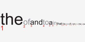
I chose to look at Jonathan Harris’s piece Wordcount, from 2003. It is a visualization of humans’ frequency of use of certain words. I really thought the concept was quite simple, but what made me begin to admire it more was when I read this section of Harris’s description: “The intention is for the user to feel embedded in the language, sifting through words like an archaeologist through sand, awaiting the unexpected find.” I realized that this was not just a list of data, but a clean visualization that users could explore and make connections within. I found my own curiosity growing as I wanted to discover the ranking of specific words. I love that the clean interface and simple concept leaves room for discovery. Since the project is very linear, I can assume that conditional statements were used to have the font size decrease as the ranking increased, from left to right. They also would need to be used to make the font fill change for every other word, alternating from black to gray. Wordcount was probably done similarly to the bar graph assignment. On his biography, it says that Harris is “exploring the ways in which humans use technology to shape their experience of life.” I feel that his fascination with human use of technology, but also of overall systems, is what inspired this piece, as language is a system that we have created (just like technology). This was a simple but effective piece for him to visually see patterns and relationships within human word use.
juyeonk-Looking Outwards-07
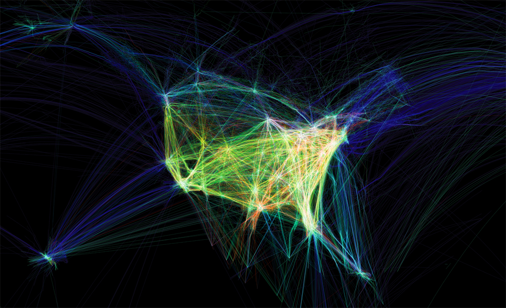
Video: showing the paths of airplanes over North America in different colors.
Title: Flight Patterns
Artist: Aaron Koblin
Year of Creation:
Link to the Project: http://www.aaronkoblin.com/project/flight-patterns/
Link to the Bio of the Artist: http://www.aaronkoblin.com/project/about/
This project was intended to visualize the air traffic above North America over the course of a day. Originally, this work was made as a part of the experiments for the larger project called “Celestial Mechanics” by Aaron Koblin and their colleagues named Scott Hessels and Gabriel Dunne at UCLA. They attained the flight information from the Federal Aviation Administration, analyzed the data and plotted them using the Processing programming environment. Colors and special effects were added later using Adobe After Effects and Maya.

(Before the special effects were added)
(After the effects were added)
mjnewman LookingOutwards-07, Section A
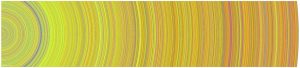
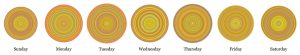
Through the Digg API, Chris Harrison was able to visually represent the most popular news stories of the day. Especially in today’s news cycle, there is so much content to absorb and process daily. With all that social media does to the news cycle, I wonder what those rings would look like in 2017 as opposed to 2007-2008. That was still a very busy and important era of the 21st century, but everything has grown and escalated since then. I admire how Harrison attempts to condense our everyday activity and attention into one artifact.
What I find interesting is how warm toned each circle is, which means there is a lot of “World & Business,” “Technology,” “Lifestyle,” and “Offbeat” Stories. However, the API is constantly being updated to better adapt to news stories, so the colors will change with that.
thlai-LookingOutwards-07
 Wind of Boston: Data Paintings is an installation by Refik Anadol Studios that uses data from patterns of wind around Boston and turns them into a series of data paintings. Even though this visualization is not necessarily immediately readable by the viewer to gain valuable information, the final product(s) are beautiful installations on digital canvases. Refik Anadol Studios developed custom software to analyze and visualize wind speed and direction patterns throughout one year, and used that data to create the series. The visuals provide a very fluid, calming feel and make me reminisce about the oceanside, which may have been the artists’ intention. I truly appreciate the dynamics of each piece and the process documentation. The final results are incredibly beautiful.
jennyzha – looking outwards 07
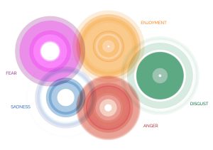
This project stemmed from a request made by the Dalai Lama himself, in 2014, to design an Atlas of Human Emotion. The purpose of the atlas was to design a map that would ultimately guide emotional travelers, and help people find a state of calm.
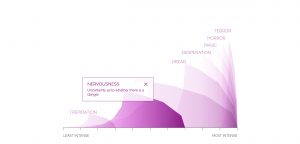
A couple of key atlas concepts include the fact that emotions are at the core of what makes us human and are distinct from one another. Furthermore, these emotions have several states, varying in intensity which, within each emotion, each emotional state has actions associated with it caused by a trigger. Finally, each emotion is associated with a particular Mood and a clearer understanding of one’s Emotions can contribute to the feeling of a Calm State.
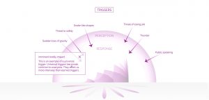
What I really love about this is how much consideration went into the flawless integration and transition of the data into the visualization. It’s attention to detail, keeping the key Atlas concepts in mind throughout the creation process, making sure different features would represent those different concepts.

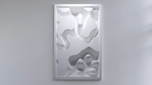
mmirho – Looking Outwards 7
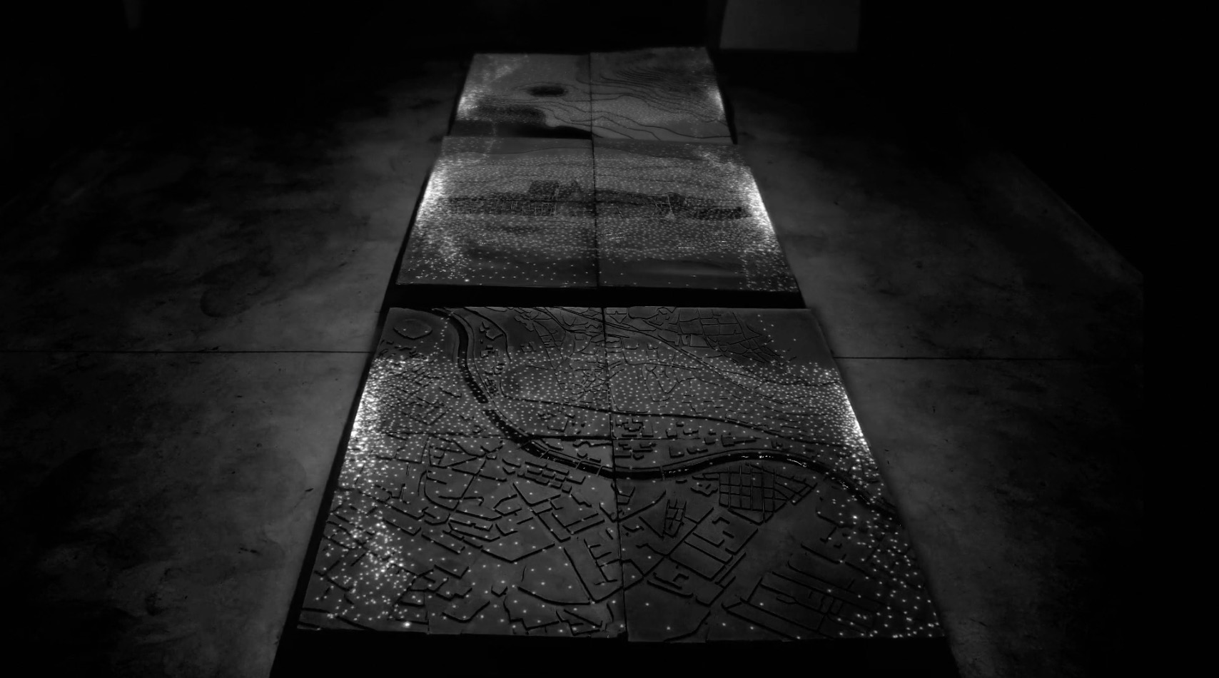
Shape in Scapes – Transporting architecture into audio-video performance
“Shape in Scapes – Transporting architecture into audio-video performance”
Created by Studio Antimateria and POLITECNICO di PIACENZA’s students.
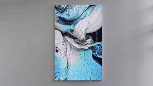
The algorithms used in this program, especially seen in this first picture, were generated through a simple program I could design, with many points reflecting off walls and flowing together as a liquid. The rest of the animations were mostly designed specifically for the surface and created an incredible light show on the model and topography.
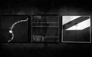
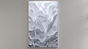
Here’s an example of a more designed formation from the project.
This work shows a large scale model of a sprawled town. The lights are what makes it significant, as they represent data points and patterns in the structure of the three models, and how they form spaces and direction.
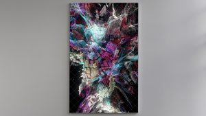
This surface of light, although I’m unaware of the technology used to create it, had simple computationally generative design behind it, and lots of directly artistic, human-created design.
I really enjoy this project because it expresses a common architectural structure in a brilliantly flashy, even more artistic way. The initial idea of the project definitely reflects the artist’s sensibilities, as it was designed to do so, directly by the artist, of course. Little computation was used, so little randomness and unpredictability occurred. However, as a result, the entire project felt a lot less natural.
heeseoc-LookingOutwards-07
I chose this graph named Name Voyager which was developed in 2005 by Martin Wattenberg, which I thought was interesting and also practical. It basically generates a graph using people’s names, having it take more space based on their popularities. The user can type in a specific name and see how popular it was and is depending on the time period, and the interesting point is that as we type, the visualization shows, letter by letter, the overall popularity of the letters we’ve entered so far. It is interesting to observe what names get out of trend and what names get more popular. I feel like the algorithm here should be pretty simple, collecting the number data depending on names and placing them on a corresponding coordinate on a graph. I wouldn’t say that it has the most aesthetically pleasing visual, but I think it is good enough for something that has been developed in 2005.
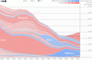
http://www.babynamewizard.com/voyager
LookingOutwards-07-Chickoff
Platts is a data visualization project created by U.K. designer Brendan Dawes in 2017 which visualizes “the journey of over 3000 ships created from five months of historical shipping data.”It was created for the Igloo 360 degree wrap-around projection system. The map of the world in this piece is created with little dots that grow over the course of the video. I find it fascinating to see how connected the world is in terms of the way we exchange products and exports, but also realize how disconnected I feel I am to that same world.
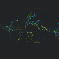
This project reminds me a lot of the travel and migration patterns of animals. I love this visualization of ship routes because it reduces human life to a simpler, objective level. The ship moves from Country A to Country B while experiencing some weather difficulties along the way. No opinion is needed with simple facts like these. And so I find it comforting to see the life in this way because it shows how insignificant and small humans are, even if we sometimes act like we’re the universe’s royalty.
selinal-Looking-Outwards-07
Personal Knowledge Database by Moebio Labs (Santiago Ortiz)
http://intuitionanalytics.com/other/knowledgeDatabase/
Moebio Labs is a collaborative team of engineers, analysts, programmers, etc. which has swept through and encountered millions of pages on the internet. While they make most of their data visualizations about a specific topic or theme, their project Personal Knowledge Database acts as an archive for the research they have done throughout the ten years since they started making data visualizations. I admire how they use of old, “unseen” material and incorporate it as a main thematic element in another one of their projects. I think there is a significance in the metaphorical translation of the project’s concept to a visual, and the interactive and technical aspects are extremely impressive. One observation I have of the algorithm used is the separation of certain links/projects into nodes within other nodes, perhaps to indicate time period and area of research.

