danakim-LookingOutwards-08

Mimi Onuoha is a Nigerian artist and researcher based in Brooklyn. She explores the implications of computational categorization and data collection. Her main mediums are code, writing, and sculptures. Through these mediums she explores missing data and the ways that people are classified, abstracted, and represented through data collection. Onuoha is currently a research resident at Eyebeam, an Artist in Residence at StudioXX, and a data journalism contributor at Quartz. She graduated from NYU’s Interactive Telecommunications Program in 2013 with an MPS, Master of Professional Studies.

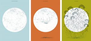
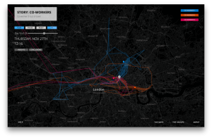
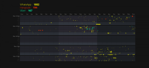
Onuoha focuses on the link between data collection and human relationships and classifications. She shapes her work around daily life a lot and its very interesting how much you can actually learn from this data that she is collecting about individuals. One of her pieces, Pathways, literally tracks the path of groups of people. She uses mobiles to collect data from each group. The use of a mobile phone to collect data is interesting because it opens up the variety of data that she can collect. She used different apps to track which messaging apps the groups used, where they were travelling, as well as how often the group interacted with one another.

Pathways; Mimi Onouha
Pathways; Mimi Onuoha

Onuoha spoke at the Eyeo Festival on June 27, 2017. She starts off the presentation by introducing the core idea of her work, which is data collection, and then proceeded to talk about influences and how that affected the way that she approached her projects. Onuoha introduces a piece of hers that she uses as an example of how she manifests her ideas into her piece and how what she learned from this particular project led to an idea for another project. She presents her work like it is a story. It helps to make the flow much smoother.

Mimi Onuoha

yunzhous-LookingOutwards-08

Robert Hodgin is a artist/coder. He does various type of work, ranging from 2D data visualizations and to immersive 3D simulations. His primary interests include theoretical physics, astronomy, particle engines, and audio visualizations. One fun fact, as a coder, he graduated from RISD with a degree in sculpture.

Hodgin visualizes&simulate data with code. For example, he visualizes fishes’ motion in the sea according to their speed, direction, etc. He visualizes lighting on earth according to data. He is very playful with his work: he gives the fish various shape. I found the playfulness delicate and interesting.

Hodgin’s lecture is very humorous. This actually grabbed my attention and made this 45min assignment engaging rather than tedious. He used metaphors(usually funny ones) to explain his work. For example, in explaining creative coding, he make a short video of painting intuitively until stopped by a bug in the code, with funny sound and visual effect. By doing this the audience would pay full attention to his lecture and easily understand.

This is the full lecture


This is another work by Hodgin I found amazing, “Fish Tornado”

Here is Hodgin’s website


Looking-Outwards 08 Thomas Wrabetz

Chris Sigrue is an artist, programmer, teacher, and inventor. I enjoyed her lecture and the audience participation in her works (something we have not really seen yet). There were a lot of really interesting and innovative exhibits: because of the audience participation, there was a level of unexpected and renewing novelty that went beyond even ordinary randomness.

gyueunp – Looking Outwards 08

Stephanie Posavec describes herself as a self-employed graphic designer
who considers “data” her favored medium. She specializes in data related design and works on data projects that involve language, literature, and science. She has worked on projects and commissions for various companies and institutions that include Facebook, BBC, Tate Britain, and Victoria and Albert Museum. After moving from the United States for her MA in Communication Design in Central Saint Martins, she decided to stay in London to continue her artistic career.
The simplicity of her the Eyeo presentation slides allowed me to easily focus on her works and the messages she delivered through the talk. One of the works that caught my attention both in her talk and her web site was the project she worked on for the Memory Palace exhibition for V&A in London. The push and pull between the objective logical design decisions and the subjective emotional design decisions that occur in the process of working with data is prevalent in this project, as it exemplifies how she works in between the two worlds.
The work consists of three different prints that are simultaneously illustrative and data oriented. Although the illustrative quality initially attracted my attention as the most appealing aspect of the work, the idea behind the artistic choices is what I find more fascinating. Each of the three prints functions as the map of the world, involving accurate data that displays the locations of various capital cities. I admire this project in that it remains true to the data while containing an illustrative quality, just like many other works by Posavec.
In short, I believe that her works go beyond focusing on data visualisation and information design. Using data as a basis to create an illustrative work of art is what I intend to explore in the near future.

Posavec’s world maps for V&A‘s Memory Palace project

hdw – Looking Outwards – 08

This week I watched the Eyeo Festival video on Policy Brutality in Ferguson from 2015. In the video, Deray Mckesson and Samuel Simyang-we, two advocates for Black Lives Matter, explained how they used informational graphics and data visualization to communicate the exigency of their issue on Twitter platform. Together, they collected and researched data from news articles online and mapped out the location of where each victim was killed on a map, allowing users to further qualify the data set with information about each victim’s age and given cause of death.
Mckesson and Simyang-we discussed how effective data visualization is as a tool for creating systematic change because it appeals to all audiences. It doesn’t matter if the presenter’s audience is for various grassroots organizations, for various policy-makers, or for the general public, the information is digestible and easy for the audience to connect with and process. Before releasing this data and sparking this trend of mapping out race-related police information, many people were not aware of how widespread the issue was. However, after a period of a few months, general public opinion had shifted with over millions of people convinced that policy brutality is a systematic issue.

nayeonk1-LookingOutwards-08

I found that she is very interesting as an artist.
she was born and raised in Iran during the war. That’s also why her work deals with the political, social and cultural contradictions we face every day. In early stage of her life, she took private creative writing course and learnt about the importance of telling personal narratives. She went to University of Tehran and was awarded her bachelor of arts in social science and media studies. And she moved to USA and attended two more university majoring Digital Media and Media art. She uses technology as part of a philosophical toolset to reflect on object; a poetic mean to document the personal and collective lives we live and our struggles as humans in the 21st century.

The 3D Additivist Cookbook (2016)
She Who Sees the Unknown (2017-2018)

These two images are some of her works that caught my eyes from her website. As a woman artist, she uses sexual images to create her work in non sexual ways. Mean by that, I feel that female’s body represented on her work are very bold and nude. I always love the way of female artist using their gender as a story of their work as it stand alone from other’s -usually male- perspectives.

She also uses her work to fight with political problems. In this video, she used 3D printer to create a sculpture to say something to IS. I admire her braveness and creativeness as an artist.

“Morehshin Allahyari’s website

mmirho – Looking Outwards 8 – BioPhilia

I watched and studied Scott Snibbe, and his 2012 lecture. Scott is an artist/developer that works in augmented reality, interactive interfaces, interactive art, and digital video. He lives in San Fransisco, currently works at Facebook as a project manager, and studied at Brown University in computer science. Scott describes himself as a pioneer in interactivity and augmented reality.

Among his many projects, I appreciated the depth he explored interactivity in an app he helped construct called Biophilia. It’s an interactive album built into an app format, so that you, as the listener, can manipulate the music in a way that makes it never the same, and different depending on the user. I really appreciate how relaxing and sane and normal everything feels in the interaction. Scott describes it as similar to nature and natural interaction, and that’s how it was deliberately designed. It’s simple, satisfying, and obvious as to the purpose.

In his presentation, I observed how Scott stayed simple. He didn’t delve too immensely far into any one theory, or concept, or piece of his work to the point where I and everyone else could easily understand what he was saying and what he meant. There was nothing intimidating about what he did, and even if he put years of his life into a piece he explained it plainly and simply. Hopefully, I can explain some of what I build the same way, to allow everyone to understand.

His Website: https://www.snibbe.com/

His lecture video:

hannajan-LookingOutwards08


(Above is a VIMEO clip of Maya Ganesh’s talk in Eyeo 2013)

Maya Indira Ganesh is a reader, writer, researcher, and activist working at Tactical Technology Collective in Berlin. She is a PhD candidate at Leuphana University, Lüneburg. She works as a feminist activist, and has been writing about and researching gender/sexuality, media, technology and rights, and social justice since the early 2000s.

A topic she is passionate about is Visual Influence. In the video clip that is attached to this post, she talks about Visual Influence and how data and visuals can be artfully used to benefit spreading and progressing social issues.

I admire her work in bringing together two different groups that are not linked together all the time. However, in stressing their advantages she talks about how both groups can benefit from collaborating their strengths together. She is able to do this because of her diverse background in working in both fields actively.

A project she has actively worked in is called Tactical Tech – a non-profit working for the past ten years to help activists worldwide use information more effectively. It made me think about how in the artistic pieces I design in the future, the message behind the art is equally as important as the aesthetic aspect of it.

https://tacticaltech.org/team-members/maya-indira-ganesh/

Matthew Erlebacher Looking Outward-08

The lecture I watched was given by Darius Kazemi. Darius is a video game developer, computer programmer, and generative artist. He graduated from Worcester Polytechnic Institute. He hoped to get a master degree, but eventually dropped out to work on independent projects. Darius worked on generative art created from several websites such as twitter and google maps. His most popular project was a bot on Amazon which bought random books, CDs, and movies each month. I admired his work because his programs took small and inconsequential things and put them together to make something bigger. His presentation style was very interesting. One of the main points that he brought up that generative art would be boring without the human input. His best example of this was a program that would give the definition of random words. Darius realized that there was nothing interesting with this whatsoever. He decided that he would turn it into a joke generator. I also like that he gave examples outside his own creation. The best example he gave was a twitter account intended to mimic a teenage girl. It was actually, so good that there was a boy who spent three hours hitting on it.

Sources:

“Darius Kazemi.” Wikipedia, Wikimedia Foundation, 20 Aug. 2017, en.wikipedia.org/wiki/Darius_Kazemi.

http://tinysubversions.com/

ljkim-looking outward 08

Eyeo2012 – Jennifer Pahlka from Eyeo Festival // INSTINT on Vimeo.

Eyeo2012 – Jennifer Pahlka

“Jennifer Pahlka is the founder and executive director of Code for America. She recently served as the U.S. Deputy Chief Technology Officer in the White House Office of Science and Technology Policy, where she architected and helped found the United States Digital Service. She is known for her TED talk, Coding a Better Government, and is the recipient of several awards, including MIT’s Kevin Lynch Award, the Oxford Internet Institute’s Internet and Society Award, and the National Democratic Institute’s Democracy Award. She spent eight years at CMP Media, where she ran the Game Developers Conference, Game Developer magazine, Gamasutra.com, and the Independent Games Festival. Previously, she ran the Web 2.0 and Gov 2.0 events for TechWeb, in conjunction with O’Reilly Media. She is a graduate of Yale University.” This is the website for code of america:

I appreciate one that she is a woman in tech. She also works to bridge the gap with the government and technology advancements. By using crowd sourcing, she bridges the gap between policy making and data driven information.Jennifer talks about how Code for America re-thinks, and re-makes our interactions with government, and why. I admire her approach to making design applicable to all aspects. Theres several areas where design can be used to make experiences more efficient. This is clearly one of them.

Its important for our government to be well informed. Tech can take away the lengthy process for the government to access information.